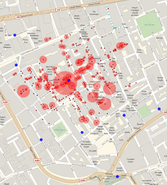
Arnoud's posting on crime maps reminded me of one of the first works in epidemiology conducted by John Snow in 1854.
Robin Wilson digitized the data and generated the famous map with several tools. The actual data can be found in several formats, one of them being found here.
I wanted to test MMA's ability to
1) Pull data using Google Fusion Table's technology. 2) Represent the data using GeoGraphics functionality.
Checking Google Fusion Tables API Documentation it is pretty straightforward to pull the data into Mathematica.
googleFusion =
  URLFetch["https://www.googleapis.com/fusiontables/v1/query",
   "Parameters" -> {"sql" ->
      "SELECT * FROM 147wlDisDp6NnpNxHQpbnjAQ-iW4dR2MAmFdQxYc",
     "key" -> "YourGoogleDeveloperKey"}];
googleFusion = ImportString[googleFusion, "JSON"][[1, 2]];
data = Table[{ToExpression@googleFusion[[i, 1]],
    "coordinates" /. Evaluate["geometry" /. googleFusion[[i, 2]]] //
      Reverse // ToExpression}, {i, Length@googleFusion}];
pumps = Cases[data, {-999, _}];
deaths = Complement[data, pumps];
markersDeath =
  GeoMarker[#[[2]],
     Graphics[{Point[{0, 0}], Opacity[0.4], Red, Disk[]}],
     "Scale" -> Scaled[#[[1]]/100]] & /@ deaths;
markerPumps =
  GeoMarker[pumps[[All, 2]], Graphics[{Opacity[0.8], Blue, Disk[]}],
   "Scale" -> Scaled[0.02]];
g = GeoGraphics[{markersDeath, markerPumps}, ImageSize -> Large]
Blue dots represent where the water pumps were located in 1854. The dots and size of the red circles represent the location and number of deaths.
