Group Abstract Group Abstract

Message Boards Message Boards

1
|
314 Views
|
6 Replies
|
3 Total Likes
View groups...
Share
Share this post:

Graphics bounding boxes in TimeLinePlot

Posted 1 month ago

I am working on a series of data visualizations I intend to publish as a tweet storm recognizing Pixar's 30th feature film. The first visualization of the series is going to be a TimeLinePlot of the 1-sheet poster for all Pixar movies. I have been running into an odd challenge with spacing of the graphics. If I accept low resolution images, the posters line up like I want them to. That leaves them barely legible. If I increase the resolution, the bounding boxes are so large the layout is unusable.

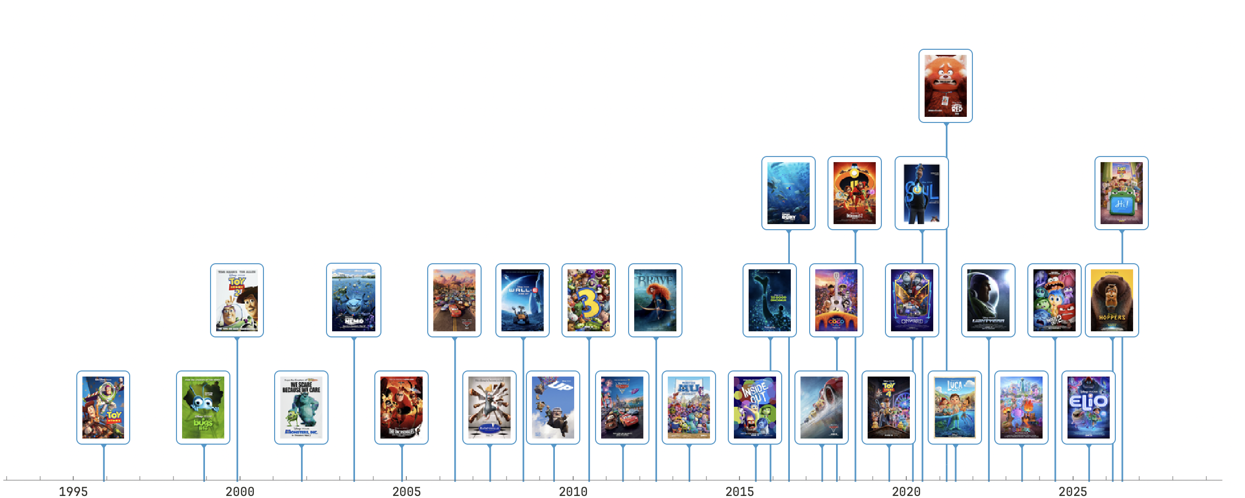
Here is an example of what I would like them to look like. Note the low resolution making the individual posters hard to identify:

Low Resolution

And here you can see the bounding box with low resolution images. Its not perfect but I can accept it:

enter image description here

Now switching to using a higher resolution option. This is the best I can get the formatting to look, but the posters are identifiable even at a small size.:

enter image description here

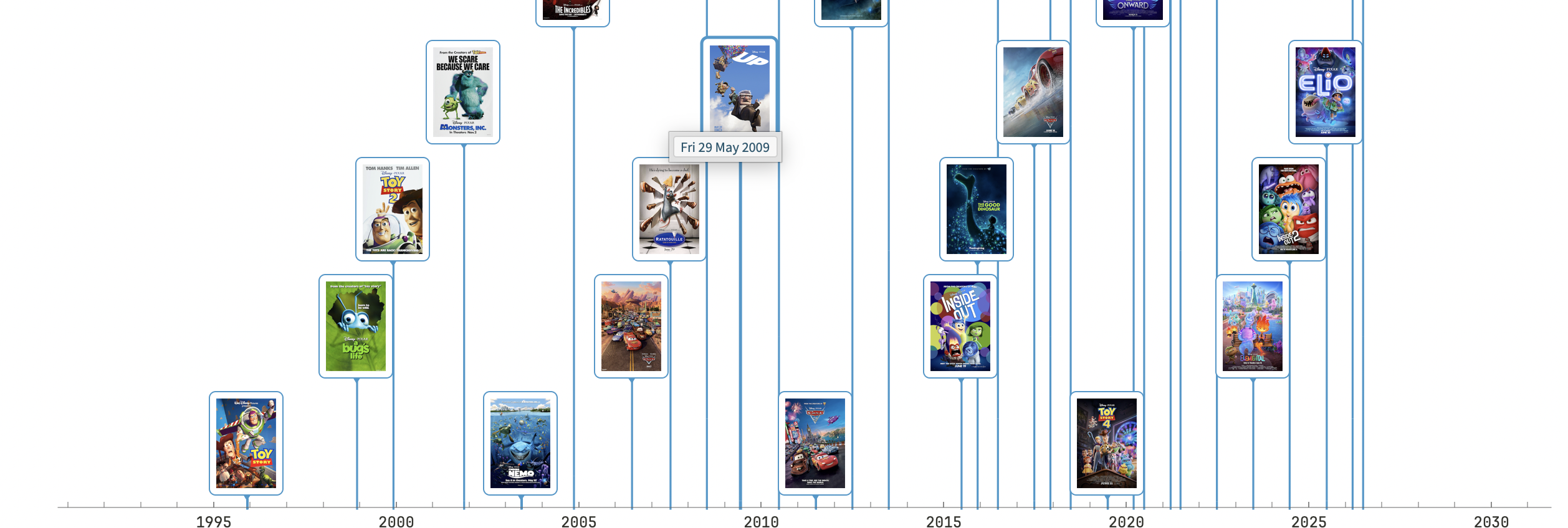
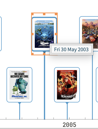
The problem becomes clear when I look at the bounding boxes:

enter image description here

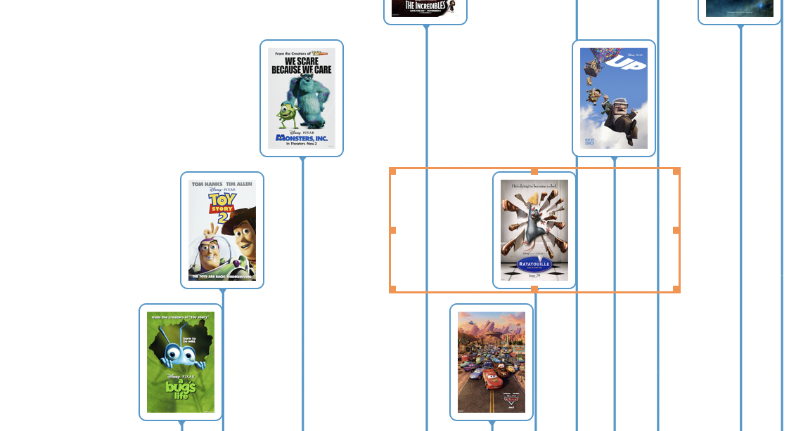
TimeLinePlot is laying out the images around the boxes. Setting the Layout Style as Packed or Overlapped makes no difference.

Here is some abridged code that I am using to generate the high resolution plot:

TimelinePlot[<|
  Import[
    [File Path], ImageSize -> {200, 300}, 
    ImageResolution -> 300] -> DateObject["6 14, 2024"],
  Import[
    [File Path], ImageSize -> {200, 300}, 
    ImageResolution -> 300] -> DateObject["6 20, 2025"],
  Import[
   [File Path], ImageSize -> {200, 300}, 
    ImageResolution -> 300] -> DateObject["3 6, 2026"],
  Import[
    [File Path], ImageSize -> {200, 300}, 
    ImageResolution -> 300] -> DateObject["6 19, 2026"]
  |>,  ImageSize -> 1200 , PlotLayout -> "Packed"]

And here is abridged code I am using the get the low resolution layout:

 TimelinePlot[<|
      Import[
        [File Path], ImageSize -> Tiny, 
        ImageResolution -> 300] -> DateObject["6 14, 2024"],
      Import[
        [File Path], ImageSize -> Tiny, 
        ImageResolution -> 300] -> DateObject["6 20, 2025"],
      Import[
       [File Path], ImageSize -> Tiny, 
        ImageResolution -> 300] -> DateObject["3 6, 2026"],
      Import[
        [File Path], ImageSize -> Tiny, 
        ImageResolution -> 300] -> DateObject["6 19, 2026"]
      |>,  ImageSize -> 1200 , PlotLayout -> "Packed"]

Does anyone have any suggestions on how to approach solving this. I have been pushing the LLM Assistant hard on the problem and Claude Code, but I am not getting anywhere.

POSTED BY: Jon Rogers
6 Replies

With ImageSize you can give both the horizontal and vertical sizes. Did you try that?

POSTED BY: Gianluca Gorni

Have you tried increasing ImageSize?

POSTED BY: Gianluca Gorni
Posted 20 days ago

Seems that maybe wrapping the image in Pane works ... Try:

Pane@Import[...]

Also,an alternative to display the images is to use Labeled:

TimelinePlot[
    {Labeled[DateObject["6 14, 2024"], image1]
    , Labeled[DateObject["6 20, 2025"], image2]
    ,...}, ...]
POSTED BY: Chris P
Posted 1 month ago

This is an update to my original post. While I was working to try to find a solution this challenge, I accidentally left a typo in my code. That typo was in the file path to one of the posters which prompted Mathematica to issue an alert of a failed import. Mathematica still rendered the plot, but inserted $Failed where the poster should have been. However, Mathematica rendered the image exactly how I wanted and expected it to be. There is something about having that failed import that pushed Mathematica in the right direction. Here is what it looked like: enter image description here

This let me find a temporary work around. I have created a Pixar movie many years in the future with an incorrect file path, and I limit the PlotRange to the 1995-2026 years. This is pushing Mathematica to create something close to the graphic I want:

enter image description here

One amazing observation you can see immediately with this visualization is the density of Pixar movies going up over time. As the density goes up in the late 00's you end with several films that underperform expectations (Brave, Monsters U), The pace slows down and you end up with a huge success like Inside Out, and then the density increases again, and more than before, leading to some big wins but also some huge flops.

POSTED BY: Jon Rogers
Posted 1 month ago

Yes. It didn't make a difference. Here is the Plot with ImageSize -> 1200

enter image description here

Now this is it with ImageSize -> {1200, 780)

enter image description here

Note that by using the {w,h} setting it crushed the image from the sides. Very unexpected behavior. There are also bugs in TimeLinePlot with the plot lines that drop to the axis. See here:

enter image description here

Those errors in the plot lines are not a problem when the image is exported though.

I am going to make an update post above about a finding that was helpful. It doesn't solve the problem but allowed me to move ahead with some of the work I wanted to do.

POSTED BY: Jon Rogers
Posted 1 month ago

I have. I changed the size of the graphic from 1200 to 1920 while keeping the size for each poster set at {200,300}. This is the result:

enter image description here

The boxes are now square, but still much larger than the posters inside pushing the plot to be unnaturally large. This is with the resolution set to Automatic. I think automatic is coming in at 72DPI.

When I set the resolution to 300 (what I desire), and keep the plot size at 1920 and poster size at {200,300}, the poster shrinks in size but the box stays the same size. Here is what it looks like:

enter image description here

POSTED BY: Jon Rogers
Reply to this discussion
Community posts can be styled and formatted using the Markdown syntax.
Reply Preview
Attachments
Remove
or Discard