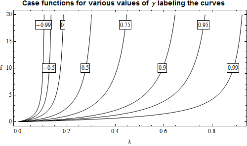
It would help some, Bilal, if you put the code in the code format by selecting it and using the "Code sample" button at the top of the entry panel. Then it is easy to copy it out into a notebook. But now, at least, we have your actual functions to work with. I'm not certain why you are working with List plots instead of a regular Plot since you have exact expressions for the function. Anyway, the idea here is to get direct labeling on the curves so we can avoid a legend, which is almost always inferior. I changed your set of gamma values to obtain a more even spacing and eliminated one value at the negative end to eliminate overcrowding. I'm not certain if that would be acceptable to you.
`<< Presentations
Define the function:
Clear[\[Gamma], \[Lambda]]
f[\[Gamma]_][\[Lambda]_] = (1 - 5 \[Lambda] +
     4 \[Gamma] \[Lambda]) ((77 \[Lambda]^2 -
       76 \[Gamma] \[Lambda]^2 + (10 \[Lambda] -
          8 \[Gamma] \[Lambda]) (1 - 5 \[Lambda] +
          4 \[Gamma] \[Lambda]))/(2 - (10 \[Lambda] -
          8 \[Gamma] \[Lambda]) (2 - 5 \[Lambda] +
          4 \[Gamma] \[Lambda]))) // Simplify
This is the list of gamma values I used:
\[Gamma]ValueList = {-0.99, -0.5, 0, 0.5, 0.75, 0.9, 0.95, 0.99}
The problem is to obtain a list of gamma values that will place the curve labels at two different levels. The following code does this for y-axis levels of 10 and 18. For 10:
Clear[\[Gamma], \[Lambda]]
Solve[f[\[Gamma]][\[Lambda]] == 10, \[Lambda], Reals];
sol10 = Simplify[%,
   0 < \[Lambda] < 1 && 0 < y < 20 && -1 < \[Gamma] < 1];
sol10 /. \[Gamma] -> \[Gamma]ValueList // N;
\[Lambda]10Rules = \[Lambda] /. %;
\[Lambda]10List =
 Inner[First@Select[{#1, #2}, 0 < # < 1 &] &, Sequence @@ %, List]
Giving
{0.101899, 0.12806, 0.174356, 0.278374, 0.408937, 0.595472, 0.719886, \
0.888023}
And for 18:
Clear[\[Gamma], \[Lambda]]
Solve[f[\[Gamma]][\[Lambda]] == 18, \[Lambda], Reals];
sol18 = Simplify[%,
   0 < \[Lambda] < 1 && 0 < y < 20 && -1 < \[Gamma] < 1];
sol18 /. \[Gamma] -> \[Gamma]ValueList // N;
\[Lambda]18Rules = \[Lambda] /. %;
\[Lambda]18List =
 Inner[First@Select[{#1, #2}, 0 < # < 1 &] &, Sequence @@ %, List]
And finally we can make the plot:
Draw2D[
  {(Draw[f[#][\[Lambda]], {\[Lambda], 0, 1},
       PlotRange -> {0, 20},
       RegionFunction ->
        Function[{\[Lambda], f}, 0 < f < 20]]) & /@ \[Gamma]ValueList,
   Table[\[Gamma] = \[Gamma]ValueList[[p]];
    Text[Framed[Style[\[Gamma], 12], Background -> White,
      FrameMargins -> 0.5], \[Lambda] =
      If[OddQ[p], \[Lambda]18List[[p]], \[Lambda]10List[[p]]]; {\
\[Lambda], f[\[Gamma]][\[Lambda]]}], {p, 1,
     Length[\[Gamma]ValueList]}]},
  AspectRatio -> 0.5,
  PlotRange -> All,
  Frame -> True, FrameLabel -> {"\[Lambda]", "f"},
  RotateLabel -> False,
  BaseStyle -> {FontSize -> 12},
  ImageSize -> 500] //
 Labeled[#,
   Style["Case functions for various values of \[Gamma] labeling the \
curves", 14, FontFamily -> "Helvetica"], {{Top, Center}}] &
Giving:

I hope this will help some, or at least give some ideas. Data graphics is actually fairly difficult and it often takes a lot of fussing around. Some good books I would recommend are those by Edward R, Tufte:
Tufte book
He actually has three books there. Graphics often have to be tailored to the data and it should be clear what the message is. Any "ink" that does not add to the message, detracts from it. I'm not quite certain what the "message" of this graphic is other than showing representative cases.