Message Boards Message Boards

1
|
20103 Views
|
11 Replies
|
5 Total Likes
View groups...
Share
Share this post:
GROUPS:

Plotting multiple curves in black and white using Mathematica

Posted 10 years ago

I want to create a plot that consists of 7 curves in black and white and a legend, how can I specify different style for every curve automatically. I tried different AbsoluteThickness for every curve but I didn't like the results, Is there an alternative way? (For example can I add a shape inside the curves and show that shape in the legend ?)

POSTED BY: Bilal Bilal
11 Replies
Posted 10 years ago

I have also used ListPlot at times to generate markers for Plot. But It's unfortunate that we have to put this much effort into what is really a very common requirement.

There is an option Mesh for Plot which does produce points on the graph which, with limitations, can be set to different styles:

Plot[Sin[x], {x, 0, 2 Pi}, Mesh -> 7, 
 MeshStyle -> Directive[PointSize[0.03], Red]]

enter image description here

Unfortunately, the options Mesh and MeshStyle do not seem to understand lists of arguments, so different styles cannot be used for the different arguments:

Plot[{Sin[x], Cos[x]}, {x, 0, 2 Pi}, Mesh -> {7, 9}, 
 MeshStyle -> {Directive[PointSize[0.03], Red], 
   Directive[PointSize[0.02], Green]}]

enter image description here

It seems to me that this functionality could be developed in such a way as to give us styled PlotMarkers for Plot and similar functions.

Kind regards,

David

POSTED BY: David Keith
Posted 10 years ago

Dear David,Thank you a lot for your help, I found a function called "LabelPlot" that can add the label inside a curve at a specific position: This is its code:

Blockquote

LabelPlot[func_List, {var_, varmin_, varmax_}, opts___?OptionQ] := 
  Module[{crvlbl, pltopts, funclis, txt, tt, aa, f},
   crvlbl = CurveLabel /. {opts} /. CurveLabel -> None;
   pltopts = Select[{opts}, #[[1]] =!= CurveLabel &];
   funclis = 
    Table[f[i][tt_] = 
      If[Head[func[[i]]] === Symbol && func[[i]] =!= var, 
       func[[i]][tt], func[[i]] /. var -> tt], {i, Length[func]}];
   txt = Table[
     If[Head[crvlbl[[i]]] === List, 
      Text[StyleForm[ToString[crvlbl[[i, 1]]], 
        Background -> GrayLevel[.95], 
        FontSize -> 14], {aa[i] = crvlbl[[i, 2]] (varmax - varmin), 
        f[i][aa[i]]}, {0, -1}], 
      Text[StyleForm[ToString[crvlbl[[i]]], 
        Background -> GrayLevel[.95], 
        FontSize -> 14], {aa[i] = (varmax - varmin)/2, 
        f[i][aa[i]]}, {0, -1}]], {i, Length[crvlbl]}];
   Plot[Evaluate[Table[f[i][rr], {i, Length[func]}]], {rr, varmin, 
     varmax}, Epilog -> txt, Evaluate[pltopts]]
   ];
LabelPlot[func_, {var_, varmin_, varmax_}, opts___?OptionQ] := 
  Module[{crvlbl, pltopts, f1, txt, tt, aa},
   crvlbl = CurveLabel /. {opts} /. CurveLabel -> None;
   pltopts = Select[{opts}, #[[1]] =!= CurveLabel &];
   f1[tt_] = 
    If[Head[func] === Symbol && func =!= var, func[tt], 
     func /. var -> tt];
   txt = If[Head[crvlbl] === List, 
     Text[StyleForm[ToString[crvlbl[[1]]], 
       Background -> GrayLevel[.95], 
       FontSize -> 14], {aa = crvlbl[[2]] (varmax - varmin), 
       f1[aa]}, {0, -1}], 
     Text[StyleForm[ToString[crvlbl], Background -> GrayLevel[.95], 
       FontSize -> 14], {aa = (varmax - varmin)/2, f1[aa]}, {0, -1}]];
   Plot[f1[tt], {tt, varmin, varmax}, Epilog -> txt, Evaluate[pltopts]]
   ];
POSTED BY: Bilal Bilal

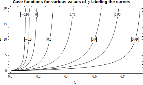
It would help some, Bilal, if you put the code in the code format by selecting it and using the "Code sample" button at the top of the entry panel. Then it is easy to copy it out into a notebook. But now, at least, we have your actual functions to work with. I'm not certain why you are working with List plots instead of a regular Plot since you have exact expressions for the function. Anyway, the idea here is to get direct labeling on the curves so we can avoid a legend, which is almost always inferior. I changed your set of gamma values to obtain a more even spacing and eliminated one value at the negative end to eliminate overcrowding. I'm not certain if that would be acceptable to you.

`<< Presentations

Define the function:

Clear[\[Gamma], \[Lambda]]
f[\[Gamma]_][\[Lambda]_] = (1 - 5 \[Lambda] + 
     4 \[Gamma] \[Lambda]) ((77 \[Lambda]^2 - 
       76 \[Gamma] \[Lambda]^2 + (10 \[Lambda] - 
          8 \[Gamma] \[Lambda]) (1 - 5 \[Lambda] + 
          4 \[Gamma] \[Lambda]))/(2 - (10 \[Lambda] - 
          8 \[Gamma] \[Lambda]) (2 - 5 \[Lambda] + 
          4 \[Gamma] \[Lambda]))) // Simplify

This is the list of gamma values I used:

\[Gamma]ValueList = {-0.99, -0.5, 0, 0.5, 0.75, 0.9, 0.95, 0.99}

The problem is to obtain a list of gamma values that will place the curve labels at two different levels. The following code does this for y-axis levels of 10 and 18. For 10:

Clear[\[Gamma], \[Lambda]]
Solve[f[\[Gamma]][\[Lambda]] == 10, \[Lambda], Reals];
sol10 = Simplify[%, 
   0 < \[Lambda] < 1 && 0 < y < 20 && -1 < \[Gamma] < 1];
sol10 /. \[Gamma] -> \[Gamma]ValueList // N;
\[Lambda]10Rules = \[Lambda] /. %;
\[Lambda]10List = 
 Inner[First@Select[{#1, #2}, 0 < # < 1 &] &, Sequence @@ %, List]

Giving

{0.101899, 0.12806, 0.174356, 0.278374, 0.408937, 0.595472, 0.719886, \
0.888023}

And for 18:

Clear[\[Gamma], \[Lambda]]
Solve[f[\[Gamma]][\[Lambda]] == 18, \[Lambda], Reals];
sol18 = Simplify[%, 
   0 < \[Lambda] < 1 && 0 < y < 20 && -1 < \[Gamma] < 1];
sol18 /. \[Gamma] -> \[Gamma]ValueList // N;
\[Lambda]18Rules = \[Lambda] /. %;
\[Lambda]18List = 
 Inner[First@Select[{#1, #2}, 0 < # < 1 &] &, Sequence @@ %, List]

And finally we can make the plot:

Draw2D[
  {(Draw[f[#][\[Lambda]], {\[Lambda], 0, 1},
       PlotRange -> {0, 20},
       RegionFunction -> 
        Function[{\[Lambda], f}, 0 < f < 20]]) & /@ \[Gamma]ValueList,
   Table[\[Gamma] = \[Gamma]ValueList[[p]]; 
    Text[Framed[Style[\[Gamma], 12], Background -> White, 
      FrameMargins -> 0.5], \[Lambda] = 
      If[OddQ[p], \[Lambda]18List[[p]], \[Lambda]10List[[p]]]; {\
\[Lambda], f[\[Gamma]][\[Lambda]]}], {p, 1, 
     Length[\[Gamma]ValueList]}]},
  AspectRatio -> 0.5,
  PlotRange -> All,
  Frame -> True, FrameLabel -> {"\[Lambda]", "f"}, 
  RotateLabel -> False,
  BaseStyle -> {FontSize -> 12},
  ImageSize -> 500] // 
 Labeled[#, 
   Style["Case functions for various values of \[Gamma] labeling the \
curves", 14, FontFamily -> "Helvetica"], {{Top, Center}}] &

Giving:

enter image description here

I hope this will help some, or at least give some ideas. Data graphics is actually fairly difficult and it often takes a lot of fussing around. Some good books I would recommend are those by Edward R, Tufte:

Tufte book

He actually has three books there. Graphics often have to be tailored to the data and it should be clear what the message is. Any "ink" that does not add to the message, detracts from it. I'm not quite certain what the "message" of this graphic is other than showing representative cases.

Posted 10 years ago

Now that I have reached this step, I am having a problem with asymptotes, they are so annoying on the graph, I can delete them manually from the graph , but I guess if I add an Exclusion for the denominator they should not appear, any idea where should I add the following statement:

Exclusions-> {2 - (10 [Lambda] - 8 [Gamma] [Lambda]) (2 - 5 [Lambda] + 4 [Gamma] [Lambda])==0}

Attachments:
POSTED BY: Bilal Bilal
Posted 10 years ago

Thank you David, It's a nice idea to put the number of the curve inside of it like you have done in your first method , it makes the graph much easier to read, but my problem here is that "i" should have 7 custom values {-0.99, -0.9 , -0.5 , 0 , 0.5 , 0.9 , 0.99} that should appear inside the curves instead of {1,2,...,7}, can this be done using your first method ?

POSTED BY: Bilal Bilal

I would suggest that the plots in the previous replies, although technically satisfying the requirement, are not all that easy to read. The markers seem to be rather cluttering the presentation and the viewer has to move between the legend and the plot and furthermore the markers are not all that clear. I would like to present two alternatives. It was easy for me to construct these with my Presentations Application, but they could be done with regular Mathematica. For the first one use Show instead of Draw2D and Plot instead of Draw and you have to wrap Graphics around the Text Table. In the second you have to use Column and Row instead of pagelet and phrase.

Solve for x in terms of y and i.

In[35]:= Solve[y==Exp[3x i],x][[1,1]]
Simplify[%,C[1]==0]
Out[35]= x->ConditionalExpression[(2 I \[Pi] C[1]+Log[y])/(3 i),C[1]\[Element]Integers]
Out[36]= x->Log[y]/(3 i)

Then for the first plot:

<< Presentations`
Draw2D[
  {Table[Draw[Exp[3 x i], {x, 0, 1}, PlotRange -> {0, 20}], {i, 7}],
   Table[Text[
     Framed[Style[i, 14], Background -> White, FrameMargins -> Tiny], 
     If[OddQ[i], {Log[18]/(3 i), 18}, {Log[15]/(3 i), 15}]], {i, 7}]},
  AspectRatio -> 0.5,
  PlotRange -> All,
  Frame -> True,
  ImageSize -> 500] // 
 Labeled[#, 
   Style[phrase[Exp[3 x i], " labeled with value of i"], 14, 
    FontFamily -> "Helvetica"], {{Top, Center}}] &

Giving:

enter image description here

I assume this will be in a printed paper or report. Still, there are great advantages in communicating directly with a Mathematica notebook or CDF files. The second example shows what you might do with a dynamic display. Here we plot all the curves in light gray except the one that is selected by the RadioBar, which is in black. If you had data points that went with each curve you could plot the data points only for the selected curve. This is a good way to untangle a number of closely overlapping data sets.

DynamicModule[{ivalue = 3},
 pagelet[
  phrase["Choose i:", RadioButtonBar[Dynamic[ivalue], Range[7]], 
   " for ", Style[Exp[3 x i], 16]],
  Dynamic@
   Draw2D[
    {Table[
      Draw[Exp[3 x i], {x, 0, 1}, PlotRange -> {0, 20}, 
       PlotStyle :> If[i == ivalue, Black, GrayLevel[0.7]]], {i, 7}]
     },
    AspectRatio -> 0.5,
    PlotRange -> All,
    Frame -> True,
    ImageSize -> 500]
  ]
 ]

Giving:

enter image description here

Posted 10 years ago

Thank you Sander and Alexey for your help, I searched all the web for a perfect solution like this,you really saved me, however if you please one last question , how to specify the values of variable "i" and put them in the legend like the "Gamma" in the first attached file?

POSTED BY: Bilal Bilal
Posted 10 years ago

Dear Sander,

Note the unwanted PlotMarkers (semidisks) at the top of your plot. It is a known bug in ListPlot and ListLinePlot. As a workaround add the ClippingStyle -> False option to ListPlot (the following output is from v. 10.0.1 under Win7 x64):

data = Table[{x, Exp[3 x i]}, {i, 7}, {x, 0, 1, 0.025}];
ListPlot[data, PlotRange -> {0, 20}, Joined -> True, Frame -> True, 
 ImageSize -> 500, 
 PlotLegends -> 
  Placed[PointLegend[ConstantArray[Black, 7], Range[7], 
    LegendMarkers -> {"\[FilledCircle]", "\[FilledSquare]", 
      "\[FilledDiamond]", "\[FilledUpTriangle]", 
      "\[FilledDownTriangle]", "\[EmptyCircle]", "\[EmptySquare]"}], 
   Above], PlotMarkers -> {"\[FilledCircle]", "\[FilledSquare]", 
   "\[FilledDiamond]", "\[FilledUpTriangle]", "\[FilledDownTriangle]",
    "\[EmptyCircle]", "\[EmptySquare]"}, PlotStyle -> Black, 
 ClippingStyle -> False]

plot

It also is worth to mention that Mathematica is unable to position PlotMarkers precisely when glyphs from a font are used as plot markers.


UPDATE

I just have noticed that in the above plot one line is missing (but plot markers appear). It seems to be a new v.10 bug. Here is a workaround for both bugs:

data = Table[{x, Exp[3 x i]}, {i, 7}, {x, 0, 1, 0.025}];
Show[ListLinePlot[data, PlotStyle -> Black, PlotRange -> {0, 20}], 
 ListPlot[data, 
  PlotLegends -> 
   Placed[PointLegend[ConstantArray[Black, 7], Range[7], 
     LegendMarkers -> {"\[FilledCircle]", "\[FilledSquare]", 
       "\[FilledDiamond]", "\[FilledUpTriangle]", 
       "\[FilledDownTriangle]", "\[EmptyCircle]", "\[EmptySquare]"}], 
    Above], PlotMarkers -> {"\[FilledCircle]", "\[FilledSquare]", 
    "\[FilledDiamond]", "\[FilledUpTriangle]", 
    "\[FilledDownTriangle]", "\[EmptyCircle]", "\[EmptySquare]"}, 
  PlotStyle -> Black], PlotRange -> {0, 20}, Frame -> True, 
 ImageSize -> 500]

plot2

POSTED BY: Alexey Popkov

Try e.g.:

data=Table[{x,Exp[3 x i]},{i,7},{x,0,1,0.025}];
ListPlot[data,PlotRange->{0,20},Joined->True,Frame->True,ImageSize->500,PlotLegends->Placed[PointLegend[ConstantArray[Black,7],Range[7],LegendMarkers->{"\[FilledCircle]","\[FilledSquare]","\[FilledDiamond]","\[FilledUpTriangle]","\[FilledDownTriangle]","\[EmptyCircle]","\[EmptySquare]"}],Above],PlotMarkers->{"\[FilledCircle]","\[FilledSquare]","\[FilledDiamond]","\[FilledUpTriangle]","\[FilledDownTriangle]","\[EmptyCircle]","\[EmptySquare]"},PlotStyle->Black]

Should give something like:

enter image description here

POSTED BY: Sander Huisman
Posted 10 years ago

Thanks for ur reply, the monochrome is a nice option, but unfortunately it fills the region under the curve also with gray, I am new to Mathematica, I have a function E(x) that should be plotted 7 times in the same graph depending on 7 values of a variable Gamma and I would like the plot to include shapes inside curves like the attached file, any suggestions?

Attachments:
POSTED BY: Bilal Bilal

Try something like:

Plot[Evaluate[Sin[# x] & /@ Range[7]], {x, 0, 3}, 
 PlotTheme -> "Monochrome", PlotLegends -> "Expressions"]

And perhaps change the thicknesses or different grayscales in addition.

POSTED BY: Sander Huisman
Reply to this discussion
Community posts can be styled and formatted using the Markdown syntax.
Reply Preview
Attachments
Remove
or Discard

Group Abstract Group Abstract