The state of Georgia has posted the election results on one of their websites. The data can be downloaded in multiple formats.
voting = Most@
   Import["Election Details.xlsx", {"Data", {3}}][[4 ;;, {7, 12, 17}]];
totals = Total[#] & /@ voting;
voting = 100 voting/totals;
We'll be conducting voting analysis based on census data. Found that the indexmundi website allows for easy access to population data.
aaPopulation =
  Import["http://www.indexmundi.com/facts/united-states/quick-facts/\
georgia/black-population-percentage#table", "Data"][[1, 2, 2, 3]];
counties =
  Entity["AdministrativeDivision", {StringReplace[#, " " -> ""],
      "Georgia", "UnitedStates"}] & /@ aaPopulation[[All, 1]];
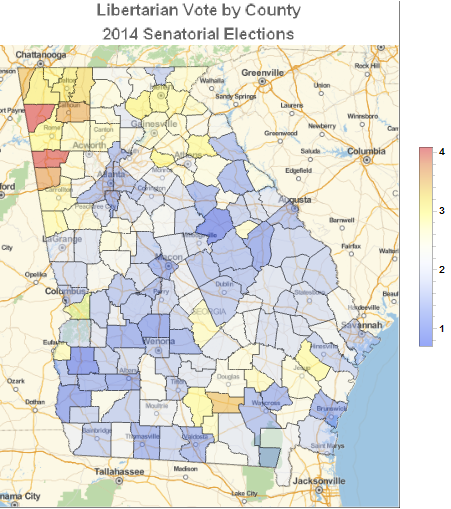
Let's first take a look at the Libertarian Vote Distribution.
libertarianVotingRules = Thread[Rule[counties, voting[[All, 3]]]];
GeoRegionValuePlot[libertarianVotingRules,
 ColorFunction -> ColorData["TemperatureMap"],
 GeoBackground -> "StreetMap", PlotStyle -> Opacity[0.5],
 PlotLabel ->
  Style["Libertarian Vote by County\n2014 Senatorial Elections",
   FontFamily -> "Arabic Transparent", 16, Bold], ImageSize -> 400]

It is interesting to see that the highest percentage of vote is found away from major cities, and mostly in the Ridge and Valley Region of Georgia.
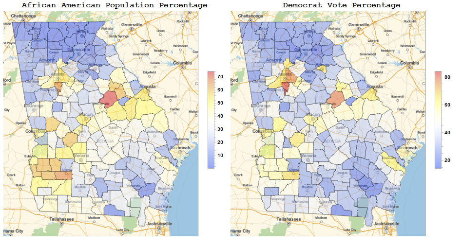
We can also visually compare the Democrat Vote vs. the Population Makeup of the counties.
aaPopulationRules = Thread[Rule[counties, aaPopulation[[All, 2]]]];
aaPopulationMap =
 GeoRegionValuePlot[aaPopulationRules,
  ColorFunction -> ColorData["TemperatureMap"],
  GeoBackground -> "StreetMap", PlotStyle -> Opacity[0.5],
  ImageSize -> 400];
democratVotingRules = Thread[Rule[counties, voting[[All, 2]]]];
democratVotingMap =
 GeoRegionValuePlot[democratVotingRules,
  ColorFunction -> ColorData["TemperatureMap"],
  GeoBackground -> "StreetMap", PlotStyle -> Opacity[0.5],
  ImageSize -> 400];
Grid[{{Style["African American Population Percentage", Bold, 16],
   Style["Democrat Vote Percentage", Bold, 16]}, {aaPopulationMap,
   democratVotingMap}}, Alignment -> Center]

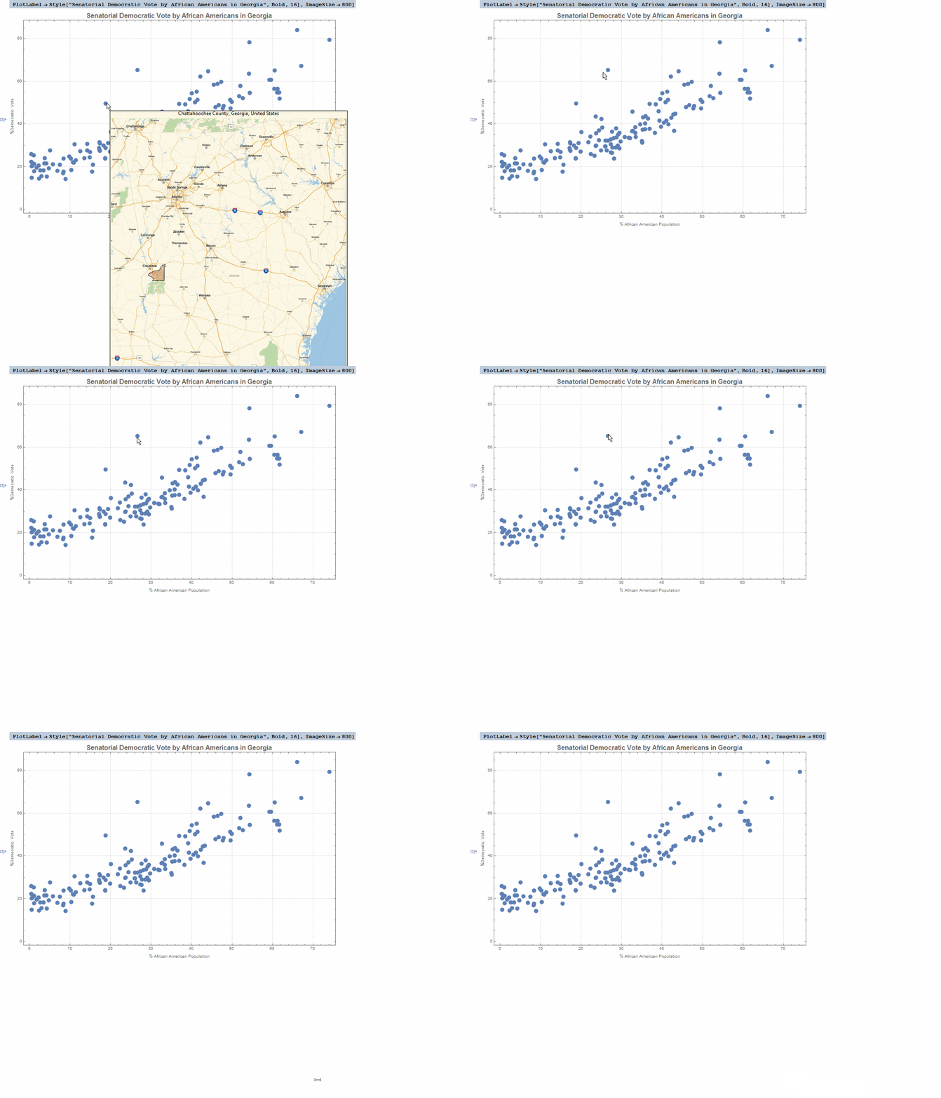
Let's take a closer look at the correlation between both characteristics.
    lpData = Thread[
       Tooltip[Transpose[{aaPopulation[[All, 2]],
          democratVoting[[All, 2]]}],
        Column[{CommonName[#],
            GeoGraphics[{EdgeForm[Black], Red, Polygon[#]},
             GeoRange ->
              Entity["AdministrativeDivision", {"Georgia",
                "UnitedStates"}], ImageSize -> Large]},
           Alignment -> Center] & /@ counties]];
ListPlot[lpData, PlotTheme -> "Detailed",
 FrameLabel -> {"% African American Population", "%Democratic Vote"},
 PlotLabel ->
  Style["Senatorial Democratic Vote by African Americans in Georgia",
   Bold, 16], ImageSize -> 800]

Two counties seem to stand out as outliers. Chatahoochee county and Clarke County. Accessing data on the counties with WolframAlpha
WolframAlpha["Chatahoochee county"]
We can see that most of the population of the Chatahooche county resides in Fort Benning. We can assume that being the population of the county mostly consisting of active duty military and families (which comes from all the US), the voting would be aligned to the overall voting intention in the country.
In the case of Clarke County, the main town is Athens, GA (99.2% of the population), which is the central campus for the University of Georgia. The Demographics and University Campus is generally more liberal than the average population (http://www.pewresearch.org/fact-tank/2014/11/05/as-gop-celebrates-win-no-sign-of-narrowing-gender-age-gaps/).

 Attachments: