Introduction
These past 6 months, I was lucky enough to have the opportunity to be part of the Wolfram Mentorships Program. With the help of my mentors in the program, I have learned the Wolfram Language and have worked on a project called "Analyzing NYC Collision Data Using the Wolfram Language".
I got my data from NYC OpenData, found at this link. NYC OpenData is a database of public data produced by the City of New York. It includes datasets about education, health, housing and public safety. I first came across the database while attending a class in mobile app development for iOS and learning about using data in our apps.
The dataset I used for this project is called "NYPD Motor Vehicle Collisions", a record of car accidents in NYC provided by the Police Department (NYPD). It includes the locations, causes and number of injuries/fatalities of accidents around the city. The dataset can be found here.
My goal was to use the broad range of capabilities of WL in visualization to analyze the collision data and to see whether there was any pattern in the data. Was there a particular time in which accidents happen more frequently than at any other time of day? Were there areas where collisions are common? What usually causes these accidents?
In this post I will discuss how I worked through this project, which has been divided into these two sections:
- Importing Data and Making it Usable
- Visualizing Data
In the first section, I will discuss how I used WL to make the data suit my purposes. In the second section I will show examples of the code and charts I generated using WL.
I would like to acknowledge Marco Thiel for his post on a similar topic, "How to avoid road accidents in New York?". My project is an independent effort to demonstrate how the Wolfram Language can be used to analyze data.
All code was written in Mathematica using the Wolfram Language.
I. Importing Data and Making it Usable
Exporting Data from NYC OpenData
Before I could do anything with data, I had to download it from NYC OpenData. The dataset's first entry is dated July 1, 2012, and it's latest entry is usually from 3-4 days before. The latest dataset I used was downloaded on May 22, 2016 as a .csv file, making my version 808,040 rows long at the time.
For the purposes of this project, I used last year's data, spanning from May 17, 2015 to May 17, 2016. This shortened version is 221,257 rows long. However, I used shorter versions of various lengths of the data while working on this project.
Importing Data into Mathematica and Making it Usable
I initially imported my data by using SemanticImport on a short version of the data without specifying the format of each column:
SemanticImport["/Users/emma/Documents/Wolfram NB's/Data/Short \Accident Data.csv"]
However, SemanticImport misinterpreted my "DATE" column, formatted in the .csv file like this: ![][3]
SemanticImport interpreted the dates in the YY/MM/DD format, instead of the MM/DD/YY format it's in. As a result of this, the data was imported like this:
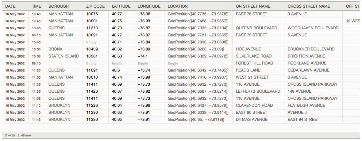
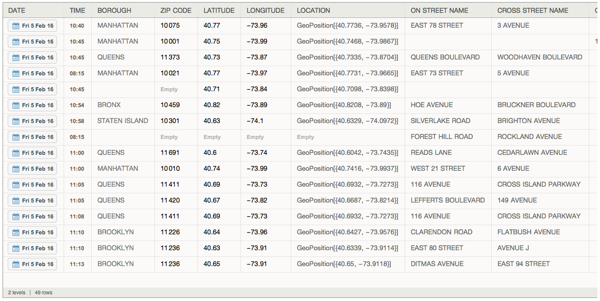
2/5/16 was interpreted as the May 16, 2002 instead of Feb 5, 2016. I discovered that one can use Interpreter to control how SemanticImport reads the data.
olddata = SemanticImport["/Users/emma/Documents/Wolfram NB's/Data/Short Accident Data.csv", {Interpreter["StructuredDate", DateFormat -> {"Month", "Day", "Year"}], "Time", Automatic, Automatic, Automatic, Automatic, Automatic, Automatic, Automatic, Automatic, Automatic, Automatic, Automatic, Automatic, Automatic, Automatic, Automatic, Automatic, Automatic, Automatic, Automatic, Automatic, Automatic, Automatic, Automatic, Automatic, Automatic, Automatic, Automatic}]
As I started testing out different charts and graphs, I realized that having all the empty rows of data would make visualizing unnecessarily difficulty. To take out these rows, I used DeleteMissing.
cleandata = DeleteMissing[olddata, 1, Infinity]
I saved the cleaned data into a .m file so I didn't have to clean the data every time. This is the final version of the data I used for this project. It has the collisions from the past year (5/17/15 - 5/17/16)
data = Get["/Users/emma/Documents/Wolfram NB's/Data/FinalYearData.m"]
II. Visualizing Data
The Wolfram Language has a broad spectrum of different kinds of charts that can be leveraged for analysis of different aspects of data. Quantitative data can be analyzed by using bar charts, pie charts etc. String-based data can be analyzed using word clouds. Geodata can be visualized on a map. The collision dataset is a great example of data that has all kinds of data types, and is a great demonstration of how WL's visualizations and graphics can effectively visualize all sorts of data.
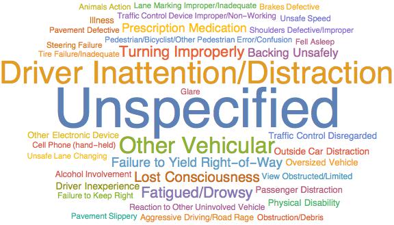
WordClouds
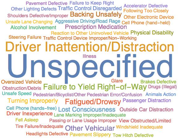
I was able to use WordClouds to visualize the causes of collisions:
Causes of All Collisions in Dataset
This WordCloud shows the overall causes of accidents in all boroughs of NYC.
WordCloud[Normal[data[[All, "CONTRIBUTING FACTOR VEHICLE 1"]]], ImageSize -> Large]
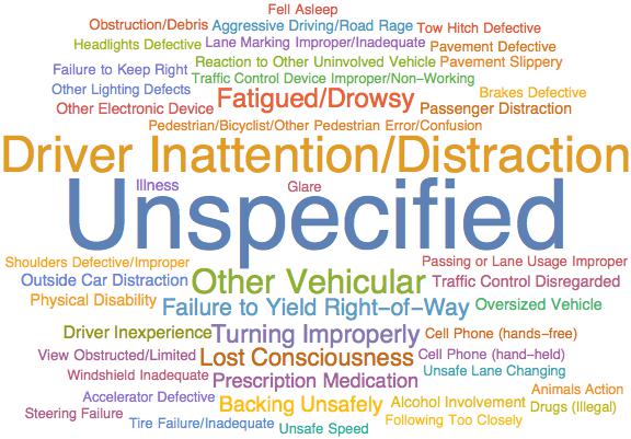
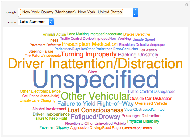
Causes of Collisions in a Borough
However, I figured that the causes might vary depending on the borough, so I was able to do the same for a specific borough and compare the charts.
WordCloud[Normal[Select[data, #[["BOROUGH"]] == Entity["AdministrativeDivision", {"NewYorkCounty", "NewYork", "UnitedStates"}]&][[All, "CONTRIBUTING FACTOR VEHICLE 1"]]], ImageSize -> Large]
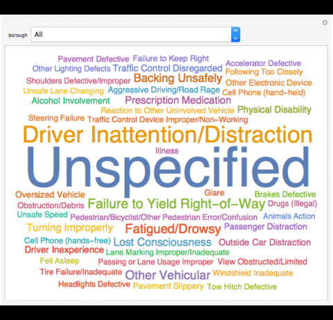
I also made great use of Manipulates in this project. They enabled to me to interactively visualize the data.
I first had to define the boroughs plus the "All" I added to the boroughs list.
boroughs = {"All", Entity["AdministrativeDivision", {"NewYorkCounty", "NewYork",
     "UnitedStates"}], Entity["AdministrativeDivision", {"KingsCounty", "NewYork",
     "UnitedStates"}], Entity["AdministrativeDivision", {"QueensCounty", "NewYork",
     "UnitedStates"}], Entity["AdministrativeDivision", {"RichmondCounty", "NewYork",
     "UnitedStates"}], Entity["AdministrativeDivision", {"BronxCounty", "NewYork",
     "UnitedStates"}]}

Manipulate[WordCloud[If[MatchQ[borough, "All"], Normal[data[[All, "CONTRIBUTING FACTOR VEHICLE 1"]]], Normal[Select[data, #[["BOROUGH"]]
== borough &][[All, "CONTRIBUTING FACTOR VEHICLE 1"]]]], ImageSize -> Large], {borough, boroughs}]
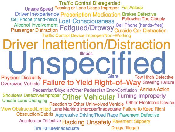
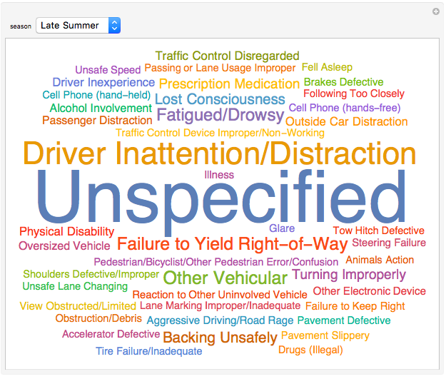
Causes of Collisions in a Season
I also figured that daylight time played into the number of accidents per day and the time they usually happen, so I decided to see whether there is a difference in causes, time etc. For example, in the winter it gets dark much earlier in the spring. I figured that in the winter, accidents would start occuring relatively frequently early in the evening than in thes spring, so I decided to group the data by season and see whether there was a different.
I defined my own grouping function to sort the data into each season. I also divided seasons into "Early" and "Late" as there is a difference between the two's daylight hours. For example, the daylight hours in most of March are still quite short, although it counts as part of Spring.
seasongroup[data_] := <|"Early Winter" ->
   Select[data, DateValue[#[["DATE"]], "Month"] == 1 || 2 &], "Late Winter" -> Select[data, DateValue[#[["DATE"]], "Month"] == 3 &],"Early Spring" -> Select[data, DateValue[#[["DATE"]], "Month"] == {4, 5} &], "Late Spring" -> Select[data, DateValue[#[["DATE"]], "Month"] == 6 &], "Early Summer" -> Select[data, DateValue[#[["DATE"]], "Month"] == {7, 8} &], "Late Summer" -> Select[data, DateValue[#[["DATE"]], "Month"] == 9 &], "Early Fall" -> Select[data, DateValue[#[["DATE"]], "Month"] == {10, 11} &], "Late Fall" -> Select[data, DateValue[#[["DATE"]], "Month"] == 12 &]|>

WordCloud[Normal[seasongroup[data][["Late Summer"]][[All, "CONTRIBUTING FACTOR VEHICLE 1"]]], ImageSize -> Large]
Similarly to the boroughs, I also defined a list of seasons including "All"
seasons = {"All", "Early Winter", "Late Winter", "Early Spring", "Late Spring", "Early Summer", "Late Summer", "Early Fall", "Late Fall"}

Manipulate[If[MatchQ[DominantColors[WordCloud[If[MatchQ[season, "All"], Normal[data[[All, "CONTRIBUTING FACTOR VEHICLE 1"]]], Normal[seasongroup[data][[season]][[All, "CONTRIBUTING FACTOR VEHICLE 1"]]]], ImageSize -> Large]], {RGBColor[1., 0.9999994542921627, 0.9999990613760404]}], "There are no collisions between 5/17/15 - 5/17/16 in " <> season, WordCloud[If[MatchQ[season, "All"], Normal[data[[All, "CONTRIBUTING FACTOR VEHICLE 1"]]], Normal[seasongroup[data][[season]][[All, "CONTRIBUTING FACTOR VEHICLE 1"]]]], ImageSize -> Large]], {season, seasons}, SynchronousUpdating -> False]
In this specific Manipulate, I had to check whether the WordCloud became a blank square. I had discovered before while testing this aspect of the project that if no collisions exist during that season, the computation wouldn't produce errors, but a blank image. To fix this I need to check for the dominant color of the WordCloud produced, and if it is white, I replace it with text. I also had to add the SynchronousUpdating option and set it to False, because it seemed to resolve a problem I faced while working on this Manipulate. The problem seemed to be that if the computation took too much memory, it would abort itself. Adding SynchronousUpdating seems to prevent this from happening.
Causes of Collisions in a Borough during a Season
I also did a WordCloud on causes of collisions in a borough during a season to see the difference when both filters were applied.
WordCloud[Normal[seasongroup[Select[data, #[["BOROUGH"]] == Entity["AdministrativeDivision", {"NewYorkCounty", "NewYork", "UnitedStates"}] &]][["Late Summer"]][[All, "CONTRIBUTING FACTOR VEHICLE 1"]]], ImageSize -> Large]
Manipulate[WordCloud[If[MatchQ[borough, "All"], If[MatchQ[season, "All"], Normal[data[[All, "CONTRIBUTING FACTOR VEHICLE 1"]]], Normal[seasongroup[data][[season]][[All, "CONTRIBUTING FACTOR VEHICLE 1"]]]], If[MatchQ[season, "All"], Normal[Select[data, #[["BOROUGH"]] == borough &][[All, "CONTRIBUTING FACTOR VEHICLE 1"]]], Normal[seasongroup[Select[data, #[["BOROUGH"]] == borough &]][[season]][[All, "CONTRIBUTING FACTOR VEHICLE 1"]]]]], ImageSize -> Large], {borough, boroughs}, {season, seasons}]
Bar Charts
I used bar charts to visualize the number of accidents that happened and its time distribution over the year.
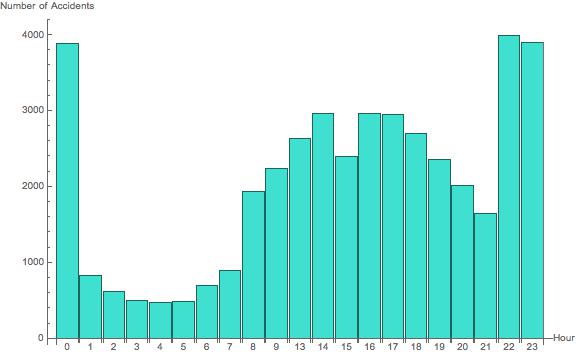
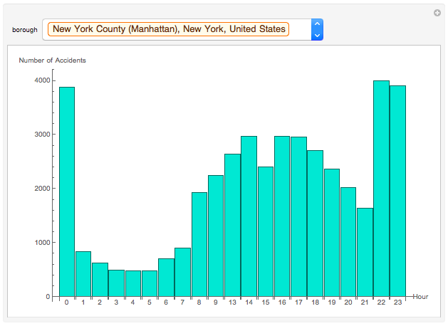
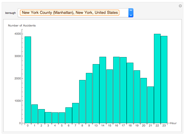
Bar Chart of # of Accidents per Hour
I hypothesized that there would be more accidents during rush hours because of the increase of cars on the road, as well as after sunset because of the low visibility in the dark. I can test this hypothesis by using a bar chart to see how many accidents happened in each hour of the course of the year.
BarChart[Length /@ KeySortBy[GroupBy[Select[data, #1[["BOROUGH"]] == Entity["AdministrativeDivision", {"NewYorkCounty", "NewYork", "UnitedStates"}] & ], DateValue[#1[["TIME"]], "Hour24"] & ], Plus], ImageSize -> Large, AxesLabel -> {"Hour", "Number of Accidents"}, ChartLabels -> Normal[Keys[KeySortBy[GroupBy[Select[data, #1[["BOROUGH"]] == Entity["AdministrativeDivision", {"NewYorkCounty", "NewYork", "UnitedStates"}] & ], DateValue[#1[["TIME"]], "Hour24"] & ], Plus]]], ChartStyle -> RGBColor[0.25098039215686274`, 0.8784313725490196, 0.8156862745098039]]
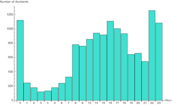
Manipulate[If[MatchQ[borough, "All"], BarChart[Length /@ KeySortBy[GroupBy[data, DateValue[#[["TIME"]], "Hour24"] &], Plus], ImageSize -> Large, AxesLabel -> {"Hour", "Number of Accidents"}, ChartLabels -> Normal[Keys[KeySortBy[GroupBy[data, DateValue[#[["TIME"]], "Hour24"] &], Plus]]], ChartStyle -> RGBColor[0.25098039215686274, 0.8784313725490196, 0.8156862745098039]], BarChart[Length /@ KeySortBy[GroupBy[Select[data, #[["BOROUGH"]] == borough &], DateValue[#[["TIME"]], "Hour24"] &], Plus], ImageSize -> Large, AxesLabel -> {"Hour", "Number of Accidents"}, ChartLabels -> Normal[Keys[KeySortBy[GroupBy[Select[data, #[["BOROUGH"]] == borough &], DateValue[#[["TIME"]], "Hour24"] &], Plus]]], ChartStyle -> RGBColor[0.25098039215686274, 0.8784313725490196, 0.8156862745098039]]], {borough, boroughs}, SynchronousUpdating -> False]
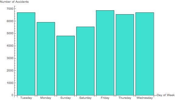
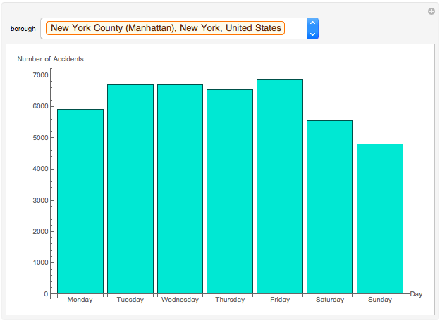
Bar Chart of # of Accidents per Day of the Week
BarChart[AssociationThread[Normal[Keys[GroupBy[GroupBy[data, #1[["BOROUGH"]] & ][[Key[Entity["AdministrativeDivision", {"NewYorkCounty", "NewYork", "UnitedStates"}]]]], DateValue[#1[["DATE"]], "DayName"] & ]]], (Length[GroupBy[GroupBy[data, #1[["BOROUGH"]] & ][[Key[Entity["AdministrativeDivision", {"NewYorkCounty", "NewYork", "UnitedStates"}]]]], DateValue[#1[["DATE"]], "DayName"] & ][[Key[#1]]]] & ) /@ Normal[Keys[GroupBy[GroupBy[data, #1[["BOROUGH"]] & ][[Key[Entity["AdministrativeDivision", {"NewYorkCounty", "NewYork", "UnitedStates"}]]]], DateValue[#1[["DATE"]], "DayName"] & ]]]], ChartLabels -> Normal[Keys[GroupBy[GroupBy[data, #1[["BOROUGH"]] & ][[Key[Entity["AdministrativeDivision", {"NewYorkCounty", "NewYork", "UnitedStates"}]]]], DateValue[#1[["DATE"]], "DayName"] & ]]], AxesLabel -> {"Day of Week", "Number of Accidents"}, ImageSize -> Large, ChartStyle -> RGBColor[0.25098039215686274, 0.8784313725490196, 0.8156862745098039]]
Manipulate[If[MatchQ[borough, "All"], BarChart[Dataset[AssociationThread[{"Monday", "Tuesday", "Wednesday", "Thursday", "Friday", "Saturday", "Sunday"}, Length@KeySortBy[GroupBy[data, DateValue[#[["DATE"]], "ISOWeekDay"] &], Plus][[Key[#]]] & /@ Range[7]]], ImageSize -> Large, AxesLabel -> {"Day", "Number of Accidents"}, ChartLabels -> {"Monday", "Tuesday", "Wednesday", "Thursday", "Friday", "Saturday", "Sunday"}, ChartStyle -> RGBColor[0.25098039215686274`, 0.8784313725490196, 0.8156862745098039]], BarChart[Dataset[AssociationThread[{"Monday", "Tuesday", "Wednesday", "Thursday", "Friday", "Saturday", "Sunday"}, Length@Normal@KeySortBy[GroupBy[Select[data, #[["BOROUGH"]] == borough &], DateValue[#[["DATE"]], "ISOWeekDay"] &], Plus][[Key[#]]] & /@ Range[7]]], ImageSize -> Large, AxesLabel -> {"Day", "Number of Accidents"}, ChartLabels -> {"Monday", "Tuesday", "Wednesday", "Thursday", "Friday", "Saturday", "Sunday"}, ChartStyle -> RGBColor[0.25098039215686274`, 0.8784313725490196, 0.8156862745098039]]], {borough, boroughs}, SynchronousUpdating -> False]
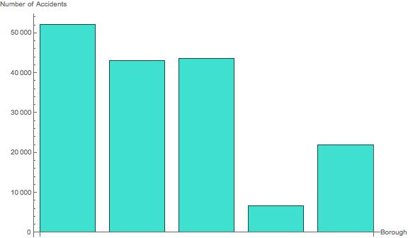
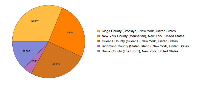
Bar Chart of # of Accidents per Borough
Certain boroughs may also have more accidents too. This could depend on the number of people who drive and many other factors.
BarChart[AssociationThread[Normal[Keys[GroupBy[data, #[["BOROUGH"]] &]]], Normal[Values[Length /@ GroupBy[data, #[["BOROUGH"]] &]]]], AxesLabel -> {"Borough", "Number of Accidents"}, ChartLabels -> Placed[Normal[Keys[GroupBy[data, #[["BOROUGH"]] &]]], Tooltip], ImageSize -> Large, BarSpacing -> Medium, ChartStyle -> RGBColor[0.25098039215686274`, 0.8784313725490196, 0.8156862745098039]]
Bar Chart of # of Accidents per Hour in a Borough
Each borough may also have a different time distribution than the others. This can be represented using a bar chart as well.
BarChart[AssociationThread[Normal[Keys[KeySortBy[GroupBy[Select[data, #1[["BOROUGH"]] == Entity["AdministrativeDivision", {"NewYorkCounty", "NewYork", "UnitedStates"}] & ], DateValue[#1[["TIME"]], "Hour24"] & ], Plus]]], Normal[Values[Length /@ KeySortBy[GroupBy[Select[data, #1[["BOROUGH"]] == Entity["AdministrativeDivision", {"NewYorkCounty", "NewYork", "UnitedStates"}] & ], DateValue[#1[["TIME"]], "Hour24"] & ], Plus]]]], AxesLabel -> {"Hour", "Number of Accidents"}, ChartLabels -> Normal[Keys[KeySortBy[GroupBy[Select[data, #1[["BOROUGH"]] == Entity["AdministrativeDivision", {"NewYorkCounty", "NewYork", "UnitedStates"}] & ], DateValue[#1[["TIME"]], "Hour24"] & ], Plus]]], ImageSize -> Large, ChartStyle -> RGBColor[0.25098039215686274, 0.8784313725490196, 0.8156862745098039]]

Manipulate[If[MatchQ[borough, "All"], BarChart[Length /@ KeySortBy[GroupBy[data, DateValue[#1[["TIME"]], "Hour24"] & ], Plus], ImageSize -> Large, AxesLabel -> {"Hour", "Number of Accidents"}, ChartLabels -> Normal[Keys[KeySortBy[GroupBy[data, DateValue[#1[["TIME"]], "Hour24"] & ], Plus]]], ChartStyle -> RGBColor[0.25098039215686274, 0.8784313725490196, 0.8156862745098039]], BarChart[AssociationThread[Normal[Keys[KeySortBy[GroupBy[Select[data, #1[["BOROUGH"]] == borough & ], DateValue[#1[["TIME"]], "Hour24"] & ], Plus]]], Normal[Values[Length /@ KeySortBy[GroupBy[Select[data, #1[["BOROUGH"]] == borough & ], DateValue[#1[["TIME"]], "Hour24"] & ], Plus]]]], AxesLabel -> {"Hour", "Number of Accidents"}, ChartLabels -> Normal[Keys[KeySortBy[GroupBy[Select[data, #1[["BOROUGH"]] == borough & ], DateValue[#1[["TIME"]], "Hour24"] & ], Plus]]], ImageSize -> Large, ChartStyle -> RGBColor[0.25098039215686274, 0.8784313725490196, 0.8156862745098039]]], {borough, boroughs}, SynchronousUpdating -> False]
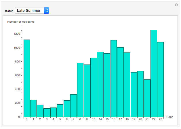
Bar Chart of # of Accidents per Hour in a Season
The main aspect I wanted to study in the season filter was the shift in the hours in which accidents happened most frequently. Daylight hours vary by season, and we can study how this affects the number of accidents at different times of day by using the BarChart.
BarChart[AssociationThread[Keys[KeySortBy[GroupBy[seasongroup[data][["Late Summer"]], DateValue[#1[["TIME"]], "Hour24"] & ], Plus]], Length /@ Values[KeySortBy[GroupBy[seasongroup[data][["Late Summer"]], DateValue[#1[["TIME"]], "Hour24"] & ], Plus]]], AxesLabel -> {"Hour", "Number of Accidents"}, ChartLabels -> Normal[Keys[KeySortBy[GroupBy[seasongroup[data][["Late Summer"]], DateValue[#1[["TIME"]], "Hour24"] & ], Plus]]], ImageSize -> Large, ChartStyle -> RGBColor[0.25098039215686274, 0.8784313725490196, 0.8156862745098039]]
Manipulate[BarChart[AssociationThread[Normal[Keys[KeySortBy[GroupBy[seasongroup[data][[season]], DateValue[#1[["TIME"]], "Hour24"] & ], Plus]]], Normal[Values[Length /@ KeySortBy[GroupBy[seasongroup[data][[season]], DateValue[#1[["TIME"]], "Hour24"] & ], Plus]]]], AxesLabel -> {"Hour", "Number of Accidents"}, ChartLabels -> Normal[Keys[KeySortBy[GroupBy[seasongroup[data][[season]], DateValue[#1[["TIME"]], "Hour24"] & ], Plus]]], ImageSize -> Large, ChartStyle -> RGBColor[0.25098039215686274, 0.8784313725490196, 0.8156862745098039]], {season, seasons}, SynchronousUpdating -> False]
Pie Charts
PieCharts can also serve a similar purpose to BarCharts, by allowing us to visualize the distribution of data across different times, boroughs etc.
PieChart of Collisions Sorted by Borough
PieChart[AssociationThread[Normal[Keys[GroupBy[data, #[["BOROUGH"]] &]]], Normal[Values[Length /@ GroupBy[data, #[["BOROUGH"]] &]]]], ChartLegends -> Keys[AssociationThread[Normal[Keys[GroupBy[data, #[["BOROUGH"]] &]]], Normal[Values[Length /@ GroupBy[data, #[["BOROUGH"]] &]]]]], ChartLabels -> Normal[Values[Length /@ GroupBy[data, #[["BOROUGH"]] &]]]]
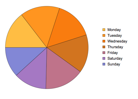
PieChart of Collisions Sorted by Weekday
PieChart[AssociationThread[{"Monday", "Tuesday", "Wednesday", "Thursday", "Friday", "Saturday", "Sunday"}, Length@KeySortBy[GroupBy[data, DateValue[#[["DATE"]], "ISOWeekDay"] &], Plus][[Key[#]]] & /@ Range[7]], ChartLegends -> {"Monday", "Tuesday", "Wednesday", "Thursday", "Friday", "Saturday", "Sunday"}, ChartLabels -> Length@KeySortBy[GroupBy[data, DateValue[#[["DATE"]], "ISOWeekDay"] &], Plus][[Key[#]]] & /@ Range[7]]
GeoListPlots (Maps)
Maps can be used to visualize location data, which is one of the most important aspects of this dataset that I want to analyze. I figured that certain areas have accidents more frequently than others due to a higher number of cars that travel through that area, a dangerous intersection etc. This can be visualized through using WL to mark areas of high accident frequency on a map.
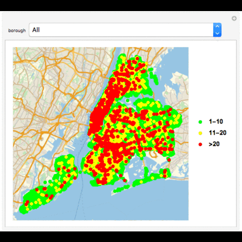
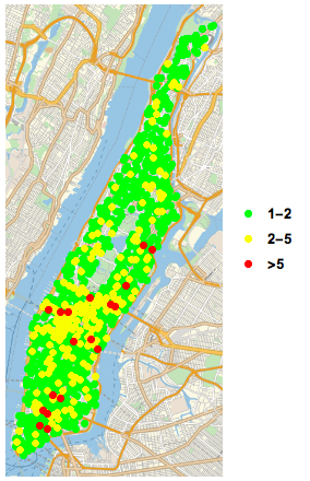
GeoListPlot of All Collisions
GeoListPlot[{Normal[Select[Tally[data[[All, "LOCATION"]]], #[[2]] == 1 || 2 &]][[All, 1]], Normal[Select[Tally[data[[All, "LOCATION"]]], 2 < #[[2]] < 5 &]][[All, 1]], Normal[Select[Tally[data[[All, "LOCATION"]]], #[[2]] >= 5 &]][[All, 1]]},PlotMarkers -> {Graphics[{PointSize[Large], Point[{0, 0}, VertexColors -> {Green}]}], Graphics[{PointSize[Large], Point[{0, 0}, VertexColors -> {Yellow}]}], Graphics[{PointSize[Large], Point[{0, 0}, VertexColors -> {Red}]}]}, PlotLegends -> {"1-2", "2-5", ">5"}]
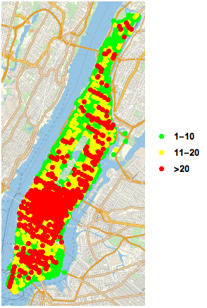
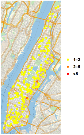
GeoListPlot of Collisions in a Borough
GeoListPlot[{Normal[Select[Tally[Select[data, #1[["BOROUGH"]] == Entity["AdministrativeDivision", {"NewYorkCounty", "NewYork", "UnitedStates"}] &][[All, "LOCATION"]]], 1 <= #1[[2]] <= 10 & ]][[All, 1]], Normal[Select[Tally[Select[data, #1[["BOROUGH"]] == Entity["AdministrativeDivision", {"NewYorkCounty", "NewYork", "UnitedStates"}] & ][[All, "LOCATION"]]], Inequality[10, Less, #1[[2]], LessEqual, 20] & ]][[All, 1]], Normal[Select[Tally[Select[data, #1[["BOROUGH"]] == Entity["AdministrativeDivision", {"NewYorkCounty", "NewYork", "UnitedStates"}] & ][[All, "LOCATION"]]], #1[[2]] > 20 & ]][[All, 1]]}, PlotMarkers -> {Graphics[{PointSize[Large], Point[{0, 0}, VertexColors -> {Green}]}], Graphics[{PointSize[Large], Point[{0, 0}, VertexColors -> {Yellow}]}], Graphics[{PointSize[Large], Point[{0, 0}, VertexColors -> {Red}]}]}, PlotLegends -> {"1-10", "11-20", ">20"}]
Manipulate[If[MatchQ[borough, "All"], GeoListPlot[{Normal[Select[Tally[data[[All, "LOCATION"]]], 1 <= #[[2]] <= 10 &]][[All, 1]], Normal[Select[Tally[data[[All, "LOCATION"]]], 10 < #[[2]] <= 20 &]][[All, 1]], Normal[Select[Tally[data[[All, "LOCATION"]]], #[[2]] > 20 &]][[All, 1]]}, PlotMarkers -> {Graphics[{PointSize[Large], Point[{0, 0}, VertexColors -> {Green}]}], Graphics[{PointSize[Large], Point[{0, 0}, VertexColors -> {Yellow}]}], Graphics[{PointSize[Large], Point[{0, 0}, VertexColors -> {Red}]}]}, PlotLegends -> {"1-10", "11-20", ">20"}], GeoListPlot[{Normal[Select[Tally[Select[data, #[["BOROUGH"]] == borough &][[All, "LOCATION"]]], 1 <= #[[2]] <= 10 &]][[All, 1]], Normal[Select[Tally[Select[data, #[["BOROUGH"]] == borough &][[All, "LOCATION"]]], 10 < #[[2]] <= 20 &]][[All, 1]], Normal[Select[Tally[Select[data, #[["BOROUGH"]] == borough &][[All, "LOCATION"]]], #[[2]] > 20 &]][[All, 1]]}, PlotMarkers -> {Graphics[{PointSize[Large], Point[{0, 0}, VertexColors -> {Green}]}], Graphics[{PointSize[Large], Point[{0, 0}, VertexColors -> {Yellow}]}], Graphics[{PointSize[Large], Point[{0, 0}, VertexColors -> {Red}]}]}, PlotLegends -> {"1-10", "11-20", ">20"}]], {borough, boroughs}, SynchronousUpdating -> False]
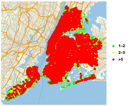
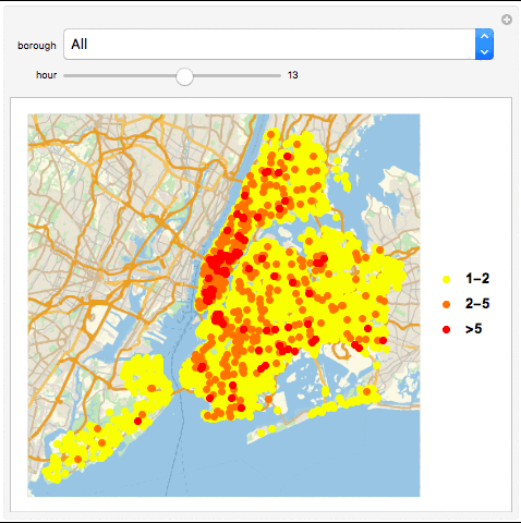
GeoListPlot with Collisions in a Borough in an Hour
GeoListPlot[{Normal[Select[Tally[GroupBy[Select[data, #1[["BOROUGH"]] == Entity["AdministrativeDivision", {"NewYorkCounty", "NewYork", "UnitedStates"}] & ], DateValue[#1[["TIME"]], "Hour24"] & ][[Key[13]]][[All, "LOCATION"]]], #1[[2]] == 1 || 2 & ]][[All, 1]], Normal[Select[Tally[GroupBy[Select[data, #1[["BOROUGH"]] == Entity["AdministrativeDivision", {"NewYorkCounty", "NewYork", "UnitedStates"}] & ], DateValue[#1[["TIME"]], "Hour24"] & ][[Key[13]]][[All, "LOCATION"]]], Inequality[2, Less, #1[[2]], LessEqual, 5] & ]][[All, 1]], Normal[Select[Tally[GroupBy[Select[data, #1[["BOROUGH"]] == Entity["AdministrativeDivision", {"NewYorkCounty", "NewYork", "UnitedStates"}] & ], DateValue[#1[["TIME"]], "Hour24"] & ][[Key[13]]][[All, "LOCATION"]]], #1[[2]] > 5 & ]][[All, 1]]}, PlotMarkers -> {Graphics[{PointSize[Large], Point[{0, 0}, VertexColors -> {Green}]}], Graphics[{PointSize[Large], Point[{0, 0}, VertexColors -> {Yellow}]}], Graphics[{PointSize[Large], Point[{0, 0}, VertexColors -> {Red}]}]}, PlotLegends -> {"1-2", "2-5", ">5"}]
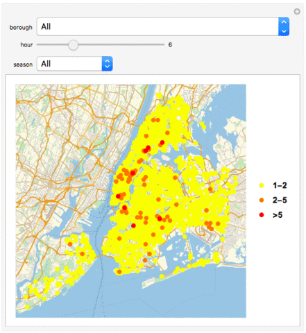
Manipulate[If[MatchQ[borough, "All"], GeoListPlot[{Normal[Select[Tally[GroupBy[data, DateValue[#[["TIME"]], "Hour24"] &][[Key[hour]]][[All, "LOCATION"]]], #[[2]] == 1 || 2 &]][[All, 1]], Normal[Select[Tally[GroupBy[data, DateValue[#[["TIME"]], "Hour24"] &][[Key[hour]]][[All, "LOCATION"]]], 2 < #[[2]] < 5 &]][[All, 1]], Normal[Select[Tally[GroupBy[data, DateValue[#[["TIME"]], "Hour24"] &][[Key[hour]]][[All, "LOCATION"]]], #[[2]] >= 5 &]][[All, 1]]}, PlotMarkers -> {Graphics[{PointSize[Large], Point[{0, 0}, VertexColors -> {Yellow}]}], Graphics[{PointSize[Large], Point[{0, 0}, VertexColors -> {Orange}]}], Graphics[{PointSize[Large], Point[{0, 0}, VertexColors -> {Red}]}]}, PlotLegends -> {"1-2", "2-5", ">5"}], GeoListPlot[{Normal[Select[Tally[GroupBy[Select[data, #[["BOROUGH"]] == borough &], DateValue[#[["TIME"]], "Hour24"] &][[Key[hour]]][[All, "LOCATION"]]], #[[2]] == 1 || 2 &]][[All, 1]], Normal[Select[Tally[GroupBy[Select[data, #[["BOROUGH"]] == borough &], DateValue[#[["TIME"]], "Hour24"] &][[Key[hour]]][[All, "LOCATION"]]], 2 < #[[2]] < 5 &]][[All, 1]], Normal[Select[Tally[GroupBy[Select[data, #[["BOROUGH"]] == borough &], DateValue[#[["TIME"]], "Hour24"] &][[Key[hour]]][[All, "LOCATION"]]], #[[2]] >= 5 &]][[All, 1]]}, PlotMarkers -> {Graphics[{PointSize[Large], Point[{0, 0}, VertexColors -> {Yellow}]}], Graphics[{PointSize[Large], Point[{0, 0}, VertexColors -> {Orange}]}], Graphics[{PointSize[Large], Point[{0, 0}, VertexColors -> {Red}]}]}, PlotLegends -> {"1-2", "2-5", ">5"}]], {borough, boroughs}, {hour, 0, 23, 1, Appearance -> "Labeled"}, ControlType -> {PopupMenu, Slider}, SynchronousUpdating -> False]
GeoListPlot with Collisions in a Season in a Borough in an Hour
seasons = {"Early Winter", "Late Winter", "Early Spring", "Late Spring", "Early Summer", "Late Summer", "Early Fall", "Late Fall"}

GeoListPlot[Normal /@ {Select[Tally[AssociationThread[Normal[Keys[GroupBy[seasongroup[GroupBy[data, #1[["BOROUGH"]] & ][[Key[Entity["AdministrativeDivision", {"NewYorkCounty", "NewYork", "UnitedStates"}]]]]][["Late Summer"]], DateValue[#1[["TIME"]], "Hour24"] & ]]], (Normal[GroupBy[seasongroup[GroupBy[data, #1[["BOROUGH"]] & ][[Key[Entity["AdministrativeDivision", {"NewYorkCounty", "NewYork", "UnitedStates"}]]]]][["Late Summer"]], DateValue[#1[["TIME"]], "Hour24"] & ][[Key[#1]]][[All, "LOCATION"]]] & ) /@ Normal[Keys[GroupBy[seasongroup[GroupBy[data, #1[["BOROUGH"]] & ][[Key[Entity["AdministrativeDivision", {"NewYorkCounty", "NewYork", "UnitedStates"}]]]]][["Late Summer"]], DateValue[#1[["TIME"]], "Hour24"] & ]]]][[Key[13]]]], #1[[2]] == 1 || 2 & ][[All, 1]], Select[Tally[AssociationThread[Normal[Keys[GroupBy[seasongroup[GroupBy[data, #1[["BOROUGH"]] & ][[Key[Entity["AdministrativeDivision", {"NewYorkCounty", "NewYork", "UnitedStates"}]]]]][["Late Summer"]], DateValue[#1[["TIME"]], "Hour24"] & ]]], (Normal[GroupBy[seasongroup[GroupBy[data, #1[["BOROUGH"]] & ][[Key[Entity["AdministrativeDivision", {"NewYorkCounty", "NewYork", "UnitedStates"}]]]]][["Late Summer"]], DateValue[#1[["TIME"]],  "Hour24"] & ][[Key[#1]]][[All, "LOCATION"]]] & ) /@ Normal[Keys[GroupBy[seasongroup[GroupBy[data, #1[["BOROUGH"]] & ][[Key[Entity["AdministrativeDivision", {"NewYorkCounty", "NewYork", "UnitedStates"}]]]]][["Late Summer"]], DateValue[#1[["TIME"]], "Hour24"] & ]]]][[Key[13]]]], 2 < #1[[2]] < 5 & ][[All, 1]], Select[Tally[AssociationThread[Normal[Keys[GroupBy[seasongroup[GroupBy[data, #1[["BOROUGH"]] & ][[Key[Entity["AdministrativeDivision", {"NewYorkCounty", "NewYork", "UnitedStates"}]]]]][["Late Summer"]], DateValue[#1[["TIME"]], "Hour24"] & ]]], (Normal[GroupBy[seasongroup[GroupBy[data, #1[["BOROUGH"]] & ][[Key[Entity["AdministrativeDivision", {"NewYorkCounty", "NewYork", "UnitedStates"}]]]]][["Late Summer"]], DateValue[#1[["TIME"]], "Hour24"] & ][[Key[#1]]][[All, "LOCATION"]]] & ) /@ Normal[Keys[GroupBy[seasongroup[GroupBy[data, #1[["BOROUGH"]] & ][[Key[Entity["AdministrativeDivision", {"NewYorkCounty", "NewYork", "UnitedStates"}]]]]][["Late Summer"]], DateValue[#1[["TIME"]], "Hour24"] & ]]]][[Key[13]]]], #1[[2]] >= 5 & ][[All, 1]]}, PlotMarkers -> {Graphics[{PointSize[Large], Point[{0, 0}, VertexColors -> {Yellow}]}], Graphics[{PointSize[Large], Point[{0, 0}, VertexColors -> {Orange}]}], Graphics[{PointSize[Large], Point[{0, 0}, VertexColors -> {Red}]}]}, PlotLegends -> {"1-2", "2-5", ">5"}]
Manipulate[If[MatchQ[borough, "All"], GeoListPlot[Normal /@ {Select[Tally[Select[seasongroup[data][[Key[season]]], DateValue[#[["TIME"]], "Hour24"] == hour &][[All, "LOCATION"]]], #[[2]] == 1 || 2 &][[All, 1]], Select[Tally[Select[seasongroup[data][[Key[season]]], DateValue[#[["TIME"]], "Hour24"] == hour &][[All, "LOCATION"]]], 2 < #[[2]] < 5 &][[All, 1]], Select[Tally[Select[seasongroup[data][[Key[season]]], DateValue[#[["TIME"]], "Hour24"] == hour &][[All, "LOCATION"]]], #[[2]] >= 5 &][[All, 1]]}, PlotMarkers -> {Graphics[{PointSize[Large], Point[{0, 0}, VertexColors -> {Yellow}]}], Graphics[{PointSize[Large], Point[{0, 0}, VertexColors -> {Orange}]}], Graphics[{PointSize[Large], Point[{0, 0}, VertexColors -> {Red}]}]}, PlotLegends -> {"1-2", "2-5", ">5"}], GeoListPlot[Normal /@ {Select[Tally[Select[Select[seasongroup[data][[Key[season]]], #[["BOROUGH"]] == borough &], DateValue[#[["TIME"]], "Hour24"] == hour &][[All, "LOCATION"]]], #[[2]] == 1 || 2 &][[All, 1]], Select[Tally[Select[Select[seasongroup[data][[Key[season]]], #[["BOROUGH"]] == borough &], DateValue[#[["TIME"]], "Hour24"] == hour &][[All, "LOCATION"]]], 2 < #[[2]] < 5 &][[All, 1]], Select[Tally[Select[Select[seasongroup[data][[Key[season]]], #[["BOROUGH"]] == borough &], DateValue[#[["TIME"]], "Hour24"] == hour &][[All, "LOCATION"]]], #[[2]] >= 5 &][[All, 1]]}, PlotMarkers -> {Graphics[{PointSize[Large], Point[{0, 0}, VertexColors -> {Yellow}]}], Graphics[{PointSize[Large], Point[{0, 0}, VertexColors -> {Orange}]}], Graphics[{PointSize[Large], Point[{0, 0}, VertexColors -> {Red}]}]}, PlotLegends -> {"1-2", "2-5", ">5"}]]{borough, boroughs}, {hour, 0, 23, 1, Appearance -> "Labeled", Enabled -> True}, {season, seasons}, ControlType -> {PopupMenu, Slider, PopupMenu}, SynchronousUpdating -> False]
Discoveries
Applications of the Wolfram Language
Through this project, I have realized that even just in the technical scope of features of the Wolfram Language, there is so much potential and so many applications. On a high-level view, the main features of the Wolfram Language I have used in this visualization project are Bar/PieChart, WordCloud, GeoListPlot, and Manipulate. The combination can cover a large area of ground for visualizing all kinds of data, quantitative, qualititative or geographical. In my opinion, Manipulate is the most powerful feature of them all. Manipulate allows the user to interact with the data, as if to make it a physical object. This is especially useful for looking for data that involve patterns or change over time or another kind of range.
In my project, I've been using Manipulates to interactively see the same information, but for a different borough, season, time or any of those combined. Using it has helped me notice changes between the charts, and to be able to see what I'm visualizing in an interface. The plasticity of the charts in the Wolfram Language has allowed me to leverage each one to the specific kind of data I'm charting.
Open Data
Open Data is the data source of this project. My dataset is one out of thousands of datasets out there available for analysis. Data available on NYC OpenData covers business, city government, education, environment, health, housing & development, public safety, recreation, social services and transportation. NASA, the US and NYC all have open databases for analysis.
Combining the wide range of data available with open data and the power of the Wolfram Language, there are infinite possibilities for explorations of how our world works.
Challenges
This was the first time I applied the Wolfram Language in a real world problem, and as a result of that, I faced many challenges along the way.
Many of them were related to my unfamiliarity with the language. For example, while I was cleaning my data as shown in "Importing Data and Making it Usable", I spent a lot of time studying my data and developing an elaborate but inefficient If statement that would filter out all the rows with missing cells in each column. However, when I was trying to work out how to optimize my data-cleaning code, I discovered that there was a function that did exactly what I was trying to do. In fact, it expedited the cleaning process by literally 10 times.
A large majority of my challenges also came from the size of the data I was working with. My final dataset consisting of one year of data has a total of 167 307 rows and 29 columns. Oftentimes, my visualizations including filtering out data that matches a criterion, such as being in a borough or happening during an hour of the day. Sometimes, I need to filter out data that matches several filters. This involves select the data that meets each filter, and then using the output on the next filter. This can take a long time, and optimizing it has been a challenge that I have faced throughout the project. Even though it can be very challenging to go through the process of debugging, I have learned through this experience how to effectively debug my code and dig into the problem with the support of my mentors and the documentation.
Overall, even though I faced my challenges, many of them have taught me valuable lessons that I can use in many other applications.
Conclusion
To summarize, it has been a great experience to learn the Wolfram Language for the first time and to do this project as my first application of the language. The project itself shows how even with my simple knowledge of the language, I can do so much that could not be done without extensive knowledge in any other language.


