The conflict around Dakota Access Oil Pipeline and protests by affected Native Americans tribes received massive resonance even outside United States. It is vital to expose related objective information to general public to ensure wide awareness and deeper understanding of the conflict. Data is the essence of social cognition but there are many challenges on the path from data to the right actions. From the very initial data recording to analysis to representations and conclusions there are omnipresent errors, biases, lack and misinterpretations. In the following we will take a look at "Pipeline Incident Flagged Files" hosted by PHMSA (Pipeline and Hazardous Materials Safety Administration under DOT.gov). The data is freely available to the public and cover all US areas. Specifically we will take a look at the Hazardous Liquid Pipeline Accident Reports for 2010 - present (PHMSA Form 7000-1 Rev. 07-2014) This is a good time to do some analysis as we are at the end of 2016 and have 7 complete years to examine.
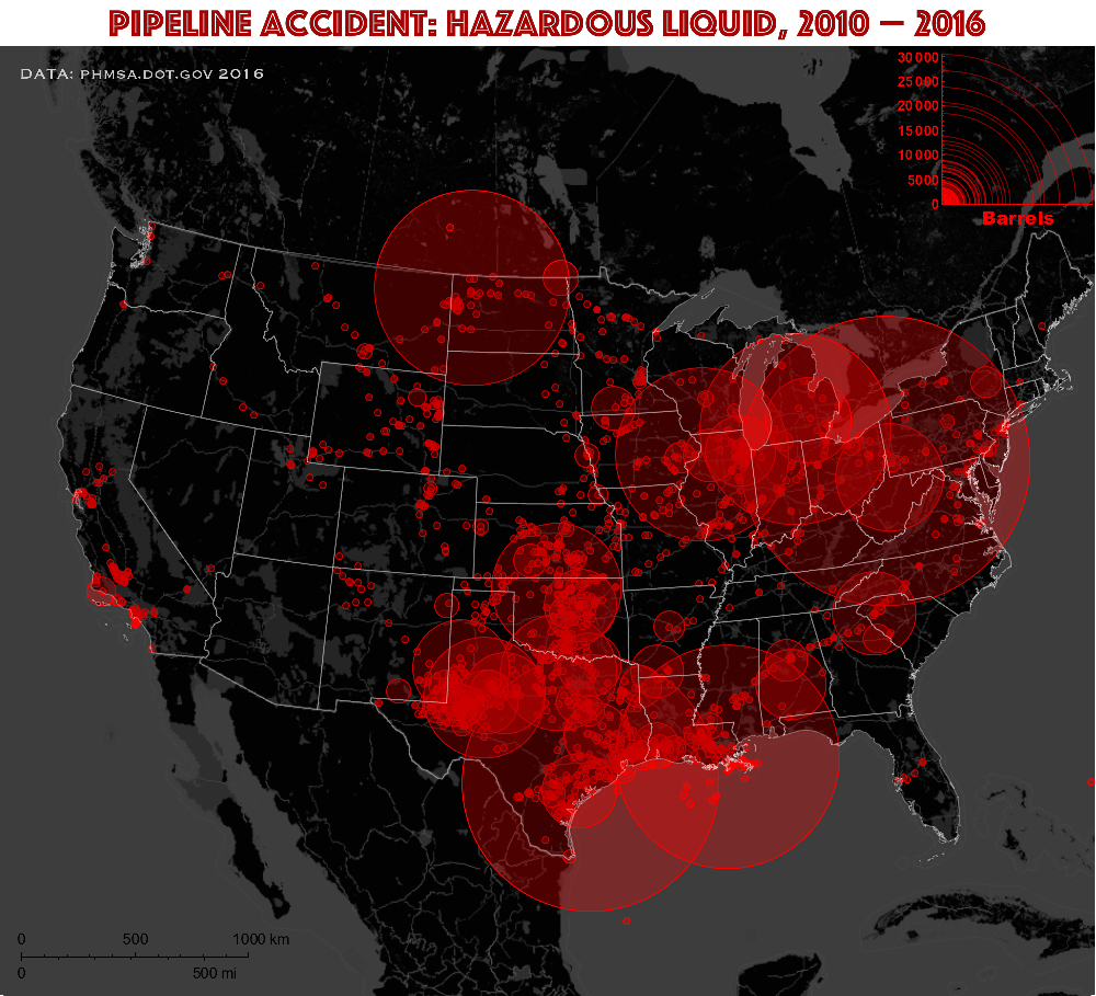
In the chart above we look at estimated volume of "unintentional commodity released" in barrels. There are other related variables too, for instance, estimated volume of "commodity recovered". But I was curious about "unintentional commodity released" as it is reflective of the risks and often the dominant value. One of the challenges in visualizations of this data is quite wide range of volume spanning several orders of magnitude up to about 30000 barrels. Accidents that count up to several scores of barrels are a small but most frequent and important as they reflect on temporal and geographical trends. On the other hand accidents with high spill volumes are less frequent but very important as posing great environmental damage. If we depict high volume accidents at a comprehensive scale, than more frequent accidents will become invisibly small at the same scale. To deal with this I show two approaches. First approach, shown above, treats any volumes smaller than roughly 500 barrels as having same radii, as just means to denote where the accident occurred. A soon as the volume of accident exceeds this limit, the volume size is proportional to the disk radius according to the plot legend. The plot legend also reflects on density of accidents at a specific volume range.
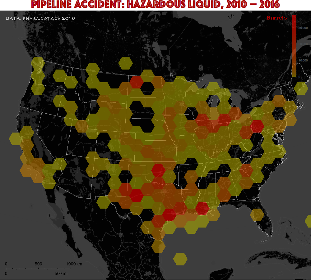
The other approach shown above is a so called GeoHistogram, that counts accidents in tailed hexagonal geo-regions and weights the counts by volume released per accident. Overall geo-density is shown as color increasing from yellow to red. If I used a linear color scale than almost all the map would be yellow representing the most frequent low-volume accidents. To highlight contrast of higher volumes we can "zoom-in" in the red part of the color scale. Mathematically the action is reminiscent of gamma-correction in image processing and not that far away from log-scale approach. What makes this procedure objective is that the color-legend reflects truthfully the volume values. You can obviously see that yellow region is suppressed at the bottom, while red colors (high volumes) take most of the space.
More visualizations and the details of how the above charts were build and more analysis are below. Please feel free to comment with more ideas of the analysis and visualizations. I would be glad to respond and tackle some good ideas. Also feel free to post your own analysis! One of the open questions for me is how volume of a spill depends on its frequency. Also, how machine learning tools can us to understand these data? I am looking forward to your contributions! Please also check out a related blog that served as inspiration
Import the data
In the archive you can download from PHMSA you can find hl2010toPresent.xlsx and easily convert it to CSV. Find attached coppy at the end of the article. Let's place notebook in the same directory as data and import:
SetDirectory[NotebookDirectory[]]
raw = Import["PipelinesIncidents.csv"];
Timporal trends and obvious recording bias
I first take a look at the column LOCAL_DATETIME, which is local time (24-hr clock) and date of the accident. By telling DateObject the right format of the date string we can import all 2729 values very quickly (under 1 second):
AbsoluteTiming[dates = DateObject[{#, {"Month", "Day", "Year", "Hour", "Minute"}}] & /@ raw[[2 ;;, 14]];]
{0.869708, Null}
dates // Length
2729
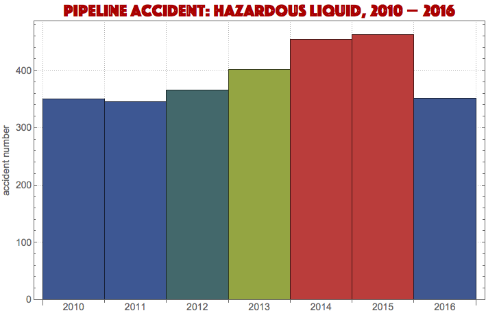
Number of accidents per year is probably a first thing that comes to mind:
DateHistogram[dates,"Year",
    ColorFunction->"DarkRainbow",BaseStyle->14,
    PlotTheme->"Detailed",FrameTicks->{False,True},
    PlotLabel->Style["Pipeline Accident: Hazardous Liquid, 2010 - 2016",25,Darker[Red],
    FontFamily->"Phosphate"],FrameLabel->{None,"accident number"}]
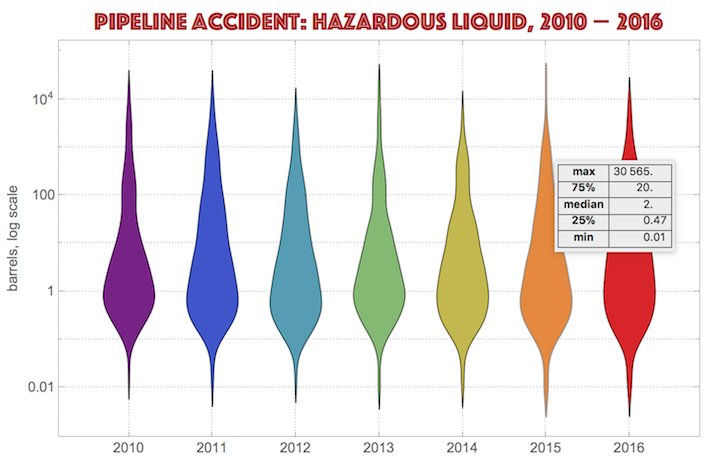
dischadata=Transpose[{dates,raw[[2;;,25]]}];
    DistributionChart[GatherBy[dischadata,#[[1,1,1]]&][[All,All,2]],ScalingFunctions->"Log",
    PlotTheme->"Detailed",ChartLabels->Range[2010,2016],BaseStyle->14,ChartStyle->"Rainbow",
    GridLines->{Range[7], Log[10.^Range[-2,4]]},FrameLabel->{None,"barrels, log scale"},
    PlotLabel->Style["Pipeline Accident: Hazardous Liquid, 2010 - 2016",25,Darker[Red],FontFamily->"Phosphate"]]
DistributionChart is great to add right below. Without log scale for the vertical axis the chart will not work visually as 75% of data lie below 20 barrels while ~30000 barrels accidents are as important to resolve in the tails, as we can see for year 2015.
Number of accidents per month highlights sharply the troublesome periods during the years:
DateHistogram[dates,
    "Month",PlotTheme->"Detailed",ColorFunction->"DarkRainbow",
    AspectRatio->1/3,DateTicksFormat->{"Day","/","MonthNameShort","/","YearShort"},BaseStyle->14,
    PlotLabel->Style["Pipeline Accident: Hazardous Liquid, 2010 - 2016",25,Darker[Red],FontFamily->"Phosphate"],
    FrameLabel->{None,"accident number"}]
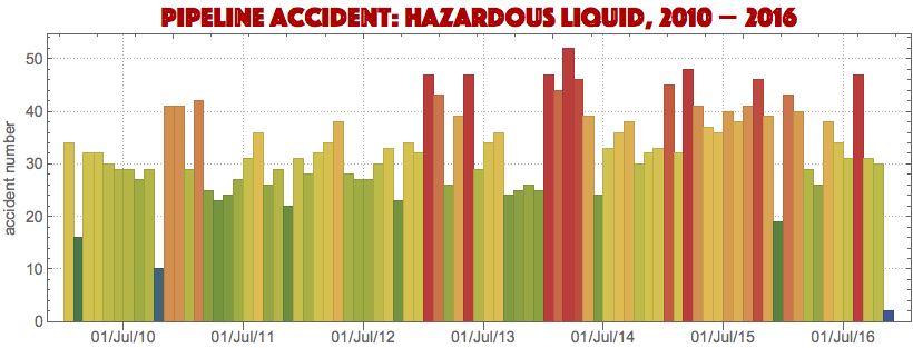
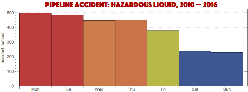
But we can take other interesting outlooks. DateHistogram can depict seasonal or periodic changes. For example we can see weekly stats by averaging all daily stats over each day of the week. We can see right away a potential presence of bias in the recording of data. On weekends the least number of accidents was reported, while the max lands on the week start slowly degrading towards the weekend. I doubt the actual frequency of accidents really depends on day of the week. So this looks like a very typical trend for an average work resource/effort available/invested through the week for many occupations.
DateHistogram[dates,"Day",
    ColorFunction->"DarkRainbow",AspectRatio->1/3,DateReduction->"Week",PlotTheme->"Detailed",
    PlotLabel->Style["Pipeline Accident: Hazardous Liquid, 2010 - 2016",25,Darker[Red],FontFamily->"Phosphate"],
    FrameTicks->{False,True},BaseStyle->14,FrameLabel->{None,"accident number"}]
Release type
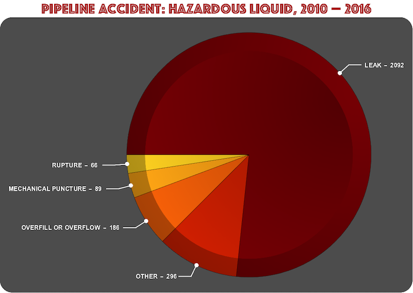
Take a look at the variable RELEASE_TYPE that is the type of accident involved. Majority is due to the leak type:
PieChart[Transpose[#][[2]],PlotTheme->"Marketing",ChartLabels->Placed[Row[#," - "]&/@#,"RadialCallout"],
PlotRange->{{-1.7,1},{-.9,.9}},BaseStyle->{15,Bold},ImageSize->1000,ChartStyle->"SolarColors",
PlotLabel->Style["Pipeline Accident: Hazardous Liquid, 2010 - 2016",35,Darker[Red],FontFamily->"Phosphate"]]&@
Reverse[SortBy[Tally[raw[[2;;,117]]],Last]]
Cause of accidents
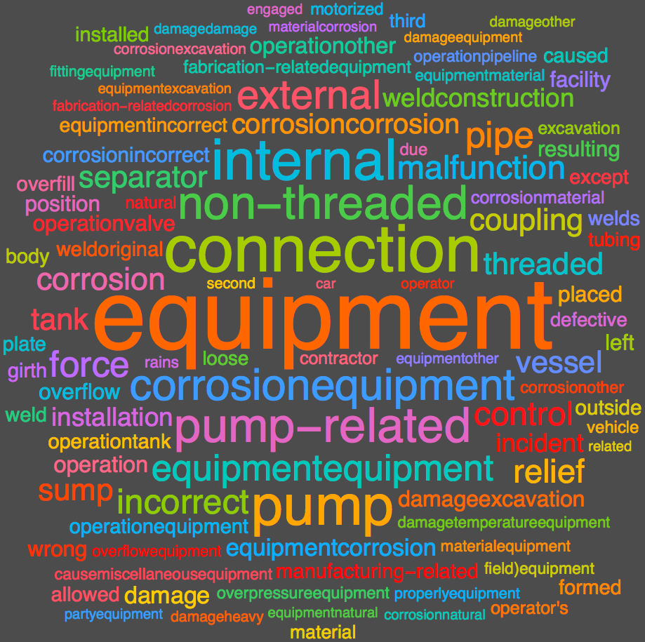
Variables CAUSE and CAUSE_DETAILS can build a detailed WordCloud for the cause of accidents:
WordCloud[StringDelete[DeleteStopwords[ToLowerCase[StringJoin[
    Flatten[raw[[2;;,235;;236]]]]]],"failure"],PlotTheme->"Marketing",ImageSize->800]
GeoHistogram: number of accidents
To understand better how to make the very first two top charts lets concentrate on variables LOCATION_LATITUDE and LOCATION_LONGITUDE. First I can build a GeoHistogram depicting just the number of accidents per tiled hexagons without weighting by the accident spill volume. This will give a good sense of geographical distribution of accidents. I build background map separately and the add it to the actual GeoHistogram with blank background (code is right below):
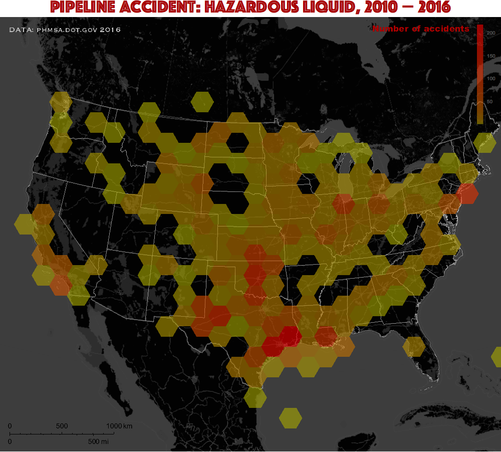
backmap=GeoGraphics[{EdgeForm[Directive[White,Opacity[.3]]],
    Polygon[EntityClass["AdministrativeDivision", "AllUSStatesPlusDC"]]},
    GeoBackground->
       GeoStyling["StreetMapNoLabels",
       GeoStylingImageFunction->(ImageAdjust@ColorNegate@ColorConvert[#1,"Grayscale"]&)],
    GeoScaleBar->Placed[{"Metric","Imperial"},{.02,.04}],
    GeoRange->2 10^6,
    GeoCenter->GeoPosition[{38.49,-98.37}],
    GeoProjection->"LambertAzimuthal",
    Epilog->{
       Text[Style["Number of accidents",17,Darker@Red,FontFamily->"Arial Black"],Scaled[{.84,.975}]],
       Text[Style["DATA: phmsa.dot.gov 2016",GrayLevel[.8],17,FontFamily->"Copperplate"],Scaled[{0.13,0.97}]]},
    BaseStyle->14,
    ImageSize->1000
];

hisloc=GeoHistogram[
    GeoPosition[raw[[2;;,16;;17]]],70,
    GeoBackground->None,
    GeoScaleBar->Placed[{"Metric","Imperial"},{.02,.04}],
    GeoRange->2 10^6,
    ColorFunction->(Blend[{Darker@Yellow,Red},#^.5]&),
    GeoCenter->GeoPosition[{38.49,-98.37}],
    GeoProjection->"LambertAzimuthal",
    PlotLegends->Automatic,
    ImageSize->1000
    ];

Labeled[
    Overlay[{Show[backmap,hisloc[[1]],GeoRange->2 10^6],Framed[hisloc[[2]],FrameStyle->None]},Alignment->{Right,Top}],
    Style["Pipeline Accident: Hazardous Liquid, 2010 - 2016",35,Darker[Red],FontFamily->"Phosphate"],
Top]
The way gamma-correction is applied can be seen from the line:
ColorFunction->(Blend[{Darker@Yellow,Red},#^.5]&)
where exponent 0.5 was applied to data values to zoom-in in higher-value red pard of the color scale. The more complex top charts of this article are no that different. Below is the code for them.
GeoHistogram: number of accidents weighted by barrel release
weighted =
  AssociationThread[GeoPosition /@ raw[[2 ;;, 16 ;; 17]],
   raw[[2 ;;, 25]]];

backmap=GeoGraphics[{EdgeForm[Directive[White,Opacity[.3]]],
    Polygon[EntityClass["AdministrativeDivision", "AllUSStatesPlusDC"]]},
    GeoBackground->
       GeoStyling["StreetMapNoLabels",
       GeoStylingImageFunction->(ImageAdjust@ColorNegate@ColorConvert[#1,"Grayscale"]&)],
    GeoScaleBar->Placed[{"Metric","Imperial"},{.02,.04}],
    GeoRange->2 10^6,
    GeoCenter->GeoPosition[{38.49,-98.37}],
    GeoProjection->"LambertAzimuthal",
    Epilog->{
       Text[Style["Barrels",17,Darker@Red,FontFamily->"Arial Black"],Scaled[{.89,.975}]],
       Text[Style["DATA: phmsa.dot.gov 2016",GrayLevel[.8],17,FontFamily->"Copperplate"],Scaled[{0.13,0.97}]]},
    BaseStyle->14,
    ImageSize->1000
];

hisoil=GeoHistogram[
    weighted,70,
    GeoBackground->None,
    GeoScaleBar->Placed[{"Metric","Imperial"},{.02,.04}],
    GeoRange->2 10^6,
    ColorFunction->(Blend[{Darker@Yellow,Red},#^.5]&),
    GeoCenter->GeoPosition[{38.49,-98.37}],
    GeoProjection->"LambertAzimuthal",
    PlotLegends->Automatic,
    ImageSize->1000
    ];

Labeled[
    Overlay[{Show[backmap,hisoil[[1]],GeoRange->2 10^6],Framed[hisoil[[2]],FrameStyle->None]},Alignment->{Right,Top}],
    Style["Pipeline Accident: Hazardous Liquid, 2010 - 2016",35,Darker[Red],FontFamily->"Phosphate"],
Top]
Accident location and release in barrels
diskleg=Graphics[{Red,Opacity[.5],Circle[{0,0},#,{0,Pi/2}]&/@raw[[2;;,25]]},
    Frame->{{True,False},{True,False}},
    FrameTicks->{None,Automatic},
    PlotRange->{{0,30600},{0,30600}},
    FrameStyle->Red,AspectRatio->1,
    BaseStyle->{13,Bold}];

geoback=GeoGraphics[{
    {EdgeForm[Red],FaceForm[Directive[Red,Opacity[.3]]],
    Disk@@@Transpose[{GeoPosition/@raw[[2;;,16;;17]],lift[Rescale[raw[[2;;,25]],{0,30565},{0,.1}]]}]},
    {EdgeForm[Directive[White,Opacity[.3]]],
    Polygon[EntityClass["AdministrativeDivision", "AllUSStatesPlusDC"]]}
    },
    GeoBackground->
       GeoStyling["StreetMapNoLabels",
       GeoStylingImageFunction->(ImageAdjust@ColorNegate@ColorConvert[#1,"Grayscale"]&)],
    GeoScaleBar->Placed[{"Metric","Imperial"},{.02,.04}],
    GeoRange->2 10^6,
    GeoCenter->GeoPosition[{38.49,-98.37}],
    GeoProjection->"LambertAzimuthal",
    PlotLabel->Style["Pipeline Accident: Hazardous Liquid, 2010 - 2016",35,Darker[Red],FontFamily->"Phosphate"],
    Epilog->{
       Text[Style["Barrels",17,Red,FontFamily->"Arial Black"],Scaled[{.93,.82}]],
       Text[Style["DATA: phmsa.dot.gov 2016",GrayLevel[.8],17,FontFamily->"Copperplate"],Scaled[{0.13,0.97}]],
       Inset[diskleg,Scaled[{.91,.91}]]},
    BaseStyle->14,
    ImageSize->1000
]


