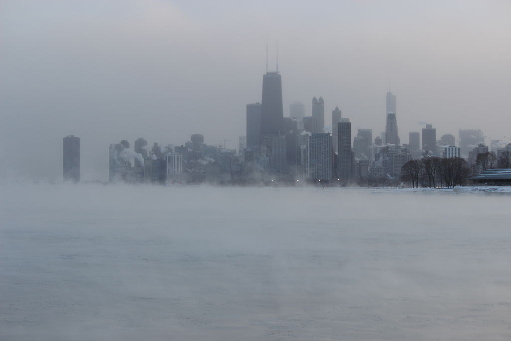
I'm in Chicago and this past week has been brutally cold. I decided it would be fun to see just how bad it is by visualizing this year's temperatures against previous years. The results were good and I thought I'd share.
First, we get about 60 years of temperature data. This data has some Missing values in it, but our code will handle this problem automagically:
temps = WeatherData["Chicago" , "MeanTemperature", {{1950, 1, 1}, Today, "Day"}, "DateNonMetricValue"]
I've also asked for the values in Fahrenheit instead of the the default Celsius. You can just remove "DateNonMetricValue" if you don't like that.
Making this data into a DataSet will help us efficiently manipulate it. We want to group all the temperatures by Month and Day so we can calculate things like the Mean and Max temperatures for any given day of the year.
tempDataset = Dataset@Normal@temps;

groupedByMonthDay =
    tempDataset[GroupBy[First /* (DateValue[#, { "Month", "Day"}] &)]]
Let's select just the list of temperatures for each Day:
groupedByMonthDayTemps = groupedByMonthDay[All, All, 2]
Now we can look at the Mean temperature for each day by evaluating:
groupedByMonthDayTemps[All, Mean]
We are going to reduce the list temperatures for each day with several different ways, so let's make a function out this. It will take a reducing function like Mean and apply it to each day's list of temperatures.
tempsReducedBy[transform_] := groupedByMonthDayTemps[All, transform];
I want to look at the median temperatures as well as the minimum, maximum, and upper and lower quartiles. The functions that do this are:
reductionFunctions = {Min, Max, Median, Quantile[#, 3/4] &, Quantile[#, 1/4] &};
We can get the daily minimum temperatures and other values using them:
 {minTemps, maxTemps, medianTemps, upperQTemps, lowerQTemps} =
      tempsReducedBy /@ reductionFunctions
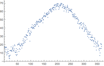
Unfortunately, when we plot these, we see they are kinda bumpy:
ListPlot@minTemps[Values]
I just just want a general curve showing what the minimum temperatures are like. We need to smooth these out. There's a lot of ways to do this. I at first chose to use the Fourier Transform myself, but realized there's a function for LowPass Filtering:
filterTemps[temps_] :=
 LowpassFilter[Normal@temps[[Values]], 1/20, 80, HammingWindow,
  Padding -> "Periodic"]
The values here are admittedly just magic numbers I've picked for aesthetic reasons. Let's add this to our code:
{minTemps, maxTemps, medianTemps, upperQTemps, lowerQTemps} =
  Map[filterTemps@*tempsReducedBy, reductionFunctions];
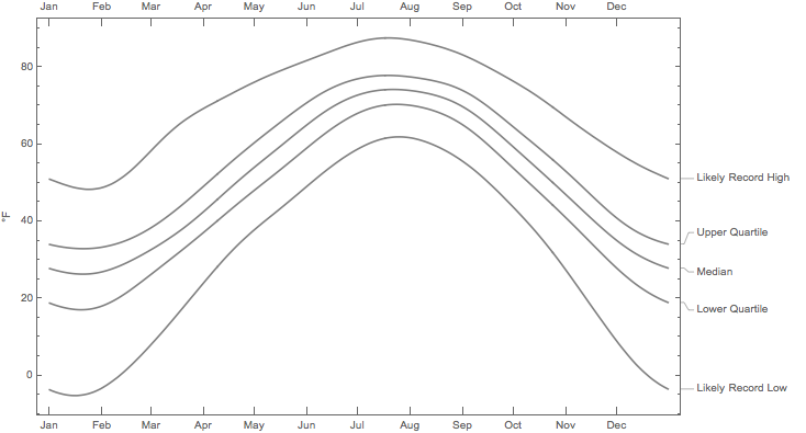
If we plot these together, we get a good a good background for how much the temperature varies throughout the year. The code is a bit long because I got picky about how I wanted it to look:
background = DateListPlot[{
   Callout[minTemps, "Likely Record Low"],
   Callout[maxTemps, "Likely Record High"],
   Callout[medianTemps, "Median"],
   Callout[upperQTemps, "Upper Quartile"],
   Callout[lowerQTemps, "Lower Quartile"]}, {{2016, 1, 1}, Automatic,  "Day"},
    Joined -> True, PlotStyle -> Gray, FrameLabel -> Automatic,
   FrameTicks -> {Table[{2016, i, 1}, {i, 12}], Automatic},
  Axes -> False]
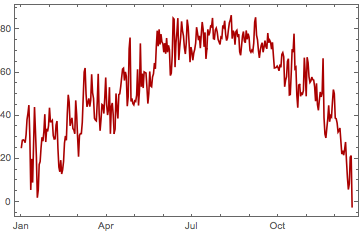
Let's get this years temperatures and lay it over our background:
currentTemps =
    WeatherData[city, "MeanTemperature", {{2016, 1, 1}, Today, "Day"}, "DateNonMetricValue"];

thisYear =
 DateListPlot[currentTemps, Joined -> True, PlotStyle -> Darker@Red]
And let's lay it on top of our background:
Show[background, thisYear,
PlotLabel -> Style["Daily Mean Temperature - Chicago - 2016", Large, FontFamily -> "Times"]]
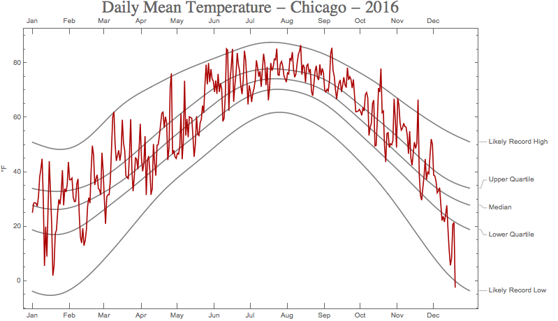
So, it's certifiably ridiculously cold in Chicago. And yesterday was almost record breaking.
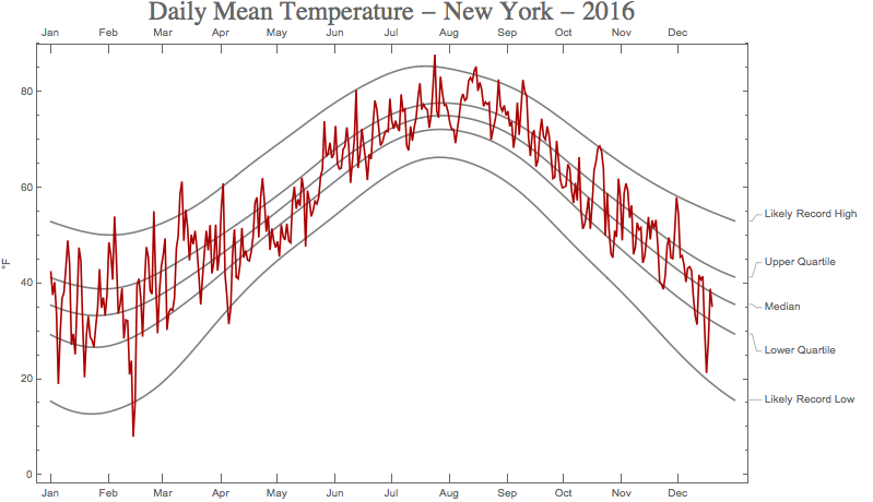
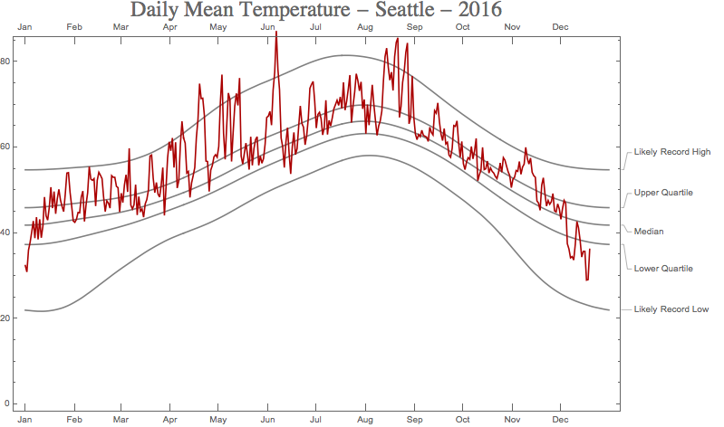
Here are some graphs for other cities that like to complain about the cold. As we can conclusively see, my friends from other cities should stop complaining about how cold it is outside. Chicago has it far worse right now: