I was reading an online article about using the Pandas package of Python. I think it might be fun to see how Wolfram Language can handle these tasks in manageable amount of code. Lets begin:
(*code source*)
url = "https://archive.ics.uci.edu/ml/machine-learning-databases/pima-indians-diabetes/pima-indians-diabetes.data"
Import Data
Python
import matplotlib.pyplot as plt
import pandas
names = ['preg', 'plas', 'pres', 'skin', 'test', 'mass', 'pedi', 'age', 'class']
data = pandas.read_csv(url, names=names)
Wolfram Language
(* $Version 11.1.0 for Mac OS X x86 (64-bit) (March 16, 2017)*)
data = Import[url];
names = {"preg", "plas", "pres", "skin", "test", "mass", "pedi", "age", "class"};
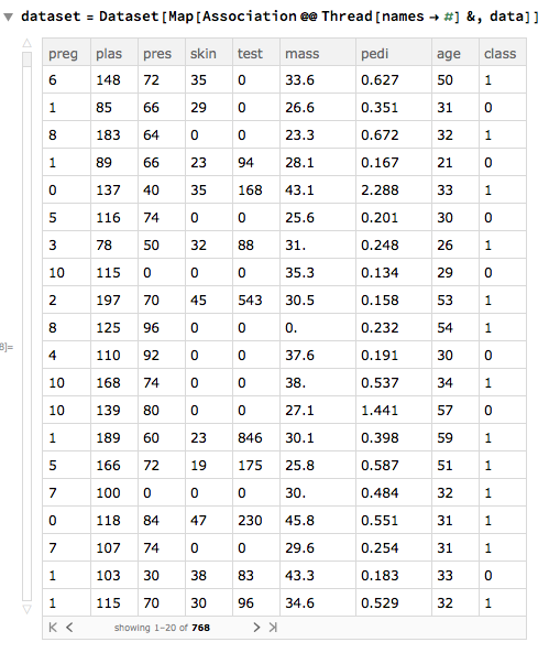
dataset = Dataset[Map[Association @@ Thread[names -> #] &, data]] (* turns {6,148} to <| preg -> 6 ,  plas -> 148 |>, row-wisely *)
Univariate Plots
Histogram
Python
data.hist()
plt.show()
Wolfram Language
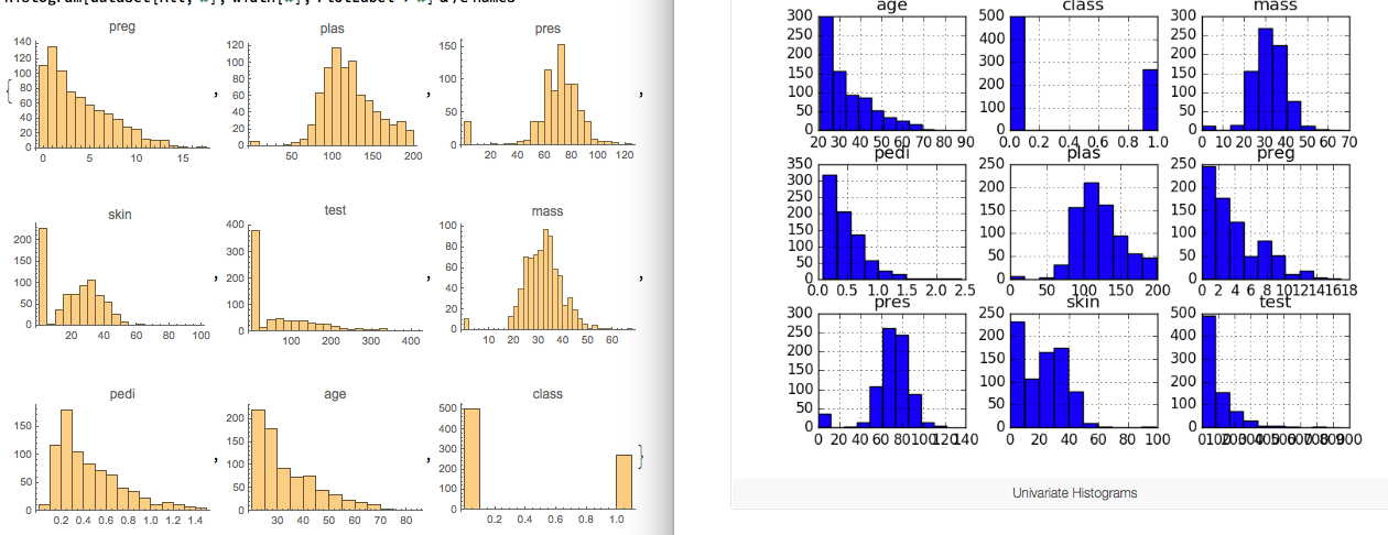
width["class"] = {0.1}; (* Very flexible to adjust the width of the bins on the fly *)
width[item_] := Automatic;
Histogram[dataset[All, #], width[#], PlotLabel -> #] & /@ names

Density Plot
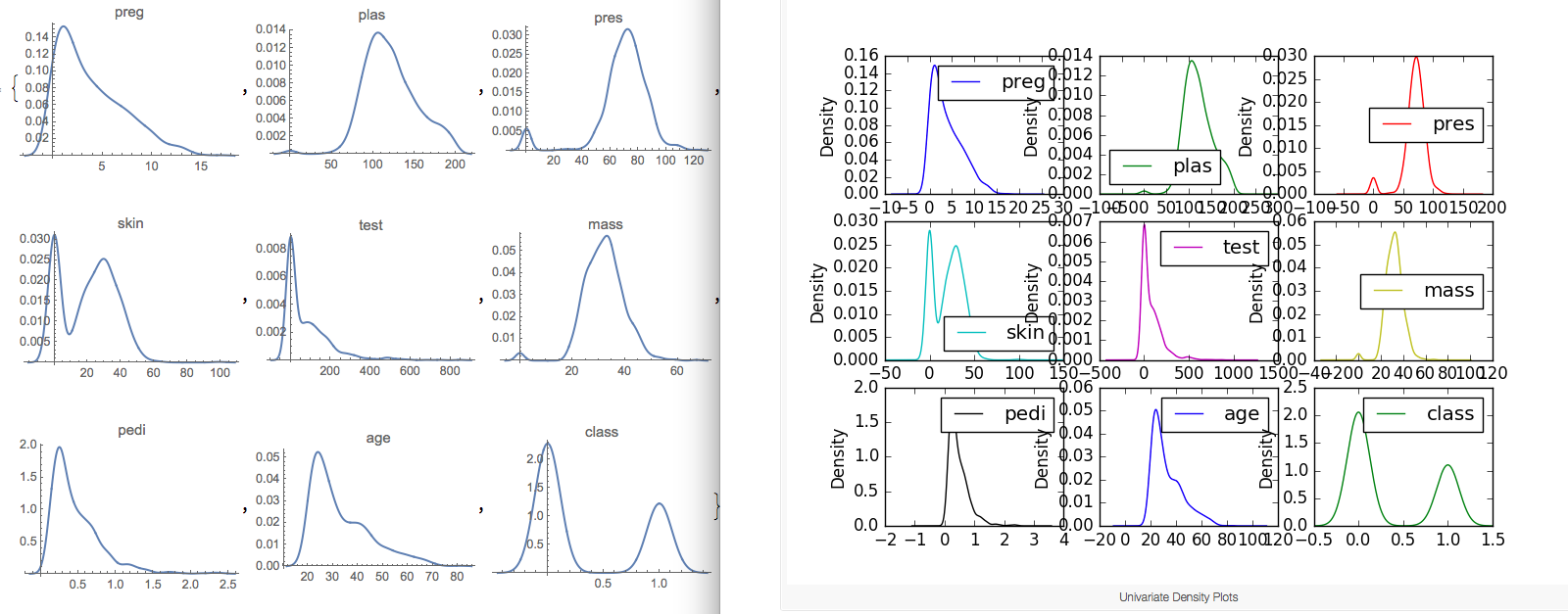
The plots look like an abstracted histogram with a smooth curve drawn through the top of each bin, much like your eye tried to do with the histograms.
So in Wolfram Language this is done by using a automatic smoothing kernel in SmoothHistogram. Just to be clear here, DensityHistogram in Mathematica means something different, which is like a 2D density plot with discrete color scale.
Python
data.plot(kind='density', subplots=True, layout=(3,3), sharex=False)
plt.show()
Wolfram Language
SmoothHistogram[dataset[All, #], PlotRange -> Full, PlotLabel -> #] & /@ names
Box Whisker Plot
Python
data.plot(kind='box', subplots=True, layout=(3,3), sharex=False, sharey=False)
plt.show()
Wolfram Language
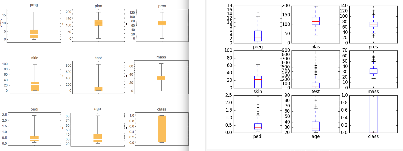
BoxWhiskerChart[dataset[All, #], PlotLabel -> #] & /@ names
Multivariate Plot
Correlation Matrix Plot
Python
correlations = data.corr()
# plot correlation matrix
fig = plt.figure()
ax = fig.add_subplot(111)
cax = ax.matshow(correlations, vmin=-1, vmax=1)
fig.colorbar(cax)
ticks = numpy.arange(0,9,1)
ax.set_xticks(ticks)
ax.set_yticks(ticks)
ax.set_xticklabels(names)
ax.set_yticklabels(names)
plt.show()
Wolfram Language
You are allowed to tweak the data with simple code here to have more control:
n = Length[names]
corr[dataset_, tuple_] := Correlation[
  N@Normal@dataset[All, tuple[[1]]],
  N@Normal@dataset[All, tuple[[2]]]
  ]
Generate some tuple of name pair
grid = Partition[Tuples[names, 2], n]
(*{{{preg,preg},{preg,plas},{preg,pres},{preg,skin},{preg,test} ... }}}*)
res = Map[corr[dataset, #] &, grid, {2}]
(* create correlation matrix : {{1., 0.129459, 0.141282, -0.0816718,...},...} *)
Control label display by yourself
 xLabel=yLabel=Transpose[{Range[n],names}]
 (* {{1,preg},{2,plas},{3,pres},{4,skin},{5,test},{6,mass},{7,pedi},{8,age},{9,class}} *)
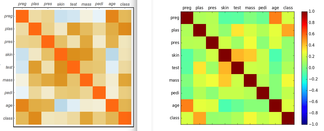
Use MatrixPlot to create a color grid:
MatrixPlot[res,
 FrameTicks -> {{yLabel, None}, {None, xLabel}},
 FrameStyle -> Directive[14, Italic]
 ]
Scatterplot Matrix
Python
scatter_matrix(data) #default settings
plt.show()
Wolfram Language
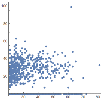
The plot is broken down to a combo of ListPlot and Histogram according to the python article I was reading. For each factor pair, I use the following function to create data points and plot them together:
pair[dataset_, tuple_] := Transpose[{
   N@Normal@dataset[All, tuple[[1]]],
   N@Normal@dataset[All, tuple[[2]]]
   }]

ListPlot[pair[dataset, {"age", "skin"}], PlotStyle -> PointSize[0.02], AspectRatio -> 1] (*customized settings*)
So I create a plot function as a wrapper upon the pair and corr function with the similar signature
plotfun[dataset_, tuple_] := If[tuple[[1]] === tuple[[2]],
  Histogram[dataset[All, tuple[[1]]], Ticks -> None],(*histogram on diagonal*)
  ListPlot[pair[dataset, tuple], PlotStyle -> PointSize[0.03], AspectRatio -> 1, Ticks -> None, Axes -> None, ImageSize -> {80, 80}]
]
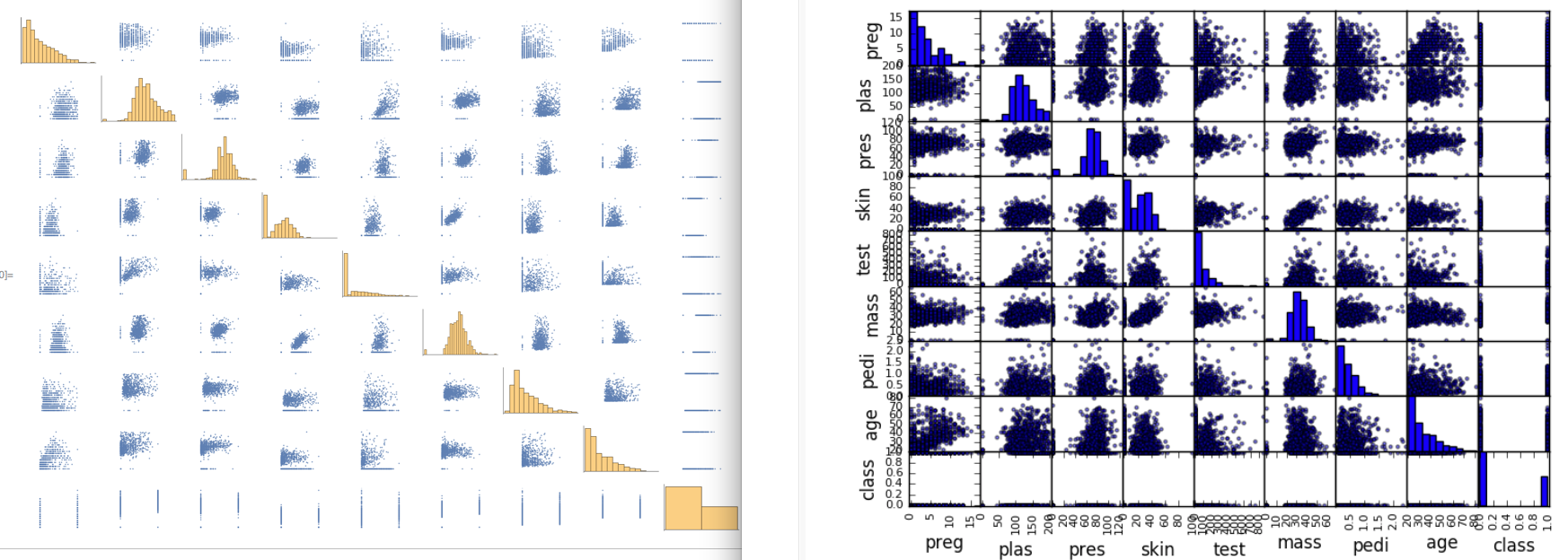
The ListPlot is somewhat longer than the Python plot function because I think I can show some beautification settings in Mathematica to have the plot a professional look. Python users can point out how to do this with matplotlib in the comment. The action code to implement the plot over a grid is one-liner:
Grid[Map[plotfun[dataset, #] &, grid, {2}]] // Rasterize
The working notebook is attached. Please download and play around. The test data is also provided in testdata.m in the form of Dataset[...] in case the url above is dead. You can just import this file with data=Import["<path>/<to>/testdata.m"] and the dataset is ready to be used in Mathematica.
 Attachments: