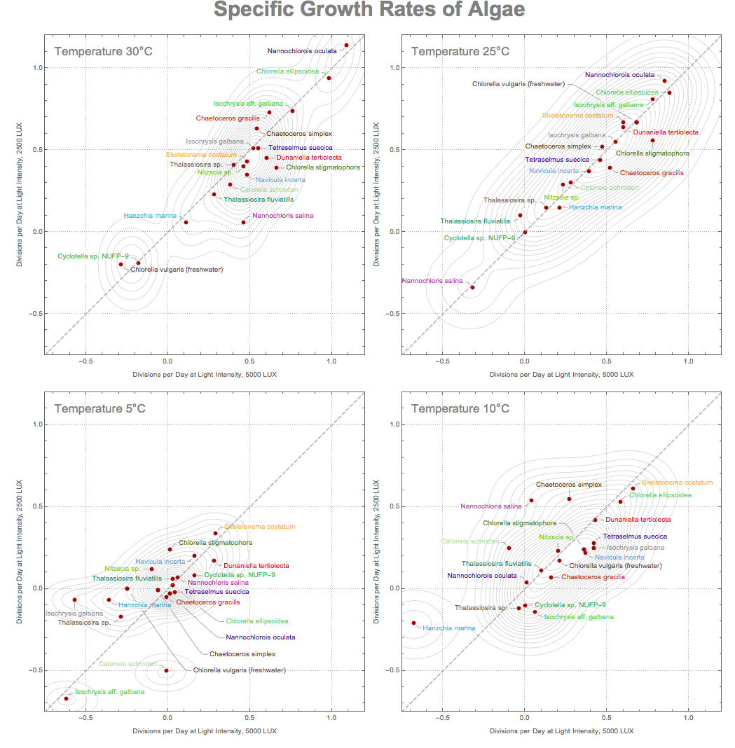
Click on image or here to zoom. Right-click to download. The graphics is in .SVG format, please make sure your browser supports viewing it. .SVG is a vector format and allows crisp resolution-independent images. Click on the image to download it and view at arbitrary high magnification. Just in case at the bottom of this post the same image is provided in .PNG foramt

Intro
This is a response to the [CALL] Reddit DataViz Battle JAN2018: Visualize the Growth Rates of Algae:
http://community.wolfram.com/groups/-/m/t/1257547
Analysis
On average across the majority of species specific growth rates of algae increase with the increase of temperature. Yet at all temperatures there are negative growth rates for some species. Moreover, in some temperature ranges, temperature increase has negative effect on growth rates of individual species.
Only at lower temperatures (5°C and 10°C) one can observe that light conditions can take some species from negative to positive growth rates. And at the higher temperatures there is a resilience to changes in light conditions. This means higher sensitivity to light at lower temperatures.
In a specific environment one of the targets cold be a (suppression/induction of) efficient algae growth under various light conditions for a wide range of species. For example, in some natural light environments access to the daylight may change over various time scales. It is obvious from 4 plots that the Temperature 25°C is optimal across majority of species as the growth is almost invariant with respect to the light conditions. The more elongated shape of contour lines and squeezing points around x = y axis speaks to that.
Temperature 25°C leads to more uniformity or least fragmentation across various species in terms of clustering, which can be seen from dominance of a single maximum in SmoothKernelDistribution (see details section).
Details on visualization choice
This is a simple but surprisingly informative (data-representation-wise) idea. A few comments I could make about this visualization.
Temperature decreases in clockwise direction: I found it is easier to compare the sequential plots in this way. It starts from highest temperature as it is the most fertile for algae and data is more ideal and less prone to noise.
It is easy to see how fertility of algae moves up as an average with the temperature growth by comparing between different scatter plots.
It is easy compare the influence of light by locating the data point above or below the dashed gray x = y line.
Color is unique to a specific label. It is easy then to track labels across 4 different plots. Coloring points would not be a good visual experience as they are too small.
The contour lines were built with the help of SmoothKernelDistribution, which helps quickly grasp 2 things:
Clustering and general distribution of points in space reflecting on inter-species relations
How well points are "squeezed" around x = y line reflecting intra-species relations affected by different light conditions
Data
The dataset is located at a web page: http://aquatext.com/tables/algaegrwth.htm
The nature of the data is clear from the website description. It is easy to get the raw data with the following WL command:
raw = Import["http://aquatext.com/tables/algaegrwth.htm", "Data"] /."0..06" -> .06;
You need /."0..06" -> .06 because the data has a clerical error resulting in the import of a string instead of a number. One way of obtaining a simple rectangular array / table of data is:
data=Cases[data,{_String,__?NumberQ},Infinity]/.
x_List/;First[x]=="Temperature":>{"Temperature",5,5,10,10,25,25,30,30};
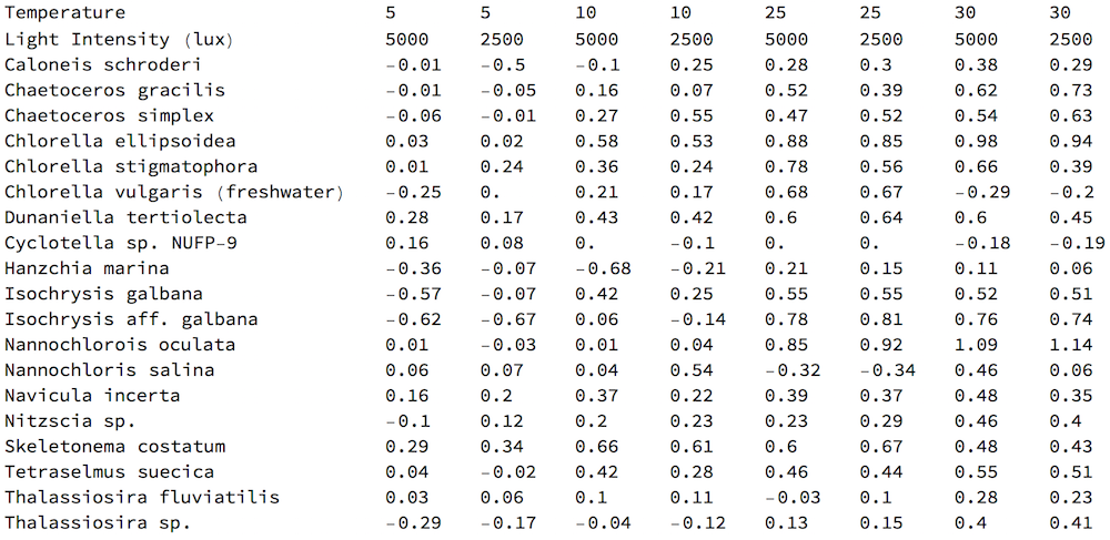
which can be viewed as
TableForm[data]

First I create a Dataset for more convenient data manipulations.
set = Dataset[data][[3 ;; -1]][SortBy[#[[9]] &]];
Extract data for each (of 4) temperature points. Let different Light Intensities serve as (x,y) coordinates of data points:
denData = Normal[set[All, Span[#1, #2]]] & @@@ Partition[Range[2, 9], 2]
Color names of species randomly:
SeedRandom[14];
lbls = Style[#, RandomColor[]] & /@ Normal[set[All, 1]]
Build a single scatter plot function:
XeqY={Text[Style["Temperature "<>ToString[#]<>"\[Degree]C",17,Gray],Scaled[{.03,.97}],{Left,Top}],
    {Dashed,Opacity[.5],Thick,Gray,InfiniteLine[{{0,0},{1,1}}]}}&;

assoc=Association[Thread[lbls->denData[[#]]]]&/@Range[4];

title=Style["Specific Growth Rates of Algae",30,Gray,Bold,FontFamily->"Arial"];

callPlot[dat_,t_]:=ListPlot[dat,PlotTheme->"Detailed",AspectRatio->1,
ImageSize->500,Epilog->XeqY[t],PlotStyle->Darker[Red],PlotRange->{{-.75,1.2},{-.75,1.2}},
FrameLabel->{"Divisions per Day at Light Intensity, 5000 LUX","Divisions per Day at Light Intensity, 2500 LUX"}]
Some labels will require manual adjustments:
pl4=callPlot[assoc[[4]],30];
pl3=callPlot[{assoc[[3]],{
    Callout[{0.68`,0.67`},lbls[[1]],{.3,.9}]}},25];
pl2=callPlot[{assoc[[2]],{
    Callout[{0.36`,0.24`},lbls[[8]],{.25,.4}],
    Callout[{0.42`,0.25`},lbls[[13]],{.45,.25}]}},10];
pl1=callPlot[{assoc[[1]],{
    Callout[{0.03`,0.02`},lbls[[-2]],{0.3,-0.2}],
    Callout[{0.01`,-0.03`},lbls[[-1]],{0.3,-0.3}],
    Callout[{-0.06`,-0.01`},lbls[[-5]],{0.2,-0.4}],
    Callout[{-0.25`,0.`},lbls[[1]],{0.1,-0.5}]}},5];
Define contours function based on SmoothKernelDistribution:
pdfs=PDF[SmoothKernelDistribution[#],{x,y}]&/@denDat;
contours[pdf_]:=ContourPlot[pdf,{x,-.75,1.2},{y,-.75,1.2},
Contours->20,ContourStyle->Opacity[.15],PlotRange->All,ContourShading->None]
Build the final plot:
final=Labeled[Show[GraphicsGrid[
    {{Show[pl4,contours[pdfs[[4]]]],Show[pl3,contours[pdfs[[3]]]]},
    {Show[pl1,contours[pdfs[[1]]]],Show[pl2,contours[pdfs[[2]]]]}},
Spacings->10{1,1},Background->White],Background->White],title,Top]
Click on the image to zoom. Then click your browser back button to return to reading the post.
