When I heard the State of the Union was coming up, I knew it was going to call for a Mathematica data deep dive! With the help of the data from this site and some archived Wikipedia data, I was able to do just that. Mathematica made it easy to compare and contrast the State of the Union addresses given by each president.
Creating a CSV file of all the relevant data
With all the data from the UCSB site, I was well on my way to doing something interesting. I was able to copy most of this information as plain text into an Excel document. However, with dates outside the normal date range, I had to be careful that none of these were converted into invalid dates. I also had to hand paste all of the URLs to the SOTU addresses I found on Wikipedia as well as the time length of the spoken speeches. I've linked the CSV file here as well as in the Mathematica notebook, so you can avoid the same hassle!
Importing the data and speeches
Using SemanticImport, this process was relatively simple. The dates, time lengths, and URLs were automatically recognized as entities, which saved me quite a bit of programming time.
fileLocation =
  "https://amoeba.wolfram.com/index.php/s/8RtPmIDGwzrr0FR/download";
SOTU = SemanticImport[fileLocation, Automatic, "Rows"]
I was then able to use Import to pull all of the speeches from the URLs in obtained in that SemanticImport. These were all imported as lists of strings automatically.
speechList = Import[SOTU[[#]][[6]]] & /@ Range[Length[SOTU]]
Using the AppendTo functionality, I was easily able to add these imported speeches to the original dataset using an iterative loop.
i = 1;
While[i < Length[speechList] + 1,
 AppendTo[SOTU[[i]], speechList[[i]]];
 i++;
 ]
Finally, using the GroupBy function, I was able to sort this list into list associated with specific presidents. This was especially helpful for some of the Manipulate functions used later to create WordClouds.
SOTUgrouped = GroupBy[SOTU, First]
Using WordCloud to visualize each speech
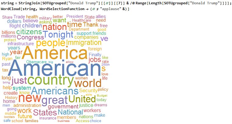
WordCloud is one of my favorite functions to use in analyzing text and speeches. This function makes it extremely easy to quickly visualize the degree of word selection in textual data. In this case, I analyzed all of President Trump's State of the Union addresses (excluding the "applause" that was included in the transcript with WordSelectionFunction). Considering there was only one, this was relatively easy, but I wanted to create a skeleton for the next portion that would join all of his speeches together with the StringJoin function and Slot functionality.
string = StringJoin[
   SOTUgrouped["Donald Trump"][[#]][[7]] & /@
    Range[Length[SOTUgrouped["Donald Trump"]]]];
WordCloud[string, WordSelectionFunction -> (# != "applause" &)]
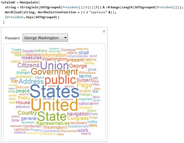
I will say this time and time again, one of the most interesting functions in Mathematica is the Manipulate function. Using this, I was able to do the same WordCloud for every single one of the presidents and give the user the ability to flip through different presidents and compare. Using the Keys function, I was able to quickly create a list of president for the variable President from my grouped list created earlier.
totalsWC = Manipulate[
  string =
   StringJoin[
    SOTUgrouped[President][[#]][[7]] & /@
     Range[Length[SOTUgrouped[President]]]];
  WordCloud[string, WordSelectionFunction -> (# != "applause" &)],
  {President, Keys[SOTUgrouped]}
  ]
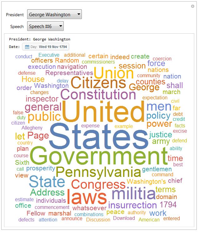
To take this a step further, I thought it would be even more interesting to have the option to select either the president's speeches as a whole or particular speeches to see how the focus changed throughout the presidency. I first programmed the Speech variable to update dynamically based on the number of speeches under each president. Unfortunately, this would cause some issues when flipping between presidents if a Speech value was out of range. I used some simple If statements with the MemberQ function to make this a bit more user-friendly when jumping around between presidents. Overall though, I followed a pretty similar skeleton to the previous example.
bySpeechWC = Manipulate[
  speeches :=
   Join[{0 -> "All Speeches"}, # -> "Speech #" <> ToString[#] & /@
     Range[Length[SOTUgrouped[President]]]];
  wc := If[
    MemberQ[Keys[speeches], Speech],
    If[
     Speech == 0,
     WordCloud[string,
      WordSelectionFunction -> (# != "Applause" && # != "applause" &),
       ImageSize -> Large],
     WordCloud[SOTUgrouped[President][[Speech]][[7]],
      WordSelectionFunction -> (# != "Applause" && # != "applause" &),
       ImageSize -> Large]
     ],
    "Word Cloud cannot be generated until you choose a speech # \
within range"];
  date := If[
    MemberQ[Keys[speeches], Speech],
    If[
     Speech == 0,
     "N/A",
     SOTUgrouped[President][[Speech]][[2]]
     ],
    "Date cannot be generated until you choose a speech # within \
range"];
  string =
   StringJoin[
    SOTUgrouped[President][[#]][[7]] & /@
     Range[Length[SOTUgrouped[President]]]];
  Column[{
    Row[{"President: " <> President}],
    Row[{"Date: ", date}],
    Row[{wc}]
    }],
  {President, Keys[SOTUgrouped]},
  {Speech, Dynamic[speeches]},
  ControlType -> PopupMenu,
  Initialization :> (Speech = 0)
  ]
Exploring word usage across different eras
I decided to take this textual analysis a step further and compare the usage of the most common state of the union words over time. I started by creating a list of the top 100 used words across all of the speeches using WordCounts. I also used StringJoin to combine all of the speeches and DeleteStopwords to avoid counting words like "the", "and", "with", etc.
top100PresTerms =
 Take[WordCounts[DeleteStopwords[StringJoin[speechList]],
   IgnoreCase -> True], 100]
I knew I would need to tally these within each speech, so I started by testing the Tally function with George Washington's original State of the Union then used the Keys function to find each of the Keys in the top 100 within this speech. This list was put into a list of Associations. Missing[] terms were used as placeholders for top 100 words not found.
gw1 = WordCounts[DeleteStopwords[SOTU[[1]][[7]]], IgnoreCase -> True]
Association[# -> gw1[#] & /@ Keys[top100PresTerms]]
Using this same methodology, I was able to iterate through every speech in order to pair a date with their respective lists of associations of the top 100 words.
i = 1;
wordUse = {};
While[i < Length[SOTU] + 1,
 allWords =
  WordCounts[DeleteStopwords[SOTU[[i]][[7]]], IgnoreCase -> True];
 compList = Association[# -> allWords[#] & /@ Keys[top100PresTerms]];
 AppendTo[wordUse, SOTU[[i]][[2]] -> compList];
 i++;
 ]
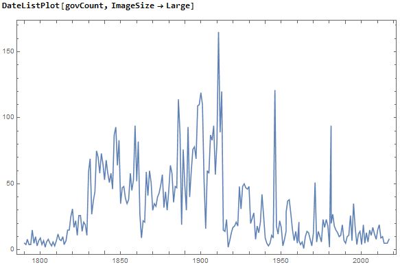
To explore how this list could be used, I picked a specific word, "government", from my top 100 list. I used this to create a time series of all of the government mentions in the speeches. This list was then usable for a DateListPlot to show the change in the frequency of this world over time.
govCount = {wordUse[[#]][[1]], wordUse[[#]][[2]]["government"]} & /@
  Range[Length[wordUse]]
DateListPlot[govCount, ImageSize -> Large]
Using the same methodology, I was able to create similar time series for each of the top 100 words and store them in a list of associations, which would prove to be beneficial for the Manipulate function.
i = 1;
timeSeries = <||>;
While[i < Length[Keys[top100PresTerms]] + 1,
 key = Keys[top100PresTerms][[i]];
 keyList =
  Association[
   wordUse[[#]][[1]] ->  wordUse[[#]][[2]][key] & /@
    Range[Length[wordUse]]];
 AppendTo[timeSeries, key -> DeleteMissing[keyList]];
 i++;
 ]
This list of associations made it easy to pull the specific time series for each of the words in the top 100 list. You can see an example of this with the word "state".
timeSeries["state"]
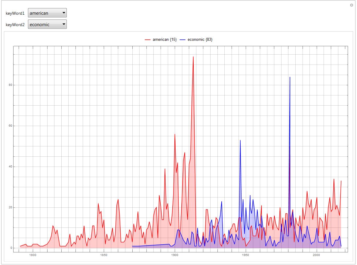
Using this same methodology, I was able to use the Keys function to again pull specific time series from my new list of associations based on the selected top 100 word. The time series was then plotted on a DateListPlot. I allowed for the user to select and compare two different key words. A nice added feature is the legend that shows the word and also their position in the top 100 list. This was made possible with the Position function.
Manipulate[
 DateListPlot[{timeSeries[keyWord1], timeSeries[keyWord2]},
  Filling -> Bottom,
  ImageSize -> Full,
  PlotRange -> Full,
  PlotStyle -> {Red, Blue},
  GridLines -> {Range[DateObject[{1790}], DateObject[{2015}],
     Quantity[5, "Years"]], Range[0, 200, 5]},
  PlotLegends ->
   Placed[{keyWord1 <> " " <>
      ToString[Flatten[Position[Keys[top100PresTerms], keyWord1]]],
     keyWord2 <> " " <>
      ToString[Flatten[Position[Keys[top100PresTerms], keyWord2]]]},
    Above]],
 {keyWord1, Keys[top100PresTerms]},
 {keyWord2, Keys[top100PresTerms]}
 ]
Observing the trend of spoken vs. written speeches
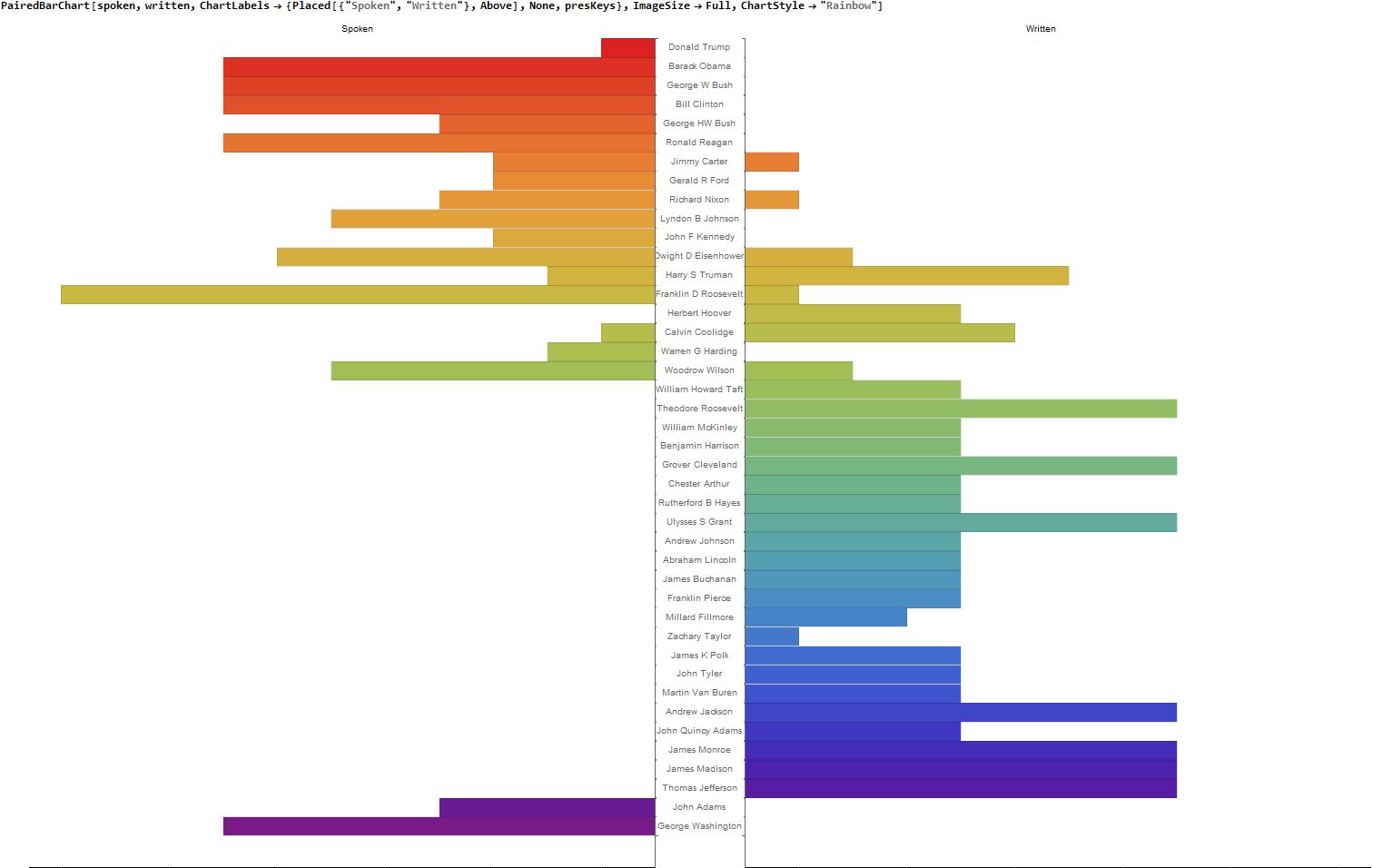
I noticed that there were also ebbs and flows of written vs. spoken speeches. To look at this, I tallied the spoken and written speeches of each president and put them into yet another list of associations.
i = 1;
presKeys = Keys[SOTUgrouped];
sORwTally = <||>;
While[i < Length[presKeys] + 1,
 indivTally =
  Tally[SOTUgrouped[presKeys[[i]]][[#]][[3]] & /@
    Range[Length[SOTUgrouped[presKeys[[i]]]]]];
 AppendTo[sORwTally, presKeys[[i]] -> indivTally];
 i++;
 ]
I decided that I wanted to visualize these in a PairedBarChart, so I placed them into two lists, spoken and written. I used a series of If statements to test for "spoken" and "written" tallies in my original list, and used 0 as a placeholder in the respective list if one or the other was not present for a specific president.
i = 1;
spoken = {};
written = {};
While[i < Length[presKeys] + 1,
 If[Length[sORwTally[presKeys[[i]]]] > 1,
  AppendTo[spoken, sORwTally[presKeys[[i]]][[1]][[2]]];
  AppendTo[written, sORwTally[presKeys[[i]]][[2]][[2]]];
  ,
  If[sORwTally[presKeys[[i]]][[1]][[1]] == "spoken",
   AppendTo[spoken, sORwTally[presKeys[[i]]][[1]][[2]]];
   AppendTo[written, 0];
   ,
   AppendTo[spoken, 0];
   AppendTo[written, sORwTally[presKeys[[i]]][[1]][[2]]];
   ]
  ];
 i++;
 ]
Using this complied list, it was simple to use the PairedBarChart. I experimented with ChartLabels to make the list a little more user-friendly and ChartStyle to give it a little extra color.
PairedBarChart[spoken, written,
 ChartLabels -> {Placed[{"Spoken", "Written"}, Above], None,
   presKeys}, ImageSize -> Full, ChartStyle -> "Rainbow"]
Comparing the average word count of each president (written, spoken, and total)
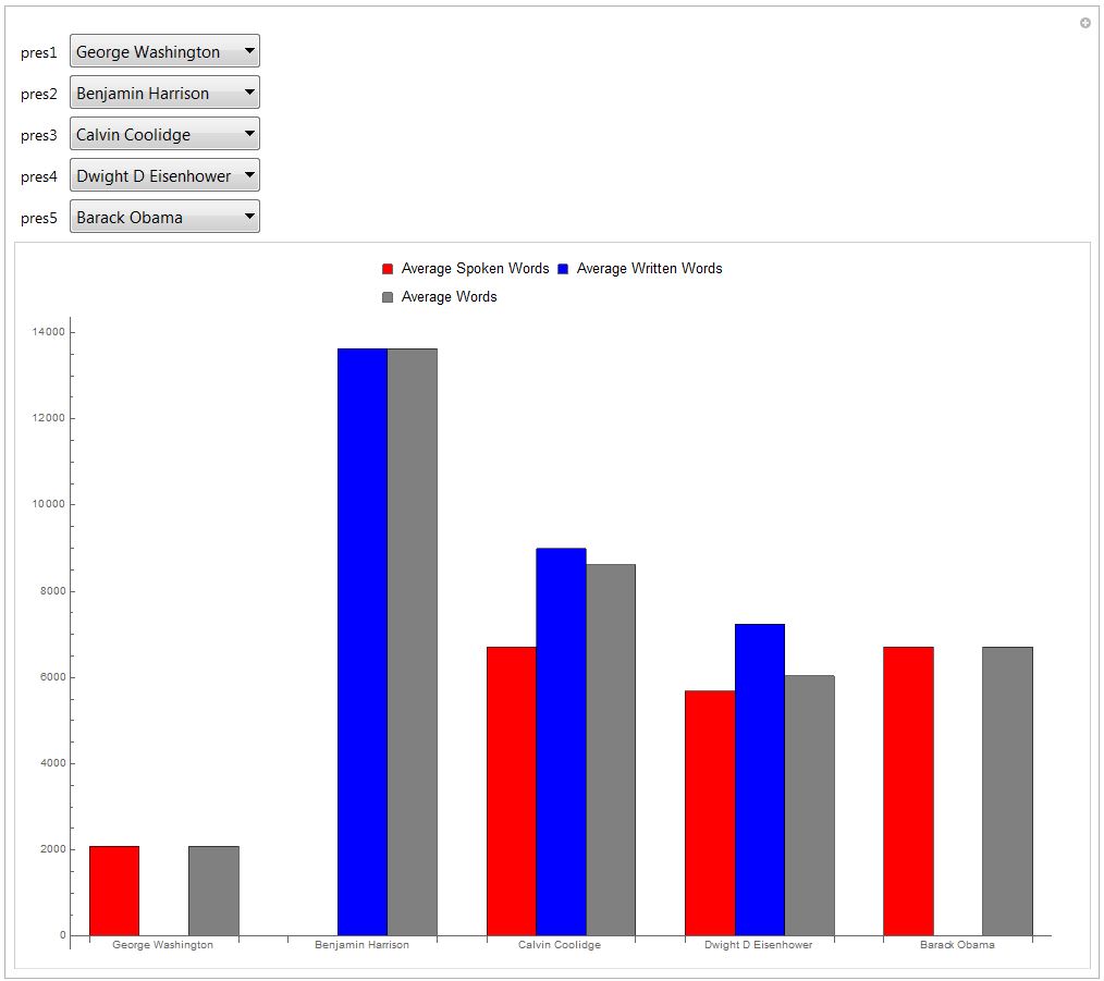
On a similar note, I thought it may be interesting to look at how word count of both spoken and written State of the Union addresses varied among presidents. I created a list of associations of presidents spoken, written, and total word count averages using a series of While loops. I added in some If loops to set the average to 0 instead of using the Mean function as I anticipated that some of the presidents would not have either an instance of "spoken" or "written" per what I found in my previous analysis.
i = 1;
presWordMeans = <||>;
While[i < Length[presKeys] + 1,
 j = 1;
 indS = {};
 indW = {};
 indAll = {};
 sORwList =
  SOTUgrouped[presKeys[[i]]][[#]][[3]] & /@
   Range[Length[SOTUgrouped[presKeys[[i]]]]];
 While[j < Length[sORwList] + 1,
  If[sORwList[[j]] == "spoken",
   AppendTo[indS, SOTUgrouped[presKeys[[i]]][[j]][[4]]],
   AppendTo[indW, SOTUgrouped[presKeys[[i]]][[j]][[4]]]
   ];
  AppendTo[indAll, SOTUgrouped[presKeys[[i]]][[j]][[4]]];
  j++;
  ];
 If[Length[indS] == 0,
  sMean = 0;,
  sMean = N[Mean[indS]];
  ];
 If[Length[indW] == 0,
  wMean = 0;,
  wMean = N[Mean[indW]];
  ];
 allMean = N[Mean[indAll]];
 AppendTo[presWordMeans, presKeys[[i]] -> {sMean, wMean, allMean}];
 i++;
 ]
Again, using the Manipulate function, I was able to make an interesting dynamic BarChart for users to compare this data across five different presidents. The Keys function again made it incredibly simple to create lists of presidents for the user to select from. ChartLegends were added to distinguish the different averages and ChartLabels were added to clarify which group corresponded to which president.
Manipulate[
 BarChart[{presWordMeans[pres1], presWordMeans[pres2],
   presWordMeans[pres3], presWordMeans[pres4], presWordMeans[pres5]},
  ImageSize -> Full, BarSpacing -> {0, 1},
  ChartLabels -> {{pres1, pres2, pres3, pres4, pres5}, None},
  ChartStyle -> {Red, Blue, Gray},
  ChartLegends ->
   Placed[{"Average Spoken Words", "Average Written Words",
     "Average Words"}, Above]],
 {pres1, presKeys},
 {pres2, presKeys},
 {pres3, presKeys},
 {pres4, presKeys},
 {pres5, presKeys}
 ]
Conclusion
I hope this has proven to be an interesting exploration of textual data analysis. I rarely get a chance to dive into the social sciences with Mathematica, so it was certainly a fun experience for me. This should be a good example of all the different input capabilities as well as the several types of data visualization tools that can be used with the Manipulate function.
Download the full notebook here or via the attached file! (Sorry guys, but you'll have to upload this year's data on your own!)
 Attachments: