Message Boards Message Boards

Climate Change in the United States

Attachments:
POSTED BY: John Shonder
12 Replies

The figure above is lacking the legend, which actually is a separate graphic: legend

POSTED BY: John Shonder

Does this help point you in the right direction?

legend = SwatchLegend[
   Automatic, {"0\[Degree]C", "1\[Degree]C", "2\[Degree]C", 
    "3\[Degree]C"}, 
   LegendMarkers -> 
    Graphics[{EdgeForm[Black], Opacity[1], Rectangle[]}], 
   LegendLabel -> "Temp \[Degree]C", 
   LegendFunction -> (Framed[#, RoundingRadius -> 5] &), 
   LegendMargins -> 5];
GeoRegionValuePlot[s, Frame -> True, FrameTicks -> None, 
 FrameLabel -> {"Bottom Title", "Left Title", "Top Title", 
   "Right Title"}, PlotLegends -> Placed[legend, Right]]

Title Climate Map

POSTED BY: Tim Laska

Thanks Tim, this helps a lot!

POSTED BY: John Shonder
Anonymous User
Anonymous User
Posted 5 years ago

I would be very interested to know if anyone can suggest faster, more compact or more readable methods of doing what I am doing here.

Not if you value your time in making such an alternate thing.

Maybe you should specify Hz if you need a framerate speed you are trying to reach.

You may experience delays with downloading map data from the wolfram server ... the answer there is to look into getting your own copy or speeding that up. It's pretty new how that all works and wolfram has been investigating ways to get the best of both worlds of convenience and options.

POSTED BY: Anonymous User
Posted 5 years ago

Hi John,

Nice analysis. I had to make a couple of changes to get it to work. Looks like the NOAA just has the most recent data on their FTP server. The latest data as of today is at ftp://ftp.ncdc.noaa.gov/pub/data/cirs/climdiv/climdiv-tmpcst-v1.0.0-20190408. I also had to change all of the Number in the SemanticImport to Real to avoid an odd error message:

MapThread::mptd: Object
Interpreter[Number][{0.00,-0.10,-0.20,0.20,-0.30,0.30,-0.40,0.40,-0.50,-0.60,0.60,-0.70,0.70,-0.80,0.80,-0.90,0.90,-1.00,1.00,10.00,-10.10,10.10,10.20,10.30,10.40,10.50,10.60,10.70,10.80,-10.90,10.90,1.10,11.00,11.10,11.20,11.30,11.40,11.50,11.60,11.70,-11.80,11.80,-11.90,11.90,-1.20,1.20,12.00,-12.10,12.10,12.20,<<731>>}] at position {2, 2} in
MapThread[Rule,{{0.00,-0.10,-0.20,0.20,-0.30,0.30,-0.40,0.40,-0.50,-0.60,0.60,-0.70,0.70,-0.80,0.80,-0.90,0.90,-1.00,1.00,10.00,-10.10,10.10,10.20,10.30,10.40,10.50,10.60,10.70,10.80,-10.90,10.90,1.10,11.00,11.10,11.20,11.30,11.40,11.50,11.60,11.70,-11.80,11.80,-11.90,11.90,-1.20,1.20,12.00,-12.10,12.10,12.20,<<731>>},Interpreter[Number][{<<1>>}]}]

has only 0 of required 1 dimensions.

Some observations

There is no need for ~Join~, associations implicitly join so this

tdata = tdata[
All, #~Join~<|"Region" -> ToExpression[StringTake[#Code, 3]], 
"Year" -> ToExpression[StringTake[#Code, -4]]|> &];

is equivalent to

tdata = tdata[
  All, <|#, "Region" -> ToExpression[StringTake[#Code, 3]], 
    "Year" -> ToExpression[StringTake[#Code, -4]]|> &]

Another way to do the mapping from Region number to State entity

stateRegionMap = EntityList[
  EntityClass["AdministrativeDivision", "ContinentalUSStates"]] // 
 AssociationThread[Range[Length[#]], #] &    

tdata = tdata[All, <|#, "StateName" -> stateRegionMap[#Region]|> &]
POSTED BY: Rohit Namjoshi

Thank you for those improvements Rohit.

POSTED BY: John Shonder
Posted 5 years ago

I would be very interested to know if anyone can suggest faster, more compact or more readable methods of doing what I am doing here.

I suppose the following code would qualify for "compact" (tho it can certainly be compacted further), but tho I find it readable, other people might have different opinions:

(* U.S. states as Entity[] objects *)
continentalStates = 
           EntityList[EntityClass["AdministrativeDivision", "ContinentalUSStates"]];

(* abbreviated month names *)
months = Table[DateString[d, "MonthNameShort"], {d, DateRange[{0, 1}, {0, 12}, "Month"]}];

(* import data as a Dataset and add headers *)
ds = SemanticImport["ftp://ftp.ncdc.noaa.gov/pub/data/cirs/climdiv/climdiv-tmpcst-v1.0.0-20190408",
                    PadRight[{"String"}, 13, "Real"]];
ds = ds[All, AssociationThread[Prepend[months, "CODE"], Range[13]]];

(* per OP, select data corresponding to the continental states... *)
continentalStateData =
           ds[Select[Between[FromDigits[StringTake[#CODE, 3]], {1, 48}] &], All];

(* ...and then select data up to the past year *)
tempHistorical =
    continentalStateData[Select[FromDigits[StringTake[#CODE, -4]] <
                                DateValue[Now, "Year"] &]]

(* compute the weighted mean of the monthly temperatures;
   note the syntax for LeapYearQ[]! *)
meanTempHistorical = tempHistorical[All, <|"State" :> (FromDigits[StringTake[#CODE, 3]] &), 
                                           "MeanAnnualTemperature" :> 
         With[{ml = Slot /@ months}, 
         Function[Mean[WeightedData[ml,
                  {31, 28 + Boole[LeapYearQ[{FromDigits[StringTake[#CODE, -4]]}]], 
                   31, 30, 31, 30, 31, 31, 30, 31, 30, 31}]]]]|>];

(* moving average of mean annual temperatures *)
gwData = KeyMap[Indexed[continentalStates, #] &,
                Normal[meanTempHistorical[GroupBy["State"],
                With[{ma = MovingAverage[#, 10]}, Indexed[ma, -1] - Indexed[ma, -100]] &,
                     "MeanAnnualTemperature"]]];

GeoRegionValuePlot[gwData, PlotLabel -> "Temperature Rise Over 100 Years", 
                   PlotLegends -> SwatchLegend[Automatic,
                      {"0 °C", "1 °C", "2 °C", "3 °C"}, LegendFunction -> "Frame",
                      LegendLabel -> "Temp, °C"]]

I'll let someone else post the resulting picture, since my version of gedanken Mathematica does not have picture-rendering ability.

POSTED BY: J. M.

Thanks to all who have contributed to improving this. Here's what the map looks like:

US Climate Change

POSTED BY: John Shonder

This representation implies that the climate obeys state boundaries, which is nonsense. I think a truer picture would result from creating a list of the centroids of the states, associating the temperature change data to these centroids, then create an Interpolation function bounded by the outer boundary of the US, then make a DensityPlot map of this interpolation, and then layer on the state boundaries if you must. You would hopefully eliminate goofy things like the jagged temperature change boundary across the central states.

This representation implies that the climate obeys state boundaries, which is nonsense.

In my experience maps like this are quite common, and most people know how to interpret them. The one below, for example. Despite the pronounced differences between states, I don't think anyone would conclude that tornadoes obey state boundaries.

Tornadoes per Square Mile by State

As for the rise in annual temperature, given data at a smaller scale one would not see such sharp boundaries between the states. For example, here is a map of temperature rise by Climate Division over a similar period. It looks to me like it is telling the same story as the map I made: marginal warming in the Deep South, and more warming in the East and the West. At this scale there are fewer sharp differences at state boundaries, but perhaps you will now conclude that climate obeys the boundaries of NOAA's climate divisions.

Temperature Rise by US Climate Division

POSTED BY: John Shonder

A public display of Eating your own dog food can be educational. Starting from the post by J.M. above, we can extract the Legend colours from the FullForm of the final plot. We test these as below:

SwatchLegend[{RGBColor[1.`, 0.92`, 0.5`], 
  RGBColor[1.`, 0.6688982203952127`, 0.24889822039521264`], 
  RGBColor[0.8933132970930611`, 0.34531930796514276`, 0.`] , 
  RGBColor[0.7`, 0.21`, 0.`]}, {"0 \[Degree]C", "1 \[Degree]C", 
  "2 \[Degree]C", "3 \[Degree]C"}, LegendFunction -> "Frame", 
 LegendLabel -> "Temp, \[Degree]C"]

We will need the bounding box for the continental states.

{{latmin, latmax}, {lonmin, lonmax}} = 
 GeoBounds[
  EntityClass["AdministrativeDivision", "ContinentalUSStates"]] 

Next add the state centroids to the Association. The list continentalStates was defined in the post by J.M. above.

Map[(gwData[#] = 
    Flatten[{ GeoPosition[#][[1]], 
      gwData[#]}]) &, continentalStates] ;    (* remap the gwData 
Association so each element contains the centroid's latitude,longitude,temperature. *)

 GeoGraphics[ GeoMarker /@ Normal[gwData ][[All, 2, {1, 2}]]  ,  
  GeoRange -> {{latmin, latmax}, {lonmin, lonmax}}, 
 GeoRangePadding -> None]  (* plot the state centroids *)

{Min[Normal[gwData ][[All, 2]]  [[All, 3]]]
 , Max[Normal[gwData ][[All, 2]]  [[All, 
    3]]]} (* this is the range of temperature changes in the data *)

We have temps outside the range used in the above plot's Legend. So we may have to extend our Legend because DensityPlot may clip. We add another legend value.

SwatchLegend[{RGBColor[1.`, 0.92`, 0.5`], 
  RGBColor[1.`, 0.6688982203952127`, 0.24889822039521264`], 
  RGBColor[0.8933132970930611`, 0.34531930796514276`, 0.`] , 
  RGBColor[0.7`, 0.21`, 0.`], 
  RGBColor[0.5`, 0.1`, 0.`]}, {"0 \[Degree]C", "1 \[Degree]C", 
  "2 \[Degree]C", "3 \[Degree]C", "4 \[Degree]C"}, 
 LegendFunction -> "Frame", LegendLabel -> "Temp, \[Degree]C"]

We create an Interpolation function f that accepts {long, lat} values and returns temperatures.

f = Interpolation[
  Map[{{#[[2]], #[[1]]}, #[[3]]} &, Normal[gwData ][[All, 2]] ], 
  InterpolationOrder -> 
   1] (* we have to reverse {lat,long} order in argument list to get \
sensible alignment of the plot *)

region =   
 Rectangle[{lonmin, latmin}, {lonmax, 
   latmax} ] ; (* define a Region that includes all the continental \
states. Use this to define the DensityPlot *)

   plot = DensityPlot[ f[u, v] , {u, v} \[Element] region, 
     ColorFunctionScaling -> False, 
     ColorFunction -> (Blend[ {{0, RGBColor[1.`, 0.92`, 0.5`]}, {1, 
           RGBColor[1.`, 0.6688982203952127`, 0.24889822039521264`]}, {2,
            RGBColor[0.8933132970930611`, 0.34531930796514276`, 
            0.`]} , {3, RGBColor[0.7`, 0.21`, 0.`]},
          {4, RGBColor[0.5`, 0.1`, 0.`]}}, #] &),  
      Frame -> False, AspectRatio -> 1, PlotRangePadding -> None, 
     ImagePadding -> None, PlotRange -> All]  (* remove labels and axes *)

Rasterize this plot and insert it as a GeoImage into a GeoGraphics.

 pp = GeoGraphics[{GeoStyling[{"GeoImage",  
      Rasterize[  plot, RasterSize -> 200]}], EdgeForm[Thin], 
    Polygon[Entity["Country", "UnitedStates"]]}, 
   PlotLabel -> "Temperature Rise Over 100 Years",
   Epilog -> {Inset[
      SwatchLegend[{RGBColor[1.`, 0.92`, 0.5`], 
        RGBColor[1.`, 0.6688982203952127`, 0.24889822039521264`], 
        RGBColor[0.8933132970930611`, 0.34531930796514276`, 0.`] , 
        RGBColor[0.7`, 0.21`, 0.`],
        RGBColor[0.5`, 0.1`, 0.`]}, {"0 \[Degree]C", "1 \[Degree]C", 
        "2 \[Degree]C", "3 \[Degree]C", "4 \[Degree]C"}, 
       LegendFunction -> "Frame", 
       LegendLabel -> "Temp, \[Degree]C"] , {Right, Bottom}, {Right, 
       Bottom}]}]  ;
states = GeoGraphics[ {GeoStyling[Opacity[0]], EdgeForm[Thin], 
    Polygon[EntityClass["AdministrativeDivision", 
      "ContinentalUSStates"]]}, GeoBackground -> "CountryBorders"]  ;
Show[pp, states] (* add state boundaries to the Density plot *)

Interpolated Temperature Rise

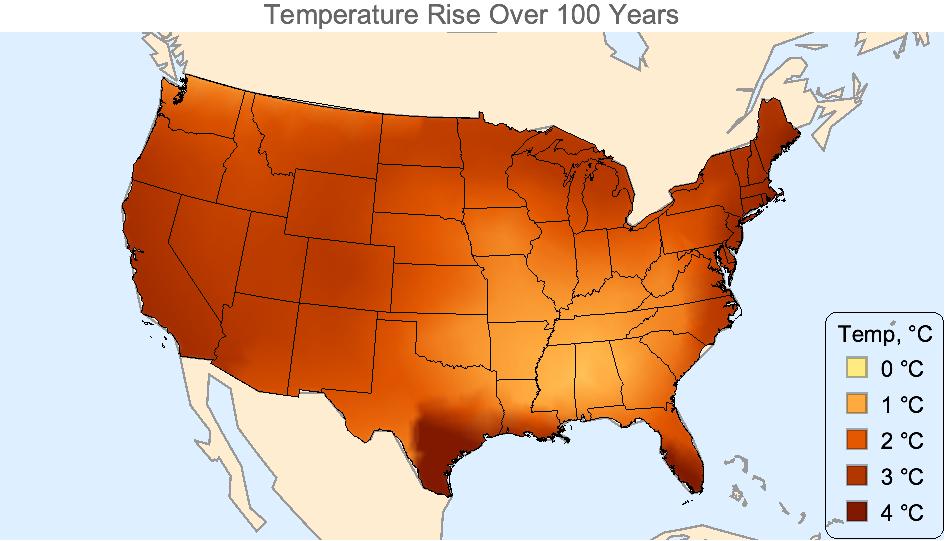
I do not fully understand GeoStyling[{"GeoImage", ...}] so am guessing that the Interpolation function has invented the hot spot on the Texas Gulf coast because extrapolation was used (south and east of the centroid). In California, I don' t know what happened, except California appears cooler than it should be.

So although very pretty, this map is even more nonsensical than the original (where climate obeyed state boundaries), and demonstrates that Interpolation outside the convex hull of the state centroids is dangerous. We need more data points.

I don't know if anyone is trying to use the geospatial statistics method? For example, IDW(Inverse Distance Weighted) or Kriging. I use an example obtained on the Internet to try to make the IDW method.

Attachments:
POSTED BY: Tsai Ming-Chou
Reply to this discussion
Community posts can be styled and formatted using the Markdown syntax.
Reply Preview
Attachments
Remove
or Discard

Group Abstract Group Abstract