A new twitter storm was initiated by the US President Donald Trump today when referring to one of his critics in Congress, Representative Elijah Cummings. 
It begs the question to explore which are actually the most dangerous cities in the United States.
Crime statistics in the US are compiled by the Federal Bureau of Investigations. The Uniform Crime Reporting Program (UCR) is a nationwide, voluntary effort by nearly 18000 law enforcement agencies that report back data on crimes.
Using the table-building tool we proceeded to download the police reports of all agencies in the US for the year 2014.
Data Preparation
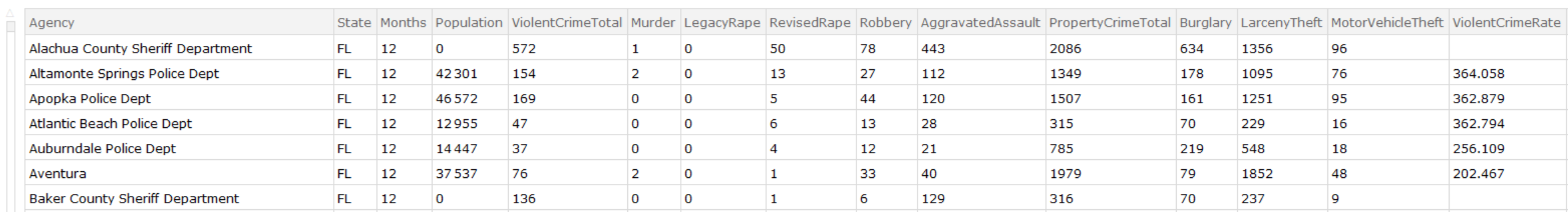
All files downloaded were located in a single directory for mass processing. We've identified that the records of interest have 24 fields available. We'll use this knowledge to select the rows of interest.
files= FileNames[All, "C:\\Users\\user\\Downloads\\Local Crime"];
vals = Flatten[
   Table[Cases[Import[files[[n]], "Data"],
     a_ /; MatchQ[Length@a, 24]], {n, Length@files}], 1];
Keys for our dataset have beend defined as follows.
keys = {"Agency", "State", "Months", "Population",
   "ViolentCrimeTotal", "Murder", "LegacyRape", "RevisedRape",
   "Robbery", "AggravatedAssault", "PropertyCrimeTotal", "Burglary",
   "LarcenyTheft", "MotorVehicleTheft", "ViolentCrimeRate",
   "MurderRate", "LegacyRapeRate", "RevisedRapeRate", "RobberyRate",
   "AggravatedAssaultRate", "PropertyCrimeRate", "BurglaryRate",
   "LarcenyTheftRate", "MotorVehicleTheftRate"};

Table[{n, keys[[n]]}, {n, Length@keys}]
({{1, "Agency"}, {2, "State"}, {3, "Months"}, {4, "Population"}, {5,
  "ViolentCrimeTotal"}, {6, "Murder"}, {7, "LegacyRape"}, {8,
  "RevisedRape"}, {9, "Robbery"}, {10, "AggravatedAssault"}, {11,
  "PropertyCrimeTotal"}, {12, "Burglary"}, {13, "LarcenyTheft"}, {14,
  "MotorVehicleTheft"}, {15, "ViolentCrimeRate"}, {16,
  "MurderRate"}, {17, "LegacyRapeRate"}, {18, "RevisedRapeRate"}, {19,
   "RobberyRate"}, {20, "AggravatedAssaultRate"}, {21,
  "PropertyCrimeRate"}, {22, "BurglaryRate"}, {23,
  "LarcenyTheftRate"}, {24, "MotorVehicleTheftRate"}}*)

valsNew = vals;
valsNew[[All, 3 ;; 14]] =
  ToExpression[vals[[All, 3 ;; 14]]] /. Null -> 0;
valsNew[[All, 16 ;;]] =
  ToExpression[vals[[All, 16 ;;]]] /. Null -> Missing["NotAvailable"];
By analyzing the data we noticed that several errors needed to be corrected. Some totals were mising, and rates were missing from the downloaded table. Thus we used the regenerated values using the details in the columns.
Recalculate Totals
valsNew[[All, 5]] = Total /@ valsNew[[All, 6 ;; 10]];
valsNew[[All, 11]] = Total /@ valsNew[[All, 12 ;; 14]];
Recalculate crime rates for those records where a population is given.
population = Flatten[Position[valsNew[[All, 4]], a_ /; a > 0]];
valsNew[[population, 15 ;;]] =
  N[100000 valsNew[[population, 5 ;; 14]]/valsNew[[population, 4]]];
Dataset
We are now ready to create the dataset.
usCrimes2014 = Dataset[AssociationThread[keys, #] & /@ valsNew]
Analysis
Let's filter out the crime statistics for those police departments for which the population is greater than 400,000 people and chart property crime rates (burglaries, larceny, etc) vs violent crime rates (murder, rape, aggravated assault, etc).
BubbleChart[
 usCrimes2014[Select[#Population >= 400000 &],
  Callout[{#PropertyCrimeRate, #ViolentCrimeRate, #Population},
    With[{pos = StringPosition[#Agency, "Police"]},
     Style[If[pos == {}, #Agency,
       StringTake[#Agency, First@First@pos - 2]], FontSize -> 8]]] &],
  PlotTheme -> "Detailed",
 FrameLabel -> {"Property Crime Rate (per 100k)",
   "Violent Crime Rate (per 100k)"}, PlotTheme -> "Detailed",
 PlotLabel -> "Crime Rates by Policy Department (2014)",
 AspectRatio -> 1/3, ImageSize -> Full]
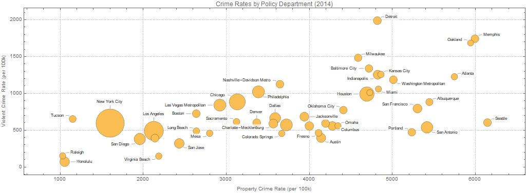
Baltimore is in the top 5 big cities with the worst violent crime rates (top place goes to Detroit's police department territory), and in the top 15 worst with regards to property crimes (Seattle Police Department has the highest rate in property crime).
Dataset is attached to the posting for further analysis by the reader.
 Attachments:


