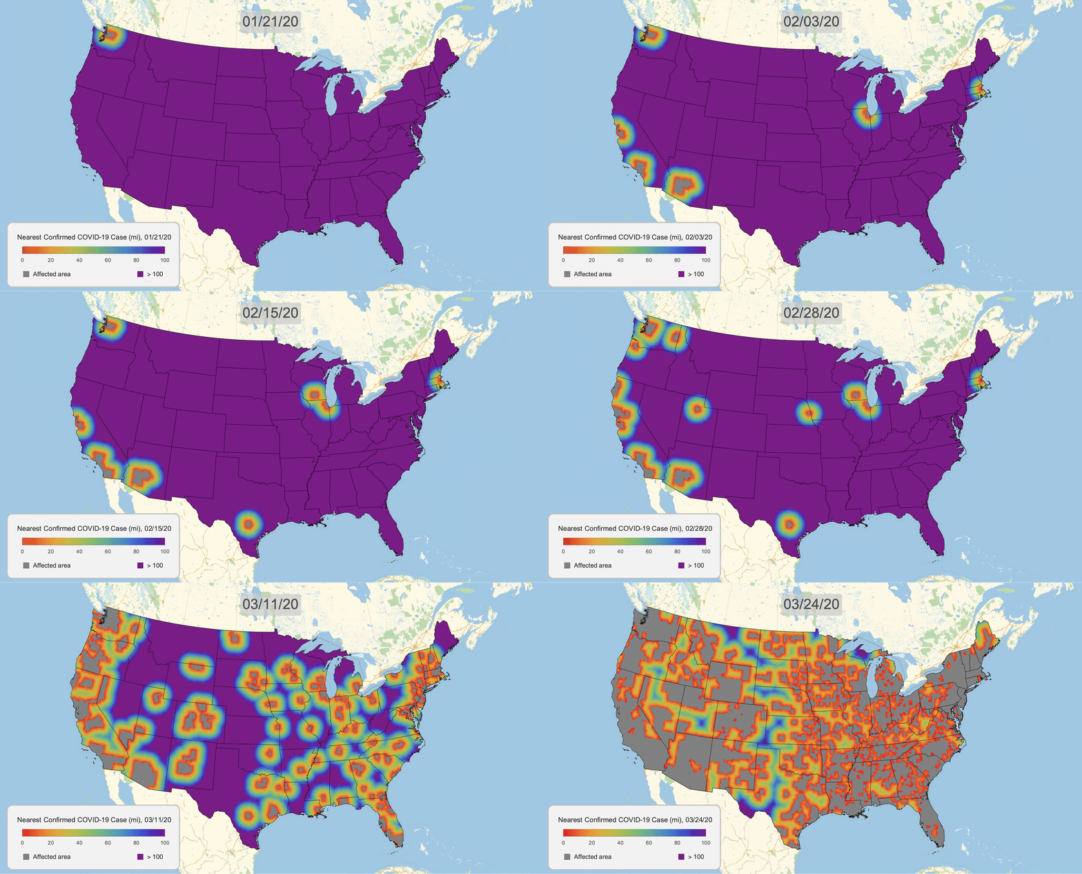
The New York Times recently published COVID-19 time series data for each US county. This gives us a very granular look at the spread of the illness over time. This will let us approximate the distance to the nearest confirmed COVID-19 case for any given location in the US.
To start this task, first we import the data, canonicalize each time series to start on Jan 21, and only keep the lower 48 states:
COVID19CountyData = ResourceFunction["NYTimesCOVID19Data"]["USCountiesTimeSeries"];

COVID19CountyData = COVID19CountyData[All, "Cases",
   TimeSeries[TimeSeriesInsert[#, {DateObject[{2020, 1, 20}], 0}], ResamplingMethod -> {"Interpolation", InterpolationOrder -> 0}] &];

COVID19CountyData = COVID19CountyData[KeySelect[!MissingQ[#] && !MatchQ[#, Entity[_, {_, "Alaska" | "Hawaii", _}]] &]];
Next we'll sample points in the US by discretizing its polygon, and then interpolating distances from these samples:
usstates = EntityClass["AdministrativeDivision", "ContinentalUSStates"];
usa = RegionUnion[BoundaryDiscretizeGraphics /@ usstates["Polygon"][[All, All, 1]]];
usatri = DiscretizeRegion[usa, MaxCellMeasure -> .05];
usasamp = GeoPosition /@ MeshCoordinates[usatri];
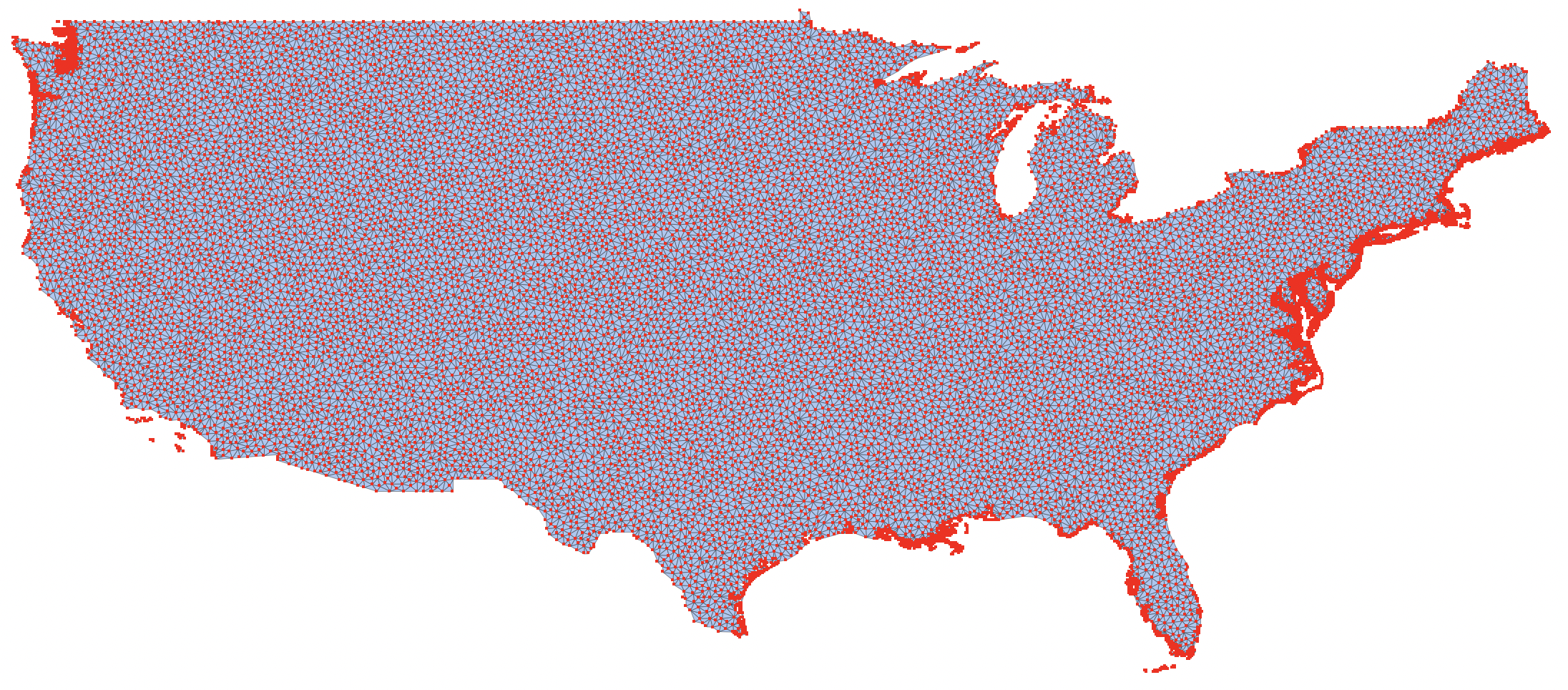
Here are the points we'll be sampling from:
MeshRegion[TransformedRegion[usatri, ReflectionTransform[{1, 0}]@*RotationTransform[π/2]], MeshCellStyle -> {0 -> {PointSize[Small], Red}, 1 -> {Thin, Black}}]

Here's the GraphicsComplex we'll be adding VertexColors to:
usagcomp = GraphicsComplex[
  GeoPosition[MeshCoordinates[usatri]],
  MeshCells[usatri, 2, "Multicells" -> True]
];
For each point, to find the GeoDistance to the nearest affected county, we'll approximate by finding the nearest GeoPosition of the county polygons. This will speed up calculations.
countypolys = EntityValue[Normal[Keys[COVID19CountyData]], "Polygon", "EntityAssociation"];
Finally, we have a function that takes in a date, finds all counties that have confirmed cases then, uses their polygons to find distances to each point we chose in the US, then creates a GeoDistance heat map:
COVID19DistanceMap[date_DateObject?DateObjectQ] :=
  Block[{counties, polys, coords, dists, gcomp, map, legend},
    counties = COVID19CountyData[Select[#[date] > 0&]];

    polys = Lookup[countypolys, Normal[Keys[counties]]];
    coords = GeoPosition /@ Join @@ Cases[polys, _List?MatrixQ, ∞];

    coords = PositionIndex[Counts[coords]][1];
    dists = Clip[QuantityMagnitude[Nearest[coords -> "Distance", usasamp][[All, 1]], "Miles"], {0., 100.}];

    gcomp = Append[usagcomp, VertexColors -> ColorData[{"Rainbow", {-100, 0}}] /@ Minus[dists]];

    map = GeoGraphics[
      {
        GeoStyling[Opacity[1]], gcomp,
        {Gray, polys},
        {EdgeForm[Black], FaceForm[], Polygon[usstates]}
      },
      ImageSize -> 1024
    ];

    legend = makeLegend[date];

    Legended[map, Placed[legend, {0.1725, 0.125}]]
]

makeLegend[date_] :=
  Framed[
    Column[{
      BarLegend[{ColorData[{"Rainbow", "Reversed"}][.01#]&, {0, 100}},
        LegendLayout -> "Row", ImageSize -> 300, LegendLabel -> Style["\[ThinSpace]   Nearest Confirmed COVID\[Hyphen]19 Case (mi), " <> DateString[date, {"Month","/","Day","/","YearShort"}], 13, GrayLevel[0.2]]],
      Row[{Spacer[24],
        SwatchLegend[{Gray, ColorData["Rainbow", 0]}, {"Affected area", "> 100"}, LegendMarkerSize -> 13, LabelStyle -> GrayLevel[0.2], LegendLayout -> "Row", Spacings -> {0.5, 10.5}]}]
    },
    Spacings -> 0],
  Background -> GrayLevel[0.95],
  RoundingRadius -> 10,
  FrameStyle -> {AbsoluteThickness[1.5], GrayLevel[0.75]},
  FrameMargins -> {{0, 10}, {10, 15}}
]
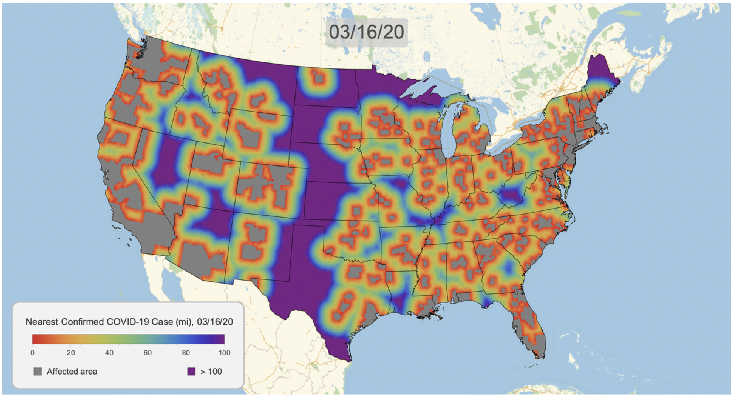
Here's the result for March 16, 2020. Notice that we clip the distance at 100 miles. This will give a consistent scale over time.
COVID19DistanceMap[DateObject[{2020, 3, 16}]]

We can now create a graphic for each day and export as a gif. Note that this is somewhat time consuming, but multiple kernels help.
frames = ParallelMap[
  Rasterize[COVID19DistanceMap[#]] &,
  DateRange[DateObject[{2020, 1, 21}], DateObject[{2020, 3, 24}]],
  Method -> "FinestGrained"
];

Export["covid19_distance_map.gif", frames,
  AnimationRepetitions -> ∞,
  "DisplayDurations" -> Append[ConstantArray[.2, Length[frames] - 1], 3]];