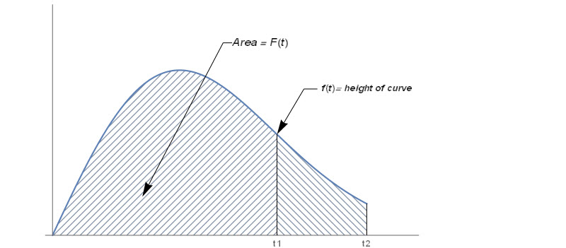
NIST's engineering statistics handbook is one of my most frequently viewed source for any applied mathematical topic and examples. In the section of reliability analysis, I spotted this graph. I can use HatchFilling function to create a similar one in Mathematica
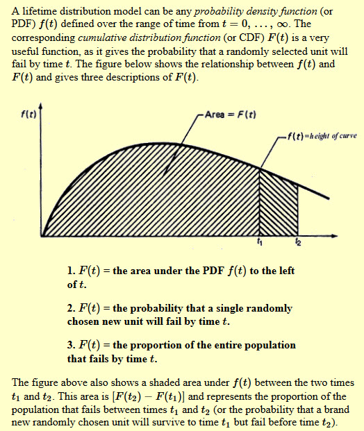
First lets break the plot into two regions
Left region
plt1 = Plot[PDF[WeibullDistribution[2, 2], x], {x, 0, 2.5},
    PlotRange -> {0, 0.6}, Filling -> Axis,
    FillingStyle -> HatchFilling[]]
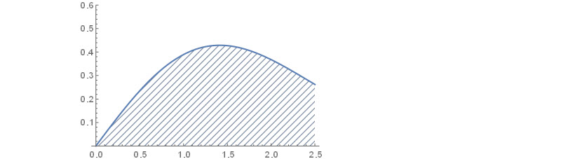
Right region. We add one argument into HatchFilling to generate stripes with 135 degree.
plt2 = Plot[PDF[WeibullDistribution[2, 2], x], {x, 2.5, 3.5},
  PlotRange -> {0, 0.6}, Filling -> Axis,
  FillingStyle -> HatchFilling[3 \[Pi]/4]]
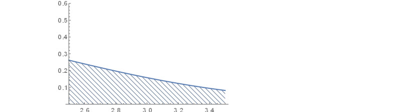
I can also set up the right hand side boundary for each plot manually:
bound1 = PDF[WeibullDistribution[2, 2], 2.5];
bound2 = PDF[WeibullDistribution[2, 2], 3.5];
Now we put two plots together and add labels at customized locations
Show[plt1,plt2,PlotRange-> {{0,4},{0,0.6}},Epilog-> {Style[Line[{
         {{2.5,0},{2.5,bound1}},
         {{3.5,0},{3.5,bound2}}}],Medium],
         Text["Area = F(t)",{2.31,0.5},BaseStyle->{12,Italic}],
         Text["f(t)= height  of curve ",{3.5,0.38},BaseStyle->{10,Italic}],
         Arrow[{{2,0.5},{1.9,0.5},{1,0.1}}],
         Arrow[{{2.95,0.38},{2.8,0.38},{2.5,bound1}}]
    },Ticks-> {{{2.5,"t1"},{3.5,"t2"}},None}]
Other Tips
 Attachments:


