Message Boards Message Boards

COVID19 in California: data structuring and visualizations

MODERATOR NOTE: coronavirus resources & updates: https://wolfr.am/coronavirus


enter image description here

POSTED BY: Mads Bahrami
6 Replies

enter image description here -- you have earned Featured Contributor Badge enter image description here Your exceptional post has been selected for our editorial column Staff Picks http://wolfr.am/StaffPicks and Your Profile is now distinguished by a Featured Contributor Badge and is displayed on the Featured Contributor Board. Thank you!

POSTED BY: Moderation Team

Yes, if your needs are varying counties on an almost daily basis then building a user interface is warranted. Otherwise if you are interested in more or less the same counties every couple of weeks then batch output like this works:

enter image description here

POSTED BY: Richard Frost
Posted 3 years ago

I used the functions to retrieve data for my county. Everything worked fine until the recent surge. On a plot of deaths the latest data was not shown but the plot shading was extended from the last point at a constant level. With help from Wolfram support I learned one had to add ,PlotRange -> Full option to DateListPlot. That fixed the problem.

Attachment

Attachment

Attachments:
POSTED BY: Douglas Kubler

You can get the data directly by using this resource function: https://resources.wolframcloud.com/FunctionRepository/resources/CaliforniaCOVID19Data/ For example:

ResourceFunction["CaliforniaCOVID19Data"]["Cases"]
POSTED BY: Mads Bahrami

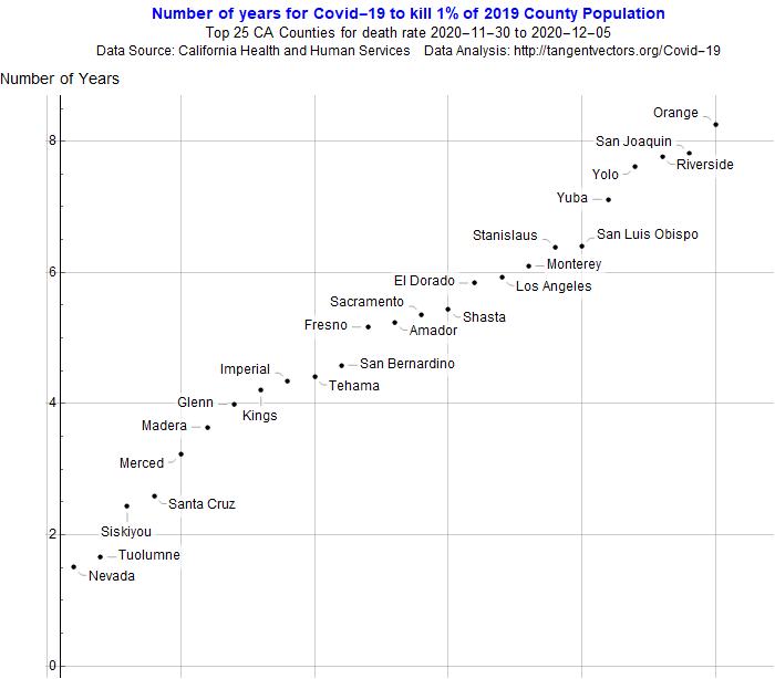
Hi Mads! I see you're just a short jump up the road in Los Angeles. We are lucky to have such rich sources of data here at the State, County, and Municipal levels. One way to help residents understand it is in terms of how fast it's affecting their population. Here's an example with death rates, but I think you could adapt the idea to infection rates:
enter image description here

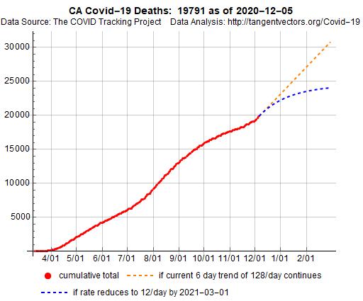
Another approach that seems work are charts of actual data with modeled projections - one portraying the current trend and another with a very optimistic trend:
enter image description here

POSTED BY: Richard Frost
Posted 3 years ago

That's a nice source but 56 charts are overwhelming. I wanted to see one or a few counties individually. Digging deeper I saw the counties are Entities so my question is how allow a county to be selected as a user option, text name or otherwise.

POSTED BY: Douglas Kubler
Reply to this discussion
Community posts can be styled and formatted using the Markdown syntax.
Reply Preview
Attachments
Remove
or Discard

Group Abstract Group Abstract