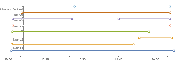
When processing usage logs from an online conferencing platform, I wanted to plot time intervals in H:MM format in TimelinePlot which shows the following issues:
- It does not display the intervals consistently i.e. one timeline is grouped whereas the other is stacked in the same plot. The display cannot be changed in PlotLayout.
- The vertical axis cuts through the timelines i.e. are not aligned. Manually setting PlotRange.did not help.
As an example, I provide the data to generate the TimelinePlot. When I replace the intervals by e.g. DateObject[{year}] format, all works fine.
Is there an issue with the TimelinePlot or I am missing something? Thanks.
<|"Name1" -> {Interval[{DateObject[{2021, 10, 15, 19, 1, 18.`},
       "Instant", "Gregorian", -5.`],
      DateObject[{2021, 10, 15, 20, 7, 28.`}, "Instant",
       "Gregorian", -5.`]}]},
  "Name2" -> {Interval[{DateObject[{2021, 10, 15, 19, 1, 29.`},
       "Instant", "Gregorian", -5.`],
      DateObject[{2021, 10, 15, 19, 51, 3.`}, "Instant",
       "Gregorian", -5.`]}],
    Interval[{DateObject[{2021, 10, 15, 19, 53, 29.`}, "Instant",
       "Gregorian", -5.`],
      DateObject[{2021, 10, 15, 20, 6, 36.`}, "Instant",
       "Gregorian", -5.`]}]},
  "name3" -> {Interval[{DateObject[{2021, 10, 15, 19, 1, 30.`},
       "Instant", "Gregorian", -5.`],
      DateObject[{2021, 10, 15, 19, 1, 39.`}, "Instant",
       "Gregorian", -5.`]}],
    Interval[{DateObject[{2021, 10, 15, 19, 1, 40.`}, "Instant",
       "Gregorian", -5.`],
      DateObject[{2021, 10, 15, 19, 57, 19.`}, "Instant",
       "Gregorian", -5.`]}]},
  "name4" -> {Interval[{DateObject[{2021, 10, 15, 19, 1, 41.`},
       "Instant", "Gregorian", -5.`],
      DateObject[{2021, 10, 15, 19, 1, 55.`}, "Instant",
       "Gregorian", -5.`]}],
    Interval[{DateObject[{2021, 10, 15, 19, 1, 56.`}, "Instant",
       "Gregorian", -5.`],
      DateObject[{2021, 10, 15, 20, 5, 59.`}, "Instant",
       "Gregorian", -5.`]}]},
  "name5" -> {Interval[{DateObject[{2021, 10, 15, 19, 1, 55.`},
       "Instant", "Gregorian", -5.`],
      DateObject[{2021, 10, 15, 19, 26, 1.`}, "Instant",
       "Gregorian", -5.`]}],
    Interval[{DateObject[{2021, 10, 15, 19, 45, 1.`}, "Instant",
       "Gregorian", -5.`],
      DateObject[{2021, 10, 15, 20, 5, 55.`}, "Instant",
       "Gregorian", -5.`]}]},
  "name6" -> {Interval[{DateObject[{2021, 10, 15, 19, 5, 22.`},
       "Instant", "Gregorian", -5.`],
      DateObject[{2021, 10, 15, 19, 5, 31.`}, "Instant",
       "Gregorian", -5.`]}],
    Interval[{DateObject[{2021, 10, 15, 19, 5, 32.`}, "Instant",
       "Gregorian", -5.`],
      DateObject[{2021, 10, 15, 20, 5, 58.`}, "Instant",
       "Gregorian", -5.`]}]},
  "Charles Packard" -> {Interval[{DateObject[{2021, 10, 15, 19, 27,
        2.`}, "Instant", "Gregorian", -5.`],
      DateObject[{2021, 10, 15, 20, 5, 54.`}, "Instant",
       "Gregorian", -5.`]}]}|>;
TimelinePlot[%]
 Attachments:


