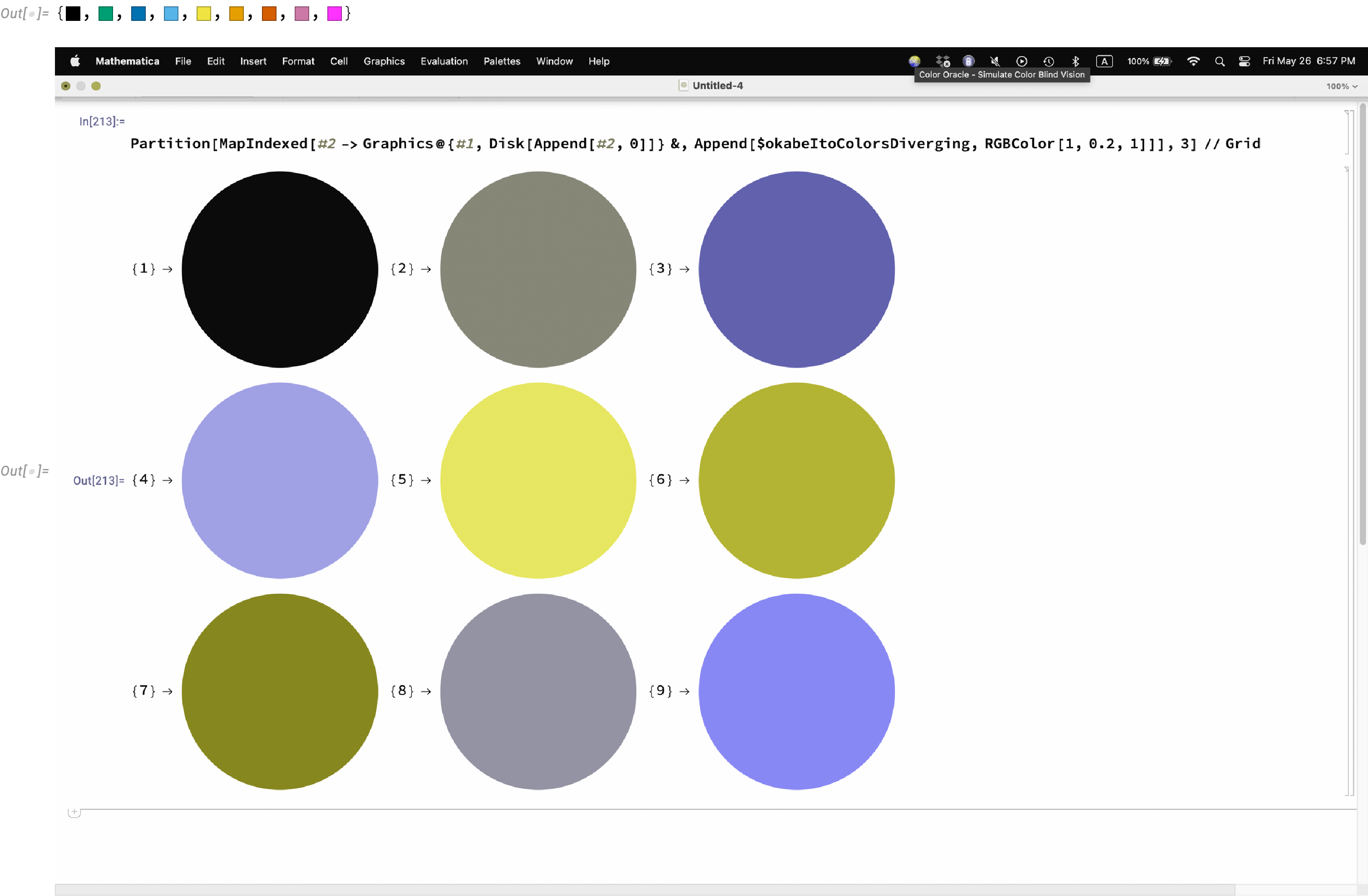
Since this community encourages discussions, I post this in hopes of furthering the occasional interest shown in color accessibility. There were two WSS22 projects on it [(1), (2)], and there's old 2017 post that contains code for analyzing color accessibility that unfortunately relies on internal data that is no longer present in Mathematica.
Some time ago I had a color-blind student, and it made me think about producing color-accessible notebooks for class. Somewhere I found the Okabe-Ito color scheme among other things. I copy-pasted the table below from some web site, long-forgotten I'm sorry to say. In any case, from time to time, such at the beginning of the COVID pandemic, I'd look further into color accessibility. I usually ended somewhat frustrated. There are a number of tools for simulating and measuring color accessibility. Unfortunately they tend to disagree. One is warned how difficult it is and of mistakes commonly made. Web sites tend not to be dated or have a log of when they are updated. Almost everyone says, in effect, "I know what I'm doing. Others might, or might not; so just believe me." But which one do you choose. So I find it difficult to find authoritative and reliable information. I hope it's out there, and I hope someone knows it. I'm sure it's simple once you have a trustworthy source.
I don't know what I'm doing really. I'm sort of a weekend hobbyist. I'm sure someone with background in design and color accessibility could do a much better job much more quickly. I put together a color scheme for the items in the Appearance panel of the Preferences dialog. It's easy to load. It's easy to reset (there's a reset button in the Preferences dialog). Or you could save your current preferences and use them to reset. See below for more.
I based the colors on the Okabe-Ito palette:
$okabeItoData = Internal`PartitionRagged[#, {3, 3, 1, 4}] & /@
   Partition[
    {"R,G,B (0-255)", , , "R,G,B (0-1)", , , "Hex", "C,M,Y,K (%)", , , ,
     0, 0, 0, 0, 0, 0 , "#000000", 0, 0, 0, 100,
     230, 159, 0, 0.902, 0.624, 0, "#E69F00" , 0, 50, 100, 0,
     86, 180, 233, 0.337, 0.706, 0.914, "#56B4E9", 80, 0, 0, 0,
     0, 158, 115, 0, 0.620, 0.451 , "#009E73", 97, 0, 75, 0,
     240, 228, 66, 0.941, 0.894, 0.259, "#F0E442", 10, 5, 90, 0,
     0, 114, 178, 0, 0.447, 0.698, "#0072B2" , 100, 50, 0, 0,
     213, 94, 0, 0.835, 0.369, 0, "#D55E00", 0, 80, 100, 0,
     204, 121, 167, 0.8, 0.475, 0.655, "#CC79A7", 10, 70, 0, 0},
    11];
$okabeItoColors = RGBColor @@@ $okabeItoData[[2 ;;, 2]]; (* Drop Black *)

$okabeItoColorsDiverging = $okabeItoColors[[{1, 4, 6, 3, 5, 2, 7, 8}]]

{RGBColor[0, 0, 0], RGBColor[0, 0.62`, 0.451`],
 RGBColor[0, 0.447`, 0.698`], RGBColor[0.337`, 0.706`, 0.914`],
 RGBColor[0.941`, 0.894`, 0.259`], RGBColor[0.902`, 0.624`, 0],
 RGBColor[0.835`, 0.369`, 0], RGBColor[0.8`, 0.475`, 0.655`]}
I tweaked some of them as I built the color scheme. I used Color Oracle to evaluate a scheme under the different types of colorblindness. As I said above, I don't know how reliable this tool is, but it is semi-easy to use. At some point, my sensibilities get burned out and I think any difference in color is a good difference. Later I'll wonder, why did I think that would be acceptable. There are lots of combinations that could be checked, and I don't have a good plan for systematically evaluating a change. I'm sharing here in case someone wants to pick up the ball and run with it. I don't think I can get a good result by myself.
Deuteranopia (a form of red-green) colorblindness is the most common. So one should avoid red and green meaning different things (see the default debugger highlighting for the worst possible example). Red is used extensively, since it is a traditional warning signal; however, it is not a particularly good color-accessible one. Magenta seems better to me, but I don't know how it appears to a colorblind person used to seeing red warnings and dealing with the world 24/7, year-in and year-out, in their normal way.
I substituted the red-brown Okabe-Ito color for the red in many of the Wolfram-Language preferences. Because I'm not red-green colorblind and that seemed a natural choice to. But it might not seem a good choice to a colorblind person. In one case, "SyntaxErrorStyle", I used magenta, just to see and to show it. I rather liked the magenta instead of red, but, as I said, I'm not colorblind.
Here are the colors for reference, including an image of them under the deuteranopia filter of Color Oracle.
Append[$okabeItoColorsDiverging, RGBColor[1, 0.2, 1]]

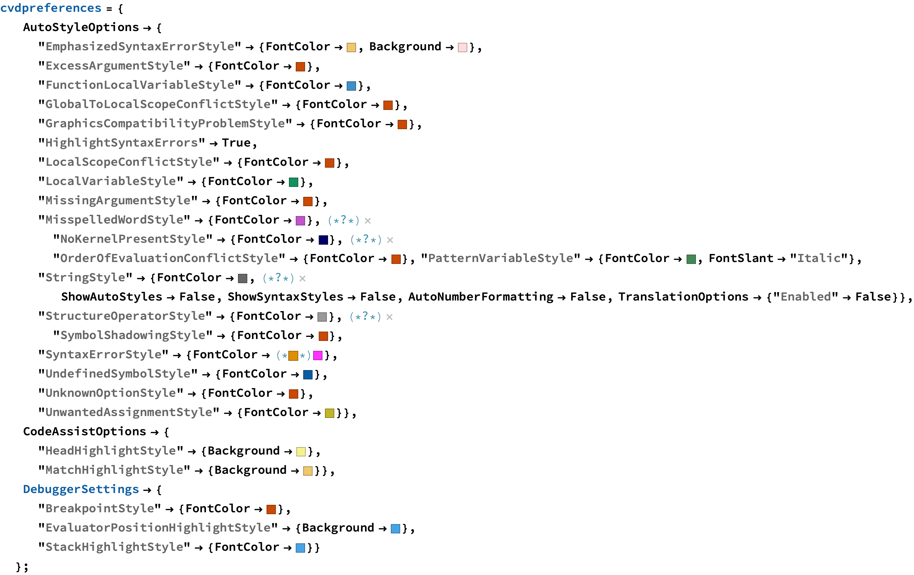
Here is a preference set for colors that seem to show differences for all three types of colorblindness, where there are significant differences in the defaults. Many of the default preference colors are are the same or nearly the same.
cvdpreferences = {
   AutoStyleOptions -> {
     "EmphasizedSyntaxErrorStyle" -> {FontColor -> RGBColor[
        0.936263065537499, 0.7788662546730755, 0.42481116960402837`],
       Background -> RGBColor[1, 0.86, 0.86]},
     "ExcessArgumentStyle" -> {FontColor -> RGBColor[
        0.7864194705119402, 0.28537422751201647`, 0.02021820401312276]},
     "FunctionLocalVariableStyle" -> {FontColor -> RGBColor[
        0.24643320363164722`, 0.5645075150682841, 0.7797360189211872]},
     "GlobalToLocalScopeConflictStyle" -> {FontColor -> RGBColor[
        0.7864194705119402, 0.28537422751201647`, 0.02021820401312276]},
     "GraphicsCompatibilityProblemStyle" -> {FontColor -> RGBColor[
        0.7864194705119402, 0.28537422751201647`, 0.02021820401312276]},
     "HighlightSyntaxErrors" -> True,
     "LocalScopeConflictStyle" -> {FontColor -> RGBColor[
        0.7864194705119402, 0.28537422751201647`, 0.02021820401312276]},
     "LocalVariableStyle" -> {FontColor -> RGBColor[
        0.07412832837415122, 0.5640497444113832, 0.37123674372472726`]},
     "MissingArgumentStyle" -> {FontColor -> RGBColor[
        0.7864194705119402, 0.28537422751201647`, 0.02021820401312276]},
     "MisspelledWordStyle" -> {FontColor -> RGBColor[0.76, 0.33, 0.8]},(*?*)
     "NoKernelPresentStyle" -> {FontColor -> RGBColor[0., 0., 0.4]},(*?*)
     "OrderOfEvaluationConflictStyle" -> {FontColor -> RGBColor[
        0.7864194705119402, 0.28537422751201647`, 0.02021820401312276]},
     "PatternVariableStyle" -> {FontColor -> RGBColor[
        0.26300450141145953`, 0.5369954985885405, 0.3450064850843061],
       FontSlant -> "Italic"},
     "StringStyle" -> {FontColor -> GrayLevel[0.4],(*?*)
       ShowAutoStyles -> False, ShowSyntaxStyles -> False,
       AutoNumberFormatting -> False,
       TranslationOptions -> {"Enabled" -> False}},
     "StructureOperatorStyle" -> {FontColor -> GrayLevel[0.6]},(*?*)
     "SymbolShadowingStyle" -> {FontColor -> RGBColor[
        0.7864194705119402, 0.28537422751201647`, 0.02021820401312276]},
     "SyntaxErrorStyle" -> {FontColor ->(**)RGBColor[1, 0.2, 1]},
     "UndefinedSymbolStyle" -> {FontColor -> RGBColor[
        0.04228274967574579, 0.36310368505378804`, 0.637293049515526]},
     "UnknownOptionStyle" -> {FontColor -> RGBColor[
        0.7864194705119402, 0.28537422751201647`, 0.02021820401312276]},
     "UnwantedAssignmentStyle" -> {FontColor -> RGBColor[
        0.7520408941786831, 0.7086594949263753, 0.15410086213473717`]}},
   CodeAssistOptions -> {
     "HeadHighlightStyle" -> {Background -> RGBColor[
        0.9600366216525521, 0.9452811474784466, 0.5678950179293507]},
     "MatchHighlightStyle" -> {Background -> RGBColor[
        0.936263065537499, 0.7788662546730755, 0.42481116960402837`]}},
   DebuggerSettings -> {
     "BreakpointStyle" -> {FontColor -> RGBColor[
        0.7864194705119402, 0.28537422751201647`, 0.02021820401312276]},
     "EvaluatorPositionHighlightStyle" -> {Background -> RGBColor[
        0.27710383764400703`, 0.6434729533836882, 0.8960097657740139]},
     "StackHighlightStyle" -> {FontColor -> RGBColor[
        0.27710383764400703`, 0.6434729533836882, 0.8960097657740139]}}
   };

Here's how to set the preferences:
SetOptions[$FrontEnd, cvdpreferences]
If you have made changes to your own preferences, they will show up in Options[$FrontEnd]. To get back your own preferences, save them (myopts = Options[$FrontEnd]), reset the preferences in the Appearance panel of the Preferences dialog, and then restore your preferences SetOptions[$FrontEnd, myopts.
If someone knows whether these options can be controlled through a stylesheet, that would give an alternative method for implementation.
I had thought that maybe by now — maybe soon — support for color accessibility would be built into Mathematica and WL. Highlighting in the Front End is just a piece of it. As you can tell, I offer my color scheme tentatively. If I've done it all wrong, I hope someone will do it all right.