Well, that sounds much clearer, but it doesn't match what you said previously. Specifically, this
{{set1}, {set2}, {set3}, {set4}, {set5} ..., {set15}}
is not the same structure as this
{{{2, 3}}, {{4, 5}, {6, 7}, {9, 8}}, {{{8, 4}, {6, 9}}, {{3, 5}, {5, 2}, {7, 8}}}}
Since you indicated that you're struggling with Mathematica syntax, let me digress a moment and make this as explicit as I can. In this expression,
{{{2, 3}}, {{4, 5}, {6, 7}, {9, 8}}, {{{8, 4}, {6, 9}}, {{3, 5}, {5, 2}, {7, 8}}}}
we have a list of 3 elements. That would presumably represent 3 days worth of readings. Day 1 had a reading from a single instrument. Day 2 had readings from 3 instruments. But day 3 doesn't fit the pattern. It looks like that third element is actually two more days worth of data: a day with 2 readings and a day with 3 readings. Do you understand my confusion now?
Your new description,
{{set1}, {set2}, {set3}, {set4}, {set5} ..., {set15}}
is consistent with what you've described, but there is still some confusion for me, because you've inserted an extra layer of brackets. You've said that set1 is {{2,7}}, and set2 is {{3,4}, {5,6}} and so forth. So, the expression
{{set1}, {set2}, {set3}, {set4}, {set5} ..., {set15}}
becomes, when fully expanded out,
{{{{2,7}}}, {{{3,4}, {5,6}}}, {{{7,8}, {9,10}, {10,11}}}, {{{2,3}, {3,4}}}, ... }
Now, maybe that's what your data actually looks like, but it doesn't seem like it should based on your verbal description.
So, because of all of that, I'm going to assume that your data actually looks like this (just 4 days, and I'm going to assign it to a variable so we can easily operate on it):
data = {{{2, 7}}, {{3, 4}, {5, 6}}, {{7, 8}, {9, 10}, {10, 11}}, {{2, 3}, {3, 4}}}
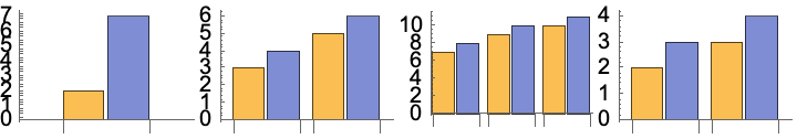
Now, at this point, you could map BarChart over this data, wrap it in a Row and we have something that might be what you want:
Row[BarChart /@ data]
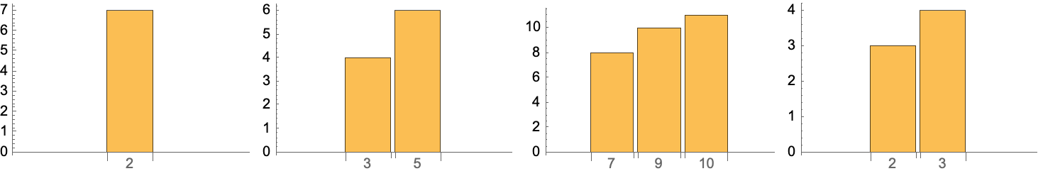
But I'm still confused, because you said that the pairs at the lowest level represent a code and a frequency. Since you have two different semantics within each pair, it doesn't seem like you just want to apply BarChart to it. It sounds like you would want to chart the frequencies and use the code as a label. So, an alternate interpretation might be something like this (I'm switching to Grid because I like its options better):
Grid[{BarChart /@ Map[Apply[Labeled]@*Reverse, data, {-2}]}, Alignment -> {Center, Bottom}]
I hope that helps. Maybe it's not what you want, but maybe it'll help you find your way. If I'm still off the mark, then all I can say is what I've already said: give us a picture or actual data or actual code that gets rid of all the ambiguity inherent in your verbal descriptions.


