Hello all,
The code below details a behavior of ContourPlot (as well as ListContourPlot) which I find inconvenient, and don't understand. It has to do with how the color is chosen for the region of values above the last drawn contour. Does anyone understand this? And know how to avoid it?
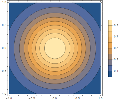
Here is a test function -- a Gaussian with a max value of 1. It plots as expected:
p1 = ContourPlot[Exp[ 2 (-x^2 - y^2)], {x, -1, 1}, {y, -1, 1},
  Contours -> Range[.1, 1, .1], PlotLegends -> Automatic,
  PlotPoints -> 100]
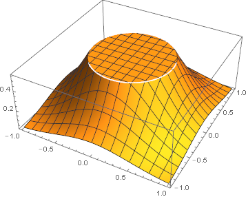
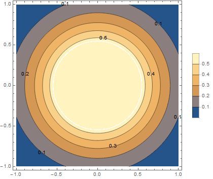
We can truncate it to produce a plateau at 0.55:
p2 = Plot3D[Min[Exp[ 2 (-x^2 - y^2)], 0.55], {x, -1, 1}, {y, -1, 1},
And it plots as expected. Note that the region above the 0.5 contour plots in the expected color.
p3 = ContourPlot[
  Min[Exp[ 2 (-x^2 - y^2)], 0.55], {x, -1, 1}, {y, -1, 1},
  Contours -> Range[.1, 1, .1], PlotLegends -> Automatic,
  PlotPoints -> 100, ContourLabels -> All]
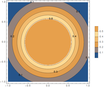
But if we create the plateau at 0.51, we get a very different result. It looks like it has colored the region from 0.5 to 0.51 as expected, but then reused the color for 0.2 to 0.3 for the values of 0.51 in the plateau.
p4 = ContourPlot[
  Min[Exp[ 2 (-x^2 - y^2)], 0.51], {x, -1, 1}, {y, -1, 1},
  Contours -> Range[.1, 1, .1], PlotLegends -> Automatic,
  PlotPoints -> 100, ContourLabels -> All]