Here I will show a way to do some analysis of GPS data using new functionality present in the Wolfram Language.
I just moved to Lyon (France), where they organised a mountainbike tour last week (Lyon Free VTT). I opted for the 'expert' trail of roughly 60 km with 1000+ meters ascend. I recorded my trip using the Garmin GPSmap 62s and I'm wearing a heart rate sensor from Garmin as well.
We start by setting the current directory to the notebookdirectoy, and look for the GPX file of the day of the event:
SetDirectory[NotebookDirectory[]];
fn = FileNames["*2015-09-13*.gpx"][[1]]

"Track_2015-09-13 121636.gpx"
So we found the file. The GPX file is an XML formatted file. So we can read the data easily:
data = Import[fn, "XML"];
The data is stored in "track points" which are abbreviated as trkpt. We can find the parts of the track by using Cases.
FirstCase[data, XMLElement["trkpt", ___], Missing[], \[Infinity]]
which looks like:
XMLElement[trkpt,{lat->45.7242092583,lon->4.8268832266},
{XMLElement[ele,{},{173.17}],
 XMLElement[time,{},{2015-09-13T06:09:03Z}],
 XMLElement[extensions,{},{
  XMLElement[{http://www.garmin.com/xmlschemas/TrackPointExtension/v1,TrackPointExtension},{},{
  XMLElement[{http://www.garmin.com/xmlschemas/TrackPointExtension/v1,hr},{},{108}]}
]}
]}
]
Wow! Looks quite complicated, but the important thing is that it always starts with the Latitude and Longitude coordinates as attributes -> values, and then followed by some more data (in this case the time, elevation, and heart rate).
So lets get all the track points:
data = Cases[data, XMLElement["trkpt", {"lat" -> lat_, "lon" -> lon_}, other_] :> {ToExpression /@ {lat, lon}, other}, \[Infinity]]
Note that I immediately detect the latitude, longitude and the other data and put them as a replacement rule right in Cases.
I started recording when I left my house to go to the Start, and I also continued recording after I cycled back from the finish to my house. So we remove this data:
data = Drop[Drop[data, 246], -128];
The trail is now stored as the first element of each element of data:
trail = GeoPosition /@ data[[All, 1]];
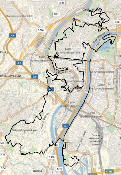
We can now easily visualise this using the new GeoGraphics function (V10 and up):
GeoGraphics[{Thick, Line[trail]}, ImageSize -> 400]
Giving:

That looks pretty good! Now let's retrieve the time, elevation and heart rate from the data. We overwrite data, because we already extracted the latitude and longitude from it:
data = data[[All,2]];
First, let's try the time, we use the new FirstCase command (V10) as we only expect one time per track point entry. We make a pure function and map that over all the data:
absolutetime = time = Map[
FirstCase[#,XMLElement["time",{},{time_}]:>AbsoluteTime[time]+$TimeZone*3600,Missing[],\[Infinity]]&
,
data
]
time -= First[time]
Note that I also add some seconds so that I have the time in my own timezone (the default is in Zulu (universal) time). In case the time is somehow not recorded it will returning Missing[]. I will also save a variable which is the time starting when I start called time (second line).
We can do something similar for the elevation:
elevation=Map[FirstCase[#,XMLElement["ele",{},{ele_}]:>ToExpression[ele],Missing[],\[Infinity]]&,data]
and for the heart rate:
hr=Map[FirstCase[#,XMLElement[{"http://www.garmin.com/xmlschemas/TrackPointExtension/v1","hr"},{},{hr_}]:>ToExpression[hr],Missing[],\[Infinity]]&,data];
Now that we have all the data, let's explore a little bit further. Let's first compute the distance travelled:
distances=BlockMap[GeoDistance@@#&,trail,2,1];
distances=Prepend[QuantityMagnitude[distances,"Meters"],0.0];
distance=Accumulate[distances];
Here I used the new BlockMap function (V10.2) to compute the distance between each pair of points. (2 to denote pairs, and 1 to have overlapping pairs). I convert the results to just number (without units), otherwise the Accumulate is very slow (why is this slow Wolfram?). Lastly I keep track of the accumulated distance using the command Accumulate.
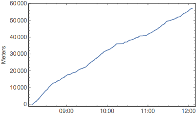
Now we can plot this as a function of time:
DateListPlot[{absolutetime,distance}\[Transpose],FrameLabel->"Meters",FrameStyle->12,ImageSize->400]
giving:

The total distance travelled is:
Last[distance]
57106.
This answer is in meters because I took the magnitude in "Meters". We can convert it to miles quite easily:
UnitConvert[Quantity[%, "Meters"], "Miles"]
35.484mi
About 35.5 miles.
Let's calculate the speed:
speed=Differences[distance]/Differences[time];
speed=Join[{speed[[1]]},MovingAverage[speed,2],{speed[[-1]]}];
The first order difference will give me the speed, I'm doing a moving average so that I have the average speed at an instant, I append and prepend the first and last speed, respectively, such as to have the length of speed and the length of time to be the same.
Now we can plot the speed (which is in meter/second, so I multiply by 3.6 to get km/h):
DateListPlot[Transpose[{absolutetime,3.6speed}],FrameLabel->"Kilometer/Hour",FrameStyle->12,ImageSize->1000,AspectRatio->1/5,PlotRange->All]

My speed varies a lot as you can see. This is partly because this is an urban trail with climbs and descends, but also sharp corners, and up and down-going stairs. But also because of some GPS errors you have some fluctuations. This is apparent in the above plot, I'm quite fast, but not 80 km/h (50 miles/hour) fast!! So let's smooth the data over a few points:
slen=3;
smoothspeed=Join[Accumulate[speed[[;;slen]]]/Range[slen],MovingAverage[speed,2slen+1],Reverse[Accumulate[Reverse[speed[[-slen;;]]]]/Range[slen]]];
Which looks more realistic:
DateListPlot[Transpose[{absolutetime,3.6smoothspeed}],FrameLabel->"Kilometer/Hour",FrameStyle->12,ImageSize->1000,AspectRatio->1/5,PlotRange->All]

You can clearly see that I had a flat tire around 10:15 that took me 7-8 minutes to repair...
Let's calculate the average speed (up to some time t):
avgspeeds=Prepend[Rest[distance]/Rest[time],0];
And showing:
DateListPlot[Transpose[{absolutetime,3.6avgspeeds}],FrameLabel->"Kilometer/Hour",FrameStyle->12,ImageSize->1000,AspectRatio->1/5,PlotRange->All]

So I ended with a speed of 3.6 Last[avgspeeds] = 14.5 km/h which is not too bad considering it includes also a flat tire.
Plotting the elevation is also quite easy now:
DateListPlot[Transpose[{absolutetime, elevation}], FrameLabel -> "Meters", FrameStyle -> 12, ImageSize -> 1000, AspectRatio -> 1/5, PlotRange -> All]

There were some very steep hills in this track, and pieces where I had to change to my lowest gear to climb them.
Also plotting the heart rate is quite easy:
DateListPlot[Transpose[{absolutetime,hr}],FrameLabel->"BPM",FrameStyle->12,ImageSize->1000,AspectRatio->1/5,PlotRange->All]

Let's compute the total number of heart beats and the average heart rate:
hb=Interpolation[DeleteMissing[{time,hr/60.0}\[Transpose],1,2],InterpolationOrder->1];
hb=Round[Integrate[hb[t],{t,Min[time],Max[time]}]]
avghr=60hb/(Max[time]-Min[time])

38443 (* beats *)
162.8 (* average beats / minute *)
That is quite high for my age (28 years)!
Let's compute the elevation gain:
elevationgain = Total[Select[Differences[elevation], Positive]]

1193.05 (* meters *)
That explains partly the low speeds and the high heart rates! I've climbed almost 1200 meters.
QuantityMagnitude[Quantity[elevationgain,"Meters"],"Stories"]
or about 400-500 stories!! (depending on your metric of a storey)
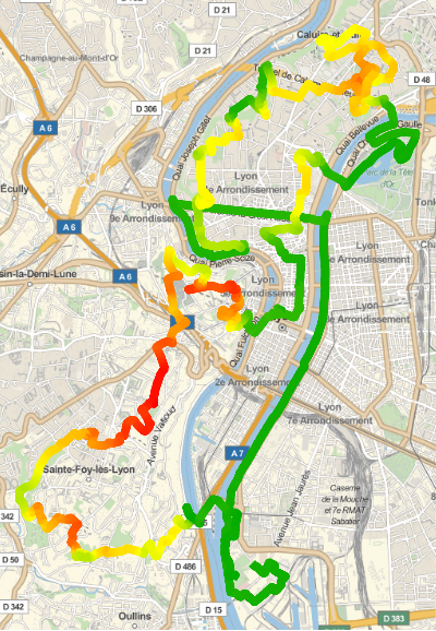
Let's make a visual plot where the climbs are by creating a map colored by the height:
colordata = Rescale[elevation];
color = Blend[{{0, Darker@Green}, {0.5, Yellow}, {1, Red}}, #] & /@ colordata;
GeoGraphics[{AbsoluteThickness[8], JoinForm["Round"], Line[trail, VertexColors -> color]}, ImageSize -> 400]

Green means low, and red means high altitude. Using the same colors we can create also the accompanying plot:
DateListPlot[Transpose[{absolutetime,elevation}],FrameLabel->"Meters",FrameStyle->12,ImageSize->1000,AspectRatio->1/5,PlotRange->All,ColorFunction->(Blend[{{0,Darker@Green},{0.5,Yellow},{1,Red}},#2]&),PlotStyle->Directive[AbsoluteThickness[5],JoinForm["Round"]]]

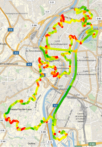
Or the same but instead colored by the speed:
colordata=Rescale[smoothspeed];
cf=Blend[{{0.2,Red},{0.45,Yellow},{0.8,Darker@Green}},#]&;
color=cf/@colordata;
g1=GeoGraphics[{AbsoluteThickness[8],JoinForm["Round"],Line[trail,VertexColors->color]},ImageSize->400]
DateListPlot[Transpose[{absolutetime,3.6smoothspeed}],FrameLabel->"km/h",FrameStyle->12,ImageSize->1000,AspectRatio->1/5,PlotRange->All,ColorFunction->(cf[#2]&),PlotStyle->Directive[AbsoluteThickness[5],JoinForm["Round"]]]


In the corners and in the climbs it is slow (red), while for the flat, down, and straight pieces it is fast (green). It looks like there is way more green, then red on the map, while for the bottom plot it is roughly equal, this is because for a low speed you travel only a little so just a bit of red on the map. While for high speed you travel more distance so it looks more green...
This is part I, below I will post a second part of the analysis. With some nice general functionality. PS. Also have a look at the 2009 post at the wolfram blog when GeoGraphics (and other functions) were not introduced yet. Wolfram Blog about GPS