Hi,
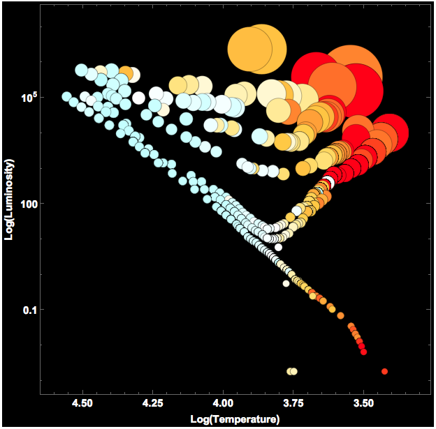
I just made a little Hertzsprung-Russell diagram for a class of mine. It's not quite perfect yet, but I wanted to post it anyway.
Mathematica (wikipedia?) knows what that diagram is:
WikipediaSearch["Hertzsprung Russell diagram"]
gives:
<|"Title" -> "Hertzsprung-Russell diagram",
"Snippet" -> "The Hertzsprung-Russell diagram, abbreviated H-R diagram or HRD, is a scatter graph of stars showing the relationship between the stars' absolute magnitudes or luminosities versus their spectral classifications or effective temperatures."|
All the data I need is in Mathematica.
stars = StarData[];
contains data for more than 107,000 stars. I will only download data for 10,000 stars as to not overload my final image.
starChoice = RandomChoice[stars, 10000];
starData = StarData[starChoice, {"Luminosity", "EffectiveTemperature", "Mass", "Radius", "BVColorIndex", "Color"}];
I access luminosity, surface temperature, mass, radius, and color data for the stars. I will want to use BubbleChart to generate the diagram. The position of the bubbles will be given by (the logarithms of) the luminosity and the surface temperature; note that the x-asis is reversed. The size of the bubbles will encode the radius and I would like to color the bubbles in a way that relates to their BVColorIndex. The most difficult issue is the colour. As a matter of fact, I will cheat a bit to make the colour distribution clearer. I use some formulas from this website for the conversion of BV to RGB colour.
{\[Lambda], x, y, z} = Import["http://www.cvrl.org/database/data/cmfs/ciexyzjv.csv"]//Transpose;
XYZ[t_] := Module[{h = 6.62607*10^-34, c = 2.998*10^8, k = 1.38065*10^-23}, {x, y, z}.((2 h c^2)/((-1 + E^((h c/k)/(t \[Lambda]*10^-9))) (\[Lambda]*10^-9)^5)) // #/#[[2]] &]
The plot is quite easy to generate from here:
normsun = QuantityMagnitude[StarData["Sun", "Luminosity"]];
BubbleChart[
 Style[{Log[10, QuantityMagnitude[#[[2]]]], QuantityMagnitude[#[[1]]]/normsun, QuantityMagnitude[#[[4]]]},
    ColorConvert[XYZColor @@ XYZ[4600*((1/(0.92 #[[5]] + 1.7)^2.4 + 1/(0.92 #[[5]] + 0.62)^2.4))], "RGB"]] & /@
  Select[starData, FreeQ[#, Missing] &], ScalingFunctions -> {"Reverse", "Log"}, Background -> Black,
 FrameLabel -> {"Log(Temperature)", "Log(Luminosity)"}, LabelStyle -> Directive[Bold, 15, White], ImageSize -> Full]
Note that there is a "fudge exponent" of 2.4 which exaggerates the colours. This gives:

If you compare this figure to the corresponding images on the wikipedia page, you will note that is looks quite similar to the second figure. The first figure on that website, shows a fine structure of all the sequences Ia and Ib for the supergiants, II for the bright giants, III for giants, IV for subgiants, and V for the main sequence. Then there are the white dwarfs. It appears that our diagram shows a similar sub-structure, but I might be mistaken.
Our own sun is on the main sequence at the intersection at a horizontal line of normalised Log-luminosity 1. (The axis is normalised to our sun's luminosity.) So our sun is "yellow-white".
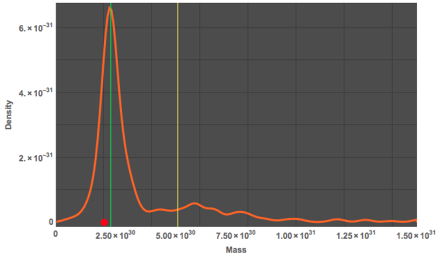
As we are already on it, we can also compare where our sun lies in terms of its mass. I therefore compute a SmoothHistogram of the masses of my 10000 stars.
SmoothHistogram[
 Select[QuantityMagnitude[starData[[All, 3]]], NumberQ],
 PlotRange -> {{0, 1.5*10^31}, All}, PlotTheme -> "Marketing",
 FrameLabel -> {"Mass", "Density"}, ImageSize -> Full,
 LabelStyle -> Directive[Bold, Medium],
 Epilog -> {Red, {PointSize[0.02],
    Point[{QuantityMagnitude[StarData["Sun", "Mass"]], 0}]}, Green,
   Line[{{Median[
       Select[QuantityMagnitude[starData[[All, 3]]],
        NumberQ]], -0.1}, {Median[
       Select[QuantityMagnitude[starData[[All, 3]]], NumberQ]],
      7.5*10^-31}}], Yellow,
   Line[{{Mean[
       Select[QuantityMagnitude[starData[[All, 3]]],
        NumberQ]], -0.1}, {Mean[
       Select[QuantityMagnitude[starData[[All, 3]]], NumberQ]],
      7.5*10^-31}}]}]

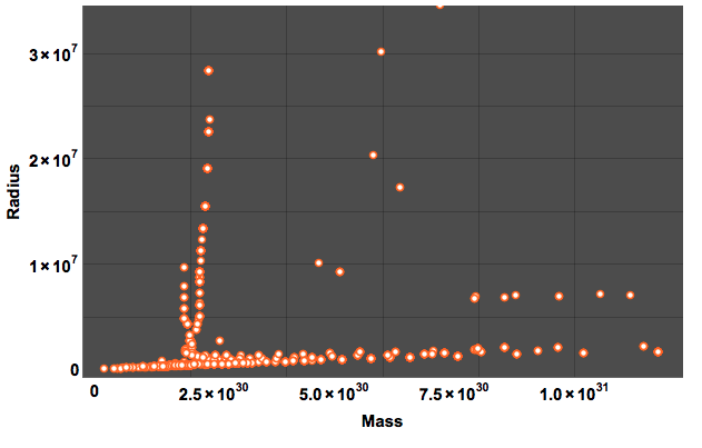
Our sun's mass is marked by the red dot on the x-axis. The green vertical line shows the median of the distribution and the yellow line the mean. I have truncated the diagram at the large masses. The following plot shows mass vs radius:
ListPlot[QuantityMagnitude /@ Select[starData[[All, {3, 4}]], FreeQ[#, Missing] &], PlotTheme -> "Marketing", LabelStyle -> Directive[Bold, 15, Black],FrameLabel -> {"Mass", "Radius"}]

Cheers,
Marco