I have been doing a lot of work with databases recently, some in Mathematica and some in R using the latter's very nice dplyr package.. Since I had trouble with the issue, I thought it might be worthwhile to share how to perform the equivalent of a "summarize" operation in R. The idea is to group data and to then produce a new dataset that computes, for each resulting group, various composite statistics associated with that group. It may be that there are simpler ways of reaching the same result, in which case you can regard this as a way of stimulating discussion on the matter. Also, I am fully aware that one can use the lovely RLink package to run R code from within Mathematica, including the dplyr package. And, indeed, sometimes this is very useful. Still, there are occasions in which one does not want the overhead of coordinating with R and wants a pure Mathematica solution. Hence this post.
I am linking to a Wolfram Cloud notebook that should provide the necessary ideas and code. A copy of the content below.
The equivalent of dplyr's "summarize" in Mathematica
The R language features a package called "dplyr" that is widely used for analyzing data. One of the key functions used in dplyr is called summarize. The idea is to take some data, group it according to some common value and then find some summary statistics on each grouping of the data. So, the question is, how do we do this in Mathematica? Since at least I did not find it obvious at first, I thought this little tutorial would be helpful. If there are better approaches, I am hoping this stimulates discussion.
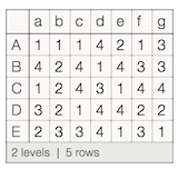
Let's build a little dataset. We'll construct it as an association of associations, meaning it will display as something with column names and row names
SeedRandom[100];
ds = Dataset@AssociationThread[CharacterRange["A","E"],
Map[AssociationThread[CharacterRange["a","g"],#]&,RandomInteger[{1,4},{5,7}]]]
Now let's group the data by its b value.
dg = Query[GroupBy[#b&]]@ds
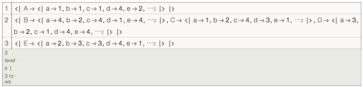
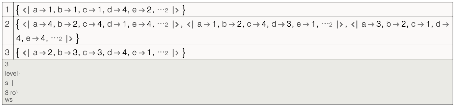
Notice that we now have an association of association of associations. We could get an association of a list of associations if we first applied Values to the data before grouping it.
dv = Query[Values/*GroupBy[#b&]]@ds
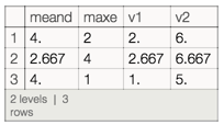
Suppose that we want the mean value of d for all of the groupings and the maximum value of e and we want the new columns to have the labels "meand" and "maxe" . In R, we would write something like "ds %>% group_by(b) %>% summarize(meand= mean(d), maxe=max(e))". How do we do it in Mathematica? The key is to look at the structure of the values that have been produced by GroupBy. Since dg is an association of association of associations, here's what we need to do.
Let's start by writing a function h that takes a list of associations (r) and produces a new association in which the key "meand" takes on the value of the mean of a "Through" of the list of associations (which can act as functions) operating on "d" and in which the key "maxe" takes on the value of the max of a similar "Through" of the list of associations operating on "e".
h=r\[Function]Association["meand"->Mean@Through[r["d"]],"maxe"->Max@Through[r["e"]]]
If each row of our data is an Association, as is the case for dg, we need to take the Values of that association for each row and then apply the function h to the result.
Query[All,Values/*h]@dg
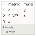
If each row of our data is a list of Associations, as is the case for dv, then we can just apply h directly to each row.
Query[All,h]@dv
And thats basically it. We can now treat the resulting Dataset as something we can in turn manipulate.
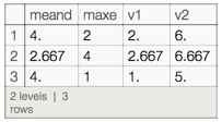
Query[All,Join[#,Association["v1"->Min[#meand,#maxe],"v2"->#meand+#maxe]]&]@Query[All,h]@dv
Or if we were ambitious and wanted to do it in one step:
Query[All,h/*(Join[#,Association["v1"->Min[#meand,#maxe],"v2"->#meand+#maxe]]&)]@dv