Message Boards Message Boards

[GIF] Dynamic Bubble Chart for Time Series

Posted 9 years ago

I was inspired by Hans Rosling talking on TED in 2006. The dynamic bubble chart tells a good story. His speech was recorded in 2006, so I am wondering what has changed after nearly 10 years later.

W|A provides same quality data and I should plot those data with BubbleChart, easily. Unfornately, BubbleChart has a very strange diameter, so I use Graphics instead, finally.

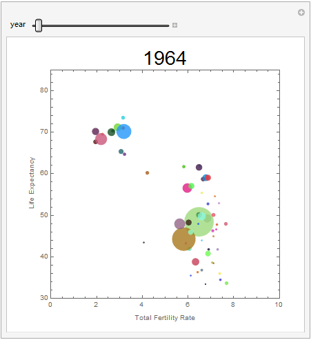
GIF shows below with totally 57 countries for time series from 1964 to 2013.

  • each bubble stand for a country (diameter is population);
  • biggest bubble is China, 2nd biggest is India, etc;
  • x axis is total fertility rate, y axes is life expectancy;
  • population less than 10 million are filtered. (If too less population, the point is really too small.);
  • country history data is available from W|A

enter image description here

Attachments:
POSTED BY: Frederick Wu
8 Replies

Nice visualisation! great job! Perhaps add PlotRangeClipping -> True to your plot so the circles are not plotted outside the box.

POSTED BY: Sander Huisman
Posted 9 years ago

Hi Sander, Good eyesight! Thank your for your tips!

POSTED BY: Frederick Wu
Posted 8 years ago

Hi Wu,I'm very amazed by Hans Rosling splendid exposition using his amazing tool -bought by Google-..please give us the code for generating this beautiful living charts--very informative--..please show us the code..it will be highly generous..

POSTED BY: Megri Youcef
Posted 8 years ago

Hi Wu,I want to tell you that Rosling has many other presentations since 2006..try youtube and you'll find a series of gorgeous talks by Rosling in different places in the world..this is the site where you find the software he uses in his talks..with updated data:

http://www.gapminder.org/

Google after buying this piece of ingenious code..called "Trendalyzer "..had integrate it ..with some modifications in their online docs.

POSTED BY: Megri Youcef

Dear @Frederick Wu, very nice post! Could you share the code for this post? You can paste it in the post or attach the notebook.

POSTED BY: Vitaliy Kaurov
Posted 8 years ago

I attached the code with data on top. Download all data from WA is time consuming.

POSTED BY: Frederick Wu
Posted 8 years ago

Thank you @Frederick Wu ,I've also found a very similar demonstration in the wolfram demonstrations website,very sophisticated ,well designed and very helpful,thank you again.

Evolution of the Fertility, Life Expectancy, and Population in Different Parts of World

enter image description here

POSTED BY: Megri Youcef

enter image description here - you earned "Featured Contributor" badge, congratulations !

This is a great post and it has been selected for the curated Staff Picks group. Your profile is now distinguished by a "Featured Contributor" badge and displayed on the "Featured Contributor" board.

POSTED BY: Moderation Team
Reply to this discussion
Community posts can be styled and formatted using the Markdown syntax.
Reply Preview
Attachments
Remove
or Discard

Group Abstract Group Abstract