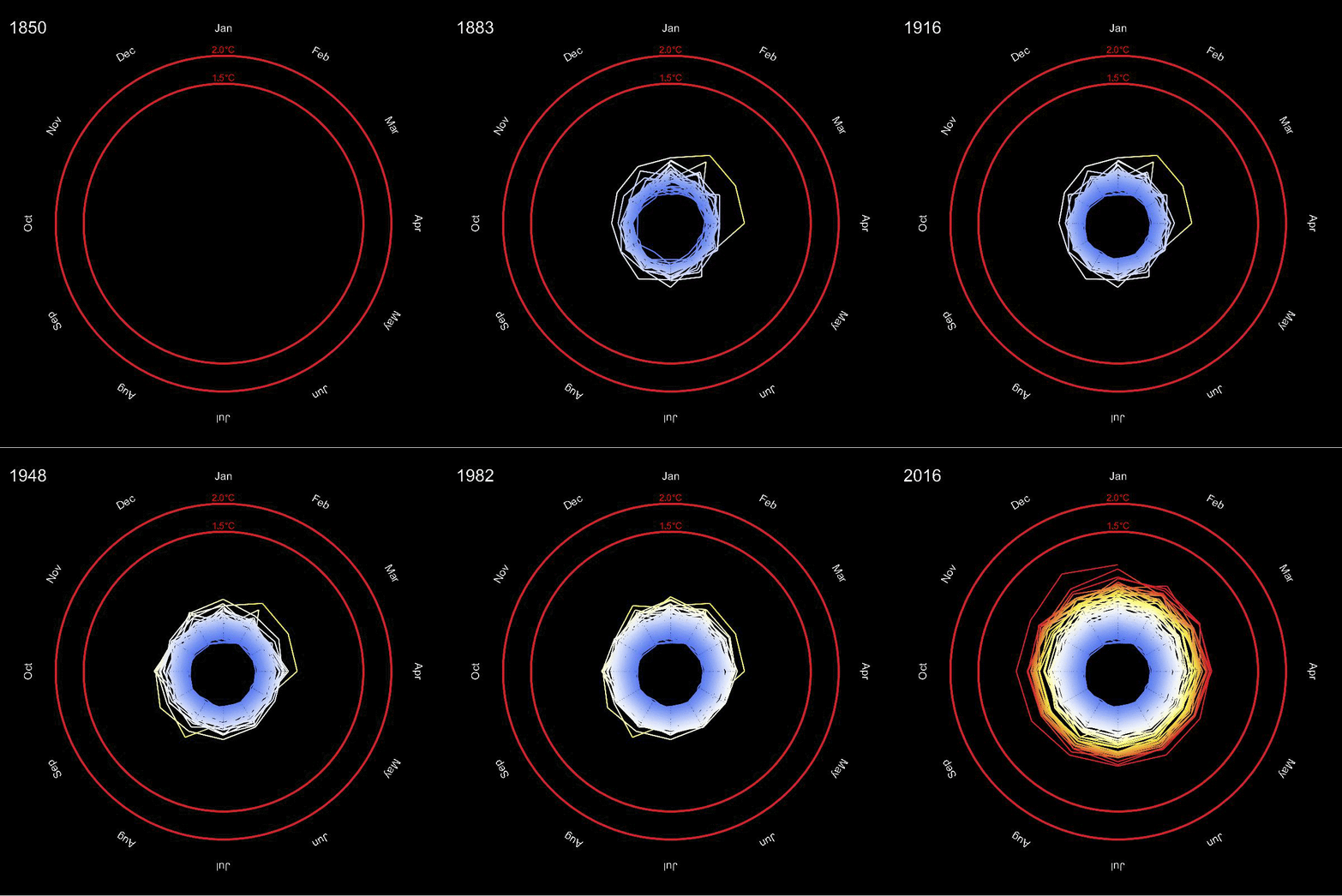
I recently came across an article which features a visualisation of the change of the average global temperature. The data to reproduce that visualisation is readily available, and so it is quite straight forward to generate the animation in Mathematica.

The data for this animation is imported like so:
tempdata = Transpose[{Interpreter["Date"][#[[All, 1]]], #[[All, 2]]}] &@
   Import["http://www.metoffice.gov.uk/hadobs/hadcrut4/data/current/time_series/HadCRUT.4.4.0.0.monthly_ns_avg.txt", "Data"];
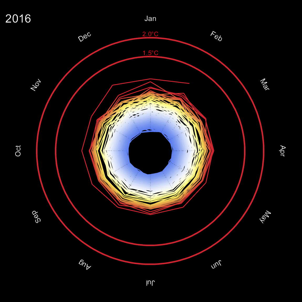
Let's first generate the final frame:
Show[ListLinePlot[#[[1]]*{Cos[-#[[2]] + Pi/2], Sin[-#[[2]] + Pi/2]} & /@
Transpose[{(Abs[#] + 1)^Sign[#] & /@ tempdata[[All, 2]], Mod[Pi/6 Range[0, 1994], 2 Pi]}][[1 ;; 1994]], AspectRatio -> 1,
Background -> Black, Axes -> None, ColorFunction -> Function[{x, y}, ColorData["Temperature"][0.35 Norm[{x, y}]^2.2]],
PlotRange -> {{-4, 4}, {-4, 4}}, ColorFunctionScaling -> False, ImageSize -> Large,
Epilog -> {White, Text[Style[(Normal@tempdata[[1994, 1]])[[1]], 22], {-3.5, 3.5}]}],
Graphics[{Function[{x, y}, ColorData["Temperature"][0.35 Norm[{x, y}]^2.2]][2.5, 0], Thickness[0.005], Circle[{0, 0}, 2.5]}],
Graphics[{Function[{x, y}, ColorData["Temperature"][0.35 Norm[{x, y}]^2.2]][3, 0], Thickness[0.005], Circle[{0, 0}, 3]}],
Graphics[{White, Rotate[Text[Style[#[[1]], 14], 3.5 {Cos[Pi/2 - #[[2]]], Sin[Pi/2 - #[[2]]]}], -#[[2]]] & /@
Transpose[{{"Jan", "Feb", "Mar", "Apr", "May", "Jun", "Jul", "Aug", "Sep", "Oct", "Nov", "Dec"},
Range[0, 2 Pi - Pi/6, Pi/6]}]}], Graphics[{Red, Text[Style["1.5\[Degree]C", 12], {0, 2.6}]}],
Graphics[{Red, Text[Style["2.0\[Degree]C", 12], {0, 3.1}]}]]

The idea is quite straight forward: we can think of this as a polar plot. The angle corresponds to the month of the year and the radius relates to the mean temperature, or in fact to the deviation from the "standard temperature". This deviation can be negative, but the radius cannot. So we use the following "scaling" for the radius:
(Abs[#] + 1)^Sign[#] &
If the temperature deviation from the standard is zero, this gives 1. If the temperature difference is positive the radius grows larger than 1. If the temperature is negative, this value is between 0 and smaller 1. The outer red rings indicate a 1.5 and a 2 degree temperature change which are critical values for a future climate change - we appear to be getting quite close now... Note that for the colours of the circles I needed to consider the scaling function from above, so that I need to feed the values 2.5 for 1.5 degrees and 3 for 2 degrees into the ColourFunction.
It is very easy to generate all frames for the movie:
Monitor[frames =
   Table[Show[ListLinePlot[#[[1]]*{Cos[-#[[2]] + Pi/2], Sin[-#[[2]] + Pi/2]} & /@
   Transpose[{(Abs[#] + 1)^Sign[#] & /@ tempdata[[All, 2]], Mod[Pi/6 Range[0, 1994], 2 Pi]}][[1 ;; k]],
   AspectRatio -> 1, Background -> Black, Axes -> None, ColorFunction -> Function[{x, y}, ColorData["Temperature"][0.35 Norm[{x, y}]^2.2]],
   PlotRange -> {{-4, 4}, {-4, 4}}, ColorFunctionScaling -> False, ImageSize -> Large,
   Epilog -> {White, Text[Style[(Normal@tempdata[[k, 1]])[[1]], 22], {-3.5, 3.5}]}],
   Graphics[{Function[{x, y}, ColorData["Temperature"][0.35 Norm[{x, y}]^2.2]][2.5, 0], Thickness[0.005], Circle[{0, 0}, 2.5]}],
   Graphics[{Function[{x, y}, ColorData["Temperature"][0.35 Norm[{x, y}]^2.2]][3, 0], Thickness[0.005], Circle[{0, 0}, 3]}],
   Graphics[{White, Rotate[Text[Style[#[[1]], 14], 3.5 {Cos[Pi/2 - #[[2]]], Sin[Pi/2 - #[[2]]]}], -#[[2]]] & /@
   Transpose[{{"Jan", "Feb", "Mar", "Apr", "May", "Jun", "Jul", "Aug", "Sep", "Oct", "Nov", "Dec"}, Range[0, 2 Pi - Pi/6, Pi/6]}]}],
   Graphics[{Red, Text[Style["1.5\[Degree]C", 12], {0, 2.6}]}],
   Graphics[{Red, Text[Style["2.0\[Degree]C", 12], {0, 3.1}]}]], {k,1, 1995, 6}];, k]
Using
ListAnimate[frames]
one can animate this. I chose to export the frames:
Monitor[Do[Export["~/Desktop/ClimateSpiral/frame" <> ToString[1000 + k] <> ".jpg", frames[[k]], ImageResolution -> 100], {k, 1, Length[frames], 2}], k]
And then used the terminal (!!!) command
convert -delay 5 -loop 0 frame*.jpg animated.gif
to generate the animation. It is a bit long for a post (15MB), but if I make it smaller the resolution is not good enough. It is obviously quite tricky to determine the "mean temperature of the world", particularly because in some areas there is only very sparse data. There is beautiful maths to actually generate estimates.
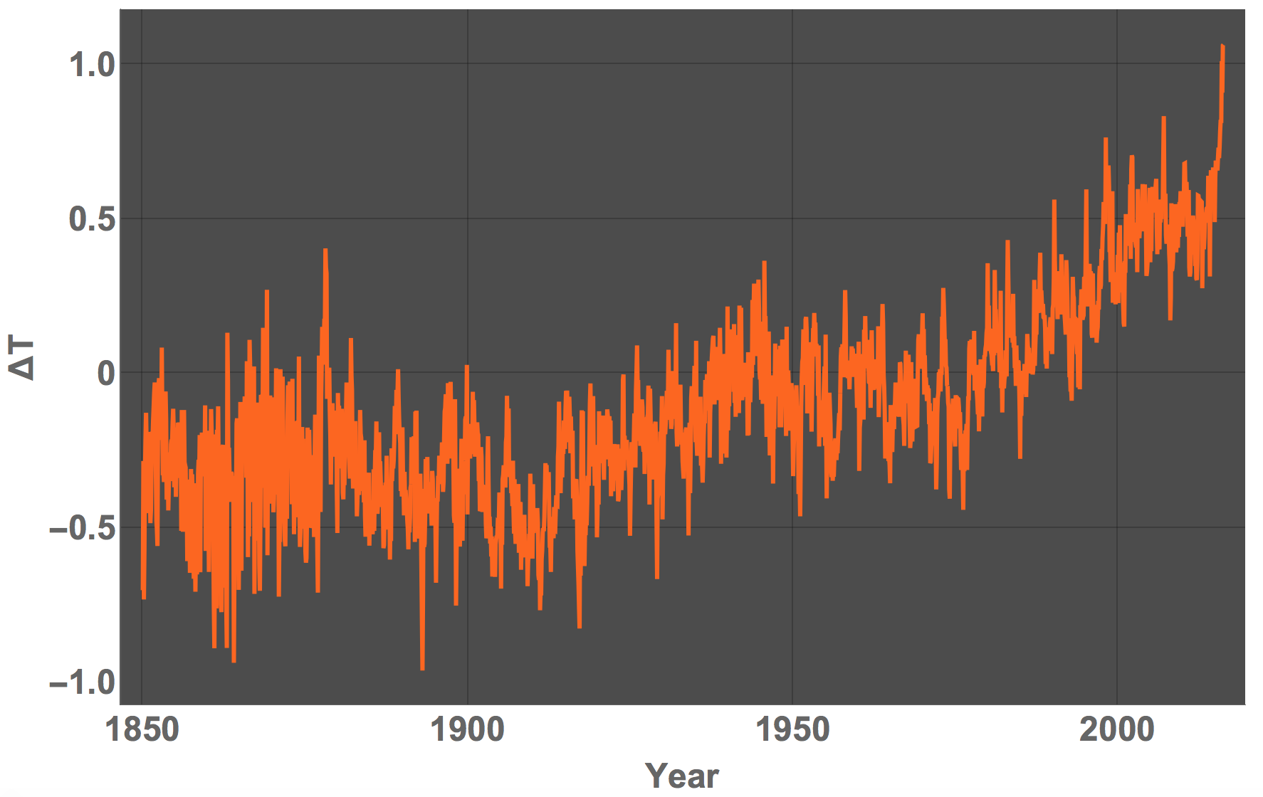
A slightly more standard visualisation would be this:
DateListPlot[tempdata, PlotTheme -> "Marketing", LabelStyle -> Directive[Bold, Large], FrameLabel -> {"Year", "\[CapitalDelta]T"}, ImageSize -> Full]

Cheers,
Marco
PS: As a small variation you can change the interpolation order in the ListLinePlot function to 1, i.e. add the option
InterpolationOrder->2
and you obtain the attached animation.