Mathematica 11 has the very useful function GeoHistogram. It is extremely useful to represent a huge variety of geospatial datasets. However, there is yet another way to represent that, which I would like to share. It is very simple and will allow us to generate plots like this one:

This plot represents the earthquake in the last month. The length of the green spikes corresponds to the strength of the earthquakes. In this post I will produce a simple function that allows us to process data of the form
{{lat1,long1},value1},{lat2,long2,value2},...,{latn,longn,valuen}}
to generate these spikes histograms. The first two functions are auxiliary only. The first calculates the latitude/longitude pairs into cartesian coordinates.
toCoordinates[coords_] :=
 FromSphericalCoordinates[{#[[1]], Pi/2 - #[[2]], Mod[Pi + #[[3]], 2 Pi, -Pi]}] & /@ (Flatten[{1., #/360*2 Pi}] & /@coords)
The second one calculates the length of the spikes. It uses the max value to normalise the lengths.
lengths[inputdata_] := 2.*(inputdata/Max[inputdata])
The following then is the function needed to generate such plots:
myGeoHistogram[data_, radius_] :=
 Show[SphericalPlot3D[radius, {u, 0, Pi}, {v, 0, 2 Pi}, Mesh -> None, TextureCoordinateFunction -> ({#5, 1 - #4} &),
 PlotStyle -> Directive[Specularity[White, 10], Texture["~/Desktop/backgroundimage.gif"]], Lighting -> "Neutral",
 Axes -> False, RotationAction -> "Clip", Boxed -> False, PlotPoints -> 100, PlotRange -> {{-3, 3}, {-3, 3}, {-3, 3}},
 ImageSize -> Full], Graphics3D[Flatten[{Green, Thick, Line[{#[[1]], (radius + #[[2]])*#[[1]]}] & /@
 Transpose[{toCoordinates[#[[All, 1]]], lengths[#[[All, 2]]]} & @data]}]]]
The first slot needs the data and the second one changes the radius of the earth. Reasonable values are from 0.5 to 2 or so. Let's generate some plots. First we need some data.
Earthquakes
The data for the animation above is earth quake data. The Wolfram Language has everything built in.
earthquakedata = EarthquakeData[All, 4, {DateObject[{2016, 7, 1}], Today}];
This loads all the geopositions and magnitudes of the earthquakes (with magnitude larger 4) from 1 July 2016 to now. If you call:
myGeoHistogram[earthquakedata,2]
you obtain a representation of the earthquakes' magnitudes. If you use instead:
quakes = Normal[({#["Position"][[1]], 2.^#["Magnitude"]} & /@ earthquakedata)][[All, 2]];
myGeoHistogram[quakes, 2.]
you obtain the output shown above. You can easily see the geological fault lines and nicely aligned chains of earthquakes.
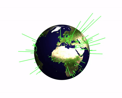
Population of the world's capitals
Next we can look at the populations of the world's capital cities. The first function downloads a list of all capitals and the second one acquires the data of position and population size.
capitals = EntityClass["Country", "Countries"][EntityProperty["Country", "CapitalCity"]];
data = {#["Coordinates"], QuantityMagnitude[#["Population"]]} & /@ capitals;
Plotting
myGeoHistogram[Select[data, NumberQ[#[[2]]] &], 2]
(note that I filter out cities with unknown data) gives the following
Of course, this function is just a starting point. I should have wrapped it into Module and set a default value of 1 or two for the radius. But that is easy to do and I would love seeing suggestions of how to improve this or apply it to interesting data sets.
Cheers,
Marco
PS: This is not completely unrelated to another post of mine.


