Hi,
this is not particularly good, but I think it might work. I generate a list of frames and animate them so that it becomes clear that the colour bar is the same as the values of the function change:
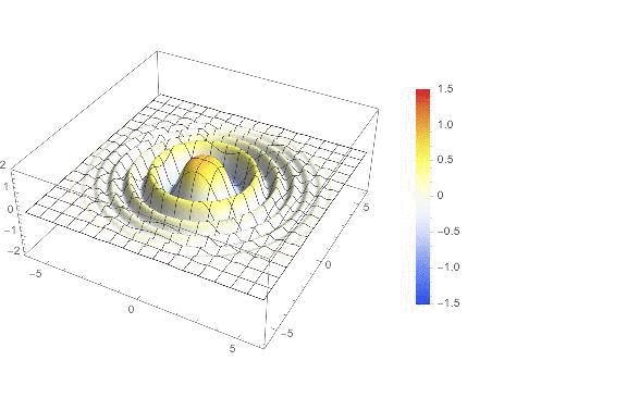
ufun[x_, y_] := Cos[(x^2 + y^2)] Exp[-0.1 (x^2 + y^2)]
{xlow, xhigh} = {-6, 6};
{ylow, yhigh} = {-6, 6};

Monitor[frames =
Table[GraphicsRow[{Plot3D[a ufun[x, y], {x, xlow, xhigh}, {y, ylow, yhigh}, ColorFunction -> (ColorData["TemperatureMap"][Rescale[#3, {-1.5, 1.5}]] &), ColorFunctionScaling -> False, PlotPoints -> 40, PlotRange -> {All, All, {-2, 2}}],
BarLegend[{"TemperatureMap", {-1.5, 1.5}}]}, ImageSize -> Large,Alignment -> {{Center, Left}}], {a, 1, 1.5, 0.02}];, a]
This can be done easier, but the code gives you quite some control about nearly all parts of the image.
Cheers,
Marco


