Nice post! I like the way you very "conversationally" retrieve data and visualize them!
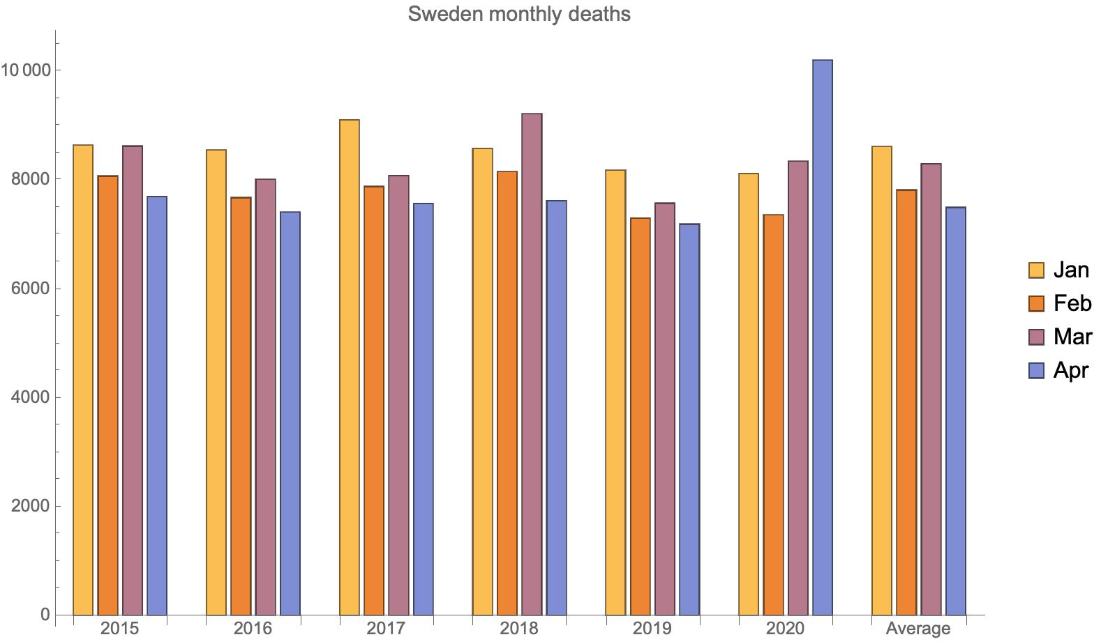
The time series plot very clearly shows the increased number of deaths in April 2020, but that observation does not come across in the subsequent bar charts. Making a 2D bar chart with an additional breakdown by month shows that April 2020 really stands out:
chartData =
  TakeList[#, {31, 29, 31, 30}] & /@ dailyDeaths[[All, 1 ;; 121]] //
   Map[DeleteMissing /* Total, #, {2}] &;
BarChart[chartData,
 ChartLabels -> {{2015, 2016, 2017, 2018, 2019, 2020, "Average"},
   None}, ImageSize -> Large, BarSpacing -> {0.25, 2},
 PlotLabel -> "Sweden monthly deaths",
 ChartLegends -> {"Jan", "Feb", "Mar", "Apr"}]

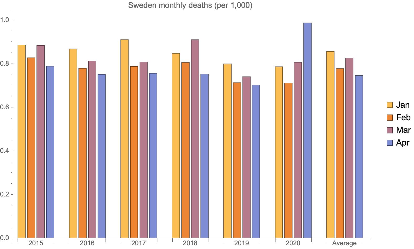
The effect is not lost looking at the population-adjusted deaths:
chartData =
  TakeList[#, {31, 29, 31, 30}] & /@ dailyDeaths[[All, 1 ;; 121]] //
   Map[DeleteMissing /* Total, #, {2}] &;
chartData = MapThread[Divide, {chartData, pop}];
BarChart[1000 chartData,
 ChartLabels -> {{2015, 2016, 2017, 2018, 2019, 2020, "Average"},
   None}, ImageSize -> Large, BarSpacing -> {0.25, 2},
 PlotLabel -> "Sweden monthly deaths (per 1,000)",
 ChartLegends -> {"Jan", "Feb", "Mar", "Apr"}]

It's probably going to take years to sort out all the effects of this pandemic. The problem will be hampered by siloed data, which will compounded by too much political influence on the collection and reporting of those data.