Images / animations are large, wait till they load. The best part IMHO is at the end. Huge table is NOT the end.
A color can be a hard thing to pinpoint. A harder question, perhaps: Do visually close colors evoke close semantic descriptions? Is electric lime close to goblin grin? Thats not RGB
but these are real colors. At least according to public color poll run by ever-inventive creator of XKCD comic Randall Munroe. And from 222,500 user sessions and over five million colors we finally can pose a question: if visual similarity of colors - like this graph (I will show how to build it from XKCD data later):
can be used to define "semantic proximity" of subjective color descriptions ...like these ones (also from XKCD data):
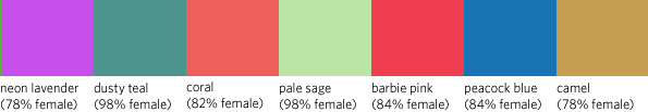
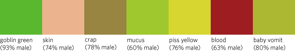
Well, we will investigate, or at least try to pinpoint, visual similarity to comprehend the semantic one (if there is any). BTW, this is not a typo, - ladies do prefer to use camel for color! And I am not going to comment about what type of glasses gentlemen see the world through. So what does programming have to do with this? Patience, there is a huge chart and a network - way down this post result of some coding
and probably a few more jokes. When Randall Munroe published the poll data there were a few efforts to visualize results. Simple table by XKCD like this
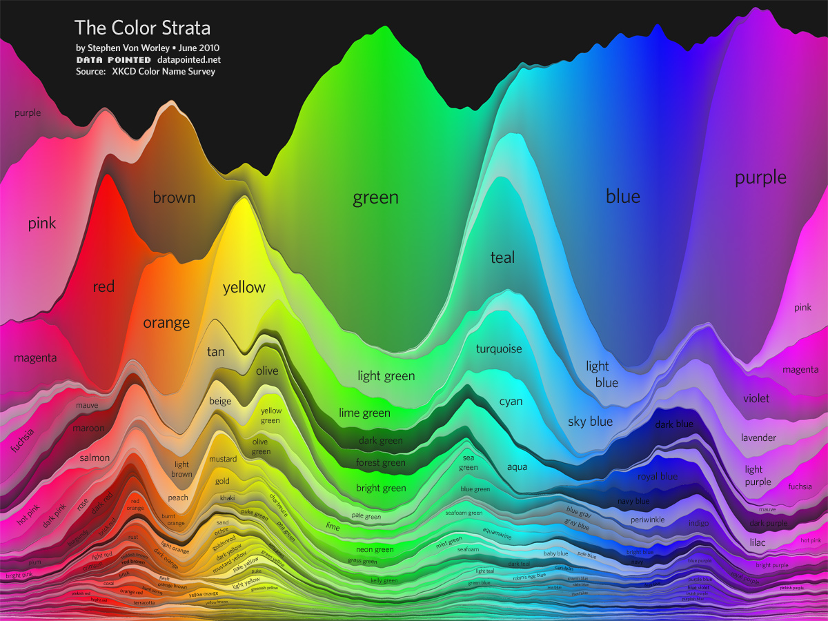
was a bit disorienting for me because colors were visually random. Data Pointed efforts were excellent. But first one had too few most-popular names (while stunning):
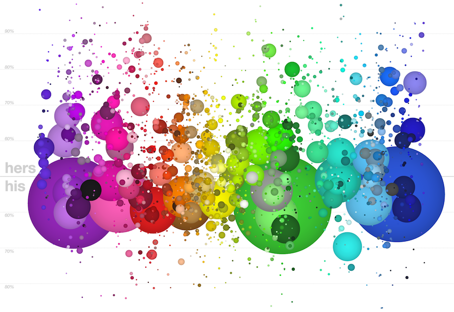
The second one, quite an interactive marvel, had some tiny points which were hard to see and easy to miss with good names:
I wanted to browse all ~1000 names but in a sort of consistent color-wise way. The main point being, when i see a "goblin green" color, I would like neighboring colors to be similar, so I can see which names should also be close semantically. Basically I wanted to compare names of similar colors. Lets import data and see a sample:
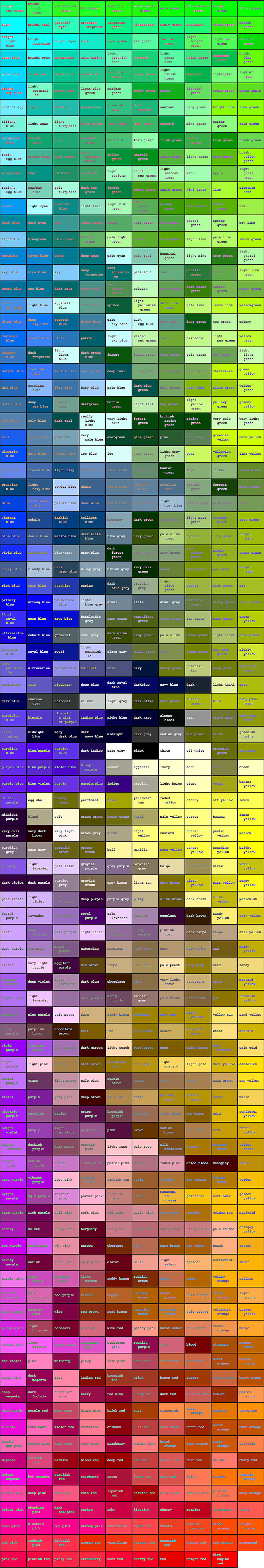
data = Import["http://xkcd.com/color/rgb.txt", "Data"][[All, 1 ;; 2]];
data // Length
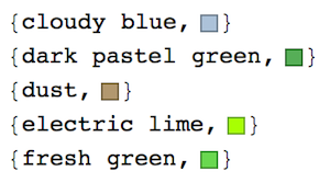
data[[;; 4]] // Column
`949
{{{"cloudy blue", "#acc2d9"}},
{{"dark pastel green", "#56ae57"}},
{{"dust", "#b2996e"}},
{{"electric lime", "#a8ff04"}}`
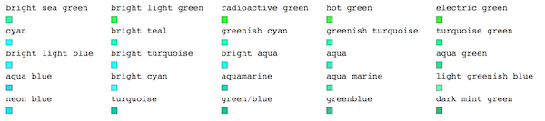
Note, colors are given as hexadecimal HTML codes. We can use Interpreter to get colors in WL format, say RGB:
clrs = Interpreter["Color"][data[[All, 2]]];
Multicolumn[clrs, 30]
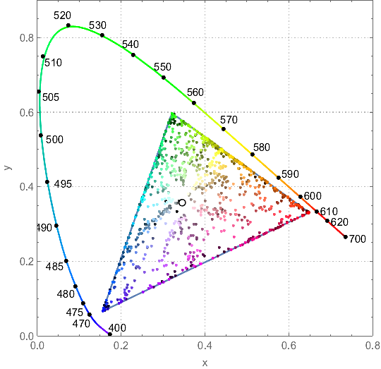
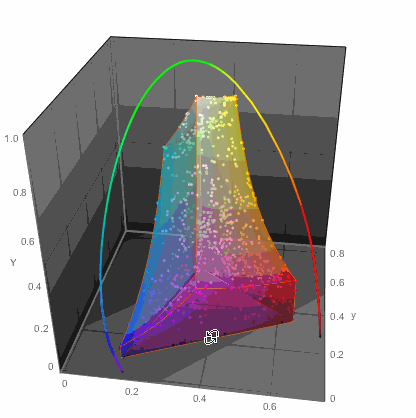
We, of course, could just throw all the points on a chromatic diagram:
ChromaticityPlot[{clrs, "RGB"}, PlotTheme -> "Detailed",
 Appearance -> {"VisibleSpectrum", "Wavelengths" -> True}]
...or in 3D
ChromaticityPlot3D[{clrs, "RGB"}, PlotTheme -> "Marketing",
 Appearance -> "VisibleSpectrum", SphericalRegion -> True]
...but that of course would not get me anywhere with readability of color names. So I decided to do the simplest thing - a table. Columns would arrange colors in one way while rows in another. This won't be perfect, but let's try it. For example in LUV color space there are 3 parameters:
- L - lightness, approximate luminance
- U - color
- V - color
LUV is a color space designed to have perceptual uniformity; i.e. equal changes in its components will be perceived by a human to have equal effects. I hope this uniformity will help me to rearrange the colors. LUV is extensively used for applications such as computer graphics which deal with colored lights and is device independent. Let's get data in a convenient format:
dataP = MapAt[ColorConvert[Interpreter["Color"][#], "LUV"] &, #, 2] & /@ data;
dataP[[;; 5]] // Column
I will sort by abstract colors U and V and sacrifice lightness L to keep things simple and 2-dimensional. 2D sorting already will be helpful. Once data are sorted according to U
dataPA = SortBy[dataP, #[[2, 2]] &];
we ragged-partition them in 10 columns and sort each column according to V:
dataPAB = SortBy[#, #[[2, 3]] &] & /@ Partition[dataPA, 10, 10, 1, {}];
dataPAB[[;; 5, ;; 5]] // TableForm
Note the tricky syntax for Partition to keep partitioning ragged and not cut off a short remaining column. Now I will just build a grid where cells are rectangles of color with the color name written inside. But here is a tricky part: text color should be in contrast to the color of cell background, to be readable. Good that we have ColorNegate! We can use ColorNegate[x] when cell color is x - cool! ...except when cell color is gray because
ColorNegate[Gray] // InputForm
GrayLevel[0.5]
Hmmm... Well let's be inventive. When ColorDistance of a cell-color too close to Gray - we'll simply use White for text. Define:
rect[{x_, y_}] := Framed[Style[x, 10,
   If[ColorDistance[ColorNegate[y], Gray] < .2, White,
    ColorNegate[y]]], Background -> y, ImageSize -> {80, 50}]
Check:
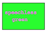
rect@{"speechless green", Green}
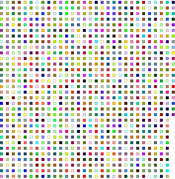
Great, we now ready. Behold, read, and wonder (right-click and "open image in new tab" to see a bigger version). Do not forget - there is more stuff after this table.
Grid[ParallelMap[rect, dataPAB, {2}], Spacings -> {0, 0}]
Well, could there a be a better or different way to visualize relationships? What about a network graph - judging by social analytics approaches - they are the best to represent relationships. Let's make a clean cut and get the data again:
data = Import["http://xkcd.com/color/rgb.txt", "Data"][[All, 1 ;; 2]];
And we turn strings of color descriptions into WL format colors with Interpreter again:
data = Reverse[MapAt[Interpreter["Color"], #, 2]] & /@ data;
data[[;; 5]] // Column
Now, like on Facebook - you have friends and they have friends and so on - we need to find closest friends of each color. We can use ColorDistance for that that utilizes many measures, for example Euclidean distance in LABColor and such. Let's define our distance function:
neco[{u_, v_}, {x_, y_}] := ColorDistance[u, x]
Now in WL we have an awesome function Nearest that can operate on any objects to deduce the closest to it objects:
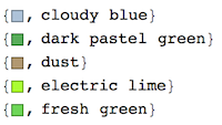
neig[c_] := Nearest[DeleteCases[data, c], c, {All, .16}, DistanceFunction -> neco]
where {All, .16} means among all objects find closest within radius 0.16 as given by DistanceFunction. DeleteCases is needed exclude the original object as its own friend. Check:

This function will connect the original color and its closest friends within 0.16 measure of DistanceFunction
edgs[v_] := v <-> # & /@ neig[v]
Check:
Noticed the trick with Sort? Sort will flip the edges to orient b<->a as a<->b so we can delete duplicates using Union when building all edges between all colors and their friends:
edgsALL = Union[Sort /@ Flatten[ParallelMap[edgs, data], 1]];
To get a simple color-proximity Graph define a VertexLabels function:
panelLabel[lbl_] := lbl[[1]]
And now behold:
g = Graph[data, edgsALL, VertexLabels -> Table[i -> Placed[{i}, Center, panelLabel], {i, data}],
  EdgeStyle -> Opacity[.2], EdgeShapeFunction -> "Line", VertexSize -> 0, ImageSize -> 900]
To build a large scale browseable network with readable labels define new label function:
panelLabel[lbl_] := Panel[Style[lbl[[2]], 14, Bold,
   If[ColorConvert[lbl[[1]], "GrayLevel"][[1]] < .5, White, Black]],
  FrameMargins -> 0, Background -> lbl[[1]]]
Instead of negating the color of text (as we did in the huge table) we make it White if GrayLevel of background is < 0.5 and Black if it is > 0.5. A different approach. Check:
Perfect. Now the monster network:
g = Graph[data, edgsALL, VertexLabels ->
    Table[i -> Placed[{i}, Center, panelLabel], {i, data}],
   EdgeStyle -> Opacity[.2], EdgeShapeFunction -> "Line",
   VertexSize -> 0, ImageSize -> 10000];
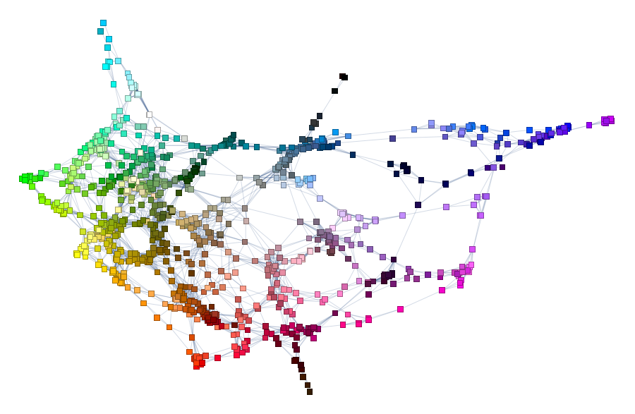
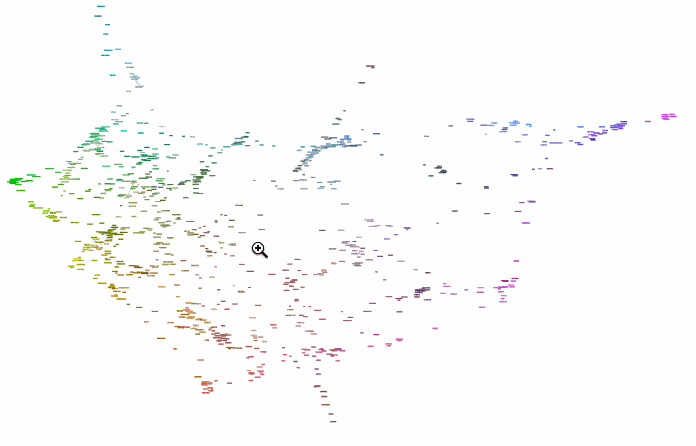
To browse it open ==> THIS LINK <== in a NEW TAB and zoom in/out. It will look something like this:
Interesting part is why did we chose radius 0.16? Two words - percolation theory. Radius 0.16 for XKCD data serves as percolation threshold much below which the network has a lot of disconnected components and much above which the network is "overconnected" complete Graph. The former is lack of information and the later is "too much" info for meaningful sharp description. My intuition is that percolation threshold is the golden middle that allows for concise but precise definitions. You can experiment lowering it and increasing it to see how network under- and over- connects. Percolation threshold is that moment when you can get from one description to another and then next one and get to any other description. Using association chains you can deduce deeper connections among remote meanings in the whole network. This is of course is speculative and arguable. Let me know if you are familiar with relevant research or have an opinion. And now using percolation threshold we can define new colors based on old descriptions:
Labeled[Grid[neig[{#, ""}], Frame -> All],
   Row[{"New clor ", Graphics[{#, Disk[]}, ImageSize -> 30], " is like"}], Top] &@RandomColor[]
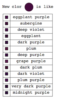
Concise (much less than full ~1000 descriptors) but precise (you "got the feeling"). Now what is next? It would be really great to make a "machine" have an imagination and form its own new color descriptors. How? - not sure but probably running WL machine learning on some large color-related corpora. When I figure it out - I will write a continuation. Or maybe you will?


