Hi Vitaliy,
nice to hear from you. Yes I read your posts with great interest. The graphic you posted is really nice. It is very interesting to see the area of the different counties and how that depends on the GeoPosition, i.e. the further east the smaller. I found this instructive:
AbsoluteTiming[
 countydata = {CommonName[#], EntityValue[#, EntityProperty["AdministrativeDivision", "Area"]],
                        EntityValue[#, EntityProperty["AdministrativeDivision", "Position"]],
                        EntityValue[#, EntityProperty["AdministrativeDivision", "Population"]],
                        EntityValue[#, EntityProperty["AdministrativeDivision", "PopulationDensity"]]} & /@ usco;]
to get some data on the counties and then this BubbleChart:
BubbleChart[{Last@Flatten[List @@ #[[3]]],
    Log@(QuantityMagnitude[#[[2]]]), QuantityMagnitude[#[[4]]]} & /@ countydata,
 Epilog -> {Line[{{-104, 3.6}, {-104, 9.7}}], Line[{{-128, 7}, {-75, 7}}]}, FrameLabel -> {"Longitute, i.e. West to East", "Log[Area of County]"}, LabelStyle -> Directive[Bold, Medium]]
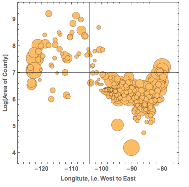
The x-axis is the position of the Counties from West to East. The y-axis shows the area of the counties and the size of the bubble represents the population in the County. The black lines are to guide the eye. The graph shows the large western Counties and the small eastern ones (in terms of surface/area). If we compare the counties east of -104 degrees longitude, we see that there are:
Total@(QuantityMagnitude@Select[countydata, Last@Flatten[List @@ #[[3]]] > -104 &][[All, 4]])
(*14755803*)
nearly 15 million people. In the west of -104 degrees, there are only
Total@(QuantityMagnitude@Select[countydata, Last@Flatten[List @@ #[[3]]] < -104 &][[All, 4]])
(*2228140*)
2.2 million people. So if the pleasure of experiencing such an event is roughly proportional to the number of people, there will be much more pleasure in the east. In other words the joy will increase over time...
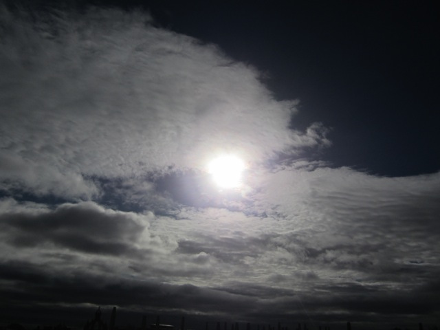
Sorry for this digression. Yes, Aberdeen was quite close to the zone of totality on 20 March. Unfortunately, the sky was not as clear as the station at the airport (a bit outside of Aberdeen) suggests. I was teaching/preparing to teach at the time, but here are some pictures that a colleague of mine took:
and
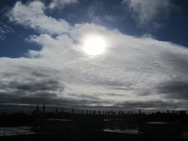
Even image processing cannot get those pictures clear. I have, however, seen some photos that students took that showed more. I will ask them to post some of the photos.
You also said that you hope that people in the US then will have the Netatmo devices. In fact, there are lots of them everywhere in the US. Here are the ones for Champaign IL:
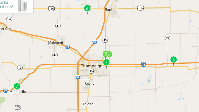
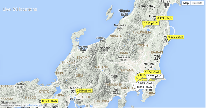
This is the cool stuff about these crowed-sourced devices. They are everywhere and the data can be quite cool. Here is a project in Japan where they use Geiger counters everywhere to track radioactivity levels:
It appears that one of the advantages of Mathematica is that, because of its ability to import all sorts of data, it can help to combine different publicly available data sources even if the data comes in very different forms. This is a nice step towards Conrad Wolfram's idea of How Citizen Computing Changes Democracy.
Data is everywhere and it's fun to work with it. With all the connected devices and technologies such as DataDrop the amount of data that will be collected in the future will be enormous. I am sure that in 2017 we will see great data collected during the eclipse.
For those who are already looking forward to it, here are some more impressions from this year's eclipse.
Cheers,
Marco


