Hi Vitaliy,
i guess it might become important for the global warming discussion one day. The good thing is that there is very good data coverage in some areas. I think two of the main problems are: (i) there is basically no data at the arctic and antarctic; these regions are very important for climate models. Of course you can use Mathematica to do eg. Kriging to estimate the temperatures in these remote regions - or use additional satellite data. (ii) climate change is a rather long term process. It is not weather change, but is supposed to take place over long periods of time. So these private weather stations would have to be operational for many years, much longer than the product exists.
In principle it should be possible to monitor (data mine with the help of DataDrop?) some extreme weather events, e.g. pressure profiles during a Hurricane etc.
There is something else that might be interesting. It is way off the original topic of the post but it is meant as a side remark, so I'll just post it here. The people from Netatmo used the indoor sound measurements, which are not publicly available, to analyse the sound levels during the football/soccer world championships to find out which fans are most enthusiastic. This was actually a quite nice addition to the fantastic blog posts (first / second) on the Wolfram blog. All three studies use data one is from a crowed sourced database.
For my own data at home I can do something similar:
data = SemanticImport["~/Desktop/Indoor_25_3_2015.csv"];
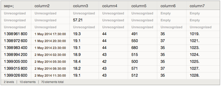
If you now plot the noise levels (column6) you get
DateListPlot[Transpose[{Lookup[data // Normal, "column2"][[23 ;;]], MovingAverage[Lookup[data // Normal, "column6"][[4 ;;]], 20] // N}], FrameLabel -> {"Time", "Noise level dB"}, LabelStyle -> Directive[Bold, Medium]]
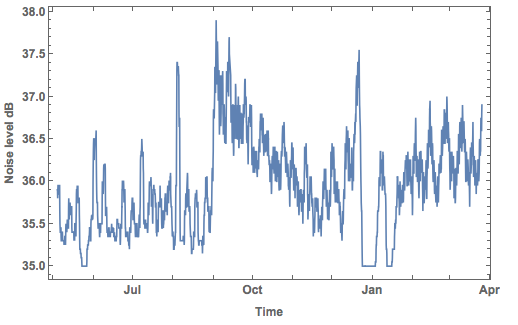
This is the noise level at my home. You see that something changed at the end of August last year, which was when my daughter was born. Before Christmas, when the noise level went down because we travelled, the noise levels went up; this agrees with her getting unsettled before Christmas. After coming back from the Christmas holidays we came back and left for another week or so as you can clearly see from the data. It is actually quite interesting to see that there is an interesting pattern developing towards the end of the time series.
DateListPlot[Transpose[{Lookup[data // Normal, "column2"][[23 ;;]],
    MovingAverage[Lookup[data // Normal, "column6"][[4 ;;]], 20] // N}][[-500 ;;]], FrameLabel -> {"Time", "Noise level dB"}, LabelStyle -> Directive[Bold, Medium], AspectRatio -> 1/3,Filling-> Bottom]
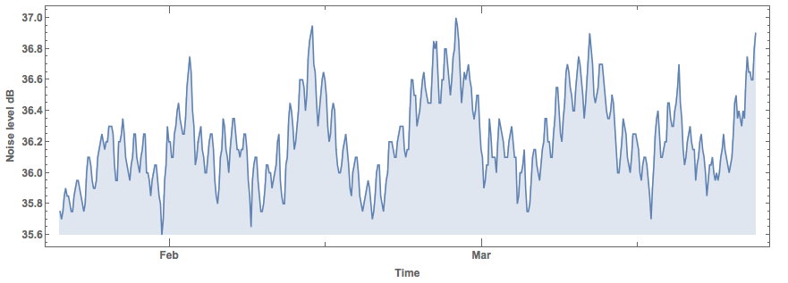
The high frequency component corresponds to days, i.e. there is a daily cycle of the noise levels. Interestingly, there is also a longer 10-11 day cycle. I have absolutely no idea where that comes from. Any hints are welcome!
Cheers,
Marco


