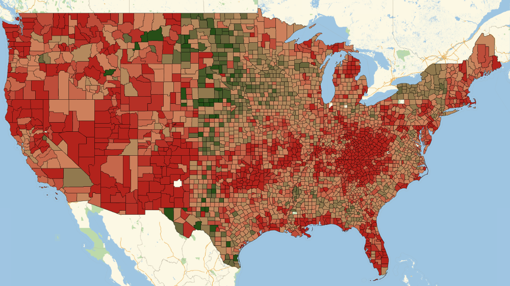
The data Drug Poisoning Mortality: United States, 19992014 are published by USA government. In a few recent blogs (1, 2, 3) static visualizations of data were performed. Here we show how to animate maps of geographical drug overdose spread in USA. Below you can see 4 images, each reflecting upon Age-adjusted death rates for drug poisoning per 100,000 population by county and year:
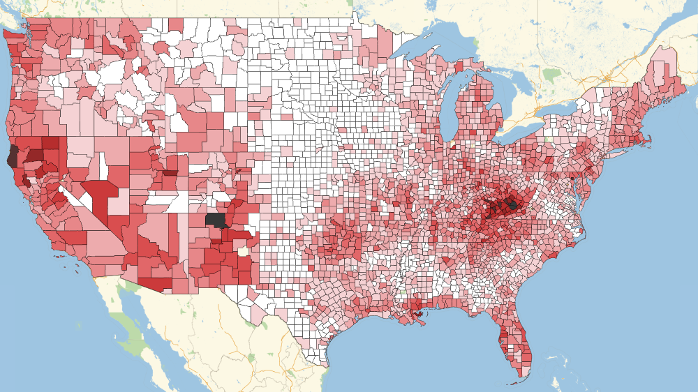
- First static frame 1999
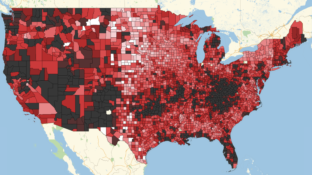
- Last static frame 2014
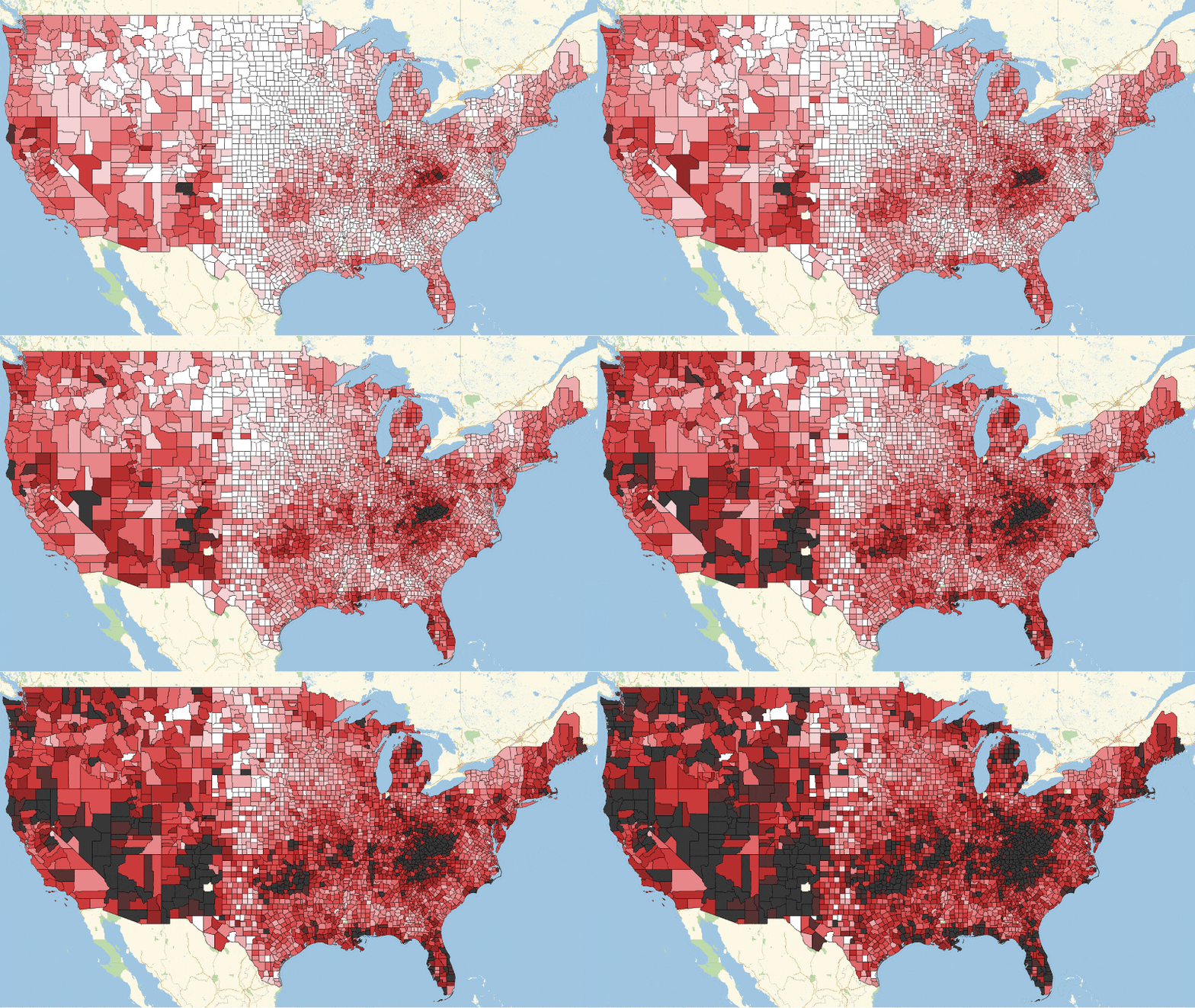
- Animated .GIF of the whole period with 1 frame per year
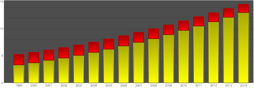
- Range of rates versus time, USA average
Quoting NPR news Obama Asks Congress For More Money To Fight Opioid Drug Abuse:
Every day in America more than 50 people die from an overdose of prescription pain medication. Some people who start out abusing pain pills later turn to heroin, which claims another 29 lives each day.
1999: Age-adjusted death rates for drug poisoning per 100,000 population by county and year

2014: Age-adjusted death rates for drug poisoning per 100,000 population by county and year

1999 - 2014 Animation: Age-adjusted death rates for drug poisoning per 100,000 population by county and year

Range of rates versus time: Age-adjusted death rates for drug poisoning per 100,000 for USA average over counties
Getting the data
We can download data in .CSV format from CDC web site. I keep data file in the same as the notebook directory to shorten file-path strings.
SetDirectory[NotebookDirectory[]]
raw = SemanticImport["ops.csv"]
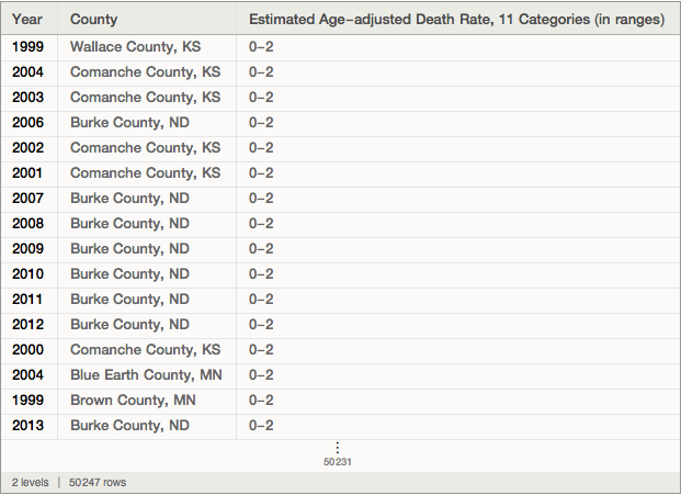
Making "interpreted" dataset
In Wolfram Language (WL) many built-in data allow for interpretation of imported data. For example, the USA counties could be interpreted as entities:

But I did not use SemanticImport to interpret on import automatically, because I would like to do this efficiently. The table has 50247 entries
Normal[raw[All, "County"]] // Length
50247
while there are only 3141 actual counties listed:
Normal[raw[All, "County"]] // Union // Length
3141
So instead of making 50247 calls to interpreter we will make just 3141 and use efficient Dispatch after to distribute replacement rules over all 50247 entries. I've spent only 100 seconds on making Dispatch
countyRULEs = Dispatch[
    Thread[# -> Interpreter["USCounty"][#]] &@
     Union[Normal[raw[All, "County"]]]]; // AbsoluteTiming
{108.124, Null}
And almost no time on interpreting dataset:
data = raw /. countyRULEs; // AbsoluteTiming
data
{0.441731, Null}
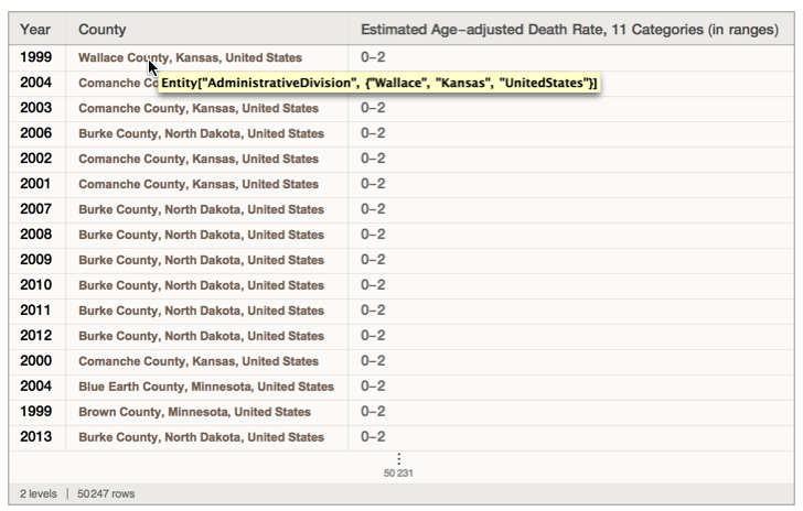
Bounds of death-rates for future rescaling
Note a StringReplace trick for going ToExpression here and throughout the rest of the post:
MinMax[ToExpression[StringReplace[Normal[
data[All, "Estimated Age-adjusted Death Rate, 11 Categories (in ranges)"]], {"-" -> "+", ">" -> "2*"}]]/2]
{1, 20}
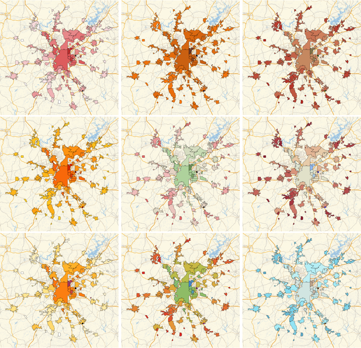
Testing color scheme
Color scheme are important to properly blend with native colors of maps and also to express data. These are some tests with Color Schemes available in Wolfram Language.
tmp = GeoNearest["City",
   Entity["City", {"Atlanta", "Georgia", "UnitedStates"}], {All, Quantity[50, "Kilometers"]}];

Multicolumn[Table[
  GeoRegionValuePlot[tmp -> "PopulationDensity", PlotLegends -> False,
    ColorFunction -> (ColorData[{clmap, "Reverse"}][#] &), ImageSize -> 400]
  , {clmap, {"CherryTones", "SolarColors", "SunsetColors",
    "RustTones", "WatermelonColors", "Rainbow", "RoseColors",
    "ThermometerColors", "BrownCyanTones"}}], 3]
Year 1999: a specific year GiS plot
GeoRegionValuePlot[

  Thread[Normal[data[Select[#Year == 1999 &], "County"]] ->
    ToExpression[StringReplace[Normal[data[Select[#Year == 1999 &]][All,
         "Estimated Age-adjusted Death Rate, 11 Categories (in ranges)"]], {"-" -> "+", ">" -> "2*"}]]/2],

  GeoRange -> {{24, 50}, {-125, -66}},
  GeoProjection -> "Mercator",
  ColorFunctionScaling -> False,
  ColorFunction -> (ColorData[{"CherryTones", "Reverse"}][
      Rescale[#, {1, 20}]] &),
  PlotLegends -> False,
  ImageSize -> 1000] // Rasterize
Making animation
frames = ParallelTable[
   GeoRegionValuePlot[

    Thread[
     Normal[data[Select[#Year == year &], "County"]] ->
      ToExpression[StringReplace[Normal[data[Select[#Year == year &],
           "Estimated Age-adjusted Death Rate, 11 Categories (in ranges)"]], {"-" -> "+", ">" -> "2*"}]]/2],

    GeoRange -> {{24, 50}, {-125, -66}},
    GeoProjection -> "Mercator",
    ColorFunctionScaling -> False,
    ColorFunction -> (ColorData[{"CherryTones", "Reverse"}][
        Rescale[#, {1, 20}]] &),
    PlotLegends -> False,
    ImageSize -> 800],
   {year, Range[1999, 2014]}];
Making legend
Panel@Grid[Transpose[{#, ColorData[{"CherryTones", "Reverse"}][Rescale[#, {1, 20}]]} & /@Range[1, 20]]]
Growth of death rates ranges vs time
bandGrowth = Transpose[Table[N[Mean[ToExpression[
      StringReplace[Normal[data[Select[#Year == y &]][All,
         "Estimated Age-adjusted Death Rate, 11 Categories (in \
ranges)"]], {"-" -> "~List~", ">" -> "{#,#}&@"}]]]], {y, Range[1999, 2014]}]]

BarChart[{#[[1]], #[[2]] - #[[1]]} & /@ Transpose[bandGrowth],
 PlotTheme -> "Marketing", ChartLayout -> "Stacked",
 ChartLabels -> {Range[1999, 2014], None}, ImageSize -> 850,
 AspectRatio -> 1/3, ChartStyle -> {Yellow, Red}]
Another color scheme sample
In this dark-low-values color scheme you can see better a few white spots. Those are very few counties where data are missing.
1999
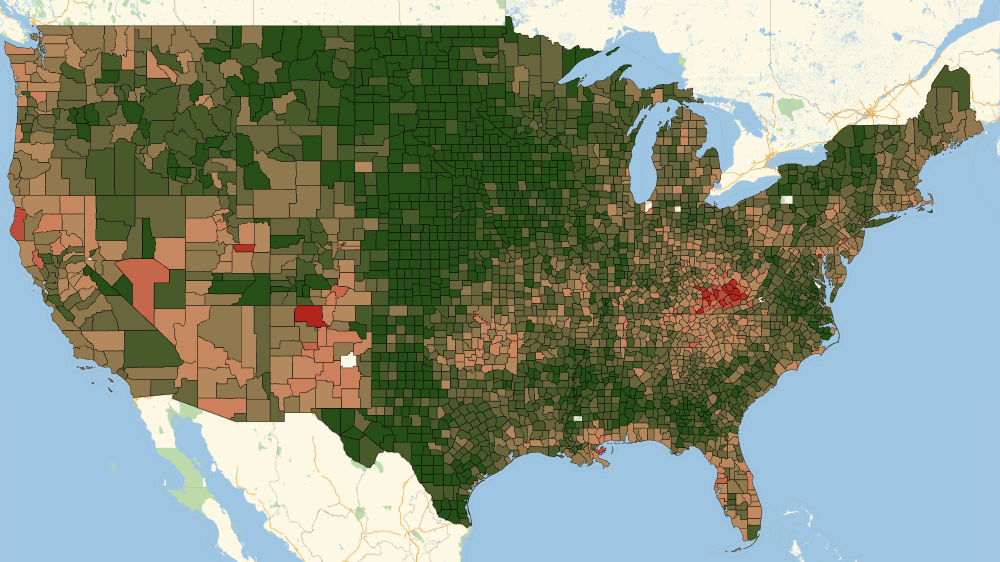
2014
 Attachments: