In 2014 Conrad Wolfram gave a fascinating TEDx talk. The main question is whether more data has led to better decision making and better democracy. He suggests that there is more and more data, but the data is often not in an accessible form. Certainly, the Wolfram's language curated data is a great resource, but a large number of its features for data processing make it possible to analyse data which originates elsewhere, e.g. from the internet. The drive to make data openly available can be seen everywhere; a great example is the NYC open data initiative. The data might not be in a curated form, but the Wolfram Language allows us to easily work with the data.
I will look at traffic accidents in New York City; here is the data to produce images like this one:
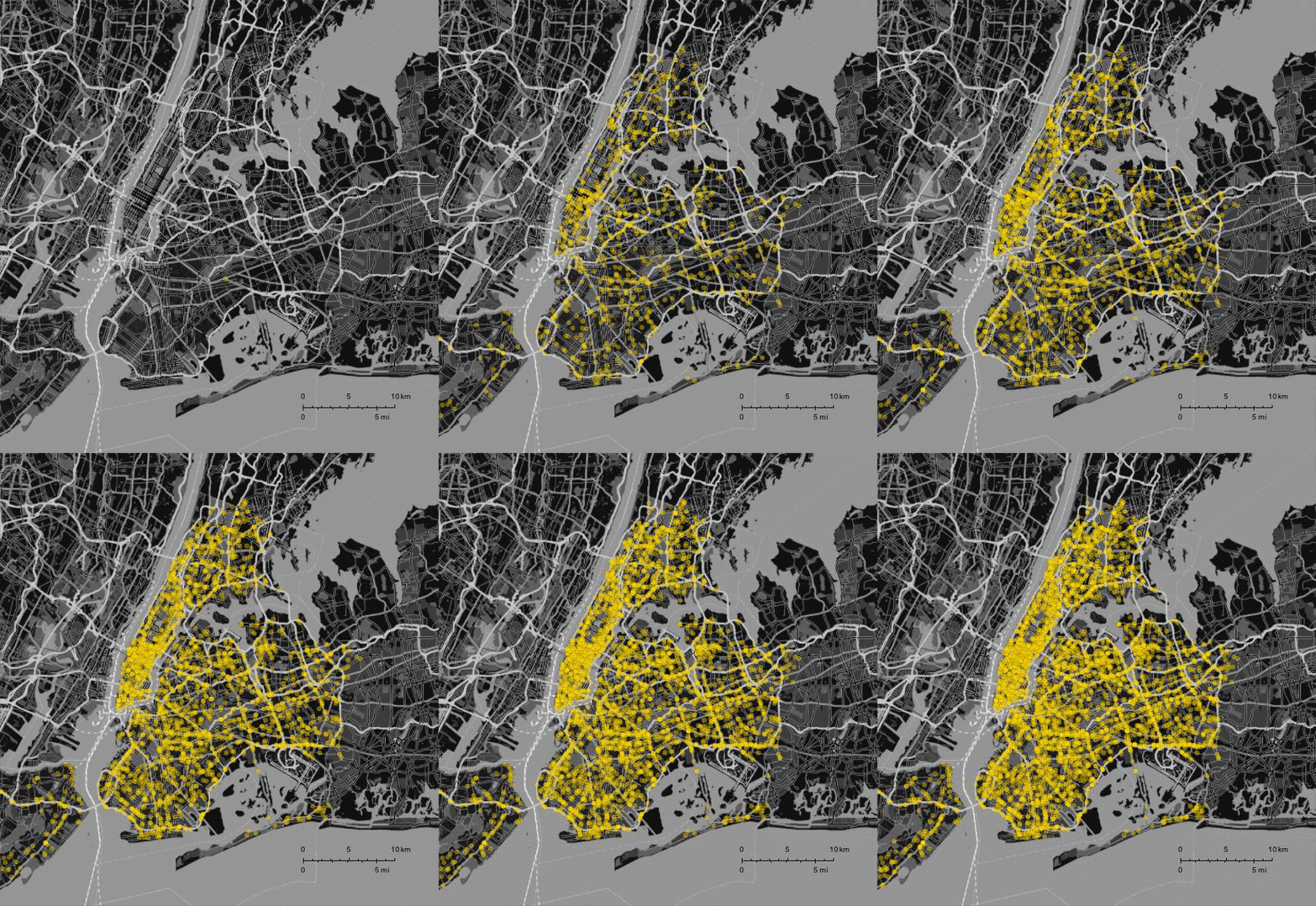
You can export the data in csv format from the website and then import into Mathematica:
data = Import["/Users/thiel/Desktop/NYPD_Motor_Vehicle_Collisions.csv"];
There is an awful lot of information:
data[[1 ;; 5]] // TableForm

These are only the first couple of rows and columns of the data set. This is the content of each of the rows:
data[[1]]

and there are
Length[data]-1
769055 rows with data in it, which we can plot:
styling = {GeoBackground ->GeoStyling["StreetMapNoLabels",GeoStylingImageFunction -> (ImageAdjust@ColorNegate@ColorConvert[#1, "Grayscale"] &)],GeoScaleBar -> Placed[{"Metric", "Imperial"}, {Right, Bottom}],GeoRangePadding -> Full,ImageSize -> Large};
GeoListPlot[GeoPosition /@ DeleteCases[data[[2 ;; 5000, {5, 6}]], {"", ""}],
 PlotStyle -> Directive[RGBColor[1, 0.85, 0], Opacity[0.4]], styling, GeoRange -> {GeoPosition[{40.50793817653841, -74.16902299250545},
"ITRF00"], GeoPosition[{40.95357970888789, -73.59969808862613}, "ITRF00"]}]
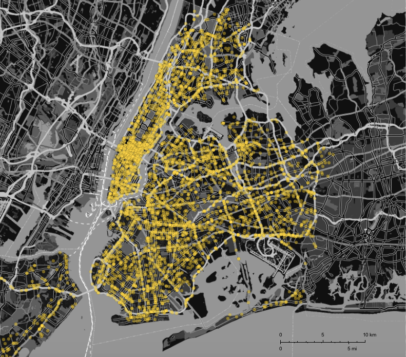
where the styling function is taken from the absolutely outstanding blog post by @Bernat Espigulé Pons on the Runkeeper app: A Year of Runkeeper: Analysis and Visualization. The frames for the movie above were generated using this piece of code:
Monitor[framesaccidents =
   Table[GeoListPlot[GeoPosition /@ DeleteCases[data[[2 ;; k, {5, 6}]], {"", ""}], PlotStyle -> Directive[RGBColor[1, 0.85, 0], Opacity[0.4]],
     styling, GeoRange -> {GeoPosition[{40.50793817653841, -74.16902299250545},"ITRF00"],
       GeoPosition[{40.95357970888789, -73.59969808862613}, "ITRF00"]}], {k, 2, 5002, 100}];, k]
Instead of using ListAnimate I prefer exporting the frames and merging them into a gif in the terminal:
Do[Export["~/Desktop/VehicleCrashes/frame" <> ToString[1000 + k] <> ".jpg", framesaccidents[[k]]], {k, 1, Length[framesaccidents]}]
When do accidents happen?
We can easily extract dates and times from the file and represent when during the day the accidents happen - here for the first 160k accidents in the list:
datestimes = Select[Quiet[DateObject /@ ToExpression[Select[Flatten[StringSplit[#, {"/", ":"}]] & /@
        data[[2 ;; 160000, {1, 2}]], Length[#] == 5 &]]], Head[#] == DateObject &];
We can then plot a histogram of that:
Histogram[N@UnitConvert[Quantity[#, "Minutes"], "Hours"] & /@ (60*#[[1]] + #[[2]] & /@ SortBy[DateValue[datestimes, {"Hour", "Minute"}], 1]), 60,
ImageSize -> Large]
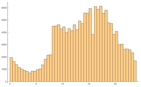
The x-axis show the time of the day and the y-axis the number of accidents. 4 am seems to be a good driving time in New York.
Causes of accidents
The file also contains reasons for the accidents which we can collect like so:
WordCloud[DeleteCases[
   DeleteCases[Flatten[{data[[2 ;; 20000, 19]], data[[2 ;; 20000, 20]]}], "Unspecified"], ""] /. "Driver Inattention/Distraction" -> "Distraction", WordOrientation -> {{-\[Pi]/4, \[Pi]/4}}]
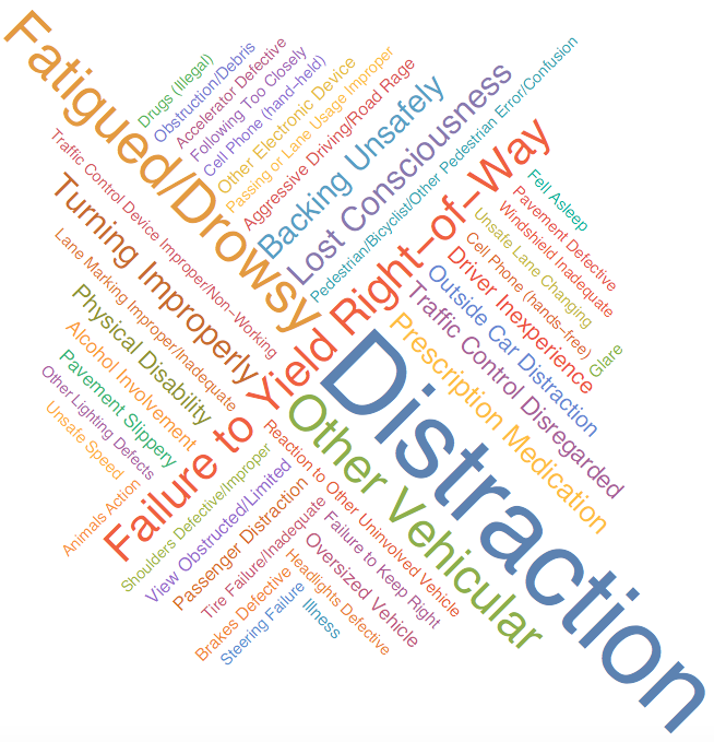
This suggests that it is a good idea not to get distracted when you drive or be too tired.
How many people were injured?
We can also extract information on how many people were injured or killed if any.
PieChart[{Count[#[[All, 1]], 0], Total[#[[All, 1]] /. "Unspecified" -> 0], Total[#[[All, 2]]] /. "" -> 0} &@ Select[data[[2 ;;]], Length[#] > 11 &][[All, {11, 12}]],
 ChartLabels -> {"no person injured", "injured", "dead"}, LabelStyle -> Directive[Bold, Medium]]
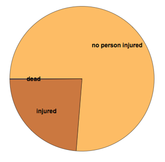
It becomes clear that in most cases nobody gets injured, but there are 980 fatalities listed in the data set.
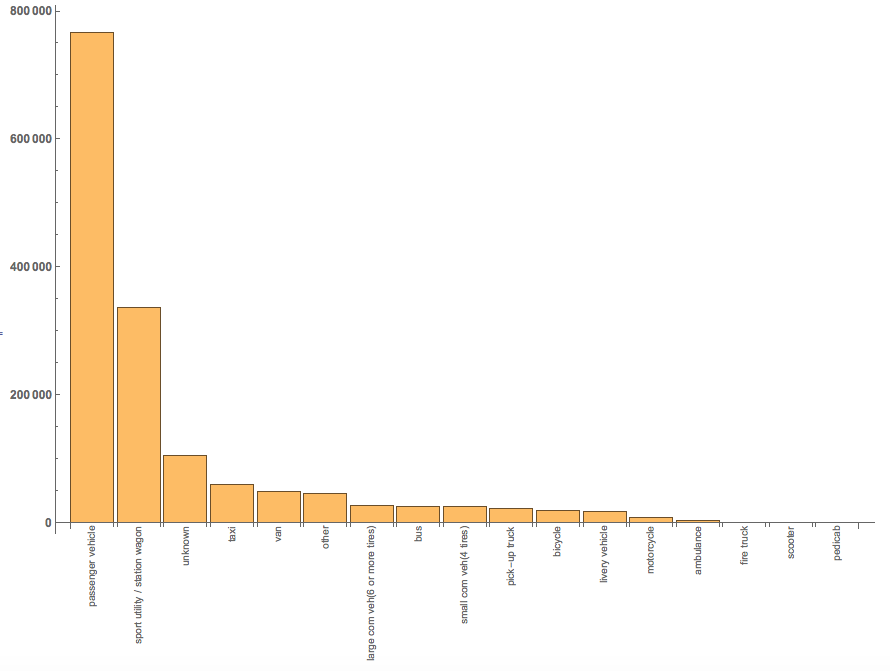
Which vehicles were involved?
There are conveniently some columns with data to help visualise that.
BarChart[#[[All, 2]], ChartLabels -> Thread@Rotate[#[[All, 1]], Pi/2],LabelStyle -> Directive[Bold, Medium]] & @
Reverse@SortBy[Tally[ToLowerCase /@ DeleteCases[Flatten[Select[data[[2 ;;]], Length[#] > 27 &][[2 ;;, {25, 26, 27, 28}]]], ""]], Last]
Distribution of accidents
We can now try to estimate the distribution of accidents in New York. The method is motivated by this fantastic post by Michael Trott.
crashDensityDistribution = SmoothKernelDistribution[RandomChoice[DeleteCases[data[[2 ;; 10000, {5, 6}]], {"", ""}], 2000], "SheatherJones"];
cplot = ContourPlot[PDF[crashDensityDistribution, {y, x}],
Evaluate@Flatten[{x, {#[[1, 1, 2]], #[[2, 1, 2]]} &@GeoBoundingBox[Entity["City", {"NewYork", "NewYork", "UnitedStates"}]]}],
Evaluate@Flatten[{y, {#[[1, 1, 1]], #[[2, 1, 1]]} &@GeoBoundingBox[Entity["City", {"NewYork", "NewYork", "UnitedStates"}]]}],
ColorFunction -> "Rainbow", Frame -> False, PlotRange -> All, Contours -> 405, MaxRecursion -> 2, ColorFunction -> ColorData["TemperatureMap"],
PlotRangePadding -> 0, ContourStyle -> None, ImageSize -> Full];
GeoGraphics[{Opacity[0.5], GeoStyling[{"GeoImage", cplot}], Polygon[Entity["City", {"NewYork", "NewYork", "UnitedStates"}]]}, GeoRange -> Entity["City", {"NewYork", "NewYork", "UnitedStates"}], ImageSize -> Full]
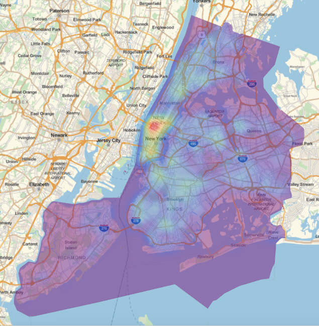
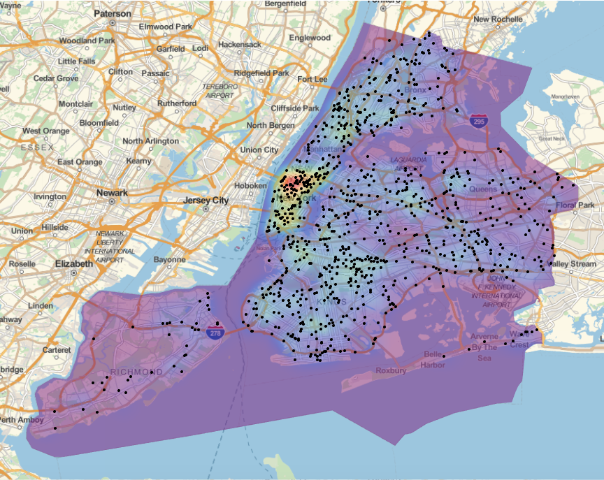
The red area in Manhattan, shows that there is a hot spot. We can add some locations of accidents to help interpret the data:
GeoGraphics[{Opacity[0.5], GeoStyling[{"GeoImage", cplot}],
Polygon[Entity["City", {"NewYork", "NewYork", "UnitedStates"}]], Black, Opacity[1], PointSize[0.005],
Point[Reverse /@ RandomChoice[DeleteCases[data[[2 ;; 2000, {5, 6}]], {"", ""}], 1500]]},
GeoRange -> Entity["City", {"NewYork", "NewYork", "UnitedStates"}], ImageSize -> Full]
As I said above, I really like @Bernat Espigulé Pons's styling:
GeoGraphics[{Opacity[0.6], GeoStyling[{"GeoImage", cplot}], Polygon[Entity["City", {"NewYork", "NewYork", "UnitedStates"}]],
Yellow, Opacity[0.2], PointSize[0.005], Point[Reverse /@ RandomChoice[DeleteCases[data[[2 ;; 2000, {5, 6}]], {"", ""}], 1500]]},
GeoRange -> Entity["City", {"NewYork", "NewYork", "UnitedStates"}], ImageSize -> Full, styling]
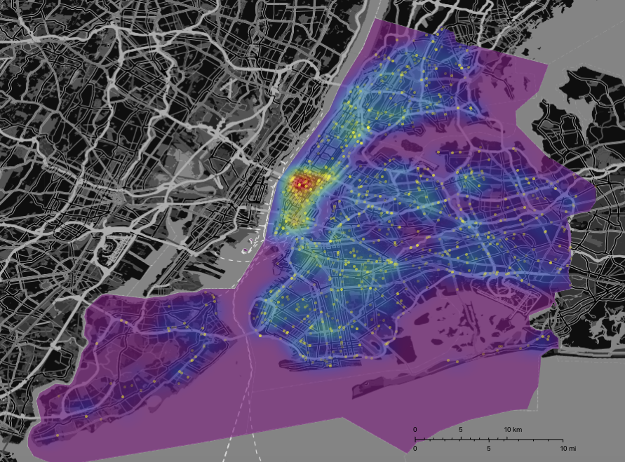
Again we see a strong cluster of accidents in Manhattan. In Central Park there are very few accidents. ;-) We can also represent the deadly accidents as points - where I leave the background distribution of all accidents in place.
GeoGraphics[{Opacity[0.6], GeoStyling[{"GeoImage", cplot}], Polygon[Entity["City", {"NewYork", "NewYork", "UnitedStates"}]],
Red, Opacity[0.6], PointSize[0.005], Point[Reverse /@ DeleteCases[Select[Select[data, Length[#] > 11 &], #[[12]] > 0 &][[2 ;;, {5, 6}]], {"", ""}]]},
GeoRange -> Entity["City", {"NewYork", "NewYork", "UnitedStates"}], ImageSize -> Full, styling]
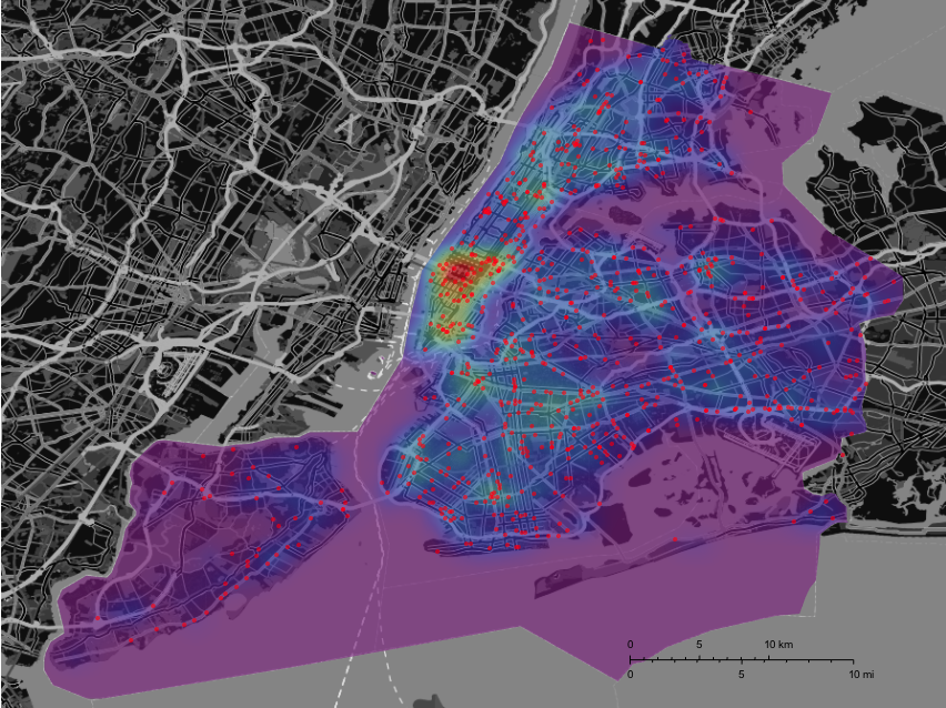
I think that the deadly accidents are slightly less concentrated in Manhattan. We might want to use a hypothesis test to check that. Here are both plots (on the same background) next to each other:
GraphicsRow[{GeoGraphics[{Opacity[0.6], GeoStyling[{"GeoImage", cplot}],
Polygon[Entity["City", {"NewYork", "NewYork", "UnitedStates"}]], Black, Opacity[0.6], PointSize[0.01],
Point[Reverse /@ RandomChoice[DeleteCases[data[[2 ;; 2000, {5, 6}]], {"", ""}], 784]]}, GeoRange -> Entity["City", {"NewYork", "NewYork", "UnitedStates"}], ImageSize -> Full, styling],
GeoGraphics[{Opacity[0.6], GeoStyling[{"GeoImage", cplot}], Polygon[Entity["City", {"NewYork", "NewYork", "UnitedStates"}]],
Black, Opacity[0.6], PointSize[0.01], Point[Reverse /@ DeleteCases[Select[Select[data, Length[#] > 11 &], #[[12]] > 0 &][[2 ;;, {5, 6}]], {"", ""}]]}, GeoRange -> Entity["City", {"NewYork", "NewYork", "UnitedStates"}], ImageSize -> Full, styling]}]
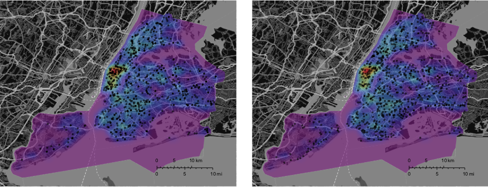
Let's adapt the distribution function for the deadly accidents and plot it again:
crashDensityDistributiondeadly = SmoothKernelDistribution[
   DeleteCases[Select[Select[data, Length[#] > 11 &], #[[12]] > 0 &][[2 ;;, {5, 6}]], {"", ""}], "SheatherJones"];
cplotdeadly = ContourPlot[PDF[crashDensityDistributiondeadly, {y, x}],
Evaluate@Flatten[{x, {#[[1, 1, 2]], #[[2, 1, 2]]} &@GeoBoundingBox[Entity["City", {"NewYork", "NewYork", "UnitedStates"}]]}],
Evaluate@Flatten[{y, {#[[1, 1, 1]], #[[2, 1, 1]]} &@GeoBoundingBox[Entity["City", {"NewYork", "NewYork", "UnitedStates"}]]}],
ColorFunction -> "Rainbow", Frame -> False, PlotRange -> All, Contours -> 405, MaxRecursion -> 2, ColorFunction -> ColorData["TemperatureMap"],
PlotRangePadding -> 0, ContourStyle -> None, ImageSize -> Full];
GraphicsRow[{GeoGraphics[{Opacity[0.6], GeoStyling[{"GeoImage", cplot}], Polygon[Entity["City", {"NewYork", "NewYork", "UnitedStates"}]],
Black, Opacity[0.6], PointSize[0.01], Point[Reverse /@ RandomChoice[DeleteCases[data[[2 ;; 2000, {5, 6}]], {"", ""}], 784]]},
GeoRange -> Entity["City", {"NewYork", "NewYork", "UnitedStates"}],ImageSize -> Full, styling],
GeoGraphics[{Opacity[0.6], GeoStyling[{"GeoImage", cplotdeadly}], Polygon[Entity["City", {"NewYork", "NewYork", "UnitedStates"}]],
Black, Opacity[0.6], PointSize[0.01], Point[Reverse /@ DeleteCases[Select[Select[data, Length[#] > 11 &], #[[12]] > 0 &][[2 ;;, {5, 6}]], {"", ""}]]}, GeoRange -> Entity["City", {"NewYork", "NewYork", "UnitedStates"}], ImageSize -> Full, styling]}]
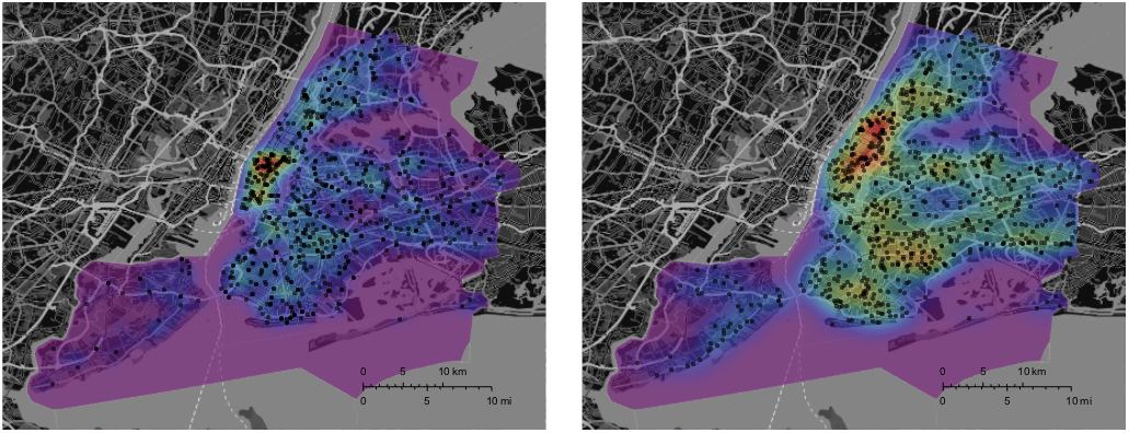
Mathematica has obviously adjusted the colour scale, but it becomes quite clear that deadly accidents seem to be more "spread out" than all accidents. This is an oversimplification, but it suggests that you are more likely to be caught in an accident in Manhattan, but you are more likely to survive it.
This is only the very first bit of the analysis and we have not explored many interesting bits of information hidden in the dataset. One thing that would be nice is to modify TravelDirections as to take into consideration that certain streets/regions are more dangerous.
Cheers,
Marco