Marco, thanks a lot for sharing these stunning visualizations! That's really interesting but tragic data:
data = SemanticImport["https://data.cityofnewyork.us/api/views/h9gi-nx95/rows.csv?accessType=DOWNLOAD"]
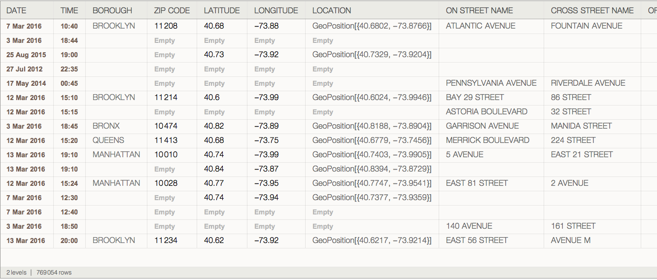
Turning this data into a Wolfram Language Dataset makes it handy:
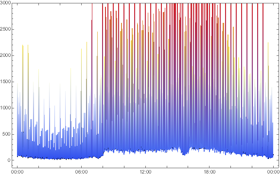
DateListPlot[Counts[data[All, "TIME"]], ColorFunction -> "TemperatureMap", PlotRange -> {All, 3000}]
datadays = Counts /@ Sort@GroupBy[data[All, {DateValue[#DATE, "DayName"], Round[AbsoluteTime[#TIME], 15*60]} &], First][All, All, 2]
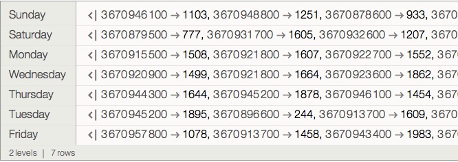
DateListPlot[datadays, PlotLegends -> Normal@Keys[datadays],
FrameTicks -> {TimeObject /@ Range[0, 24, 2], Automatic}, PlotTheme -> "Marketing", ImageSize -> 600]


