Introduction
This post is to proclaim the MathematicaVsR at GitHub project "Text analysis of Trump tweets" in which we compare Mathematica and R over text analyses of Twitter messages made by Donald Trump (and his staff) before the USA president elections in 2016.
This project follows and extends the exposition and analysis of the R-based blog post "Text analysis of Trump's tweets confirms he writes only the (angrier) Android half" by David Robinson at VarianceExplained.org; see [1].
The blog post [1] links to several sources that claim that during the election campaign Donald Trump tweeted from his Android phone and his campaign staff tweeted from an iPhone. The blog post [1] examines this hypothesis in a quantitative way (using various R packages.)
The hypothesis in question is well summarized with the tweet:
Every non-hyperbolic tweet is from iPhone (his staff).
Every hyperbolic tweet is from Android (from him). pic.twitter.com/GWr6D8h5ed
-- Todd Vaziri (@tvaziri) August 6, 2016
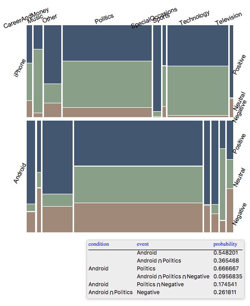
This conjecture is fairly well supported by the following mosaic plots, [2]:


We can see the that Twitter messages from iPhone are much more likely to be neutral, and the ones from Android are much more polarized. As Christian Rudder (one of the founders of OkCupid, a dating website) explains in the chapter "Death by a Thousand Mehs" of the book "Dataclysm", [3], having a polarizing image (online persona) is as a very good strategy to engage online audience:
[...] And the effect isn't small-being highly polarizing will in fact get you about 70 percent more messages. That means variance allows you to effectively jump several "leagues" up in the dating pecking order - [...]
(The mosaic plots above were made for the Mathematica-part of this project. Mosaic plots and weekday tags are not used in [1].)
Links
Concrete steps
The Mathematica-part of this project does not follow closely the blog post [1]. After the ingestion of the data provided in [1], the Mathematica-part applies alternative algorithms to support and extend the analysis in [1].
The sections in the R-part notebook correspond to some -- not all -- of the sections in the Mathematica-part.
The following list of steps is for the Mathematica-part.
Data ingestion
The blog post [1] shows how to do in R the ingestion of Twitter data of Donald Trump messages.
That can be done in Mathematica too using the built-in function ServiceConnect, but that is not necessary since [1] provides a link to the ingested data used [1]:
load(url("http://varianceexplained.org/files/trumptweetsdf.rda"))
Which leads to the ingesting of an R data frame in the Mathematica-part using RLink.
Adding tags
We have to extract device tags for the messages -- each message is associated with one of the tags "Android", "iPad", or "iPhone".
Using the message time-stamps each message is associated with time tags corresponding to the creation time month, hour, weekday, etc.
Here is summary of the data at this stage:

Time series and time related distributions
We can make several types of time series plots for general insight and to support the main conjecture.
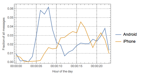
Here is a Mathematica made plot for the same statistic computed in [1] that shows differences in tweet posting behavior:

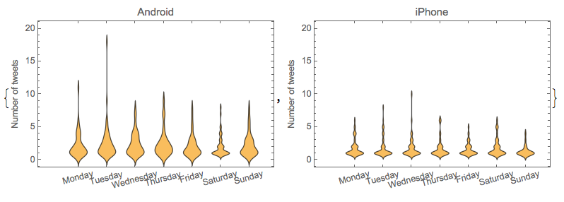
- Here are distributions plots of tweets per weekday:

Classification into sentiments and Facebook topics
Using the built-in classifiers of Mathematica each tweet message is associated with a sentiment tag and a Facebook topic tag.
In [1] the results of this step are derived in several stages.
Here is a mosaic plot for conditional probabilities of devices, topics, and sentiments:

Device-word association rules
Using Association rule learning device tags are associated with words in the tweets.
In the Mathematica-part these associations rules are not needed for the sentiment analysis (because of the built-in classifiers.)
The association rule mining is done mostly to support and extend the text analysis in [1] and, of course, for comparison purposes.
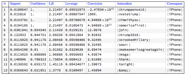
Here is an example of derived association rules together with their most important measures:

In [1] the sentiments are derived from computed device-word associations, so in [1] the order of steps is 1-2-3-5-4. In Mathematica we do not need the steps 3 and 5 in order to get the sentiments in the 4th step.
Comparison
Using Mathematica for sentiment analysis is much more direct because of the built-in classifiers.
The R-based blog post [1] uses heavily the "pipeline" operator %>% which is kind of a recent addition to R (and it is both fashionable and convenient to use it.) In Mathematica the related operators are Postfix (//), Prefix (@), Infix (~~), Composition (@*), and RightComposition (/*).
Making the time series plots with the R package "ggplot2" requires making special data frames. I am inclined to think that the Mathematica plotting of time series is more direct, but for this task the data wrangling codes in Mathematica and R are fairly comparable.
Generally speaking, the R package "arules" -- used in this project for Associations rule learning -- is somewhat awkward to use:
it is data frame centric, does not work directly with lists of lists, and
requires the use of factors.
The Apriori implementation in "arules" is much faster than the one in "AprioriAlgorithm.m" -- "arules" uses a more efficient algorithm implemented in C.
References
[1] David Robinson, "Text analysis of Trump's tweets confirms he writes only the (angrier) Android half", (2016), VarianceExplained.org.
[2] Anton Antonov, "Mosaic plots for data visualization", (2014), MathematicaForPrediction at WordPress.
[3] Christian Rudder, Dataclysm, Crown, 2014. ASIN: B00J1IQUX8 .