MODERATOR NOTE: coronavirus resources & updates: https://wolfr.am/coronavirus
[updated notebooks in comments - please go to latest]
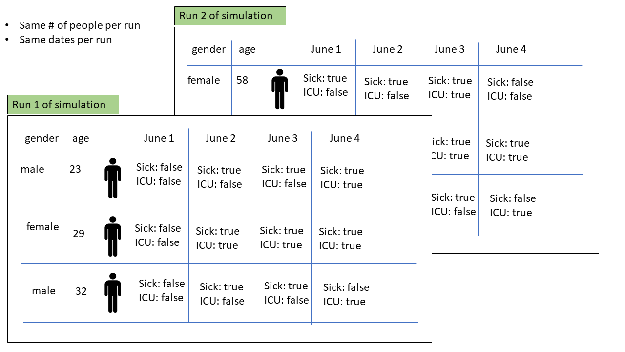
Hello Community, so I am working on enumerating the possible data visualizations of the results that will be coming from a monte carlo simulation of the effects of COVID-19 after various reopening scenarios. This post is strictly seeking contributions to visualizing the toy dataset defined in the attached notebook (the actual simulation is being done by someone else and is not ready yet). If you want to contribute to a system to help educate decision makers about various ways to think about this challenge in the face of great uncertainty in data, simulation, and underlying models, then please download the attached notebook, create a function that visualizes some aspect of the data like the first few examples I have added in the notebook, then post your results here. Given a clean data spec there are so many ways to visualize the data and each way allows someone to answer different questions. Let's help everyone wrap there head around this!
Here is a simple graphical model of the data that will come out of the simulation...
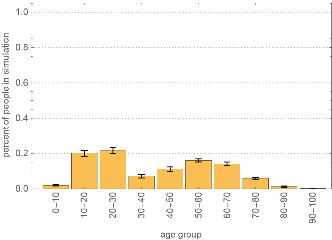
Here is the first example of a visualization of one aspect of the data...
 Attachments:


