Group Abstract Group Abstract

Message Boards Message Boards

[CALL] ways to visualize COVID-19 simulation results?

MODERATOR NOTE: coronavirus resources & updates: https://wolfr.am/coronavirus


[updated notebooks in comments - please go to latest]

Hello Community, so I am working on enumerating the possible data visualizations of the results that will be coming from a monte carlo simulation of the effects of COVID-19 after various reopening scenarios. This post is strictly seeking contributions to visualizing the toy dataset defined in the attached notebook (the actual simulation is being done by someone else and is not ready yet). If you want to contribute to a system to help educate decision makers about various ways to think about this challenge in the face of great uncertainty in data, simulation, and underlying models, then please download the attached notebook, create a function that visualizes some aspect of the data like the first few examples I have added in the notebook, then post your results here. Given a clean data spec there are so many ways to visualize the data and each way allows someone to answer different questions. Let's help everyone wrap there head around this!

Here is a simple graphical model of the data that will come out of the simulation...

enter image description here

Here is the first example of a visualization of one aspect of the data...

enter image description here

Attachments:
POSTED BY: Kyle Keane
11 Replies
Posted 5 years ago

How about this?

data = Table[
   RandomVariate[BetaDistribution[2, RandomReal[]], 100], {4}, {2}];
DistributionChart[data, ChartLegends -> {"False", "True"}, 
 ChartLabels -> {{"0-9", "10-19", "20-29", "30+"}, None}]

enter image description here

POSTED BY: Diego Zviovich

update 3 (major revision): I improved the data structure to make it more closely tied to the result database. I also generalized pipeline a lot. I am still working on recreating the earlier visualizations in this new workflow.

enter image description here

enter image description here

Attachments:
POSTED BY: Kyle Keane

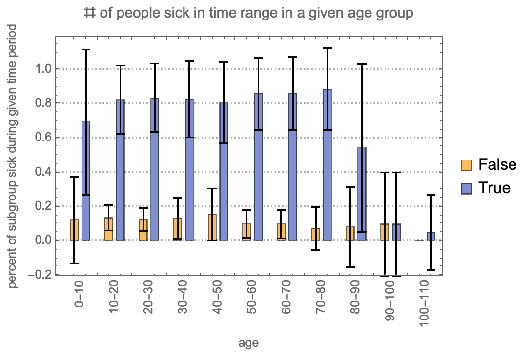
for the 2-level bar chart in update 1, using a legend for the bar colors for True and False would allow you to use the age group labels along the horizontal axis. Here is a simple hack of your BarChart that accomplishes this:

BarChart[First /@ visualizeThis, Frame -> True,
 FrameLabel -> {"age", 
   "percent of subgroup sick during given time period"},
 PlotTheme -> "Detailed",
 ChartLabels -> {Rotate[#, Pi/2] & /@ Last /@ visualizeThis, None},
 ChartLegends -> {False, True},
 PlotLabel -> "# of people sick in time range in a given age group"]

enter image description here

POSTED BY: Robert Nachbar

update 2 (notebook attached): So I have come across a math-y question about whether I should be calculating the average number of days someone is sick by looking at the average for each run individually, then averaging those... or just averaging the number of days for all individuals across all runs. I believe the correct way is the first approach as is evidenced by the last age group showing the proper mean with huge uncertainty. The question is shown in the attached notebook and the visualizations below shown there is a big consequence for the this decision.

here is averaging each run first, then averaging the averages...

enter image description here

and here is averaging all individuals across all runs in one go

enter image description here

Attachments:
POSTED BY: Kyle Keane

update 1 (notebook attached): I have my first visualization, although it needs some better generalization into a reusable function for numerical demographics. I also need some better styling guidance.But a good night's progress on a very sizable (and imo important) task. Hope to see some others able to engage here, I know my prompt might be too abstract or vague, ask questions if you want to.

enter image description here

Attachments:
POSTED BY: Kyle Keane
Attachments:
POSTED BY: Kyle Keane

Holy moly that is cool, I didn't even realize distribution chart was a thing! Thank you! Will start working on one of those. I just added a much cleaner data set and some starter code that I will begin working on to produce visualizations for one given action. Attaching here as well

Attachments:
POSTED BY: Kyle Keane

Hi all, we made some press on simplifying the data format that should make things simpler, the notebook is attached with a very clean output from one sort of real simulation run.

Attachments:
POSTED BY: Kyle Keane
POSTED BY: EDITORIAL BOARD
POSTED BY: Nathan Shpritz

Thanks Bob, that looks much cleaner! I have not played with charts and really appreciate the tweak.

POSTED BY: Kyle Keane
Reply to this discussion
Community posts can be styled and formatted using the Markdown syntax.
Reply Preview
Attachments
Remove
or Discard