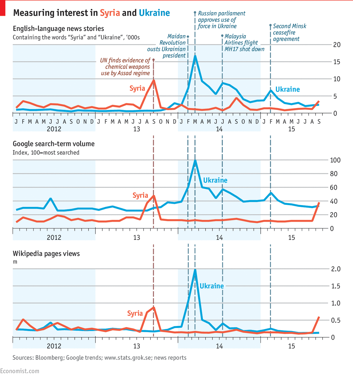
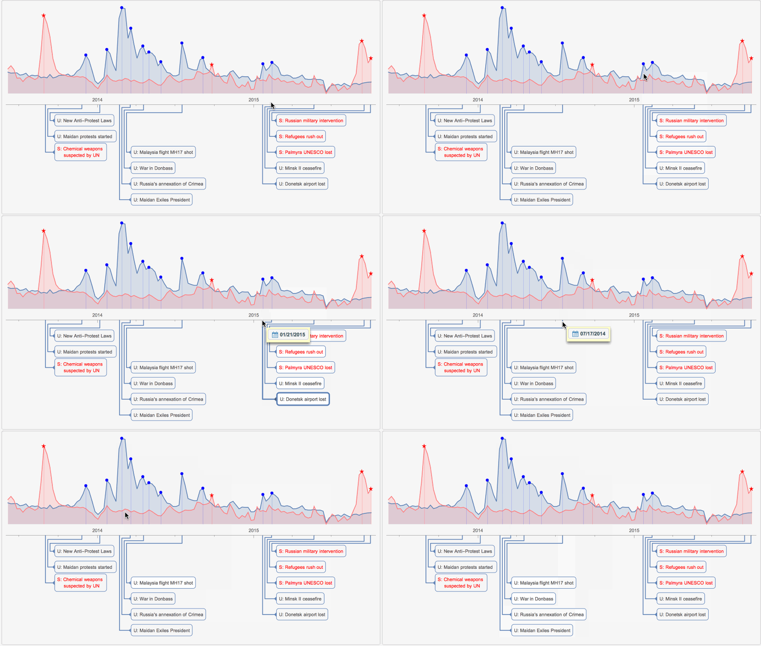
I intend to show some how to use programming to data mine current events, and I will not delve into the politics per se. Recently The Economist published an article where it attempts to measuring relative public interest in Syria and Ukraine from various internet sources, such as new media, search terms, and Wikipedia. Below the first image is from The Economist and the second is made with Wolfram Language (WL). It is easy to create such infographics, especially with handy Wolfram|Alpha data and functions new like FindPeaks and TimelinePlot. Please take a note of WL interactivity in the second image. Tutorial is below the images.


I will concentrate on the third, the last, plot from The Guardian. Wolfram|Alpha servers have numerous curated data including Wikipedia popularity (weekly hits per day) for many specific English language pages. I will access the popularity data for Ukraine and Syria as
{ukraine, syria} =
  WolframAlpha["ukraine syria", {{"PopularityPod:WikipediaStatsData", 1}, "ComputableData"}];
here is a sample, that as you can see contains date stamps and hits per day:
Short[ukraine]

Here is the plot:
DateListPlot[{ukraine, syria},
 PlotRange -> All, PlotTheme -> "Detailed", AspectRatio -> 1/4,
 ImageSize -> 800, PlotLegends -> {"ukraine", "syria"}]

I will be interested in the events starting second half of 2013 and TimeSeriesWindow function will help us to cut those data out:
{ukraineW, syriaW} =
  TimeSeriesWindow[TimeSeriesResample[TimeSeries[#]], {DateObject[{2013, 6}], Now}] & /@
   {ukraine, syria};
FindPeaks is a nice function that will help me to find only those peaks whose value is above 10^4 hits per day:
peaksU = FindPeaks[TimeSeriesResample[TimeSeries[ukraineW]], 0,
   Quantity[0, IndependentUnit["hits"]/("Days")], Quantity[10000, IndependentUnit["hits"]/("Days")]];
peaksS = FindPeaks[TimeSeriesResample[TimeSeries[syriaW]], 0,
   Quantity[0, IndependentUnit["hits"]/("Days")], Quantity[10000, IndependentUnit["hits"]/("Days")]];
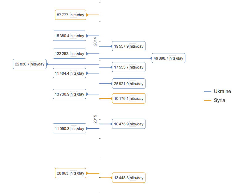
I can even visualize these peaks with help of TimelinePlot:
TimelinePlot[{Labeled @@@ Normal[peaksU], Labeled @@@ Normal[peaksS]},
AxesOrigin -> Center, PlotLegends -> {"Ukraine", "Syria"}, PlotLayout -> "Vertical"]

Or I can put the peaks on the time series plots. It is also better to use log-scale to see smaller data patterns:
p1 = DateListLogPlot[{ukraineW, peaksU, syriaW, peaksS},
 PlotStyle -> {
   Automatic, Directive[Blue, PointSize[.01]],
   Pink, Directive[Red, PointSize[.01]]},
 Joined -> {True, False, True, False},
 PlotMarkers -> {"", {"\[FilledCircle]", 10}, "", {"\[FivePointedStar]", 12}}, AspectRatio -> 1/4,
 ImageSize -> 800, Filling -> Bottom, PlotRange -> {{DateObject[{2013, 6}], Now}, All},
 PlotRangePadding -> {0, .15}, PlotLegends -> {"Ukraine", "peaks U", "Syria", "peaks S"}]

The point is to see to what historical events those peaks correspond. The Guardian lists a few important ones. Below I list my modified version, but we should remember these are just guesses and there is no proof what really induces spikes in Wikipedia visits. There are many close events and it is easy to miss or misinterpret. Also note slight shifts in dates between the event and Wikipedia data peak, - probably an indication of some duration and inertia in the process event >> mass media >> Wikipedia. Events I found reading online articles:
p2 = TimelinePlot[
  <|<|
    Style["S: Chemical weapons \n suspected by UN", Red] -> DateObject[{2013, 9}],
    Style["S: Palmyra UNESCO lost", Red] -> DateObject[{2015, 5, 21}],
    Style["S: Refugees rush out", Red] -> DateObject[{2015, 9, 15}],
    Style["S: Russian military intervention", Red] -> DateObject[{2015, 9, 30}]
    |>,
   <|
    "U: Maidan protests started " -> DateObject[{2013, 11, 25}],
    "U: New Anti-Protest Laws" -> DateObject[{2014, 1, 6}],
    "U: Maidan Exiles President" -> DateObject[{2014, 2, 21}],
    "U: Russia's annexation of Crimea" -> DateObject[{2014, 3, 18}],
    "U: War in Donbass" -> DateObject[{2014, 4, 18}],
    "U: Malaysia flight MH17 shot" -> DateObject[{2014, 7, 17}],
    "U: Donetsk airport lost" -> DateObject[{2015, 1, 21}],
    "U: Minsk II ceasefire" -> DateObject[{2015, 2, 11}]
    |>|>,
  PlotRange -> {DateObject[{2013, 6}], Now},PlotRangePadding -> 0,
AspectRatio -> 1/3.5, ImageSize -> 800, AxesOrigin -> Top];
Note how carefully I select the sam values for PlotRange and PlotRangePadding in p1 and p2 plots. I also cheated a bit to save the space - you will need to set PlotLegends to None in p1 and remove Frame and Axes. But in the end here is the final line to make the 2nd image (animation) at the top:
Panel[Grid[{{p1}, {p2}}, Spacings -> {0, 0}]]
Please share your own ideas and code on similar data analysis (but not the political views please).
 Attachments: