One of the hobbies that I really enjoy is target practice. It requires focus and lots of practice. But most importantly, you need track your improvement (or lack of) objectively.
What better than using the Wolfram Language capabilities to do so!
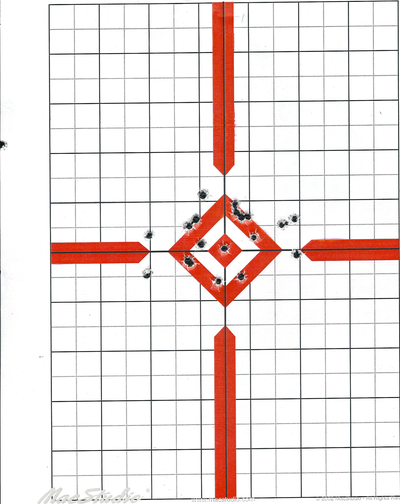
The following image is a sample of a target placed about 10 yards away.
The first two objectives are:
- Obtain the coordinates of the center of the target
- Obtain a list of the positions of each impact for further calculations.
Finding the target center
Let's use an image of the bullseye to locate the center of the target. Using ImageCorrelate will help us do so.
findCenter[img_, kern_] := Module[{data},
data = ImageData[
ImageCorrelate[img, kern, NormalizedSquaredEuclideanDistance],
"Byte"];
Rest@Reverse@First@Position[Reverse@data, Min[Flatten[data]]]]
kern = Import["C:\\Users\\Diego\\Documents\\Documents\\Shooting\\10 \yds\\kernel.jpg"];
target = Import["C:\\Users\\Diego\\Documents\\Documents\\Shooting\\10 \yds\\scan0008.jpg"];
findCenter[target, kern]
(*{761, 799}*)
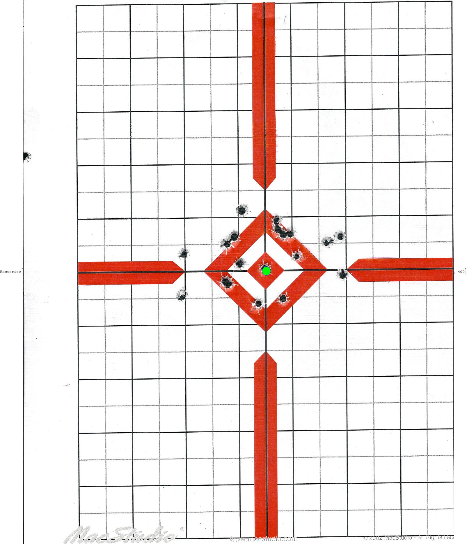
Show[target, Graphics[{Green, Disk[findCenter[target, kern], 10]}]]
Obtaining the distance of each impact to the center of the target
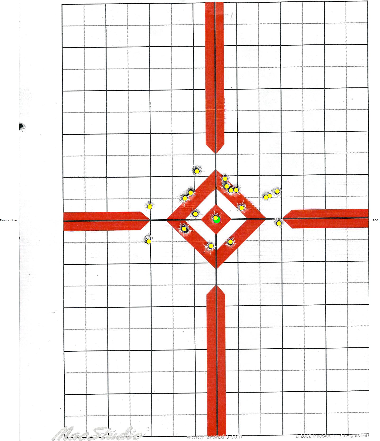
Using the morphological image processing capabilities of WL we can proceed to extract the positions of each shot. Based on the scanner resolution used to capture the image, the values returned are in cm.
shots[img_, kern_] :=
 Module[{src, red, shotValues, center, values, data},
  red = ColorSeparate[img, "RGB"][[1]];
  shotValues = DeleteCases[DeleteCases[
     Last /@ ComponentMeasurements[
       MaxDetect@DistanceTransform@ColorNegate@DeleteSmallComponents@
           Binarize[
            Closing[ImageAdjust[Blur@Blur@Blur@red, {1, 1}], 2]],
       "Centroid"], {0.5, ___}], {___, 0.5}];
  data = ImageData[ImageCorrelate[img, kern, NormalizedSquaredEuclideanDistance],"Byte"];
  center = Rest@
    Reverse@First@Position[Reverse@data, Min[Flatten[data]]];
  values = (# - center)/100 & /@ shotValues]
Exploratory Data Analysis of a practice session
Now that we the functions needed we can process all targets of a given set.
files = FileNames["C:\\Users\\Diego\\Documents\\Documents\\Shooting\\10 \yds\\scan*.jpg"];
imgs = Import[#] & /@ files;
results = Flatten[shots[#, kern] & /@ imgs, 1];
kde = SmoothKernelDistribution[results];
Show[ContourPlot[PDF[kde, {x, y}], {x, -5, 5}, {y, -5, 5}],
 Graphics[{Dashed, Line[{{0, -5}, {0, 5}}], Line[{{-5, 0}, {5, 0}}],
   Circle[{0, 0}, #] & /@ {1, 2, 3}, Red, PointSize[0.03],
   Point@Mean@kde}], ImageSize -> Large, PlotTheme -> "Detailed"]
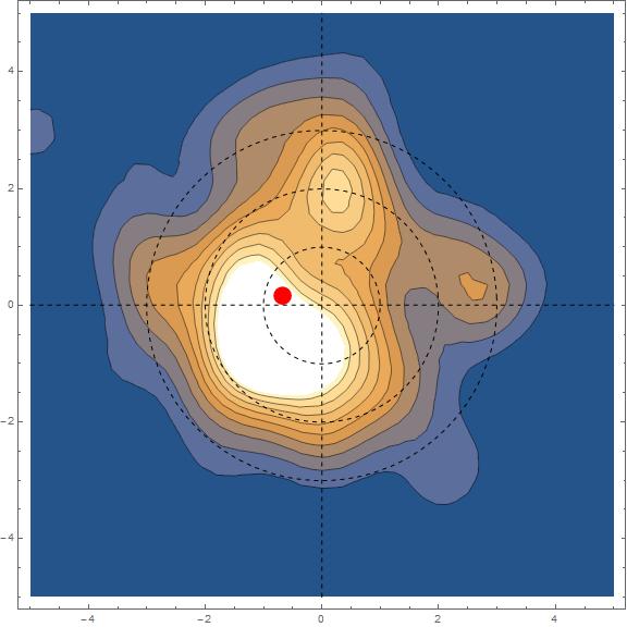
Although the mean is located 0.6 cm to the left of the center, shots are slightly to the lower left cuadrant. I'm a lefty, so my defect would be the equivalent to shooting down and to the right for a right handed person.
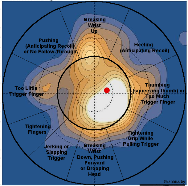
Let's see what the marksmanship tutorial chart has to say about this issue. 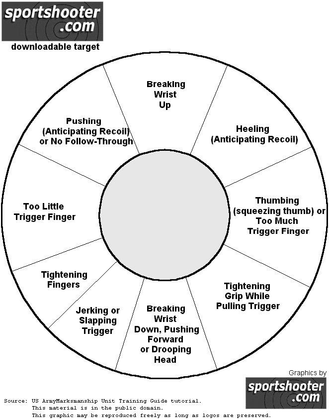
I'm tightening the grip too hard while pulling the trigger. Will need to work on this more.
Now, what is the probability that I would hit the center within a radius of 0.5,1, 2 and 3.5 cm?
NProbability[
   EuclideanDistance[{0, 0}, {x, y}] <= #, {x, y} \[Distributed] kde,
   PrecisionGoal -> 5] & /@ {0.5, 1, 2,3.5}
(*{0.0349262, 0.139871, 0.491972, 0.856485}*)
Given that an commercial apple is about 7cm in diameter. I've got a 86% chance of hitting it from a distance of 10 yards.


