Background
Over the last couple of days hurricane Matthew has battered the East Coast of the United states. It has brought devastation and death to many communities. At the time of writing this post, the storm is still ongoing, but the Wolfram Language has already important data about the storm in its repository.
Grid[{CommonName[#], Entity["TropicalStorm", "Matthew2016"][#]} & /@ Evaluate[Entity["TropicalStorm", "Matthew2016"]["Properties"]],
Frame -> All]
In this post I will present some very simple analyses and graphics to visualise some aspects of tropical storms. We will study historical paths of storms

and study some more of their characteristics.
Wolfram Language Data
The Wolfram Language holds an incredible amount of information about tropical storms. As of today he function
tropicalstorms = TropicalStormData["Entities"];
provides data of 12741 storms. The last 100 of which are
tropicalstorms[[-100 ;;]]
As you can see there are many storms in the list after Matthew. We will come back to some of that data later.
External data
For this post I will also need data on the position of the storm at different times - data which is not contained in the Wolfram Language. For Matthew this data can be found on this website. We can use
dataMatthew =
Flatten[Import["https://www.wunderground.com/hurricane/atlantic/2016/Hurricane-Matthew?map=radar", "Data"][[3, 3, 1, 2 ;;]], 1];
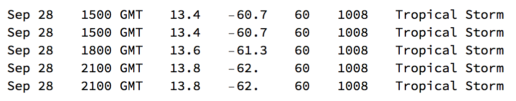
to import and clean the data. It then looks a bit like this:
dataMatthew[[1 ;; 5]] // TableForm
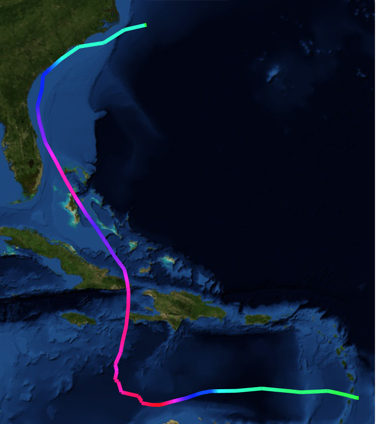
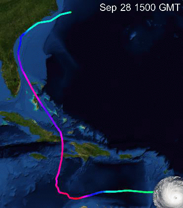
Matthew's path
So now we have positions (3rd and 4th columns) and also windspeed (5th column in miles per hour). The max speed
Max[dataMatthew[[All, 5]]]
is 160 miles per hour so we can generate a coloured trail by normalising the windspeed.
GeoGraphics[{Yellow, Thickness[0.01], GeoPath[GeoPosition /@ dataMatthew[[All, {3, 4}]], VertexColors -> Evaluate[Hue[#/160.] & /@ dataMatthew[[All, 5]]]]},GeoBackground -> "Satellite"]
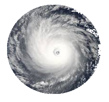
That image is still a bit static. I would like to display a photo of a (any) storm so that we can get a feeling for the movement. On google I found an image (which was marked as freely usable and distributable) - see attached. When I place that image on the map it has a squared shape. I did not like that - so I used the masking tool to create a mask (also attached.)
Importing the two
hurricatetemplate=Import["~/Desktop/HurricaneTemplate.jpeg"];
mask=Import["~/Desktop/HurricateTemplate.jpeg"];
we can create
hurrtemplate = RemoveBackground[ImageMultiply[hurrtemplate, mask]]
Now we can make a little video:
frames =
Table[GeoGraphics[{Yellow, Thickness[0.01], GeoPath[GeoPosition /@ dataMatthew[[All, {3, 4}]],
 VertexColors -> Evaluate[Hue[#/160.] & /@ dataMatthew[[All, 5]]]], Opacity[0.4], GeoMarker[GeoPosition[dataMatthew[[k, {3, 4}]]], hurrtemplate,
 Scale -> 0.1]}, GeoBackground -> "Satellite", Epilog -> Inset[Text[Style[dataMatthew[[k, 1]] <> " " <> dataMatthew[[k, 2]], White,20]], {0.1, 0.2}]], {k, 1, Length[dataMatthew]}];
Ok. Now we can follow the path of Matthew. What about all the other storms?
More external data
I would need data for their paths, too. Luckily there is this website. If we download the data, we get a folder which contains several files. We will need to import two of them:
stormdata = Import["/Users/thiel/Desktop/Allstorms/Allstorms.ibtracs_all_lines.v03r09.shp"];
data = Import["/Users/thiel/Desktop/Allstorms/Allstorms.ibtracs_all_lines.v03r09.dbf"];
The shape file contains easily decipherable data about the paths. If we look at
(stormdata[[1, 2, 1, 2]][[1 ;; 32]])[[All, 1]]
We see a couple of geopositions for a couple of entries.
Preprocessing and cleaning the data
Unfortunately, they are not separated by storm. We can use the data file to separate the paths. Here is the first entry:
data[[1]]
The first entry is a unique identifier of the storm. It contains the year and day of the year encoded. The last five numbers give the year and time in a more standard form. It turns out that the 9th entry is the windspeed in knots. the 10th entry is the atmospheric pressure. Using the identifier for the name we can now separate the entries of each storm:
timeslength = Tally[data[[-150000 ;;, 1]]][[2 ;;]];
I only use the last 150000 entries. time length looks like this
timeslength[[1 ;; 3]]
{{"1967241N15170", 84}, {"1967241N16324", 28}, {"1967242N18253", 16}}
So it contains the identifier and the number of entries. We can now separate the storms:
separatedstorms =
-Reverse /@ Join[{{1, (Reverse@timeslength[[All, 2]])[[1]]}}, {1, 0} + # & /@ Partition[Accumulate[Reverse@timeslength[[All, 2]]], 2, 1]];
Plotting larger numbers of storms
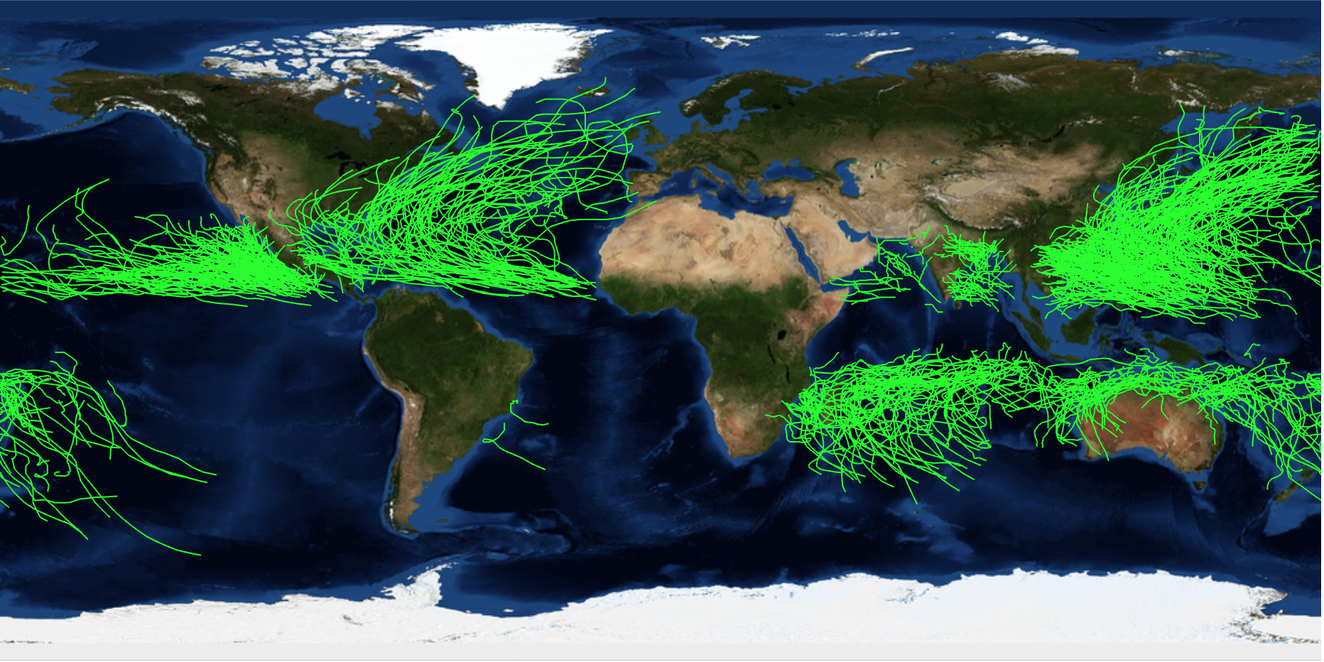
Plotting the paths of the last 1000 storms is not easy:
GeoGraphics[Join[{Green}, (GeoPath[GeoPosition[Reverse[#]] & /@ Flatten[(stormdata[[1, 2, 1, 2]][[#[[1]] ;; #[[2]]]])[[All, 1]], 1]]) & /@ separatedstorms[[1 ;; 1000]]], GeoRange -> "World", GeoBackground -> "Satellite", ImageSize -> Full]
The thing is that I would also like to represent the windspeed with colours along the paths. One needs to fiddle a bit with the speeds and normalisations but it is quite straight forward to come up with this:
nStorms = 300;
GeoGraphics[(GeoPath[DeleteDuplicates[GeoPosition[Reverse[#]] & /@
Flatten[(stormdata[[1, 2, 1, 2]][[#[[1]] ;; #[[2]]]])[[All, 1]], 1]],
VertexColors -> Evaluate[Hue[0.5 (1 - Sqrt[#])] & /@ ((#/Max[data[[separatedstorms[[nStorms, 1]] ;;, 9]] + 1]) & /@ ((data[[#[[1]] ;; #[[2]], 9]] /. {-999. -> -1}) + 1))]]) & /@ separatedstorms[[1 ;; nStorms]], GeoRange -> "World", GeoBackground -> "Satellite", ImageSize -> Full]
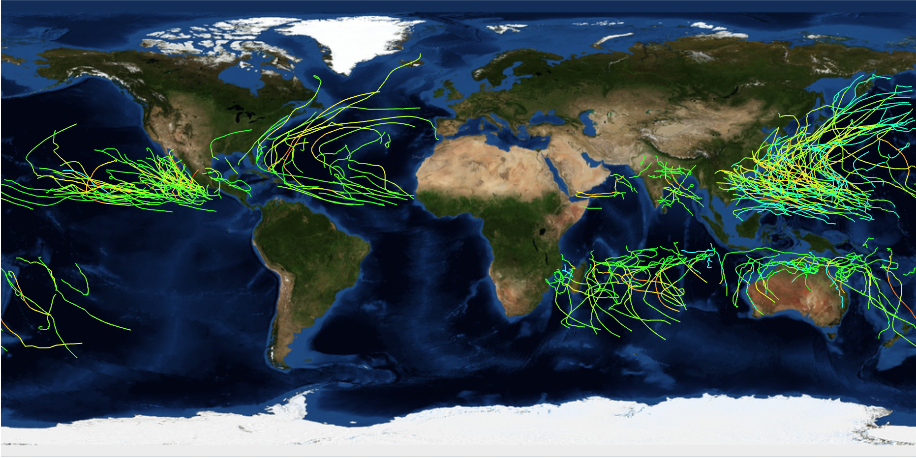
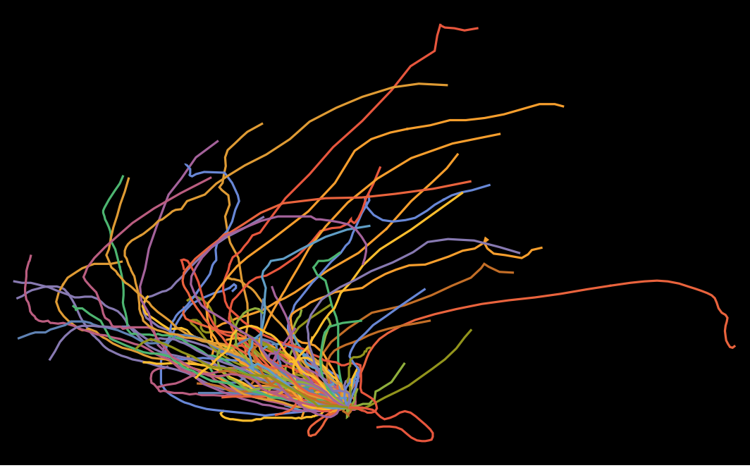
The nStorms variable allows us to choose the number of storms we want to visualise. nSTorms=1000 looks like this:
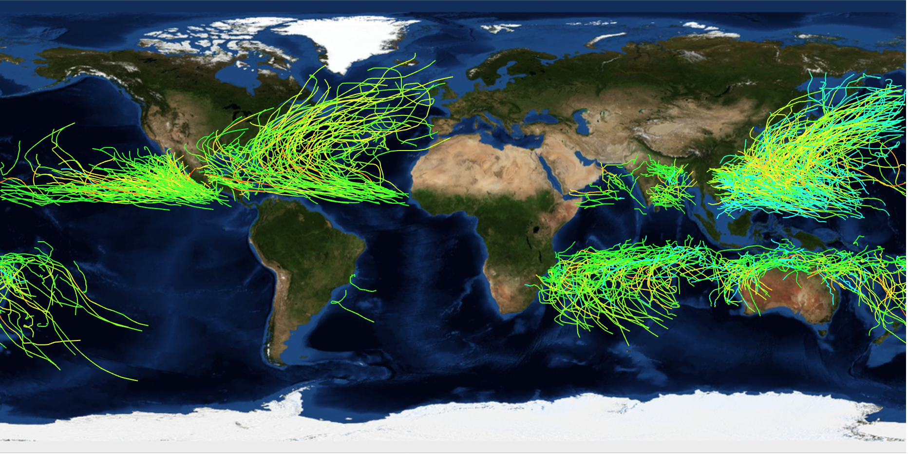
Geographical distribution of storms
We can clearly see different densities of storms in different regions and an equatorial gap. We now also have everything in place to visualise the density of storms in different regions. The new function GeoHistogram is quite useful for that:
nStorms3 = 3000;
GeoHistogram[Flatten[DeleteDuplicates[GeoPosition[Reverse[{(Mod[180 + #[[1]], 360] - 180) /. -180. -> -179.9, #[[2]]}]] & /@
Flatten[(stormdata[[1, 2, 1, 2]][[#[[1]] ;; #[[2]]]])[[All, 1]],1]] & /@ separatedstorms[[1 ;; nStorms3]]],
 Quantity[500, "Kilometers"], "PDF", PlotStyle -> Opacity[0.6],
 ColorFunction -> "TemperatureMap", PerformanceGoal -> "Quality",
 GeoRange -> "World", ImageSize -> Full, GeoBackground -> "Satellite"]
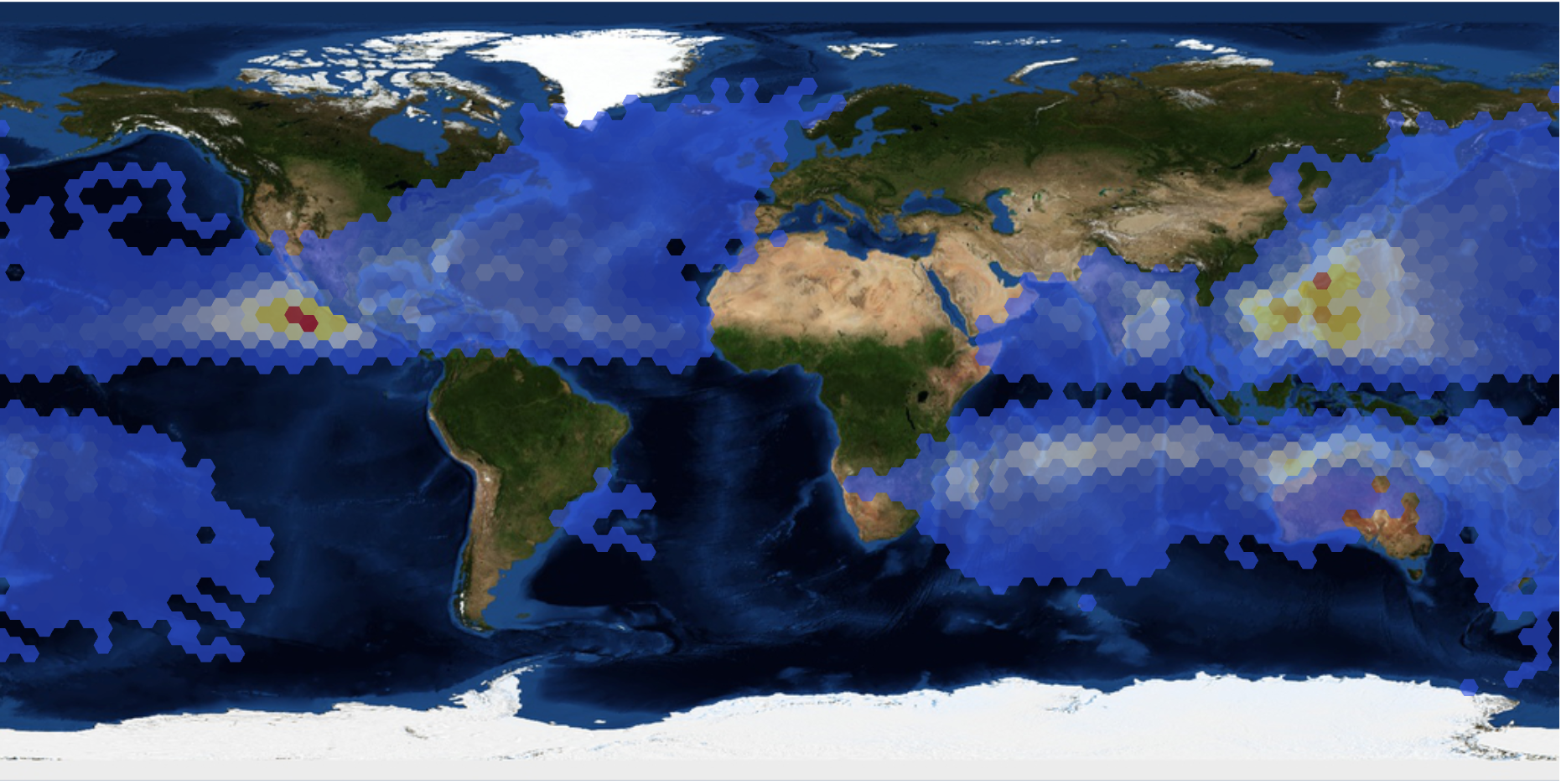
This gives some kind of birds eye view of different regions and their storm risk. I actually wanted to use different weights according to the wind speeds and GeoHistrogram allows us in principle to do that. I thought it should work like this:
nStorms2 = 2000;
GeoHistogram[<|Rule @@@ Transpose@{Take[Flatten[DeleteDuplicates[GeoPosition[Reverse[#]] & /@
Flatten[(stormdata[[1, 2, 1, 2]][[#[[1]] ;; #[[2]]]])[[All,1]], 1]] & /@ separatedstorms[[1 ;; nStorms2]]],
UpTo[Length[Flatten[(data[[#[[1]] ;; #[[2]], 9]]) & /@
separatedstorms[[1 ;; nStorms2]]]]]], Flatten[(#/Max[data[[separatedstorms[[nStorms2, 1]] ;;, 9]] + 1]) & /@ ((data[[#[[1]] ;; #[[2]], 9]] /. {-999. -> -1}) + 1) & /@
separatedstorms[[1 ;; nStorms2]]]}|>,
Quantity[500, "Kilometers"], "Intensity",
GeoBackground -> "Satellite", PlotStyle -> Opacity[0.3],
ColorFunction -> "TemperatureMap", ImageSize -> Full]
But this obviously goes wrong:
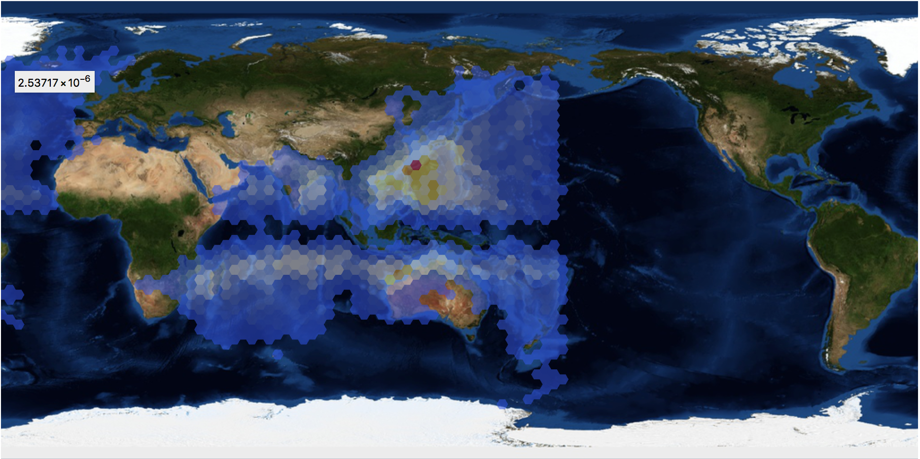
I made a couple of observations of why this goes wrong and what causes it, but this is not the place to discuss this at length.
Northern vs southern hemisphere
Another interesting thing to plot is the paths of the storms for those on the northern hemisphere and those on the southern hemisphere. I will normalise all storms so that they all start at the origin. Here is the plot for north:
Monitor[ListLinePlot[
  Table[Reverse /@ (({#[[1]], Mod[#[[2]], 360]} - {Evaluate[Select[paths2, #[[1, 1]] > 0 &]][[k, 1]][[1]],
  Mod[Evaluate[Select[paths2, #[[1, 1]] > 0 &]][[k, 1]][[2]], 360]}) & /@ Evaluate[Select[paths2, #[[1, 1]] > 0 &][[k]]]), {k, 1, 100}],
  PlotRange -> All, Axes -> False, Background -> Black], k]
and there the same for south:
Monitor[ListLinePlot[
 Table[Reverse /@ (({#[[1]], Mod[#[[2]], 360]} - {Evaluate[Select[paths2, #[[1, 1]] < 0 &]][[k, 1]][[1]],
 Mod[Evaluate[Select[paths2, #[[1, 1]] < 0 &]][[k, 1]][[2]], 360]}) & /@
 Evaluate[Select[paths2, #[[1, 1]] < 0 &][[k]]]), {k, 1, 100}],
 PlotRange -> All, Axes -> False, Background -> Black], k]
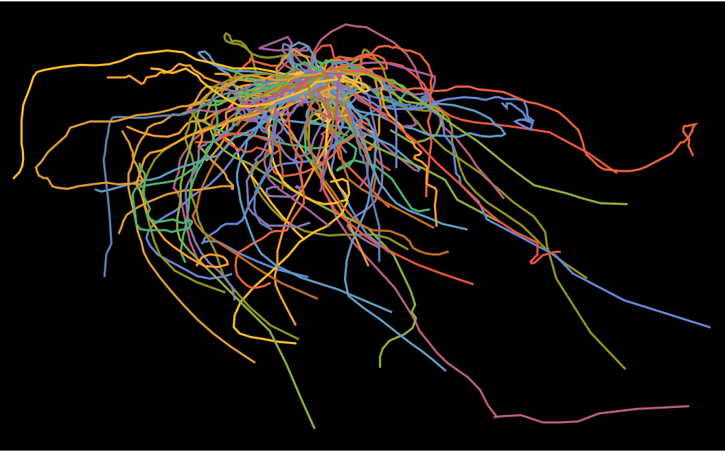
The colours are quite meaningless, but we can draw everything together and obtain:
Monitor[southernstorms =
  ListLinePlot[
   Table[Reverse /@ (({#[[1]], Mod[#[[2]], 360]} - {Evaluate[Select[paths2, #[[1, 1]] < 0 &]][[k, 1]][[1]],
   Mod[Evaluate[Select[paths2, #[[1, 1]] < 0 &]][[k, 1]][[2]],360]}) & /@
   Evaluate[Select[paths2, #[[1, 1]] < 0 &][[k]]]), {k, 1, 100}],
   PlotRange -> All, Axes -> False, Background -> Black,
   PlotStyle -> Directive[Yellow, Thickness[0.001]]], k]
and
Monitor[northernStorms =
  ListLinePlot[Table[Reverse /@ (({#[[1]], Mod[#[[2]], 360]} - {Evaluate[Select[paths2, #[[1, 1]] > 0 &]][[k, 1]][[1]],
  Mod[Evaluate[Select[paths2, #[[1, 1]] > 0 &]][[k, 1]][[2]],360]}) & /@
   Evaluate[Select[paths2, #[[1, 1]] > 0 &][[k]]]), {k, 1, 100}],
   PlotRange -> All, Axes -> False, Background -> Black,
   PlotStyle -> Directive[Red, Thickness[0.001]]], k]
to give:
Show[southernstorms, northernStorms, PlotRange -> All, ImageSize -> Full]
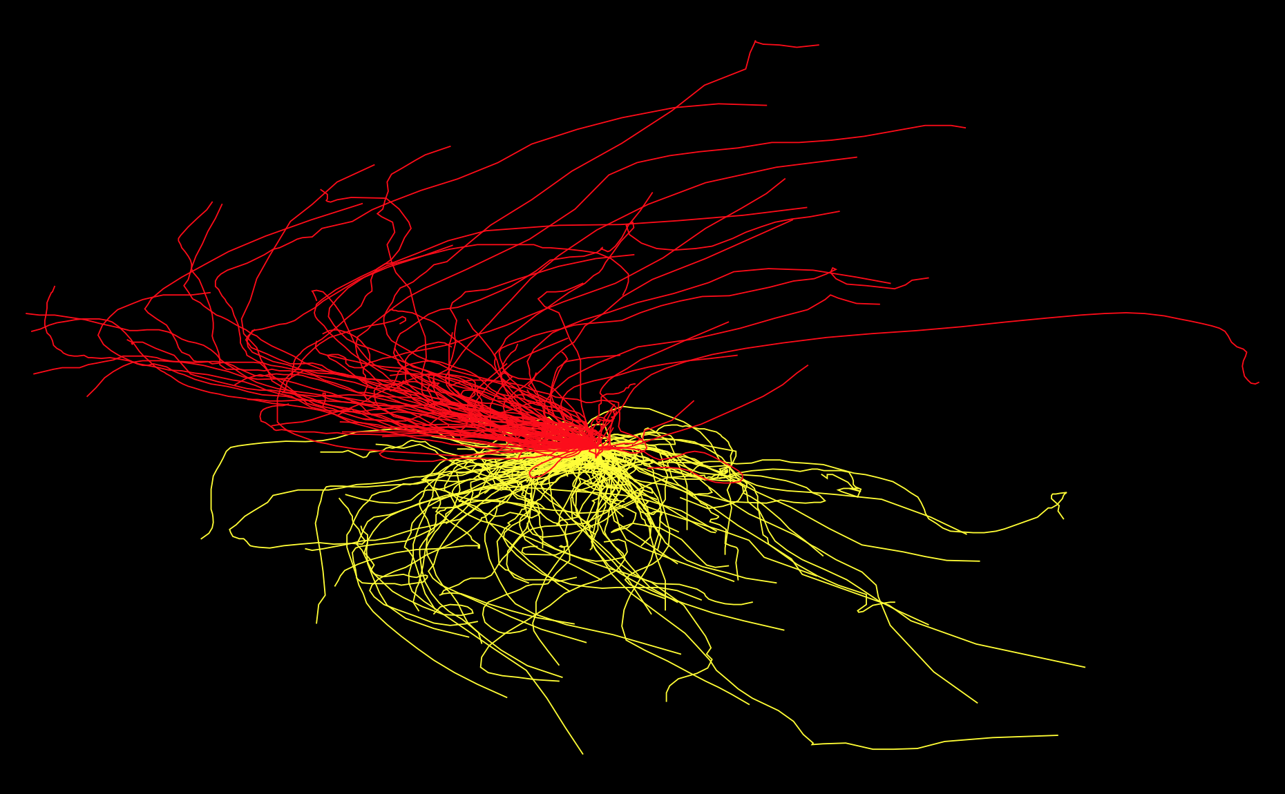
One can clearly see the different directions of movement in the north and the south.
Maximal windspeeds of storms
Another thing we can try is look for the maximal windspeeds. First we calculate the max windspeed for each storm:
maxStormspeed =
 DeleteCases[Max /@ (((data[[#[[1]] ;; #[[2]], 9]] /. {-999. -> -1}) + 1) & /@ separatedstorms[[1 ;; 2000]]), 0] ;
and then plot the corresponding histogram:
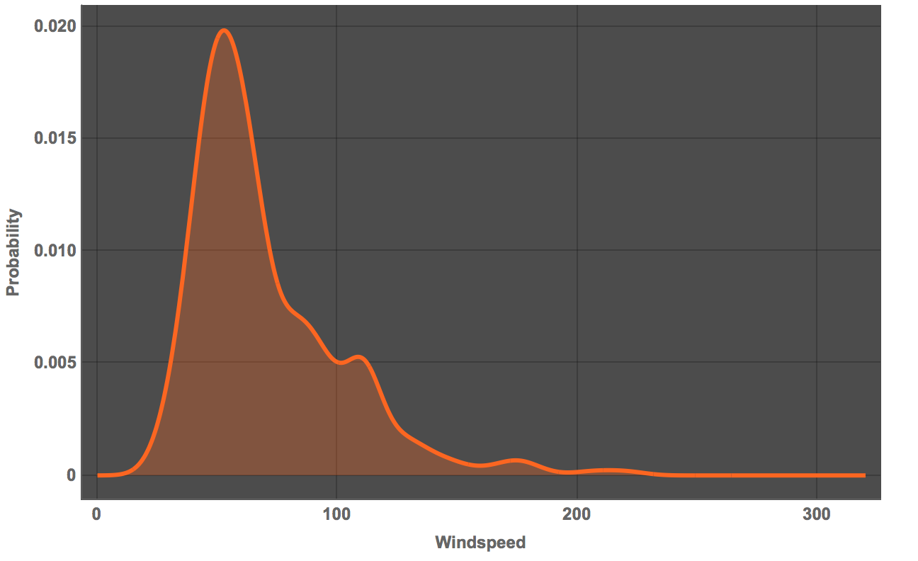
Plot[PDF[SmoothKernelDistribution[maxStormspeed], x], {x, 0, 320}, Filling -> Bottom, PlotTheme -> "Marketing",
FrameLabel -> {"Windspeed", "Probability"}, LabelStyle -> Directive[Bold, Medium]]
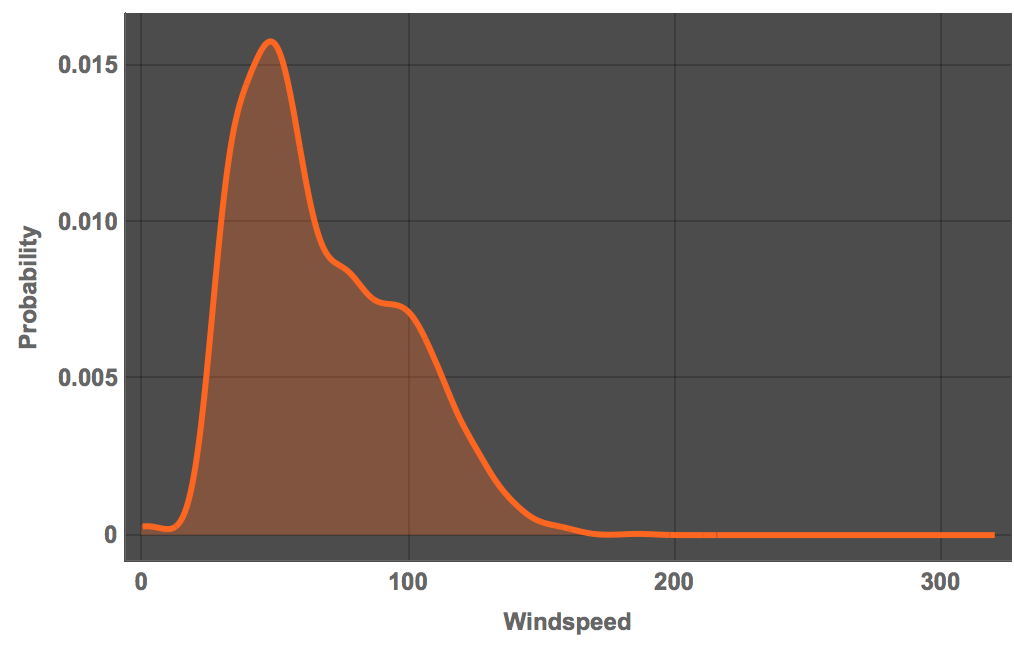
So it is clear that every strong storms are very rare - as expected. We can plot that logarithmically to emphasise this result:
Plot[PDF[SmoothKernelDistribution[maxStormspeed], x], {x, 0, 320},
 Filling -> Bottom, PlotTheme -> "Marketing",
 ScalingFunctions -> {"Linear", "Log"},
 FrameLabel -> {"Windspeed", "Log Probability"},
 LabelStyle -> Directive[Bold, Medium]]
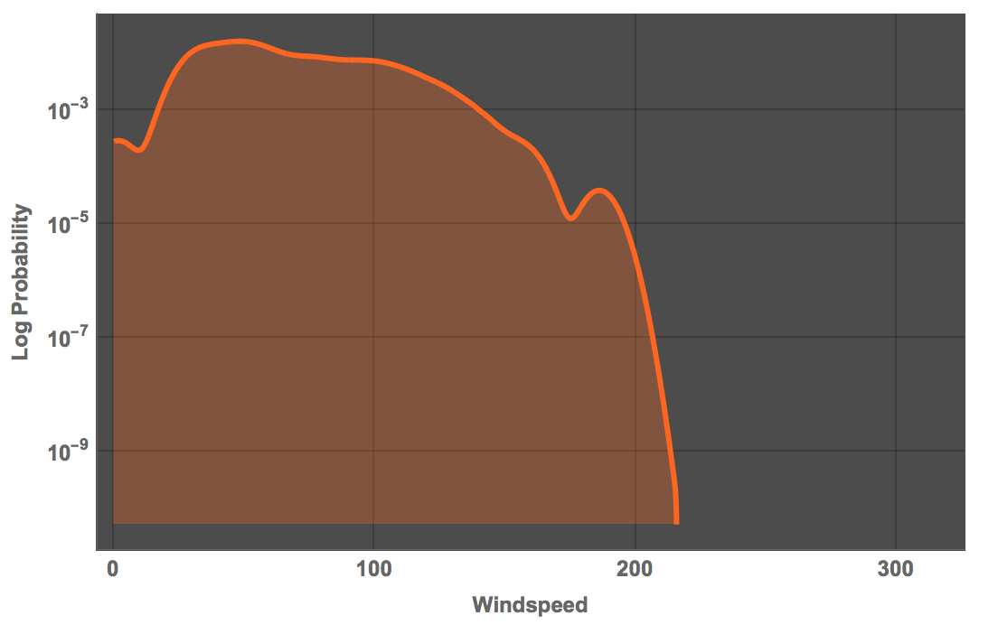
Note that the windspeed is in knots. One of the strongest storms ever recorded appears to be Camille of 1969 with windspeeds up to 190 miles per hour. The corresponds to:
N[Quantity[1911096/11575, "Knots"]]
165 knots, which is more or less where this curve ebbs off. Using data from the Wolfram Language directly, we obtain a very similar picture:
mmawindspeeds = #[EntityProperty["TropicalStorm", "WindSpeed"]] & /@ tropicalstorms[[-500 ;;]];
Plot[PDF[SmoothKernelDistribution[
QuantityMagnitude /@ DeleteMissing[mmawindspeeds]], x], {x, 0, 320},
 Filling -> Bottom, PlotTheme -> "Marketing",
 FrameLabel -> {"Windspeed", "Probability"},
 LabelStyle -> Directive[Bold, Medium]]
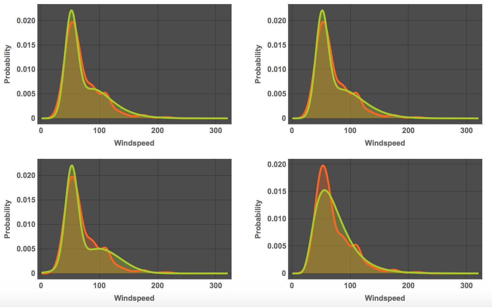
If we wish to do so, we can also ask Mathematica to "guess" the mathematical form of the distribution.The four most likely candidates are:
TableForm[FindDistribution[QuantityMagnitude /@ DeleteMissing[mmawindspeeds], 4]]

We can look at the quality of the different fits:
GraphicsGrid[
 Partition[
  Table[Plot[{PDF[
      SmoothKernelDistribution[
       QuantityMagnitude /@ DeleteMissing[mmawindspeeds]], x],
     PDF[distribs[[k]], x]}, {x, 0, 320}, Filling -> Bottom,
    PlotTheme -> "Marketing",
    FrameLabel -> {"Windspeed", "Probability"},
    LabelStyle -> Directive[Bold, Medium], PlotRange -> All], {k, 1,
    4}], 2]]
The discussion about windspeed distribution has come up before in this community.
How are storms called?
Using data built into the Wolfram Language we can also look for common names that are given to these storms:
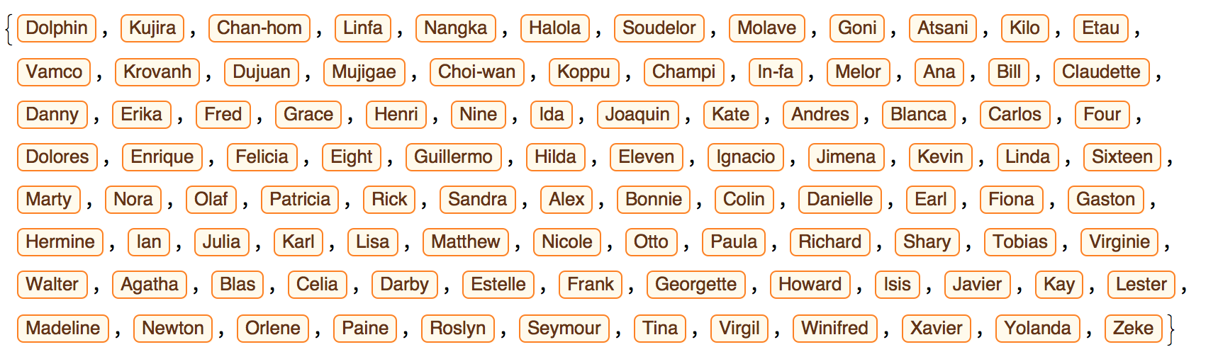
WordCloud[Select[DeleteCases[CommonName[tropicalstorms], "Unnamed"], StringFreeQ[#, CharacterRange["0", "9"]] &]]

Back to Matthew
Regarding Matthew, I tried to look at the wind flow today. Mathematica has the data:
Monitor[windvectordata =
Table[{GeoPosition[{i, j}], WindVectorData[GeoPosition[{i, j}],
DateObject[{2016, 10, 9}, TimeObject[{6, 0}]]]}, {i, 12, 50, 2}, {j, -90, -55.8, 2}];, {i, j}]
which we can then plot:
ls = ListStreamPlot[
Cases[{Flatten[Reverse[#[[1, 1]]]], QuantityMagnitude[#[[2]]]} & /@
Flatten[windvectordata, 1], {_, {_?NumberQ, _?NumberQ}}]];
arrows = Cases[ls, Arrow[_], Infinity];
GeoGraphics[{Yellow, Arrowheads[Small], arrows},
 GeoBackground -> "Satellite"]
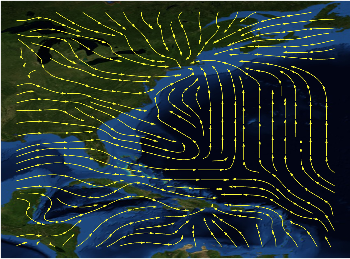
The eye of the storm becomes quite obvious but even in a ListVectorDensityPlot
ls2 = ListVectorDensityPlot[
  Cases[{Flatten[Reverse[#[[1, 1]]]], QuantityMagnitude[#[[2]]]} & /@
    Flatten[windvectordata, 1], {_, {_?NumberQ, _?NumberQ}}],
  ColorFunction -> "TemperatureMap", StreamColorFunction -> Hue,
  StreamPoints -> Fine, VectorPoints -> 0, Frame -> None,
  ImagePadding -> False]
The current situation does not seem to be quite well reflected. Here is a screenshot from another program I have:
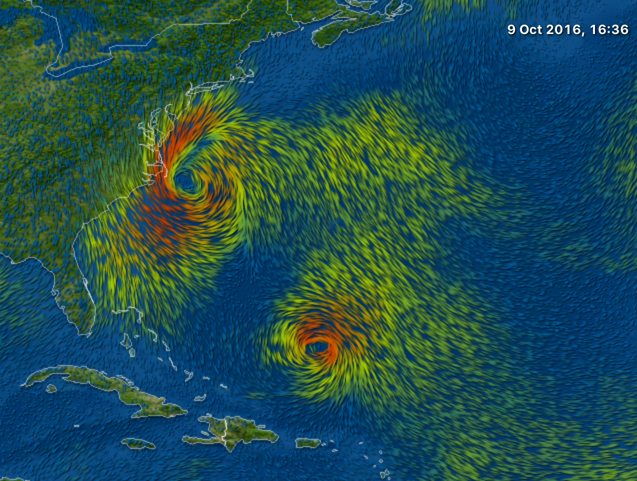
These images do not represent the exact same time, but there should be another storm out at the see. I can only suppose that this is because WindVectorData uses interpolation between weather stations, but I am not sure about this.
I will probably adds some more bits to this post over the coming days, so stay tuned.
Cheers,
Marco


