I have looked at a number of example some similar to the ones above. Some word histories tell nice stories, for example about medicine. Here are three words for malaria:
Options[WordFrequencyPlot] = {"YearStart" -> 1800, "YearEnd" -> Now,
   "Case" -> True, "Smooth" -> 3, "Scaling" -> None,
   "Style" -> Automatic};

WordFrequencyPlot[words_, OptionsPattern[]] :=
 With[{$data =
    WordFrequencyData[words,
     "TimeSeries", {OptionValue["YearStart"], OptionValue["YearEnd"]},
      IgnoreCase -> OptionValue["Case"]]},
  DateListPlot[
   MapThread[
    Callout, {MeanFilter[#,
        Quantity[OptionValue["Smooth"], "Years"]] & /@ Values[$data],
     words}], ScalingFunctions -> OptionValue["Scaling"],
   PlotRange -> All, PlotTheme -> "Detailed",
   PlotStyle -> OptionValue["Style"], FrameTicks -> {Automatic, None},
    ImageSize -> Large, FrameLabel -> {"YEAR", "FREQUENCY in TEXT"}]]

WordFrequencyPlot[{"ague", "malaria", "paludism"}]
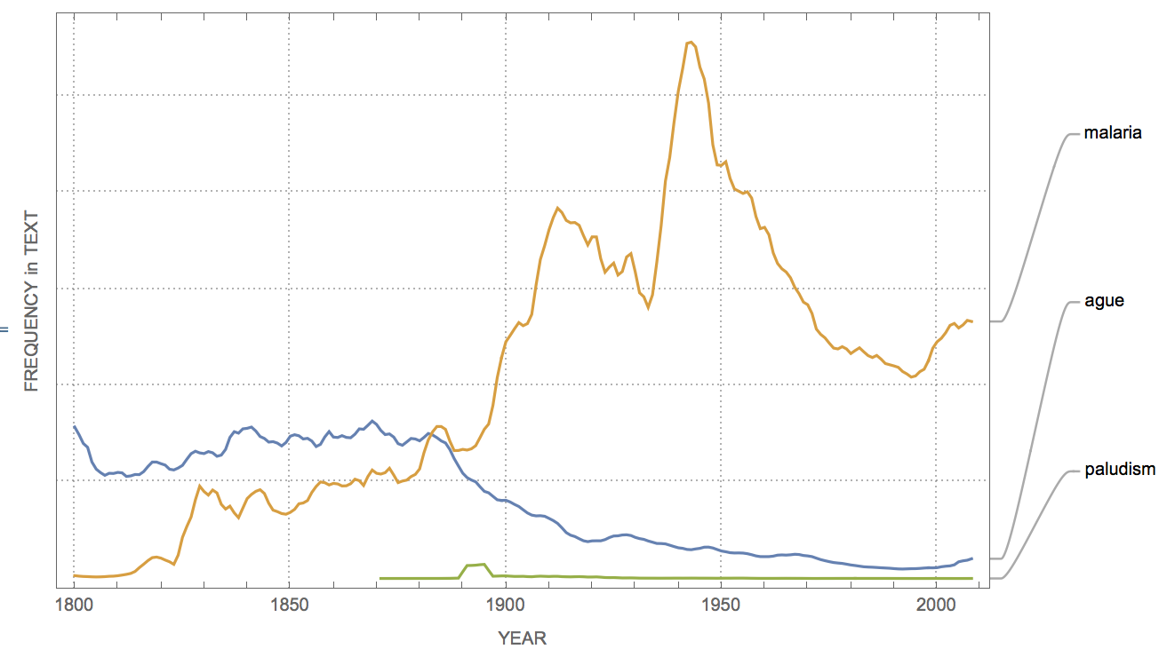
Until 1880, when Laveran first discovered the parasite, ague and malaria have basically the same frequency. Malaria is derived from malaria aria "bad air", whereas ague comes from acute febris "acute fever".
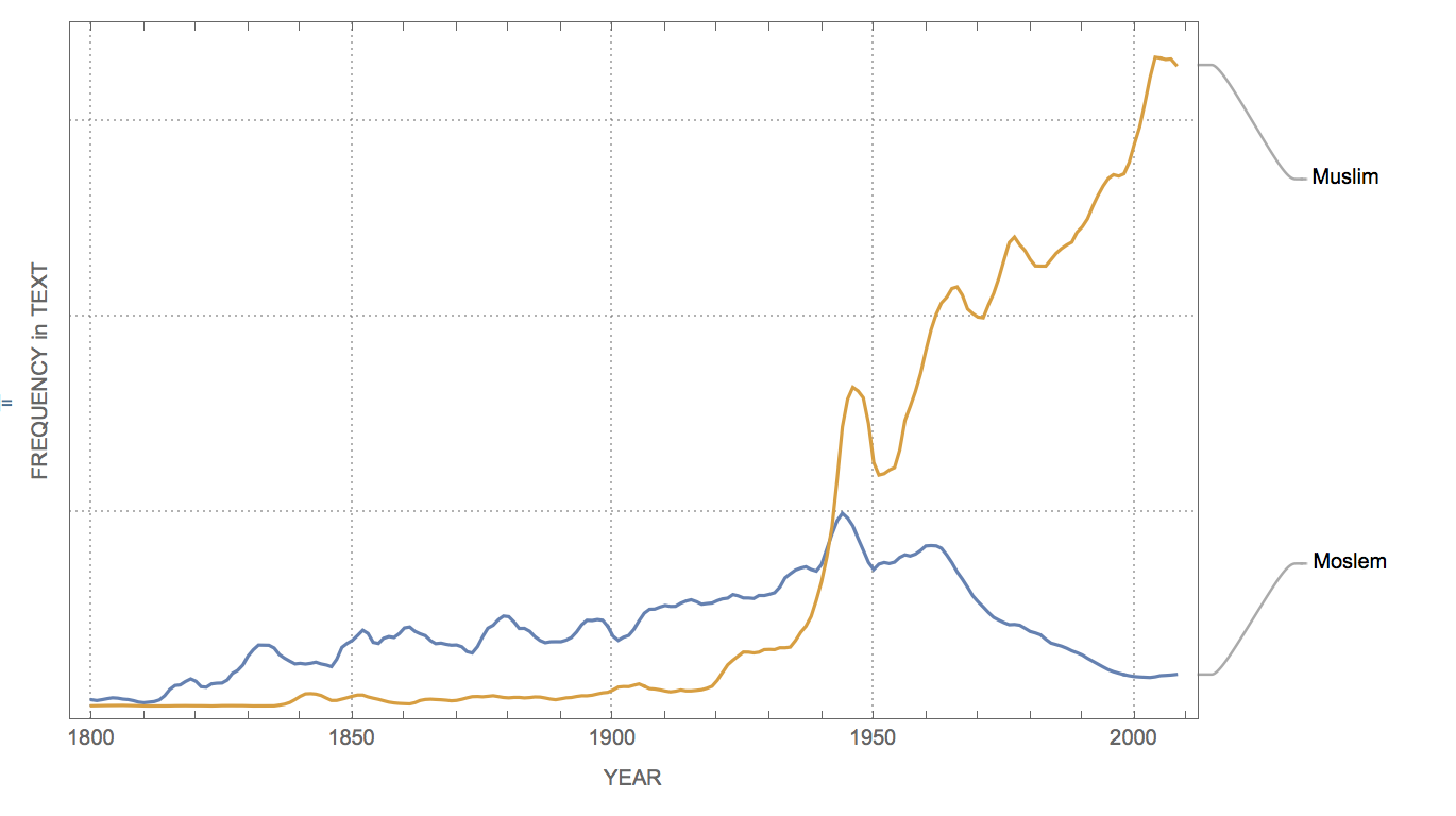
Sometimes we can also observe a shift in the frequency of words reflecting meaning the same thing
Options[WordFrequencyPlot] = {"YearStart" -> 1800, "YearEnd" -> Now, "Case" -> True, "Smooth" -> 3, "Scaling" -> None, "Style" -> Automatic};

WordFrequencyPlot[{"Moslem", "Muslim"}]
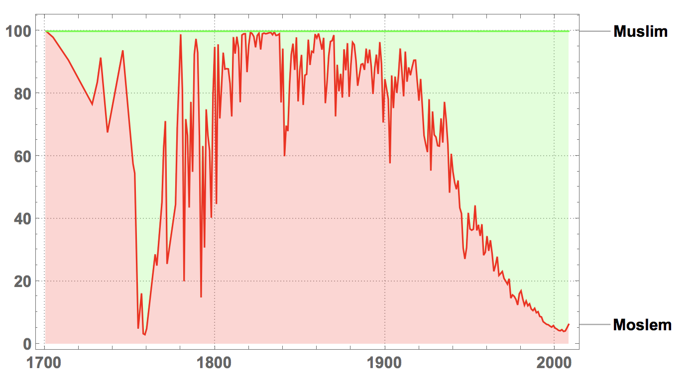
In those cases a relative frequency plot, i.e. displaying quantiles could be interesting:
StackedDateListPlot[
 MapThread[
  Callout, {Values[
    WordFrequencyData[{"Moslem", "Muslim"}, "TimeSeries"]], {"Moslem",
     "Muslim"}}], PlotRange -> All, PlotLayout -> "Percentile",
 ImageSize -> Large, PlotStyle -> {Red, Green},
 LabelStyle -> Directive[Bold, 16], PlotTheme -> "Detailed"]
Such a plot is also useful to compare opposites like the words peace and war, which are also studied in an earlier post:
StackedDateListPlot[
 MapThread[
  Callout, {Values[
    WordFrequencyData[{"war", "peace"}, "TimeSeries"]], {"war",
    "peace"}}], PlotRange -> All, PlotLayout -> "Percentile",
 ImageSize -> Large, PlotStyle -> {Red, Green},
 LabelStyle -> Directive[Bold, 16], PlotTheme -> "Detailed"]
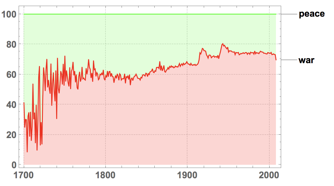
It is interesting to see that since about 1850 the word war is more frequent than peace.
These plot also reflect use of words such as bike and bicycle
StackedDateListPlot[
 MapThread[
  Callout, {Values[
    WordFrequencyData[{"bicycle", "bike"}, "TimeSeries"]], {"bicycle",
     "bike"}}], PlotRange -> All, PlotLayout -> "Percentile",
 ImageSize -> Large, PlotStyle -> {Red, Green},
 LabelStyle -> Directive[Bold, 16], PlotTheme -> "Detailed"]
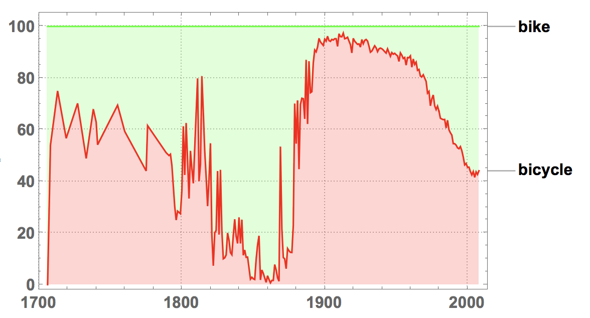
I would have expected that bike becomes more prominent during the 20th century. Between 1800 and 1880 is is also surprisingly common. I am not sure why, but this could be due to the other meaning of bike which is something like "nest or swarm of bees".
It would be interesting to consider the change of meaning of words. I tried to look at the word "gay" which has changed meaning over the years from lighthearted (13th century), bright and showy (14th century) and happy. It could also imply morality and mean gay women (prostitute) or gay man (womaniser), gay house (brothel). around 1900 it was something like "cheerful"; in the 1980 young users would use it to mean "lame, stupid" around 1990 it got to mean homosexual. I tried to use google n-grams to figure that out, but it didn't really work well. Here are words that are used close to gay over the years:
Table[{k,
  StringSplit[
    StringSplit[
      StringSplit[
        StringSplit[
          URLExecute[
           "https://books.google.com/ngrams/graph?content=gay+*_ADJ&\
year_start=" <> ToString[k] <> "&year_end=" <> ToString[k + 20] <>
            "&corpus=15&smoothing=3"], "direct_url="][[2]],
        " width"][[1]], "gay%20"][[3 ;;]], "_"][[All, 1]]}, {k, 1800,
  2000, 20}]
which gives
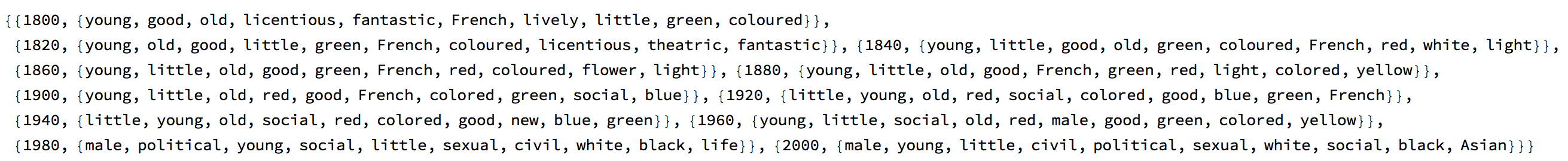
The frequency plot is:
Options[WordFrequencyPlot] = {"YearStart" -> 1800, "YearEnd" -> Now,
   "Case" -> True, "Smooth" -> 3, "Scaling" -> None,
   "Style" -> Automatic};

WordFrequencyPlot[{"gay"}]
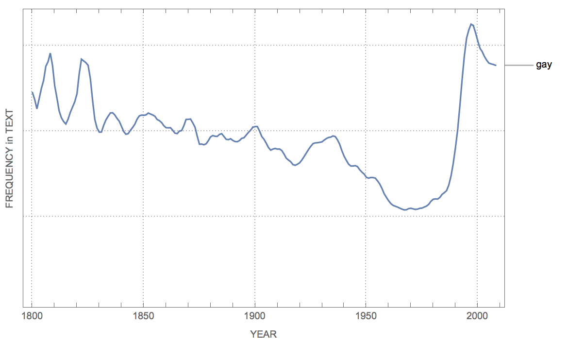
or over longer times:
Options[WordFrequencyPlot] = {"YearStart" -> 1500, "YearEnd" -> Now,
   "Case" -> True, "Smooth" -> 3, "Scaling" -> None,
   "Style" -> Automatic};

WordFrequencyPlot[{"gay"}]
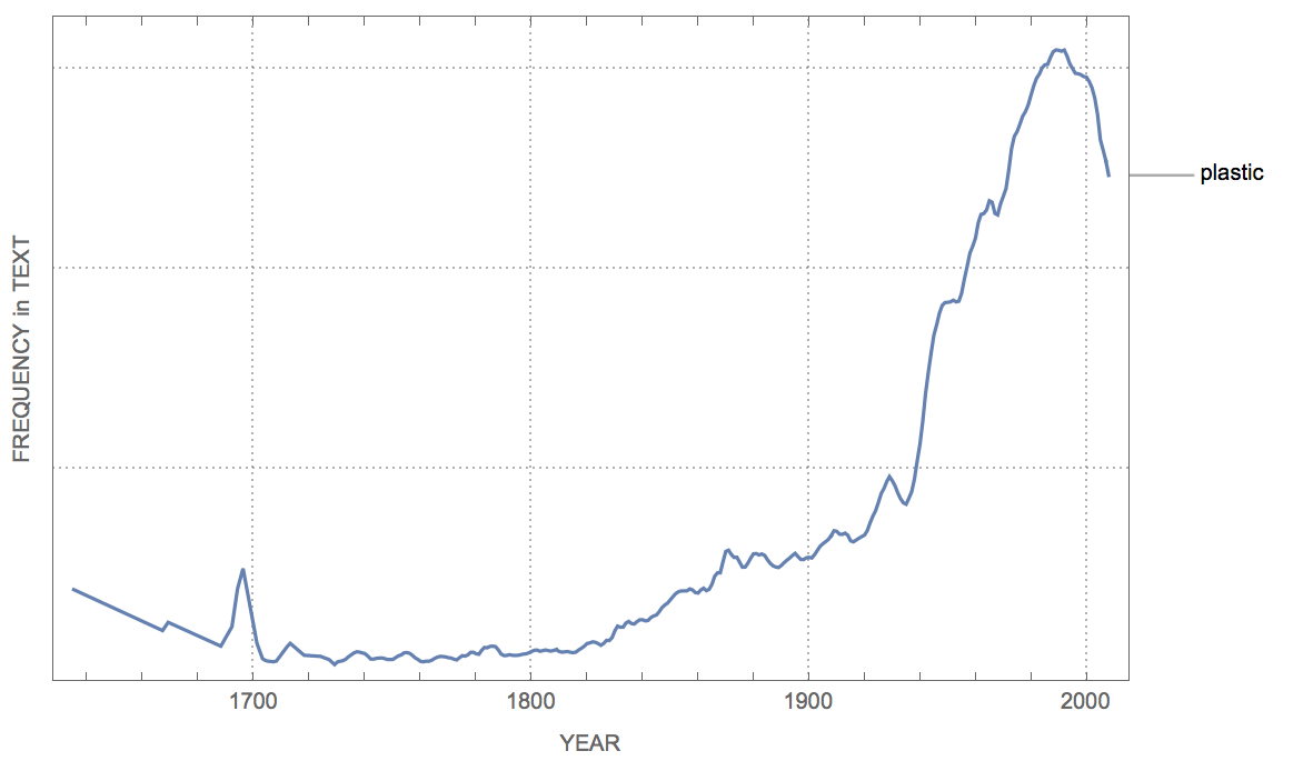
Also plastic has changed meaning from the the characteristic of being plastic to the material plastic:
WordFrequencyPlot[{"plastic"}]
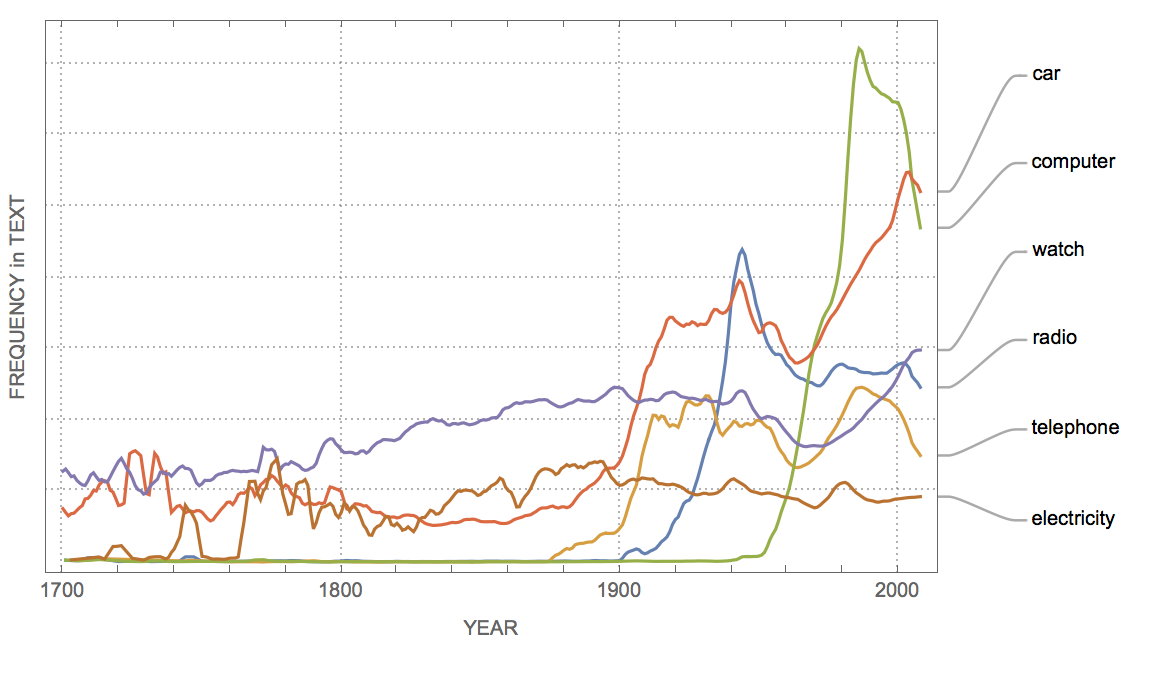
In general we can see when different products have been developed:
WordFrequencyPlot[{"radio", "telephone", "computer", "car", "watch",
  "electricity"}, "YearStart" -> 1700, "YearEnd" -> Now]
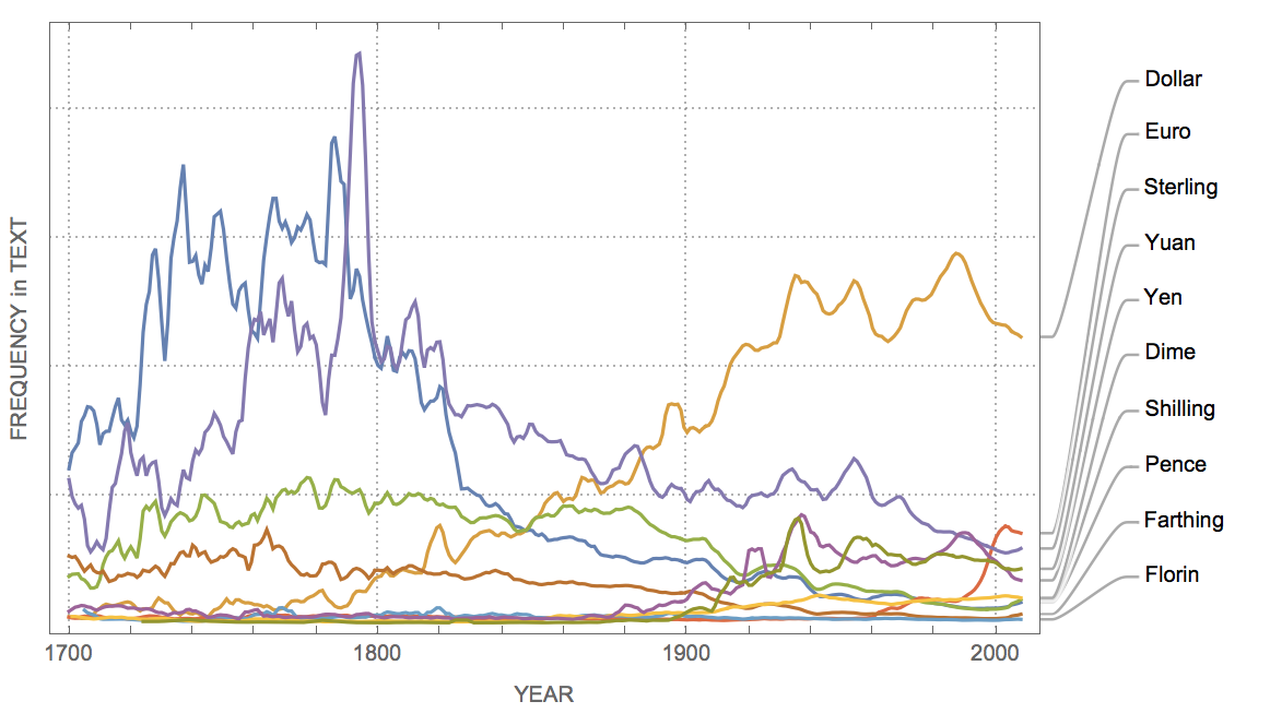
Of course, words can come out of fashion, too. For example:
WordFrequencyPlot[{"Pence", "Dollar", "Shilling", "Euro", "Sterling",
  "Farthing", "Florin", "Dime", "Yen", "Yuan"}, "YearStart" -> 1700,
 "YearEnd" -> Now]
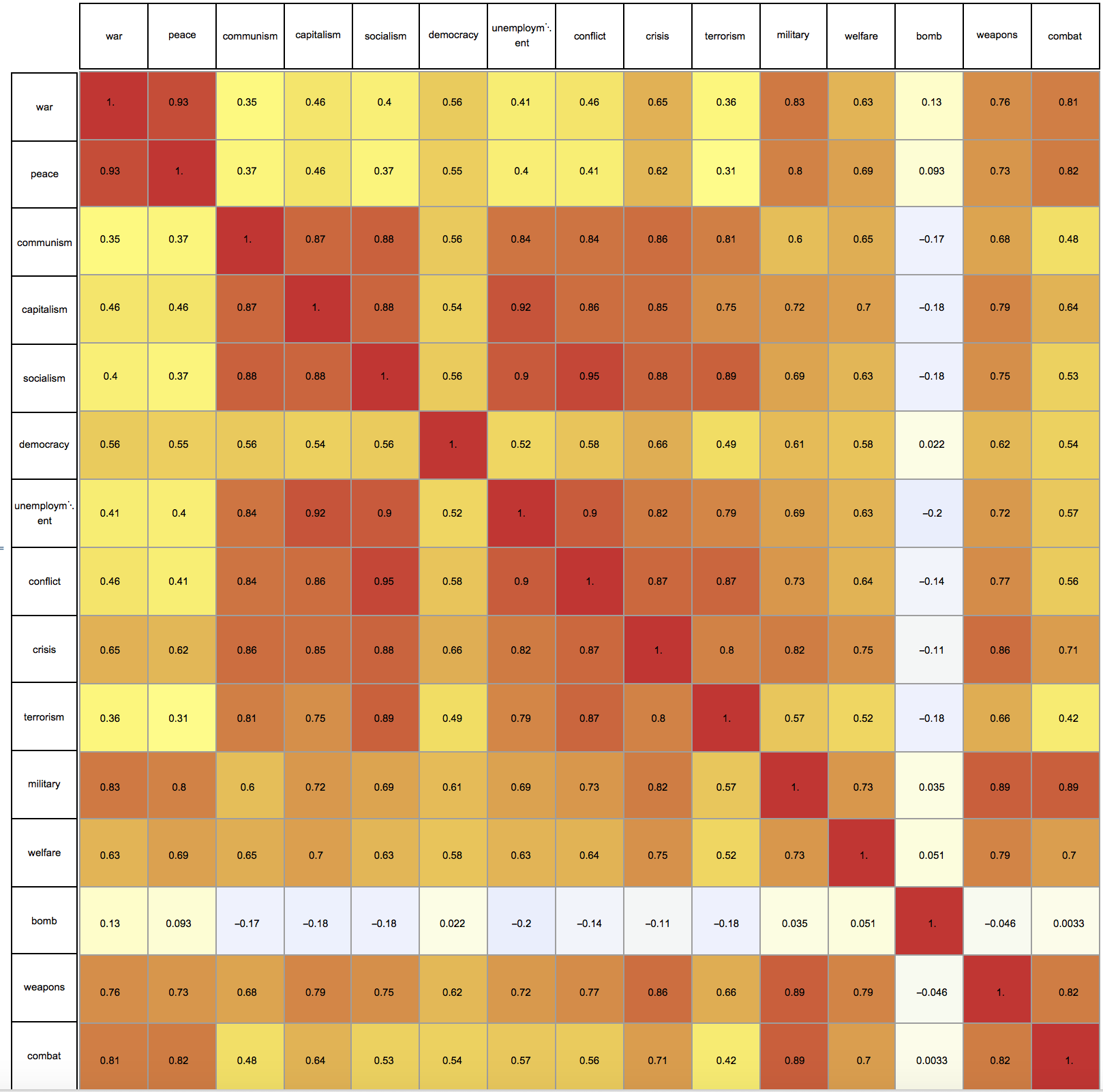
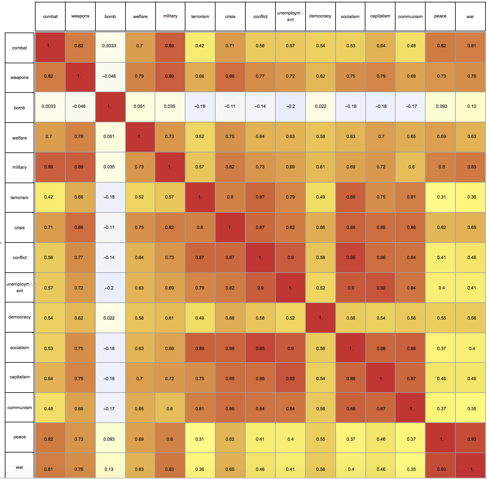
In fact we can study this more systematically, by looking at the correlations between frequency curves:
words = {"war", "peace", "communism", "capitalism", "socialism",
  "democracy", "unemployment", "conflict", "crisis", "terrorism",
  "military", "welfare", "bomb", "weapons", "combat"}

worddata = (WordFrequencyData[#, "TimeSeries"])["Values"] & /@ words;

cm = Correlation[
   Transpose@
    worddata[[All,
     1 ;; Min[
       Table[Length[worddata[[i, ;;]]], {i, 1,
         Length[words] - 1}]]]]];

Column[{GraphicsRow[words[[1 ;;]], ImageSize -> 1000, Frame -> All],
  Row[{GraphicsColumn[words[[1 ;;]], ImageSize -> 67, Frame -> All],
    Overlay[{ArrayPlot[cm,
       ColorFunction -> (ColorData["TemperatureMap"][(1 + #)/2] &),
       Frame -> None, Mesh -> True, PlotRangePadding -> 0,
       ImageSize -> 1000, ColorFunctionScaling -> False],
      GraphicsGrid[Map[NumberForm[#, 2] &, cm, {2}],
       ImageSize -> 1000]}]}]}, Alignment -> Right, Spacings -> 0]
We can use a BandwidthOrdering
Needs["GraphUtilities`"]
{r, c} = MinimumBandwidthOrdering[cm, Method -> "RCMD"]

cm2 = Correlation[
   Transpose@
    worddata[[r]][[All,
      1 ;; Min[
        Table[Length[worddata[[r]][[i, ;;]]], {i, 1,
          Length[words]}]]]]];

Column[{GraphicsRow[words[[r]], ImageSize -> 1000, Frame -> All],
  Row[{GraphicsColumn[words[[r]], ImageSize -> 67, Frame -> All],
    Overlay[{ArrayPlot[cm2,
       ColorFunction -> (ColorData["TemperatureMap"][(1 + #)/2] &),
       Frame -> None, Mesh -> True, PlotRangePadding -> 0,
       ImageSize -> 1000, ColorFunctionScaling -> False],
      GraphicsGrid[Map[NumberForm[#, 2] &, cm2, {2}],
       ImageSize -> 1000]}]}]}, Alignment -> Right, Spacings -> 0]
Using that we can try to find words with a similar behaviour:
StackedDateListPlot[
 MapThread[Callout,
  Log /@ {Values[
     WordFrequencyData[{"Democracy", "War", "Peace"},
      "TimeSeries"]], {"Democracy", "War", "Peace"}}],
 PlotRange -> All, PlotLayout -> "Percentile", ImageSize -> Large,
 PlotStyle -> {Red, Green, Blue}, LabelStyle -> Directive[Bold, 16],
 PlotTheme -> "Detailed"]
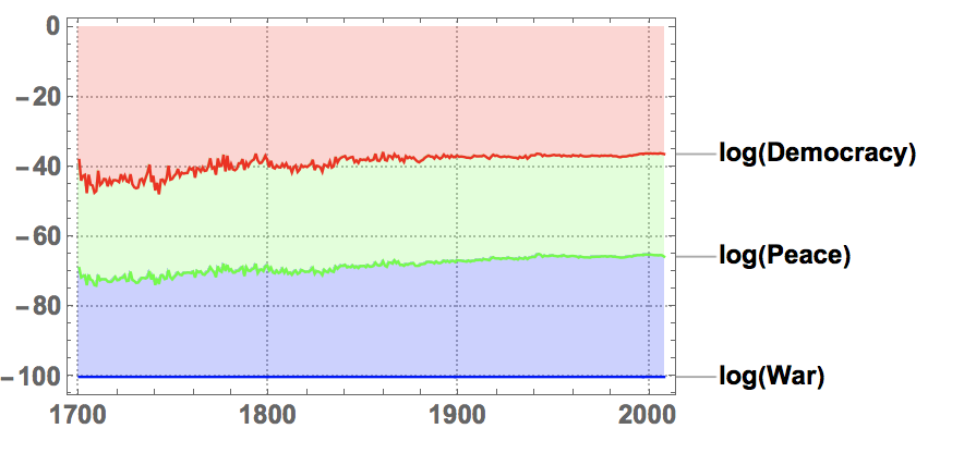
which indicates near constant ratios over a long time. This is not that easy to see in the FrequencyPlot
WordFrequencyPlot[{"Democracy", "War", "Peace"}, "YearStart" -> 1900,
 "YearEnd" -> Now, "Scaling" -> {None, "Log"}]
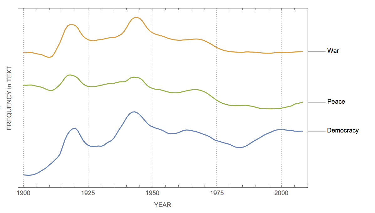 .
.
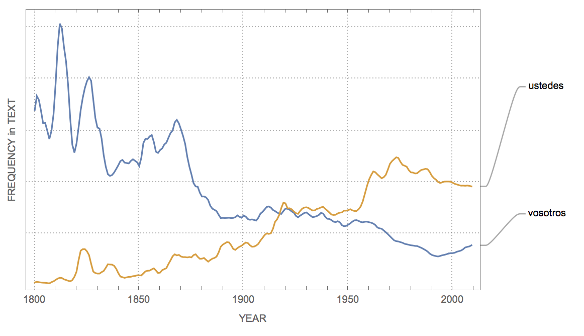
Finally, it is interesting to look at other languages such as tu vs usted in Spanish
Options[WordFrequencyPlotSpanish] = {"YearStart" -> 1800,
"YearEnd" -> Now, "Case" -> True, "Smooth" -> 3, "Scaling" -> None,
"Style" -> Automatic};

WordFrequencyPlotSpanish[words_, OptionsPattern[]] :=
With[{$data =
WordFrequencyData[words,
"TimeSeries", {OptionValue["YearStart"], OptionValue["YearEnd"]},
IgnoreCase -> OptionValue["Case"], Language -> "Spanish"]},
DateListPlot[
MapThread[
Callout, {MeanFilter[#,
Quantity[OptionValue["Smooth"], "Years"]] & /@ Values[$data],
words}], ScalingFunctions -> OptionValue["Scaling"],
PlotRange -> All, PlotTheme -> "Detailed",
PlotStyle -> OptionValue["Style"], FrameTicks -> {Automatic, None},
ImageSize -> Large, FrameLabel -> {"YEAR", "FREQUENCY in TEXT"}]]

WordFrequencyPlotSpanish[{"vosotros", "ustedes"}]
or Du and Sie in German
Options[WordFrequencyPlotGerman] = {"YearStart" -> 1800,
"YearEnd" -> Now, "Case" -> True, "Smooth" -> 3, "Scaling" -> None,
"Style" -> Automatic};

WordFrequencyPlotGerman[words_, OptionsPattern[]] :=
With[{$data =
WordFrequencyData[words,
"TimeSeries", {OptionValue["YearStart"],
OptionValue["YearEnd"]},(*IgnoreCase\[Rule]OptionValue["Case"],*)
IgnoreCase -> False, Language -> "German"]},
DateListPlot[
MapThread[
Callout, {MeanFilter[#,
Quantity[OptionValue["Smooth"], "Years"]] & /@ Values[$data],
words}], ScalingFunctions -> OptionValue["Scaling"],
PlotRange -> All, PlotTheme -> "Detailed",
PlotStyle -> OptionValue["Style"], FrameTicks -> {Automatic, None},
ImageSize -> Large, FrameLabel -> {"YEAR", "FREQUENCY in TEXT"}]]

WordFrequencyPlotGerman[{"Du", "Sie"}]
I suppose that there are interesting mechanisms working here. It definitely feels that "Du" becomes more prevalent as opposed to the more formal "Sie". But there might be an affect due to (social?) media etc. in the opposite direction.
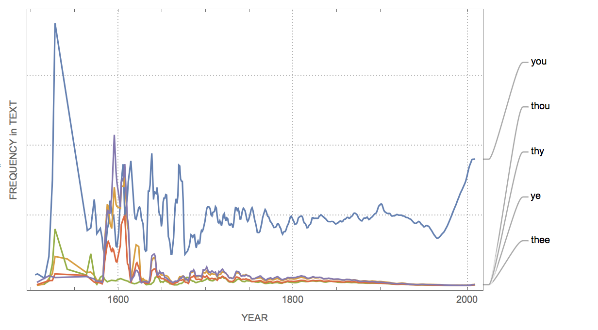
Here are a couple of pronouns in English:
WordFrequencyPlot[{"you", "thou", "ye", "thee", "thy"},
 "YearStart" -> 1200, "YearEnd" -> Now]
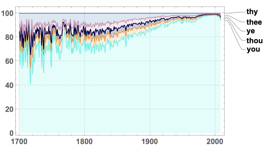
which might look better on a percentile plot:
StackedDateListPlot[
 MapThread[
  Callout, {Values[
    WordFrequencyData[{"you", "thou", "ye", "thee", "thy"},
     "TimeSeries"]], {"you", "thou", "ye", "thee", "thy"}}],
 PlotRange -> All, PlotLayout -> "Percentile", ImageSize -> Large,
 PlotStyle -> RandomColor[5], LabelStyle -> Directive[Bold, 16],
 PlotTheme -> "Detailed"]
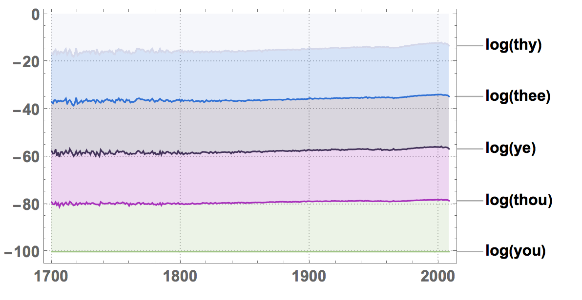
Logarithmically, this becomes:
StackedDateListPlot[
 MapThread[Callout,
  Log@{Values[
     WordFrequencyData[{"you", "thou", "ye", "thee", "thy"},
      "TimeSeries"]], {"you", "thou", "ye", "thee", "thy"}}],
 PlotRange -> All, PlotLayout -> "Percentile", ImageSize -> Large,
 PlotStyle -> RandomColor[5], LabelStyle -> Directive[Bold, 16],
 PlotTheme -> "Detailed"]
Cheers,
Marco


