Message Boards Message Boards

[CALL] Reddit DataViz Battle JAN2018: Visualize the Growth Rates of Algae

Intro

One of the most popular Reddit's channels Data Is Beautiful (with multi-million membership of subscribers) has just started Battle Competitions for data visualizations that will run monthly. This is a call to Wolfram Community members to collaborate on JAN 2018 Battle.

Direct reference to the JAN 2018 Battle: https://redd.it/7nm6ed

Solutions

Rules of this thread

Reddi requires direct links to the images. Hence a separate post is necessary. Here are the steps:

  • Make a separate post solving the challenge with detailed title describing your specific method of visualization and starting with tag [Reddit-DiBB0118] (Data is Beautiful Battle 01/2018)

  • Make a comment in this thread simply stating the title and copying your post URL.

See my example in the comments. I will collect the solutions in the "solutions" section above. This method enables you to post your own posts on Reddit if you want to keeping your authorship.

Goal

I simply suggest that Wolfram Community members brainstorm in the comments below about how the best to visualize the dataset. Feel free to submit your own solutions to Reddit if you want to as they require the original authors. The main goal though is simply to have fun here on Community. Don't forget to vote up the posts you like.

Important

Battles have simple rules explained clearly in the Reddit battle thread linked above. To not get disqualified it is advised to read rules carefully. You can ask Reddit admins any additional questions directly in the thread comments. I recommend reading other people comments as they clarify the nature of the dataset.

Getting the data w/ Wolfram Language (WL)

The dataset is located at a web page: http://aquatext.com/tables/algaegrwth.htm

The nature of the data is clear from the website description. It is easy to get the raw data with the following WL command:

raw = Import["http://aquatext.com/tables/algaegrwth.htm", "Data"] /."0..06" -> .06;

You need /."0..06" -> .06 because the data has a clerical error resulting in the import of a string instead of a number. One way of obtaining a simple rectangular array / table of data is:

data=Cases[raw,{_String,__?NumberQ},Infinity]/.
x_List/;First[x]=="Temperature":>{"Temperature",5,5,10,10,25,25,30,30};

which can be viewed as

TableForm[data]
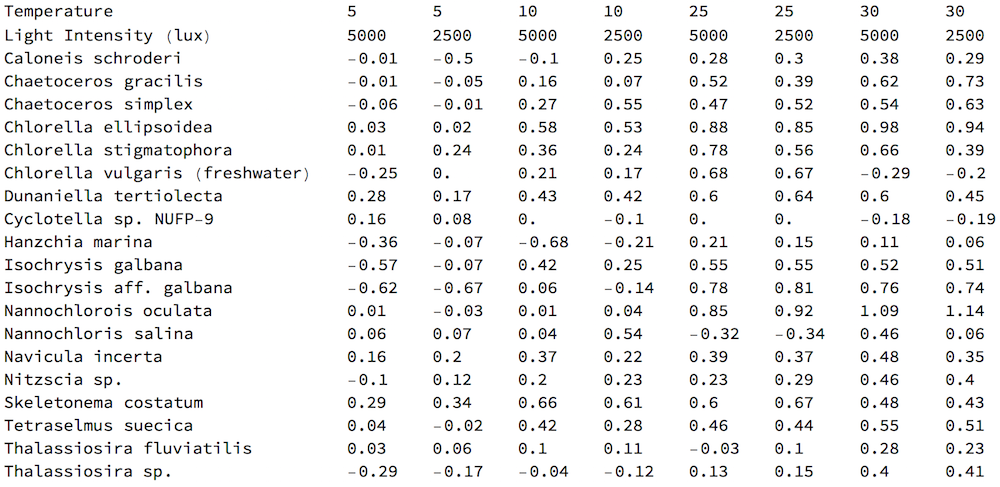
enter image description here

POSTED BY: Vitaliy Kaurov
18 Replies

Population - pyramid like visualization : http://community.wolfram.com/groups/-/m/t/1258056

enter image description here

Heatmap of inter- and intra- species comparison: http://community.wolfram.com/groups/-/m/t/1257577

enter image description here

POSTED BY: Vitaliy Kaurov

Growth Rate in "Intensity Space": http://community.wolfram.com/groups/-/m/t/1258281

enter image description here

POSTED BY: Henrik Schachner
Posted 7 years ago

Intraspecies comparison using RadarChart: http://community.wolfram.com/groups/-/m/t/1260507

enter image description here

POSTED BY: Diego Zviovich

Scatter plot slices of temperature dynamics: http://community.wolfram.com/groups/-/m/t/1261948

Let me know if you cannot see the image. It is in .SVG format. Click on image or here to zoom. Right-click to download. The graphics is in .SVG format, please make sure your browser supports viewing it. .SVG is a vector format and allows crisp resolution-independent images. Just in case at the link above the same image is provided also in .PNG foramt


enter image description here

POSTED BY: Vitaliy Kaurov

Awesome! I was waiting for someone to use Machine Learning on this somehow. And your Radar Chart Package expresses the idea perfectly.

POSTED BY: Vitaliy Kaurov

Interspecies comparison using HeatmapPlot: http://community.wolfram.com/groups/-/m/t/1261444

I consider this plot to be a "standard thing" to do for this kind of data, not a "winning" plot. And, yes, it similar to Vitaliy's...

enter image description here

POSTED BY: Anton Antonov

Thank you Vitaliy! And yes are correct, we can do a double-dendrogram plot:

HeatmapPlot[Transpose[Rest /@ sdata[[3 ;; -1]]], 
 Map[Row[{"temp:", Style[#[[1]], Bold, Purple], ", lux:", Style[#[[2]], Bold, Purple]}] &, Transpose[Rest /@ sdata[[1 ;; 2]]]], 
 First /@ sdata[[3 ;; -1]],
 DistanceFunction -> {EuclideanDistance, EuclideanDistance}, 
 Dendrogram -> {True, True}, ImageSize -> 1000]

enter image description here

This plot seems more informative than the first one I posted. Note the grouping of the temperature and lux pairs becomes the same as in the raw data.

POSTED BY: Anton Antonov

Neat idea, Henrik! I was also considering this Intensity "phase space" as I call it, but your coloring for temperature is much more innovative than my idea. Thank you!

POSTED BY: Vitaliy Kaurov

Very Nice. I also like Sanders (and Vitaly) but I noticed with Sanders approach that some algae react opposite to the LUX. With your approach this is not obvious but could be highlighted perhaps. EG. the ellipsoidia is lower with 2500K and higher with 5000K The oculata is the other way around. I don't know if it is really relevant but Sander's approach (less intuitive (for me)) shows this very nicely. Your approach for me is more intuitive. Perhaps a Color code on the top of the bars might indicate this pattern? Just a thought :)

POSTED BY: l van Veen

Stunning, I also love bubble charts! I was actually thinking of one but yours is much better. Thank you!

POSTED BY: Vitaliy Kaurov

Beautiful work, thank you for taking the challenge! And thank you very for submitting to Reddit! BTW could "negative value for divisions per day" mean that population is shrinking? Basically death rate > birth rate... assuming they start with some substantial initial population.

POSTED BY: Vitaliy Kaurov

Awesome, Anton, thank you! Hierarchical clustering did also crossed my mind, nice execution! From the option

Dendrogram -> {True, False}

I guess that one can add another "orthogonal" dendogram for columns with the option set to {True, True}, is that correct? Similar to this one:

https://www.r-bloggers.com/drawing-heatmaps-in-r

enter image description here

POSTED BY: Vitaliy Kaurov

Thanks @l van Veen - I opted for a relative change bar chart to show this!

Yes I like this version very much! Feel free to update you actual post if you'd like, and/or post it on Reddit.

POSTED BY: Vitaliy Kaurov
Posted 7 years ago

I am just now reading this and amazed at the broad nature of the responses! Just to throw out a little life science out there - I think the reason the temperatures effect on the final division rates in a much more apparent way is because it is linear in nature while the lux values actually behave in a cyclical way to stimulate the divisions through simulating activity/rest cycles most biological life requires. It may be interesting to analyze or visualize how these cycles effect the growth patterns in some way. Perhaps I will take a look at it later this week.

Keep up the good work guys!

POSTED BY: William Duhe
Reply to this discussion
Community posts can be styled and formatted using the Markdown syntax.
Reply Preview
Attachments
Remove
or Discard

Group Abstract Group Abstract