Intro
One of the most popular Reddit's channels Data Is Beautiful (with multi-million membership of subscribers) has just started Battle Competitions for data visualizations that will run monthly. This is a call to Wolfram Community members to collaborate on JAN 2018 Battle.
Direct reference to the JAN 2018 Battle: https://redd.it/7nm6ed
Solutions
Heatmap of inter- and intra- species comparison by Vitaliy Kaurov:
Bubble chart for 4D data by Sander Huisman:
Population - pyramid like visualization: by George Varnavides
Growth Rate in "Intensity Space" by Henrik Schachner
Intraspecies comparison using RadarChart by Diego Zviovich
Interspecies comparison using HeatmapPlot by Anton Antonov
Scatter plot slices of temperature dynamics by Vitaliy Kaurov
RadarChart for each pecies by Anton Antonov
Rules of this thread
Reddi requires direct links to the images. Hence a separate post is necessary. Here are the steps:
Make a separate post solving the challenge with detailed title describing your specific method of visualization and starting with tag [Reddit-DiBB0118] (Data is Beautiful Battle 01/2018)
Make a comment in this thread simply stating the title and copying your post URL.
See my example in the comments. I will collect the solutions in the "solutions" section above. This method enables you to post your own posts on Reddit if you want to keeping your authorship.
Goal
I simply suggest that Wolfram Community members brainstorm in the comments below about how the best to visualize the dataset. Feel free to submit your own solutions to Reddit if you want to as they require the original authors. The main goal though is simply to have fun here on Community. Don't forget to vote up the posts you like.
Important
Battles have simple rules explained clearly in the Reddit battle thread linked above. To not get disqualified it is advised to read rules carefully. You can ask Reddit admins any additional questions directly in the thread comments. I recommend reading other people comments as they clarify the nature of the dataset.
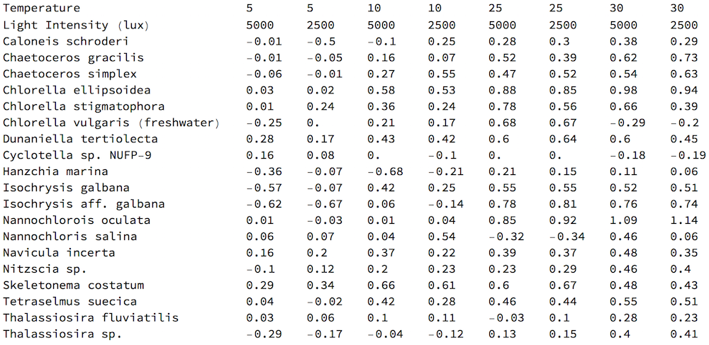
Getting the data w/ Wolfram Language (WL)
The dataset is located at a web page: http://aquatext.com/tables/algaegrwth.htm
The nature of the data is clear from the website description. It is easy to get the raw data with the following WL command:
raw = Import["http://aquatext.com/tables/algaegrwth.htm", "Data"] /."0..06" -> .06;
You need /."0..06" -> .06 because the data has a clerical error resulting in the import of a string instead of a number. One way of obtaining a simple rectangular array / table of data is:
data=Cases[raw,{_String,__?NumberQ},Infinity]/.
x_List/;First[x]=="Temperature":>{"Temperature",5,5,10,10,25,25,30,30};
which can be viewed as
TableForm[data]