 Attachments:
|
|
|
Dear Vitaliy and many other experts,
- Is it possible to compile the data for the number of testing? So that we can get the ratio of the confirmed cases relative to those who get tested?
- Is it also possible to redesign the data set to include the 'City', in addition to the current geographical classification, namely, country/region and administrative region? That way, perhaps we can get more detailed information about the containment and spread of the COVID-19 inside and outside of the city?
Best,
|
|
|
Dear @Hee-Young, Not sure about (1), but I passed your post to our team. It’s an interesting question. I do know that people have been tested in areas with no confirmed cases. Finding out more about that could give an interesting look at the effectiveness of containment/prevention in those areas. For (2), the source data gives the region information, which is actually the mixture of AdministrativeDivision, City, County as well as Air force base location. In the latest Wolfram Data Repository (WDR) item, we have the AdministrativeDivision column as well as more specific location (which gives the city or country information). So far most of the cities are for the US but I see some Canadian cities as well so it looks like there is possibility that more city information (outside the US) will be added in the future. Also note that the dataset has GeoPosition column, which gives more details and was used to create this additional example with geo bubbles (details at WDR): 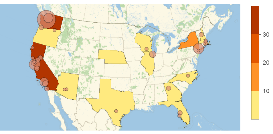
Show[GeoRegionValuePlot[
  Normal@ResourceData["Epidemic Data for Novel Coronavirus COVID-19"][
     Select[MatchQ[Entity["Country", "UnitedStates"], #Country] &]][
    GroupBy["AdministrativeDivision"], Total, #ConfirmedCases["LastValue"] &]], GeoBubbleChart[
  Normal@ResourceData["Epidemic Data for Novel Coronavirus COVID-19"][
     Select[MatchQ[Entity["Country", "UnitedStates"], #Country] && ! MissingQ[#AdministrativeDivision] &]][
    All, {#GeoPosition, #ConfirmedCases["LastValue"]} &], ChartStyle -> ColorData[8, 3]]]
|
|
|
Thank you very much.
I am also compiling some data for South Korea (where my parents are living). Once I am done, let me send you (share with other experts) the data set.
|
|
|
Is it possible to compile the data for the number of testing? So that we can get the ratio of the confirmed cases relative to those who get tested?
Three weeks have passed and I am curious if anyone has found any testing data for any other countries than the US. I am looking for resources that would help us determine if the case numbers we see reflect true cases, or are at this point mostly bottlenecked by testing capacity. There is testing data here: https://ourworldindata.org/covid-testing
https://ourworldindata.org/coronavirus-testing-source-data But these are the total number of tests performed. I am looking for more granular day-by-day (or any longer time period by time period) data.
|
|
|
Yaneer Bar Yam, from the New England Complexity Institute set a challenge for volunteers to join and coordinate efforts in several fronts to raise awareness on the coronavirus challenge. https://twitter.com/yaneerbaryam/status/1235053834763812866 If you join, there is a channel in slack at the workgroup that is for Mathematica users. It feels quite lonely right now (Mads and I). Additional volunteers welcomed necsivolunteersatgmail.com
|
|
|
I suspect the problem is early data collection. Iran probably does not have the resources to detect whether all exposed cases have become infected. Thus the cumulative case data will lag the actual cases until the backlog of cases in the community is discovered. The log plot of cumulative cases from the JHU data is still showing exponential growth. 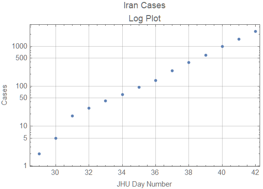
When quarantine measures start to work or susceptible population significantly declines, the graph should start to show growth slower than exponential. Until that happens it won't be possible to predict the end of the epidemic.
|
|
|
I've analyzed the data disparity of Iran (case-fatality ratio) and predicted the number of diagnosed cases. Interestingly (or sadly), it was confirmed by new data. I welcome any suggestion on how to normalize data or better approaches to tackle this issue.
|
|
|
In case it's not covered in data resources in OP, here is a history data source someone crawled from Ding Xiang Yuan (DXY), down to every cities of every provinces in China. COVID-19/2019-nCoV Infection Data Realtime Crawler https://github.com/BlankerL/DXY-COVID-19-Crawler/blob/master/README.en.md Note the data source is non-official. DXY, as I know it, is an online non-gov society of doctors and nurses from mainland china. Their data could be different from officially published one.
|
|
|
I have published 2 notebooks on the Wolfram Could which uses a logistic growth model to track the coronavirus epidemic with the data from the GitHub repository:
|
|
|
I have studied the genetic sequences of COVID-19 and SARS-like viruses, using Chaos Game Representation and Z-curve methods (hyperlinks to my Community posts). Z-curves provide a fascinating visualization of genomes that helps a lot for classification and clustering. The hierarchical clustering of viruses identifies Bat coronavirus RaTG13 as the most-likely culprit of COVID-19. My results strongly support the hypothesis of a Bat origin of COVID-19. I appreciate any comment or feedback :-)
|
|
|
I have compiled some of the work done so far into a compact cloud dashboard:
https://wolfr.am/COVID19Dashboard It is mainly built to give an overview of some information from our WDR resources, with corresponding daily updates. It is still a work in progress; I will be adding more visualizations and interactivity in the coming days. (The code is rather messy, but I'll also be publishing a cleaned-up notebook with some sample code for creating similar elements.) Aside from the visual elements, folks here might find the "Resources" tab helpful. It includes several of the Wolfram resources listed here, but also has some external resources I've seen floating around in several threads about the outbreak. I'll be continuously adding to that section as well. Feel free to comment if you think of anything you'd like to see added! (Or if you see something that isn't working--e.g. the tooltips for the world map, which I'm looking to fix.) Enjoy!
|
|
|
I just wanted to note for anyone who might be interested that the latest release of IGraph/M from a few days ago now exposes the igraph C library's SIR modelling functionality. It is fairly simple at the moment. It can run several simultaneous stochastic SIR simulations on a network, and only returns the S, I, R values at each timestep (not individual node states). It can be used to study the effect of network structure on the spreading. http://szhorvat.net/mathematica/IGDocumentation/#epidemic-models UPDATE: I just added another example to the documentation to clarify what this functionality is good for. If you've opened the above link before, please do a hard-refresh of the page (Shift-F5 on Linux/Windows or Command-Shift-R on Mac)
|
|
|
Extremely interesting. Thanks for the original work and for sharing your model.
|
|
|
It is very nice to see how fast Wolfram Inc is moving in gathering and curating data on the corona virus outbreak. Thank you very much! Still, for me to use, e.g. the ResourceObject["Patient Medical Data for Novel Coronavirus 2019-nCoV from Wuhan, China"]
it is paramount the I can trust the data source, especially in this Age of Misinformation. You give a name and a link to a Google Sheet, but who is behind that? Which organization? How have you curated that specific data set? Best,
Per Møldrup-Dalum
|
|
|
Hi @Per Møldrup-Dalum, I am glad you like our resources and we highly appreciate user feedback, thank you! For this specific type of question I recommend reaching out directly to our Wolfram Data Repository team at: https://datarepository.wolframcloud.com/contact-us Please note, Wolfram Data Repository entries are continuously updated and new information can appear on their pages in the future.
|
|
|
Hi Vitaliy, thank you for answering. I can see that the dataset now has a link to source and metadata information! Fantastic!
|
|
|
It would be neat to see a SEIR type analysis
|
|
|
I did a simple chart how 2019-nCoV aligns against SARS, MERS. Here results and source code. https://gitlab.com/sparvu/mathematica 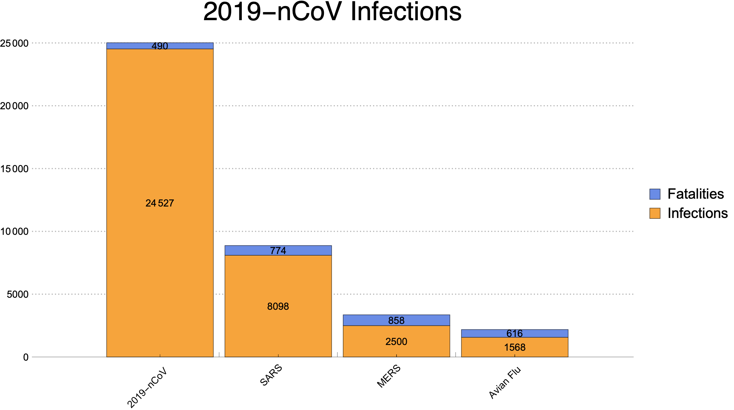
data={{24527,490},{8098,774},{2500,858},{1568,616}};
BarChart[data,
PlotTheme->"Business",
ChartLayout->"Stacked",
ChartLabels->{Placed[{"2019-nCoV","SARS","MERS","Avian Flu"},{{0.5,0},{0.8,1.2}},Rotate[#,(1.75/7) Pi]&],Placed[{"",""},Above]},
LabelingFunction->(Placed[Rotate[#,0 Pi],If[#1>1,Center,Above]]&),
ChartLegends->Placed [{"Infections","Fatalities"},Right],
PlotLabel->Style["2019-nCoV Infections",FontFamily->"Helvetica",Thin,24],
AspectRatio->0.55]
|
|
|
Very neat, thanks for sharing!
|
|
|
There is also raw data being collected here in the form of a Google Sheet. It relies on data abstracted by a human (a work study student at the University of Houston operating under my supervision) from the daily reports being produced by the World Health Organization. I attach a notebook that shows how the data can be sucked in from the Google Sheet and turned into a Wolfram Language Dataset. From there, I run a few basic queries. Please see notebook in Wolfram Cloud or attached below.
Attachments:
|
|
|
Reply to this discussion
in reply to
|


