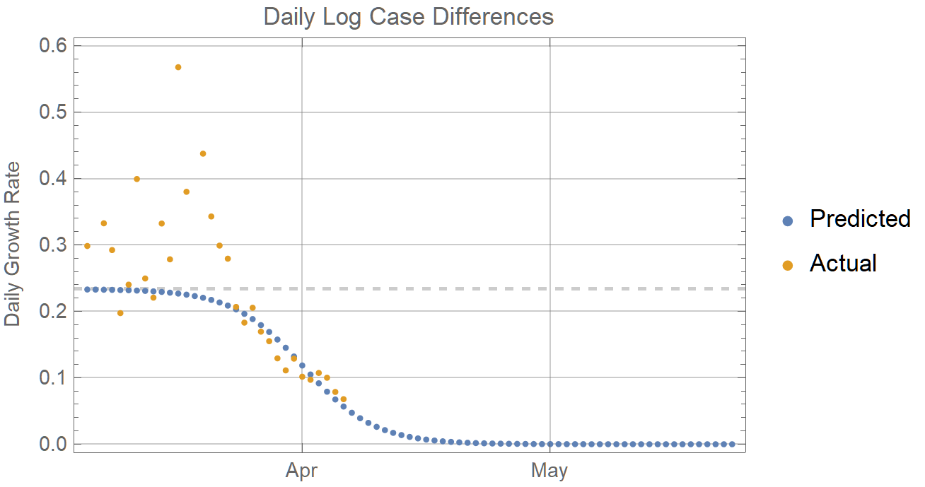
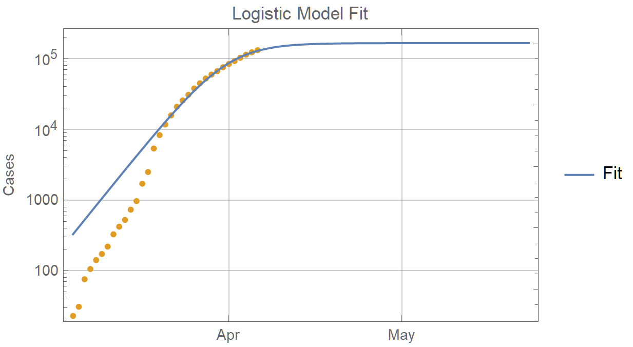
@Robert Rimmer, nice observation! I think it fits very well with SIR model. So maybe SIR model can explains it Please see notebook in Wolfram Cloud or attached below.
Attachments:
|
|
What Is Going on in South Korea?A country which controlled exponential spread of the virus more quickly than any other country in the world, now seems to be in a phase of linear growth of cases at about 100 per day. Linear growth should have been easy to control over several mean incubation periods. Something else must be going on. Perhaps a mutation? Persistent carrier spread with low transmissibility? Given the realities of medical testing, a significant false positive rate is another possibility, which might also explain the low death rate. Any other ideas???? 
|
|
Any idea how many tests they are doing each day now? Do you know if this includes imported cases?
|
|
Dear All, thank you very much for your comments and astonishing contributions. Here are a couple of things that may be useful to you.
Check the "Computational Publications" section in the head post above. It is continuously updated and now features a stunning number of articles from you and your fellow community members. Our deepest gratitude for that!
When you publish a new coronavirus-relevant article on Wolfram Community, please make sure you also come here and make an announcement comment with the article's URL link and it's summary so everyone following this thread is aware.
Join the group Medical Sciences: https://wolfr.am/MedicalSciences to get automatic email notifications when new articles are added in that group. Make sure the option box is checked in Profile => Email Notifications => "There is a new post in one of your groups".
Join our Staff Picks group http://wolfr.am/StaffPicks to get automatic email notifications when the best content is awarded Staff Picks recognition.
To share this discussion with friends and colleagues use short URL: https://wolfr.am/coronavirus
Control notifications from this forum via settings in Profile => Email Notifications
Please continue contributing your wonderful ideas and encourage others.
Again - huge thanks!
|
|
There's been so much great work from the Wolfram Community around this topic, and more information and data sets emerging every day than we can reasonably expect to digest within the company — I added a post at https://wolfr.am/COVID-19-DATA with some requests and recommendations for people who want to do more, whether it's just pointing out relevant data sources, or taking the time to make some of that data computable and more instantly ready for other Wolfram Language users to explore.
|
|
Hey, Stephen will be doing a live exploration of some COVID-19 data this afternoon (1:30pm CST, US) on his twitch channel: twitch.tv/stephen_wolfram and will be simulcast on the Wolfram Research Youtube Channel. Thought the folks on this thread may want to join :)
Stay well
|
|
Hi all, Thank you so much for the insightful data and analysis!Impressive work! Could someone please share with me (notebook?) how the Ribbon and Surface model are created? ~ Best regards, Saar Hersonsky
|
|
The 3D models in the dashboard are STL files we grabbed from Arnoud's GitHub: https://github.com/arnoudbuzing/wolfram-coronavirus/tree/master/data-files You can also find several models from NIH: https://3dprint.nih.gov/discover/coronavirus You should be able to pull any of the models into a notebook using Import . Ribbon model:
Import["https://github.com/arnoudbuzing/wolfram-coronavirus/raw/master/data-files/QHD43415_1-putative-protease_cleaned-ribbon.stl"]
Surface model:
Import["https://github.com/arnoudbuzing/wolfram-coronavirus/raw/master/data-files/QHD43415_1-putative-protease_cleaned-surf.stl"]
|
|
Hey Brian, Thank you so much for the information! I was able to Import both files
with the full path you kindly provided in your reply: Import["https://github.com/arnoudbuzing/wolfram-coronavirus/raw/master/data-files/QHD434151-putative-proteasecleaned-ribbon.stl"]. Could you kindly explain how you got the correct path above? I am not sure how the "raw" (just before the /data-files/) shows up in your message. It definitely does not show up when I use "copy path" appearing in my browser and therefore the Import did not work. Best regards,
Saar
|
|
Awesome! I used your path and could not figure out why I failed...Indeed, I dowloaded and use Import on my local machine. Thanks so much and I will be back with more after I study the algorithms to produce these
surfaces. Saar
|
|
We have a livestream planned today at 5pm EST with Anton Atonov and Diego Zviovich to explore epidemiological models and geo-spatial-temporal #COVID-19 simulations and visualizations: https://twitch.tv/wolfram Come check it out!
|
|
Another stream today! This one featuring Robert Nachbar discussing Epidemiological Models for Influenza and COVID-19. Will be livestreamed at 3pm EST on https://twitch.tv/wolfram
|
|
Thanks, @Avery Davis, but soome Twitch videos seem to disappear? Are there more stable links like YouTube?
|
|
Please join us in our https://www.twitch.tv/wolfram discussion on Geo-spatial-temporal COVID-19 simulations and visualizations over USA next Tuesday March 17 5:30 PM EST. We'll take Anton's framework and apply it to create a model for the US. 
|
|
Could you double check the date in your post. March 13 is in the past and was not a Tuesday
|
|
Yesterday the John Hopkins data for the US was about 1000 cases too low but the last two digits 68 matched the worldometer numbers (I didn't track when it was corrected). There must be a lot of human intervention to produce the numbers so they can be misleading.
|
|
Why is this surprising? The rate of spread of the infection depends upon the virus and quarantine methods, which have been known for centuries. The virus doesn't discriminate by nationality, and all European countries should know basic epidemiology. The one day difference, could simply be Roche shipping more test kits on the same day. South Korea, the outlier, got a lucky break all their index cases belonged to a religious group that had visited Wuhan together. The cases were all known instantly and easy to isolate.
|
|
I am not talking about all of them having an exponential growth (I thought this would be obvious, but next time I'll spell it out :-) ) I am talking about the fluctuations in the last few days, which are common to the European countries in the plot, but not to Iran, the US or Korea. If testing is currently limited by the manufacturing of kits, and most come from the same source, then you could be right. Another suggestion I got is that the data reporting deadline (for this particular dataset) has changed, shifting some reported cases from March 12 to March 13. This seems the most plausible to me, so far.
|
|
I noticed that there is a clear correlation in case counts in the last few days between European countries. Why would this be? Does anyone know if the data is normalized or post-processed in any way that could cause this effect? Or is the effect present in the true numbers? 
Specifically:
- March 13: all European countries have a bigger than usual increase
- March 12: all of them have a smaller than usual increase
- The non-European countries in the plot (Iran, USA, Korea) don't follow this pattern
Any opinions on this? I can't believe it's not some data post-processing effect. That's the only thing that makes sense. Can anyone confirm this? These countries (or even regions of the same country) are too far to influence each other directly. The pattern makes no sense in the context of weekend/weekday (why would Thursday have a smaller increase than Wednesday?)
Edited for clarity.
|
|
Late reply. Probably you already figured it out. There were no updates in those days for some countries. JHU have many issues in their datasets.
https://github.com/CSSEGISandData/COVID-19/issues
caseData[[{17, 12, 201, 210, 405, 463, 32, 19, 21},
{"Country/Region", "3/11/20", "3/12/20", "3/13/20"}]]

|
|
Thanks for the response. Yes, you are correct. I finally noticed too. I kept staring at Germany mostly, which did have a small increase, which is part of the reason why I was confused.
|
|
Here are a couple of other ideas. The case data for Italy is starting to converge, so you could use the L from that and estimate that the deaths stay a relatively stable ratio to cases. That might be a big assumption for Italy where the death rate seems too high. You can also track parameter convergence--this is dramatically convincing for South Korea. Code for these functions using case data for Italy and South Korea are in the attached files as well as code to fit to the differential equation, from the first derivative of the logistic function. Rather than using interpolation to get the derivatives you could manually draw approximate ideal slope lines to the data to get an estimate for k and L from the equation for the parabola.
Also when the log plot starts to show downward concavity, use only the most recent points which will be in the logistic phase.
Attachments:
|
|
Attn: Szabolcs Horvát <--- Robert, please forward, Thanks, Sam Daniel Szabolcs Horvát's case counts curves show that most countries have yet to gear up their testing and the rate of cases discovered remains steep. In contrast, the South Korea curve is flattening out, very likely due to its aggressively and extensive testing, showing that they rate of new cases is diminishing. On the other hand, the Iran and Germany curves show large case numbers, but it appears that they have many more cases to discover. Clearly all the other curves are yet to catch up... It would be more interesting, if the data existed, to plot case-naiver curves against age and prior health conditions. That is, a 3D plot with dimensions {x,y,z} = {cases, age, all underlying conditions}. Medical professionals might also be interested is specific underlying conditions, such as pulmonary hypertension, etc.
|
|
Robert: Thank you so much - that was a very helpful discussion, and I will go through the other discussion thread that you linked to. The one problem with choosing to fit to an exponential model (because the outbreak is in its exponential phase), is that it eliminates L as a parameter, and I am interested in that value. Nevertheless, it's also a useful thing to have better short term estimates as you showed. If I insist that my model also produces a value for L, I must accept that the estimate of this value will be poor while the outbreak is in its exponential phase. And that makes sense. I had hoped that a constraint might add some extra information to the model, but apparently this damages the parameter estimation. I assume L estimation gets better when the phase reaches its midpoint. Thanks for your very helpful demonstration! Steve Rector
|
|
Please see notebook in Wolfram Cloud or attached below.
Attachments:
|
|
HI. In the attached notebook, I've fitted a Logistic model to Wolfram repository data for CoV deaths from Italy through March11, with 90% confidence bands out to March 15. Since we're still in an early phase of the outbreak, the bands diverge relatively rapidly as expected. In the NLM fit, I've added a constraint to "L" based on the a-priori information that the number of deaths cannot be less than a number close to the present value. However, when I print out the ParameterConfidenceIntervalTable, the 90% CI for L is: {-3453.81, 15896.9}, with expected value 6221. I also get the warning: FittedModel::constr: The property values {ParameterConfidenceIntervalTable} assume an unconstrained model. The results for these properties may not be valid, particularly if the fitted parameters are near a constraint boundary. Now, I expect there to be a very wide interval for L given the early phase of the outbreak. But, the Confidence Intervals are not taking into account my a-priori information, and the warning explains it. It seems to me there must be a method where the CI of the fit parameters can take into account this a-priori info (in my case, L > 1200). Is this a missing feature in Mathematica? Stephen Rector
Attachments:
|
|
How can we update to the latest version of a resource object? Here it says, "Updated: 8 March 2020". But I can't get anything later than March 4: 
Am I doing something wrong?
|
|
It is supposed to update automatically. If it does not, you can always delete it manually with
DeleteObject[ro]
|
|
Dear @Vitaliy Kaurov
I would like to share the attached data for Korea, in order to help stimulate the related research. Please take a look at and feel free to use whereever necessary. There might be some errors in the spread, which I will continue to update and correct in the near future.
Attachments:
|
|
Dear Vitaliy and many other experts,
- Is it possible to compile the data for the number of testing? So that we can get the ratio of the confirmed cases relative to those who get tested?
- Is it also possible to redesign the data set to include the 'City', in addition to the current geographical classification, namely, country/region and administrative region? That way, perhaps we can get more detailed information about the containment and spread of the COVID-19 inside and outside of the city?
Best,
|
|
Dear @Hee-Young, Not sure about (1), but I passed your post to our team. It’s an interesting question. I do know that people have been tested in areas with no confirmed cases. Finding out more about that could give an interesting look at the effectiveness of containment/prevention in those areas. For (2), the source data gives the region information, which is actually the mixture of AdministrativeDivision, City, County as well as Air force base location. In the latest Wolfram Data Repository (WDR) item, we have the AdministrativeDivision column as well as more specific location (which gives the city or country information). So far most of the cities are for the US but I see some Canadian cities as well so it looks like there is possibility that more city information (outside the US) will be added in the future. Also note that the dataset has GeoPosition column, which gives more details and was used to create this additional example with geo bubbles (details at WDR): 
Show[GeoRegionValuePlot[
Normal@ResourceData["Epidemic Data for Novel Coronavirus COVID-19"][
Select[MatchQ[Entity["Country", "UnitedStates"], #Country] &]][
GroupBy["AdministrativeDivision"], Total, #ConfirmedCases["LastValue"] &]], GeoBubbleChart[
Normal@ResourceData["Epidemic Data for Novel Coronavirus COVID-19"][
Select[MatchQ[Entity["Country", "UnitedStates"], #Country] && ! MissingQ[#AdministrativeDivision] &]][
All, {#GeoPosition, #ConfirmedCases["LastValue"]} &], ChartStyle -> ColorData[8, 3]]]
|
|
Thank you very much.
I am also compiling some data for South Korea (where my parents are living). Once I am done, let me send you (share with other experts) the data set.
|
|
Is it possible to compile the data for the number of testing? So that we can get the ratio of the confirmed cases relative to those who get tested?
Three weeks have passed and I am curious if anyone has found any testing data for any other countries than the US. I am looking for resources that would help us determine if the case numbers we see reflect true cases, or are at this point mostly bottlenecked by testing capacity. There is testing data here: https://ourworldindata.org/covid-testing
https://ourworldindata.org/coronavirus-testing-source-data But these are the total number of tests performed. I am looking for more granular day-by-day (or any longer time period by time period) data.
|
|
Yaneer Bar Yam, from the New England Complexity Institute set a challenge for volunteers to join and coordinate efforts in several fronts to raise awareness on the coronavirus challenge. https://twitter.com/yaneerbaryam/status/1235053834763812866 If you join, there is a channel in slack at the workgroup that is for Mathematica users. It feels quite lonely right now (Mads and I). Additional volunteers welcomed necsivolunteersatgmail.com
|
|
I suspect the problem is early data collection. Iran probably does not have the resources to detect whether all exposed cases have become infected. Thus the cumulative case data will lag the actual cases until the backlog of cases in the community is discovered. The log plot of cumulative cases from the JHU data is still showing exponential growth. 
When quarantine measures start to work or susceptible population significantly declines, the graph should start to show growth slower than exponential. Until that happens it won't be possible to predict the end of the epidemic.
|
|
I've analyzed the data disparity of Iran (case-fatality ratio) and predicted the number of diagnosed cases. Interestingly (or sadly), it was confirmed by new data. I welcome any suggestion on how to normalize data or better approaches to tackle this issue.
|
|
In case it's not covered in data resources in OP, here is a history data source someone crawled from Ding Xiang Yuan (DXY), down to every cities of every provinces in China. COVID-19/2019-nCoV Infection Data Realtime Crawler https://github.com/BlankerL/DXY-COVID-19-Crawler/blob/master/README.en.md Note the data source is non-official. DXY, as I know it, is an online non-gov society of doctors and nurses from mainland china. Their data could be different from officially published one.
|
|
I have published 2 notebooks on the Wolfram Could which uses a logistic growth model to track the coronavirus epidemic with the data from the GitHub repository:
|
|
I have studied the genetic sequences of COVID-19 and SARS-like viruses, using Chaos Game Representation and Z-curve methods (hyperlinks to my Community posts). Z-curves provide a fascinating visualization of genomes that helps a lot for classification and clustering. The hierarchical clustering of viruses identifies Bat coronavirus RaTG13 as the most-likely culprit of COVID-19. My results strongly support the hypothesis of a Bat origin of COVID-19. I appreciate any comment or feedback :-)
|
|
I have compiled some of the work done so far into a compact cloud dashboard:
https://wolfr.am/COVID19Dashboard It is mainly built to give an overview of some information from our WDR resources, with corresponding daily updates. It is still a work in progress; I will be adding more visualizations and interactivity in the coming days. (The code is rather messy, but I'll also be publishing a cleaned-up notebook with some sample code for creating similar elements.) Aside from the visual elements, folks here might find the "Resources" tab helpful. It includes several of the Wolfram resources listed here, but also has some external resources I've seen floating around in several threads about the outbreak. I'll be continuously adding to that section as well. Feel free to comment if you think of anything you'd like to see added! (Or if you see something that isn't working--e.g. the tooltips for the world map, which I'm looking to fix.) Enjoy!
|
|
I just wanted to note for anyone who might be interested that the latest release of IGraph/M from a few days ago now exposes the igraph C library's SIR modelling functionality. It is fairly simple at the moment. It can run several simultaneous stochastic SIR simulations on a network, and only returns the S, I, R values at each timestep (not individual node states). It can be used to study the effect of network structure on the spreading. http://szhorvat.net/mathematica/IGDocumentation/#epidemic-models UPDATE: I just added another example to the documentation to clarify what this functionality is good for. If you've opened the above link before, please do a hard-refresh of the page (Shift-F5 on Linux/Windows or Command-Shift-R on Mac)
|
|
Extremely interesting. Thanks for the original work and for sharing your model.
|
|
It is very nice to see how fast Wolfram Inc is moving in gathering and curating data on the corona virus outbreak. Thank you very much! Still, for me to use, e.g. the ResourceObject["Patient Medical Data for Novel Coronavirus 2019-nCoV from Wuhan, China"]
it is paramount the I can trust the data source, especially in this Age of Misinformation. You give a name and a link to a Google Sheet, but who is behind that? Which organization? How have you curated that specific data set? Best,
Per Møldrup-Dalum
|
|
Hi @Per Møldrup-Dalum, I am glad you like our resources and we highly appreciate user feedback, thank you! For this specific type of question I recommend reaching out directly to our Wolfram Data Repository team at: https://datarepository.wolframcloud.com/contact-us Please note, Wolfram Data Repository entries are continuously updated and new information can appear on their pages in the future.
|
|
Hi Vitaliy, thank you for answering. I can see that the dataset now has a link to source and metadata information! Fantastic!
|
|
It would be neat to see a SEIR type analysis
|
|
I did a simple chart how 2019-nCoV aligns against SARS, MERS. Here results and source code. https://gitlab.com/sparvu/mathematica 
data={{24527,490},{8098,774},{2500,858},{1568,616}};
BarChart[data,
PlotTheme->"Business",
ChartLayout->"Stacked",
ChartLabels->{Placed[{"2019-nCoV","SARS","MERS","Avian Flu"},{{0.5,0},{0.8,1.2}},Rotate[#,(1.75/7) Pi]&],Placed[{"",""},Above]},
LabelingFunction->(Placed[Rotate[#,0 Pi],If[#1>1,Center,Above]]&),
ChartLegends->Placed [{"Infections","Fatalities"},Right],
PlotLabel->Style["2019-nCoV Infections",FontFamily->"Helvetica",Thin,24],
AspectRatio->0.55]
|
|
Very neat, thanks for sharing!
|
|
There is also raw data being collected here in the form of a Google Sheet. It relies on data abstracted by a human (a work study student at the University of Houston operating under my supervision) from the daily reports being produced by the World Health Organization. I attach a notebook that shows how the data can be sucked in from the Google Sheet and turned into a Wolfram Language Dataset. From there, I run a few basic queries. Please see notebook in Wolfram Cloud or attached below.
Attachments:
|
|
Reply to this discussion
in reply to
|